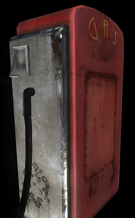
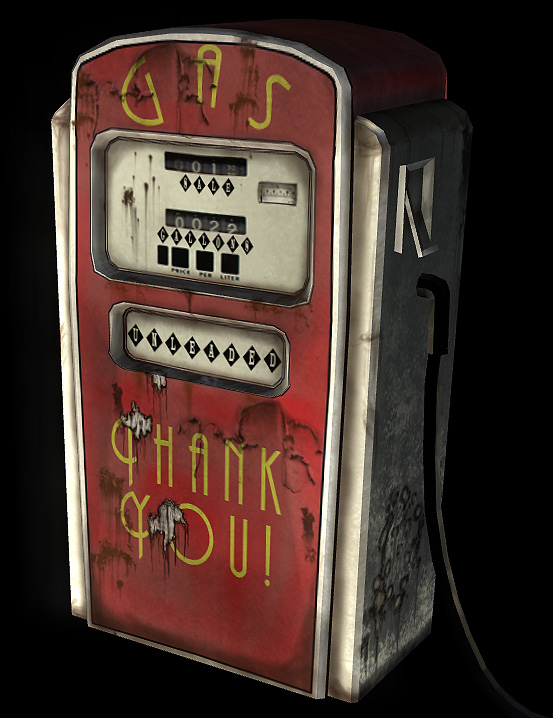
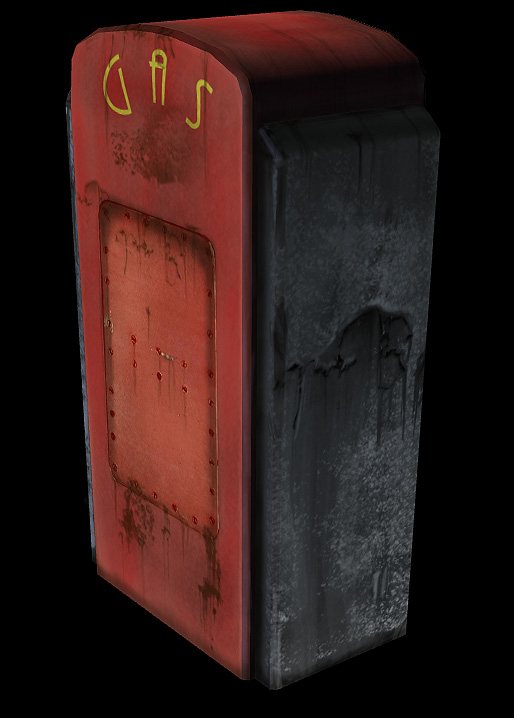
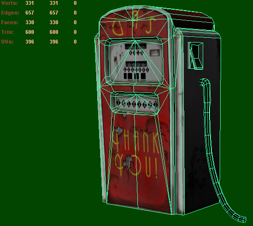
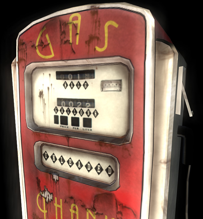
Vintage Gas Pump
Herro PC! This is a model I just finished earlier today for a scene I am working on. This is really the first 100% game model I have ever done really..
The scene I have in mind is a small marina/dock area just after a zombie apocalypse. This is the first model I completed for it. It's going to be out on the end of the dock for fueling boats!
600 tris
Diffuse + Spec
1024x2 each!
Any comments and crits are welcome")
The scene I have in mind is a small marina/dock area just after a zombie apocalypse. This is the first model I completed for it. It's going to be out on the end of the dock for fueling boats!
600 tris
Diffuse + Spec
1024x2 each!
Any comments and crits are welcome
Replies
the texture is really blury specialy for a 1024
the photosourced numbers http://www.swamppolitics.com/news/politics/blog/2008/05/16/P5170253.JPG dont seem to match the style and the rest of the texture.
keep at it tho, you will improve with every piece
I will fiddle with the text as well.. i was messing around with a lot of fonts and i think the arc thats being used was tweaked for one of the other fonts i had in mind >.<
thanks for the reply
- The yellow font is kinda hard to read, and if read quickly it looks like it says "chank" at the bottom :F Maybe move the dirt stain a little?
- Or change the font to something heavier and then add some wear'n'tear to it?
- Those square-font things pop out from the overall look of your texture. They look too sharp to fit in, especially in the main screen with the blurred numbers.
- Those stains look kinda weird with black outlines...
- ... And also the black outline that surrounds the front panels gives a cartoony feeling about your model. Is that intentional?
Despite of that your model looks pretty good so far