Home 3D Art Showcase & Critiques

Gravity Generator

polycounter lvl 8
Offline / Send Message
beartraps polycounter lvl 8
This is for an Unreal map im workin on right now. I could use some guidance:
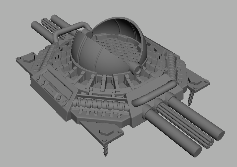
Hi Poly:
Picture1-29.png

Low Poly Start:
Picture1-28.png

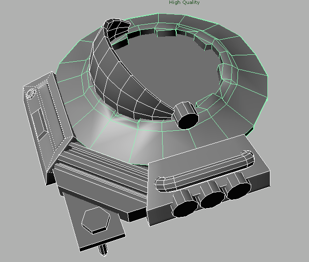
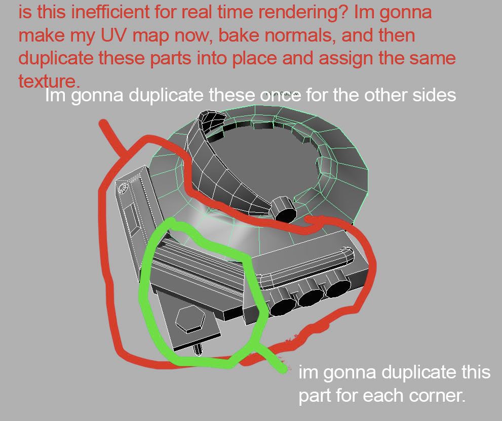
Here is where i could use some guidance, I hope i'm being clear enough.

help-1.jpg

Replies

  • MoP
    Options
    Offline / Send Message
    MoP polycounter lvl 18
    That sounds like a smart plan to me.
    Highpoly looks cool too.
  • MALicivs
    Options
    Offline / Send Message
    MALicivs polycounter lvl 15
    you have quite a few detail discrepancies in your low poly.
    for example the smaller tubes have the same number of sides as the bigger ones, and considering the way they are placed it doesnt seem like a good idea, so you probably wanna increase the number of sides on the bigger ones ( or remove on the other, depending on how much detail you want).

    another example is the circular part arround that "dome" that is just flat polygons, even though the high poly has some pretty deep detail. when you compare it to the corner ( the part you're gonna copy arround) it really doesnt make sense, because you keep most of the shapes in the low poly on that one.

    hope it helps :)
  • beartraps
    Options
    Offline / Send Message
    beartraps polycounter lvl 8
    Thanks for the feedback dudes!

    Ive baked some of this out in maya, getting a few artifacts here and there but nothing too serious, should be a simple fix in PS:

    Picture1-30.png

    One thing I notice is that it seems the rays cast from the low poly are getting confused as to which way is the proper way to go, this is a good example of what I mean:

    Picture2-15.png
    Picture3-15.png
    ugh.jpg

    Looks like its split halfway across these faces, some want to go forward and some go back ( i may be wrong, i hope i dont sound like an idiot) Ive encountered the same issues before and theres no fix that I know of, maybe its a maya thing? Ive hardened and softened edges and split UVs where hard edges occur, froze transforms and deleted history... hmmmm...
  • Guriamo
    Options
    Offline / Send Message
    Guriamo polycounter lvl 17
    did you try extracting just the problem part and baking it alone? sometimes that helps with such issues...
  • beartraps
    Options
    Offline / Send Message
    beartraps polycounter lvl 8
    ^ Thanks, worked like a charm!
  • Sirdelita
    Options
    Offline / Send Message
    Sirdelita polycounter lvl 10
    haha! lovin the photoshop diagrams!
  • beartraps
    Options
    Offline / Send Message
    beartraps polycounter lvl 8
    baked with some ambient occlusion, currently at 2178 tris and 1k maps:

    Picture1-31.png
    Picture2-16.png
  • MALicivs
    Options
    Offline / Send Message
    MALicivs polycounter lvl 15
    how big is that thing supposed to be really?
  • ZacD
    Options
    Offline / Send Message
    ZacD ngon master
    all of the cylinders have too many sides
  • beartraps
    Options
    Offline / Send Message
    beartraps polycounter lvl 8
    MALicivs: The handles are for people to lift it, so I would say around 4 feet by 4 feet, and pretty damn heavy.

    ZacD: Maybe so, but I really hate when cylinders have too little sides, really looks like shit and gives away the fact that its low poly, u know?
  • GugloPWN
    Options
    Offline / Send Message
    From the size of the screws I thought it was only a foot or two big. But you'd bet it'd be heavy, its a friggin gravity generator!
  • beartraps
    Options
    Offline / Send Message
    beartraps polycounter lvl 8
    Im tryin to get an idea of materials and colors, i really hate all of these except the simple number 3:

    paintover.jpg
  • sub_roland
    Options
    Offline / Send Message
    sub_roland polycounter lvl 12
    i agree that that there is something nice and simple to 3 but i may be a little to plain. my fav is 2 but not as is, needs to learn a little more towards 3
  • poopinmymouth
    Options
    Offline / Send Message
    poopinmymouth polycounter lvl 19
    2 and 5 are nice, but I think you have both too much, and too little color at the same time. By too much, I mean the metals are too saturated as a whole, much too vibrant for something with this much detail. By too little, I mean you seem to have only one color per material, lending it a cartoony feel. Try to keep the main overall color a bit less saturated, and then get more color variation in the shadows, and even in the main areas.
  • killingpeople
    Options
    Offline / Send Message
    killingpeople polycounter lvl 18
    just don't do 3
  • Oniram
    Options
    Offline / Send Message
    Oniram polycounter lvl 16
  • beartraps
    Options
    Offline / Send Message
    beartraps polycounter lvl 8
    poopinmymouth: thanks for that, very helpful indeed!

    I added some more detail to the normal map and worked on these paintovers today, i feel like im getting there:

    paintovers.jpg
  • Slave_zero
    Options
    Offline / Send Message
    Slave_zero polycounter lvl 8
    I suggest that you don't overdo it with those glowing bits. Having some glow effects on scifimodels is cool, but as soon as there are glowing areas all over the place it gets somewhat cheap and midnless to me.

    To your drawing:
    I like the display glowing, I like the glow in the lower areas right below the pipe and I like the glowing effects in the middle of this gravity sphere.
    But I would leave out / reducee the glowing on the ring arround the sphere. This is just a little too much. It would take away much of the nice detail you have in your normalmap.

    As for the colors: I think the warm color of #4 do a great job to contrast the cold metal. You could think giving the display a warm or cold color, because white just doesn't seem to fit here perfectly.
  • Canden Picard
    Options
    Offline / Send Message
    Wow, They all look great, but, Id say 2 and 3. Great work.
  • spahr
    Options
    Offline / Send Message
    spahr polycounter lvl 8
    4 for me. And id have to agree with with Slave zero, I would be worried about overdoing the glow. It just seems to thick right now. Cool stuff.
  • beartraps
    Options
    Offline / Send Message
    beartraps polycounter lvl 8
    thanks for the feedback dudes, here's a comparison. I toned down the glow in this too. i dunno, i dont want to totally kill it because i feel it looks naked without it:

    camparison.jpg
  • Slave_zero
    Options
    Offline / Send Message
    Slave_zero polycounter lvl 8
    No to me it's much better now

    I see much potential in the reduced glow effects. Now you can do great work on the metal materials. Those shiny effects will be taken away if you overdo it.

    The reason it feels naked to you might be that at the ring where you reduced the glow there just black holes right now.

    You can get some variance in that area by making the struts on the ring brighter. Then you will have a nice contrast between the black holes (former glow areas) and the struts.

    To me the right Image is the better one. But this may also depend on the usage in a certain map / game.
    For example. If you want to be absolutly sure the player recognizes this piece or area (because some interaction has to take place there) it might be nice to do more glows. Especially if playtests have shown that players don't see this Area or recognise it's importance. SO in that case you could go with the left design.

    But as a simple decoration asset with no functionality or interactions I'd prefer the right one.
  • Proxzee
    Options
    Offline / Send Message
    This is looking great. I would say you need to bring up the value of the green so you can see it better. Enough to differentiate it from the gray.
  • spahr
    Options
    Offline / Send Message
    spahr polycounter lvl 8
    I like them both now, either or. Id just focus more on the material for the metal.

    http://www.game-artist.net/forums/spotlight-articles/42-tutorial-hard-surface-texture-painting.html

    This tut has a great base for making metal textures with scratched paint, helped me a lot.

    Quick question, will any of it animate?
  • beartraps
    Options
    Offline / Send Message
    beartraps polycounter lvl 8
    ^ thanks, i want it to animate but im not sure we'll have enough time to do. If not ill make that a future WIP. thanks for the tut btw.

    so im gonna call this almost done, just want to take it into Unreal or Marmoset to see how it looks.

    1024 diffuse, spec, and normals, maya viewport grab with crappy incandescence glow and default lighting:

    Picture4-16.png
  • praxedes
    Options
    Offline / Send Message
    This is looking really cool! I can't wait to see the end result in Marm-

    btw EarthQuake pointed me at the cgfx shader Brice did for Maya recently, and it improves the viewpoint images by , ooohh, a zillion percent- it's in this thread:

    http://boards.polycount.net/showthread.php?p=954863

    apologies if you've seen this already, but it is pure awesome! Track back through the thread for the zip file with tut images and the texture maps for the shading options! My viewport images are loking better than (whisper it ) Marmoset in some cases (and the lighting's more controllable too)

    Cheers,

    ~P~
  • beartraps
    Options
    Offline / Send Message
    beartraps polycounter lvl 8
    thanks prax, ill give that shader a go!
  • kodiak
    Options
    Offline / Send Message
    just one thing: Aren't the nails at the bottom wasted polys? In what-in-game scenario would you see those?
  • beartraps
    Options
    Offline / Send Message
    beartraps polycounter lvl 8
    for what their purpose is now, yes they are unnecessary, but the idea was for these to be carried by people and then drilled into the ground in a cinematic.
  • praxedes
    Options
    Offline / Send Message
    Tis is realy coming on- looking forward to the final render! You going CGFX or something like U3 or Marm?

    ~P~
Sign In or Register to comment.