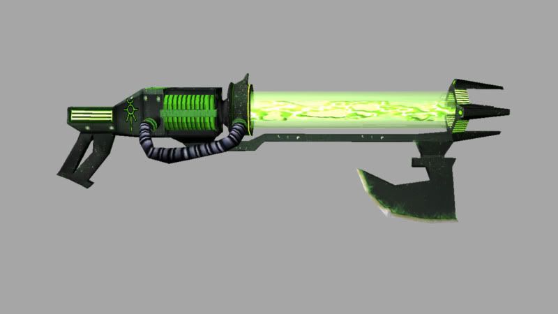
40K Necron Flayer
Hello my PC brethren, its been a while since ive posted. Been keeping busy with getting everything ready to graduate. Here is a shot of an asset i did for my asset development class. 800 Tri limit, and it had to be a weapon. Im a HUGE fan of War and War 40k, so i decided on they necron flayer. Im turning it in tomorrow night as what you see here, but I want to continue working on this to make it a quality portfolio piece. Any and all crits are greatly appreciated. So let em fly boys. It is 750 Tri's with 1k maps.
Replies
maybe paint some highlights, add some dirt/ contrast and or bake a cavity/ AO map to support the shape and some details it has.
Agree with Renderhjs about paintin in some highlights as well as some color variation. Does this object have a normal or spec map on it? It looks right now like just a diffuse channel is being shown.
The diffuse looks like first pass right now, and would benefit greatly from a bit more love in a detail pass. Consider this WH40K weapon someone made in real life, and have done a great job of painting to look like it's really worn and torn:
(http://www.terminally-incoherent.com/blog/wp-content/uploads/2007/11/longshot1.jpg) in case it doesnt show up
look at the handle there where the grime builds up between the two different surfaces. Try to capture that kind of detail when transitioning between areas such as the handle vs the stock of the gun, or where the axe meets the barrel.
The underlying base texture is clearly visible as the same texture throughout the entire weapon and I would advise going in to different areas of the texture and selecting certain areas that are separate parts and tinting them slightly just to give different sections of the gun variation. This can also be accented in the specular map.
Don't be afraid to do a high poly of this bad boy, it'll REALLY help it in the end. I know you're keeping this weapon relatively low poly, but even new MMO games that are "low poly" are still baking high to low textures on just about everything.
Since you still have 50 tri's t o spare before you hit your 800 tri limit I'd go back in and add some chamfers on selected edges to make the silhouette look less polygon'y. Even if you go slightly over your limit it would be worth it in order to make the weapon look a little smoother.
OOh i think i found something:
I think this is the same gun you're making. This guy took a little liberty with the coloring which I think overall matches the semi-painted look of the warhammer 40k dawn of war game. See how he has painted in darkness between the subsections of the gun? Smoothe.
Judging by the way you're making your textures for this weapon at this particular point it looks like you want to go more in a photo real direction and if that is the case I recommend adding another 1500 triangles to it and doing a full high poly bake down... that is if you want it to be portfolio worthy.
If you want to take it in a more painterly low poly direction I'd still recommend a simple smoothed version of the gun to bake down just to get some more control over the boxyness of the look of it, and then follow a more hand painted approach than you've taken thus far.
Off to a good start Jim - Keep going - keep posting here!
edit: take another render of this guy... show off how the spec map is working... if you do have one on there already, then I think your lighting is killing it right now.
Have a look at Pior's gun he made. Pay close attention to how he did the spec map and how it plays against the diffuse channel. Look at its reaction in the render.
Try to replicate this look in your materials and you'll have a higher quality, and much more convincing weapon!
the construction and proportions look a bit off-model. you're missing a lot of the cool details.
reference reference reference!
edit: this thread makes me want to make one!
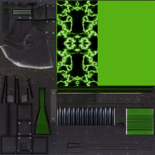
and here are my maps as requested by sir adam
As far as the tris go - if you're truly dead set on keeping it under 800 tris, consider taking a loop or two out of the hose... the ones that wrong lenghtwise, htat will free up a few extra tris for beveled edges on the main sections of the gun. Not only will this give your gun a nicer smoother look but it will also help you control your normals a lot more. When you bake a high to low, the normal directions of your low poly are greatly affected by smoothing groups.
Since your high poly has a nice smooth transition on the 90 degree edges, but your low poly only has a single flat fuckin 90 degree hard edge, you end up with really harsh changes in your normal map. This is because when the normal map is being generated, it is trying to compensate the super hard change in normal angle from your low poly based on the smoother and more gradual angle change in your high poly model. So sticking in beveled edges on those 90 box edges will make it so your normal map doesn't have to work so hard to transition the smooth edge.
Your normal map here looks like it only has a blue channel. Did you just forget to turn on your green and red channels? That would greatly affect your renders.
I like the first high poly you dide, and I think you do too. I say fuck it, go over your 800 tri limit or find an innovative way to work those nice smooth shapes into yoru low poly and get those extra neat looking details into your piece.
Right now your spec map isn't going to do anything for you at all. Go back in to it and scrap the green/black idea. It's gonna make it super flat and wont add any additional interesting detail in the end. Look a few posts up at the handgun that Pior made. See how his spec map has all of that interesting saturation change, red and green hues, and the fat white lines hand painted on to all of the hard corner edges of the gun? It looks cartoony on the spec map, but look at the render. Those uniquenesses in the spec map look AMAZING when the lighting reacts with it. Do something like that with your spec map. Try overlaying a noisy metal texture underneath everything and running a blur filter on it. Go back in and paint some interesting SUBTLE color change in to it, then manually paint in scratches where the corners of the gun are.... Use an AO Bake as yoru guide to help you know where all of those cool hard edges are going to land so you'll know where to paint your scratches.
Ditch the neon green from the spec map altogether. Perhaps it would help you understand how it all works a bit better if you just went back to black and white spec maps for a while. Get a good handle on how the light reacts with those changes in black/white value and then move in to the color of it all.
The black and white makes it REACT with the light, the color makes it Dynamic. Worry about the reaction first. It's more important right now.
All of these changes could be finished within a matter of a few hours - so sit down for a bit and think about how you'll go about executing a new set of textures in order to really sell this thing a GUN instead of just a 3d model.
Hope this helps captain! Anxious to see some modifications!
Have you put this in a game engine yet? I bret it would look pretty cool in unreal. They simply have better shaders than those available in max or maya.
Marmoset would set this fucker off though! It makes metal look kickass!
papa pope showed me this day. had to comment on it.
Keep it up i love 40K also!
suggestions:
- more industrial tube (looks organic now)
- not outline effects around characters or logos, that looks just cheap. A dirt border is ok to highlight it but that would be way more subtle.
- the green looks like a full RGB color, which always reminds me of either lazy coders (coders art), msPaint color palette or some other lousy tool used. Don't just pick the most obvious color. Instead perhaps make it more toxic, brownish (nature, used) or just add a gentle spin to it so that it is not the obvious Green:255 color.
- some reflection on the glas- tube? its either dusty or shiny right now it is to plain. Add either some dust at the bottom and or top or some reflective effects such as hotspots and or a reflection map.
I spent a good chunk of today remodeling the handle. I used the side ortho from the codex as reference to more closely match the proportions of the gun. I modified the low poly and also re layed out the uv's for what i think to be better efficiency. i chose to not overlap uv's so the bakedown will not give me funky colors in the normal.
the handle looks way better now, also those plates next to each other somehow look more convincing in the grey shading, I didn't noticed them in the first pictures as separate items. Perhaps some metal, steel or other industrial material?
Props for having the patients to re-work this one man!
I agree. The handle does look better from the last I saw of it. Keep up the good work bud.
The muzzle texture looks hastily done and half-finished too.
I like your specular map tho.
keep it up
zenarion Thanks man, however on that shot there is no spec or glow, but rest assured friend they are a'comin!
Justin_Meisse Could you explain the additive blend process? Any crits from a WAR artist are greatly appreciated
This is something I did over a lunch break a few months ago, basically just scrolling the lightning texture across a plane that gets distorted as it reaches the top, I'm also doing some gamebryo tom-foolery to get vertex-alpha near the top:
[ame]
Personally i like the textured alpha a bit better, but the dynamic lightning kinda wails too.
Sorry its to my photobucket, but youtube was taking too damn long.