Home 3D Art Showcase & Critiques

They're coming to get you, Barbara

ben.jpg

ben%20back.jpg

Ben%20closeup.jpg

ben%20textures.jpg

ben%20wire.jpg


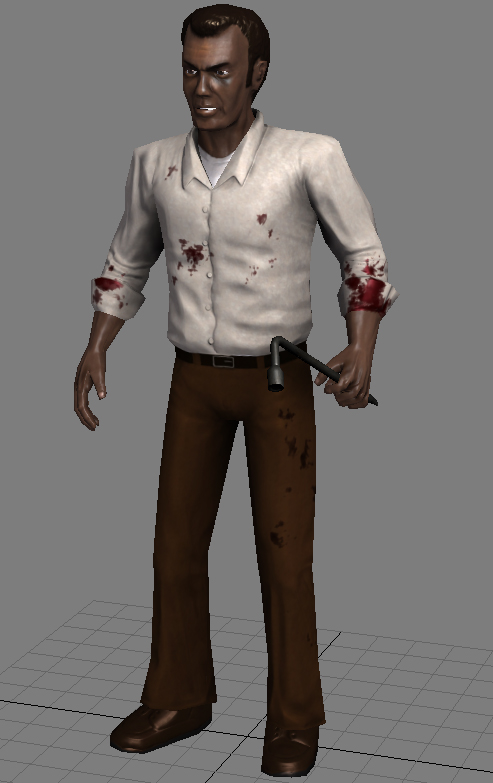
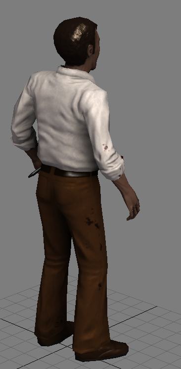
So I wanted to take a stab at a normal mapped character. I don't think I've ever really sculpted an entire character before. I didn't want to overwhelm myself with anything too elaborate, so I settled on making a guy in plain clothes. I wanted it to be exciting so I made it a guy from one of my favorite movies.
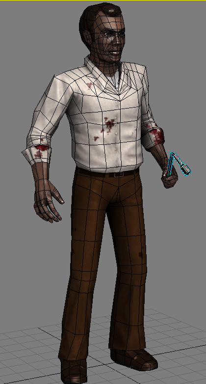
2996 triangles.
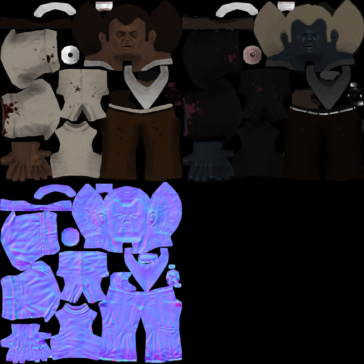
2048X spec, ts normals, color.

For those who haven't seen the movie, SHAME ON YOU! Below are some references.

20080907055634!Duane_Jones_as_Ben_in_Night_of_the_Living_Dead_bw.jpg

swingscrowbar.jpg

Ben_giving_Barbra_slippers_in_Night_of_the_Living_Dead_bw.jpg

Hmmm... I guess that's it. Crits welcome.

Replies

  • SomberResplendence
    I think the spec map could use a little work, or the lighting... first impression was that it looks like an action figure. I love how it's Ben, but in your style. My only crit would be that spec map... at least the hair and skin.
  • c0ldhands
    Options
    Offline / Send Message
    c0ldhands polycounter lvl 15
    What mr.Batman said, the hair looks like plastic. But i like the topology of this character, seems its has more polygons than it really has.
  • nfrrtycmplx
    Options
    Offline / Send Message
    nfrrtycmplx polycounter lvl 18
    This would be perfect for a celebrity deathmatch mod.
  • Alec3d
    Options
    Offline / Send Message
    reaaaaaaly nice topology.
  • Taylor Hood
    Options
    Offline / Send Message
    Choco hair FTW
  • Mark Dygert
    Options
    Offline / Send Message
    ha, that's great!

    I agree about the spec. Way to light in the hair, belt and part of his shirt. It looks like you inverted your diffuse? I think it would help if you worked on the spec one material at a time.

    Painting the spec highlight into the eye is kind of a bad idea. You want that highlight to show up anywhere on the eye and respond to the lights in the scene as the character moves around, not be static.


    Shoulders could probably use a loop or two on the bicep side to help deformation.
  • t4paN
    Options
    Offline / Send Message
    t4paN polycounter lvl 10
    Awesome movie and quote. "Choc hair" does indeed need some more love, probably in the spec, like most other said. Other than that, nicely translated, you even gave him the 60's pants!
  • Nizza_waaarg
    Options
    Offline / Send Message
    Nizza_waaarg polycounter lvl 15
    Agree'd on the spec map (original :poly142:). I'd try toning down both the spec and spec power on his hair if you can but not sure how it'd turn out (toning down the spec would be good tho i think).

    also diggin the topo ^__^


    ...and can someone tell me what movie it is :poly122:
  • John Warner
    Options
    Offline / Send Message
    John Warner polycounter lvl 18
    that movie scared the shit out of me when i was young.

    I think his proportions could be a tad weird.. head seems pretty big, shoulders seem rather large, legs seem a little bit simple and thin..

    and cut back that spec! he's lookin plastic-y
  • dolemite
    Options
    Offline / Send Message
    ben%20.jpg
    ben%20face.jpg

    Hey thanks all for the feedback!


    I'm still learning how to do the spec properly, and fighting against my need to make everything shiny. I like shiny things... So I adjusted the proportions a bit on the body. I'm realizing I made a lot of mistakes with this piece, and so I'll probably be putting it to bed soon. I think I should make one with a lot more detail, like the belt should be modeled out, etc.

    I think I will be putting this aside pretty soon and starting on some sculpts. I need to learn more about that, and need to learn more about anatomy I think.

    Vig: I really tried to make the spec one material at a time. I started with the AO a a guide and basically made everything the color I wanted the specular highlight to be. Of course if it looks like I did it by inverting the diffuse, I must have done it all wrong hahaha.

    John Warner: How's it now? I'm a tard on proportions, trying to get better though.

    Nizza_waaarg: You need culture [ame]http://www.youtube.com/watch?v=jfShkumjeq8[/ame] :) I lowered the spec level on everything. I hope it looks better :/

    LoM Chaos,
    nfrrtycmplx,
    c0ldhands,
    Alec3D: Thanks!

    t4paN: Glad you liked the quote. I think next time I'll call it "black male zombie killer wip." Was worried that people didn't get it :(

    SomberResplendence: Burn in hell!!!!! I mean, I love you! XD
  • BradMyers82
    Options
    Offline / Send Message
    BradMyers82 interpolator
    Looking better. The model looks really stiff to me though. Partly because of how you have him posed, and partly the model itself. For example, he looks sort of like he is wearing shoulder pads like some women have in coats. The way the shirt is bloused out, looks like air is blowing up in there. His waist and hip area seem low and overly small. The arms might be a tad short (do the hands hit mid thigh when all the way down?).
    Some more subtle color variation in the textures might also work wonders.
    I would just go in there and start playing with the proportions. Keep working on it, its coming along nicely.
Sign In or Register to comment.