The BRAWL² Tournament Challenge has been announced!
It starts May 12, and ends Sept 12. Let's see what you got!
https://polycount.com/discussion/237047/the-brawl²-tournament
It starts May 12, and ends Sept 12. Let's see what you got!
https://polycount.com/discussion/237047/the-brawl²-tournament
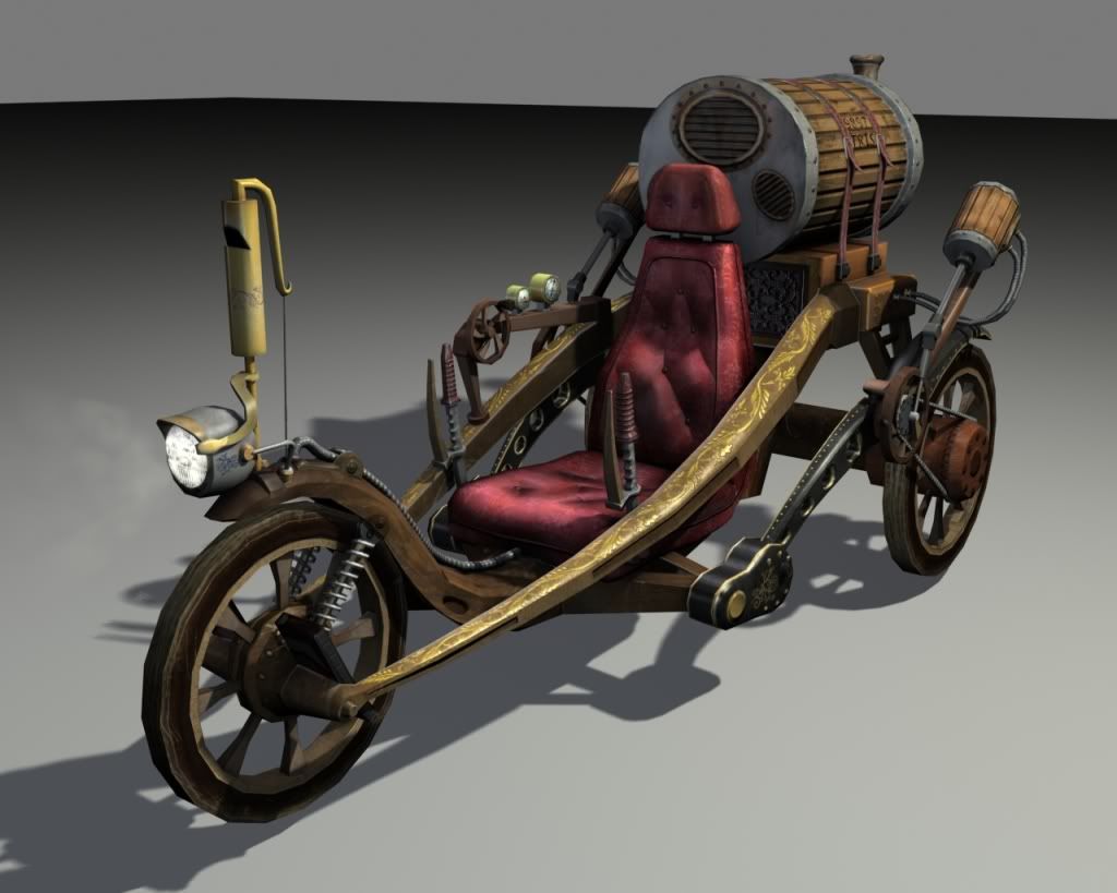
Steampunk Vehicle WIP
This is for a Steam Punk assignment in my Game Assets class. I found this pretty sweet lookin vehicle and chose to model it while making a few of my own alterations to it. Original design can be found here http://www.crabfu.com/steamtoys/diy_steampunk/
Finished! Finally lol, it's as done as I'm going to get it for now, hope you guys like it.

____________________________________________________________________________________________
--ORIGINAL WIP Images--
_BELOW_
____________________________________________________________________________________________
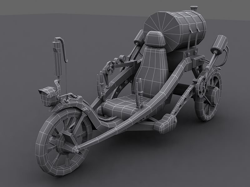
LowPoly Wireframe
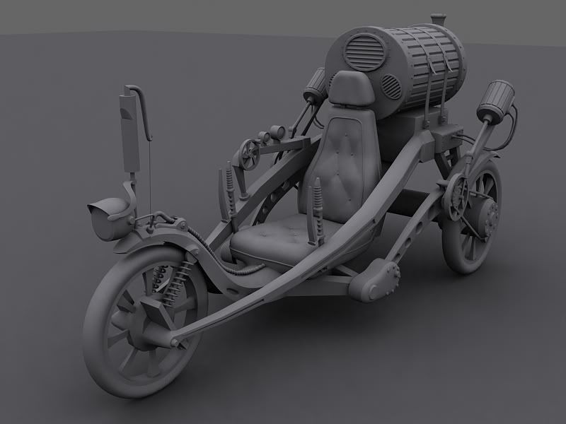
High Poly
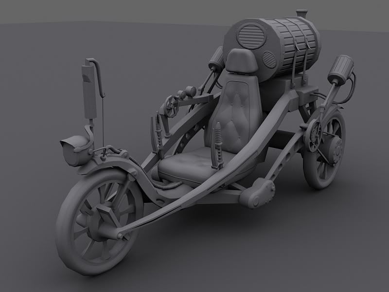
LowPoly + Normal Map
Finished! Finally lol, it's as done as I'm going to get it for now, hope you guys like it.


____________________________________________________________________________________________
--ORIGINAL WIP Images--
_BELOW_
____________________________________________________________________________________________
LowPoly Wireframe

High Poly

LowPoly + Normal Map


Replies
the two levers control the amount of steam pumped to each wheel, which changes the rotational speed of that specific wheel, causing it to turn / go straight?
either way
looks sick! can't wait to see it completed
my only concern is that the whistle might get in the way , and that the whistle doesn't look connected to any piping to bring steam to it
Looks very cool in general though.
Cheers, Nick.
Also this is a concept of crabfu's no?
http://www.crabfu.com/steamtoys/diy_steampunk/
might be nice to mention that.
Looks great! can't wait to see it textured.
Also I edited my original post giving credit to crabfu's for his original design
Anything besides fear that are keeping those feet up and not into the wheel?
Nice bike though! Interesting concept.
I agree with Helixx on upping the number of sides for the barrel if possible. If not it's all good.
Can't wait to see it finished. Keep up the good work man.
I've had tons of problems with getting materials to look right in the past, but I'm seeing the same problems with this.
--First, I'd add more wear to the actual rig itself. The metal especially couldn't possibly be that clean. Even if you're done with this asset, just study corrosion and wear on metal. It'll really make a difference.
--And, of course, the spec itself needs to reflect all that wear. I'm even having a hard time seeing any spec at all on this.
Keep it up!
First your metal looks like cement, very flat, and seems to have the same specular lvl as everything else.
Second, your rubber tier looks like its made out of wood
Third, your gold looks like its just some yellow color, needs more from the spec to help it pop, use a colored spec to give it that gold pop.
Forth, your gold accents along the wood are getting lost, they look cool but I could barley tell they were there, they should pop out and not have the same spec as the wood which is too shinny and is looking like its been highly polished.
Fifth, the 3 vent things on the barrel are not working as is. They look like very flat diffrent colored textures place on there. Nothing is grounding it to that metal. Also if that barrel is full of steam im sure some would come out of those vents and leave stains on the outside of the metal.
Sixth, I think the barrels count could be dropped a lot, the staps could be done with alphas and even the indenet in the center dosnt creat enough of a change in shilouhet where I think you could just have it normaled.
Last, you need to show a little more wear, lots of things look to flat and just like place holder colors.
You have some nice elements you just need to push it a bit more
Lol that's cuz it is
So I got that one right, but yeah I was crunched for time on the texturing for this since I spent so much time on the model. If I ever decide to use it for my portfolio I will definitely have to rework a lot of stuff. The spec was kinda last minute too so you basically spotted all the stuff I had to kind of throw in there. Thanks for the crits
But then, you knew that
Hey one thing though, the axle on the front wheel looks like it isn't centered. easy fix if you feel like it.
And, are you rendering with Catmull-Rom in that final screen shot?
Whats True: That is a good catch, I didnt even realize that till now, how can you tell from the render? Also I wont be home for about a week, but when i get home I'll post up the Texture for you