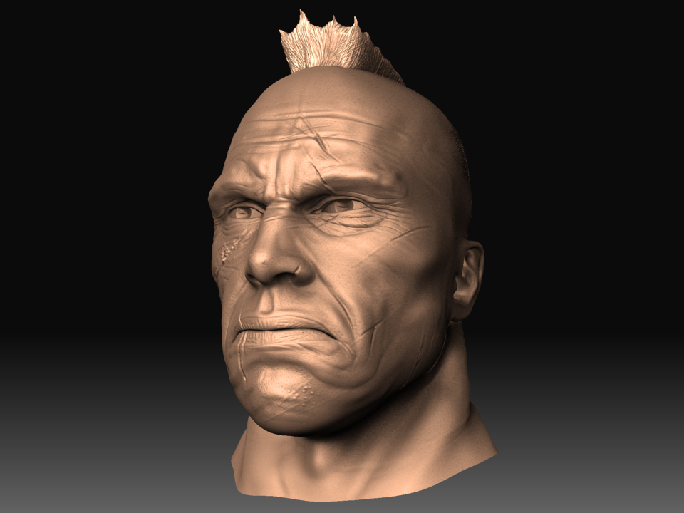
Looks like a good start. One thing that bugs me is the hair. You have it appear as a solid Mohawk shape but within that shape the strands flare out. I would say if you are going to use that method for the hair, make the strands straight and get rid of the batwing top.
good luck!
agreed, good start. I think that the top of the ear may be a little low, it's hard to tell in a perspective shot. On average you would see the top of the ear roughly in line with the upper eyelid/brow, if that makes sense?
I'll post some better angles. Thanks for the critiques! yea with a receading hairline like he's got i don't think his mohawk would be this full. I'll post some with it pulled forward and i'll make the scars more believable.
i agree with The_Kozmonaut...he looks old around the corners of the mouth and eyes but the cheeks, the upper lip and the neck are really smooth. Also the creases in the forehead don't look natural...for one they should sink down slightly toward the center of the face... but besides that those kind of wrinkles don't show up that much on an expression like that....mostly you see those wrinkles when the eyebrows are raised...when they are pursed down like that the ones toward the bridge of the nose are more promenent
No this is my own mesh i've hammered away at to get as good as possible for animation. I developed it with max and some retopology tool in zbrush. I don't know if you all have seen the preview for Max 2010 but it has it's own retopology tool which allows you to draw you flow and rather than going in and pointing and click to create you mesh the program now recognizes your lines and creates it for you..geez i feel that some day they won't need us at all! Gotta love technology. But I have like three head models for male and female for different flow depending out how skinny or plump there face is.
Thank you Kozmonaut & se7ered. I did rush to the scars and thanks for pointing out the wrinkles on the forehead. Im going to be working on this guy like crazy starting tomorrow so i'll continue to post with the changes.
Replies
good luck!