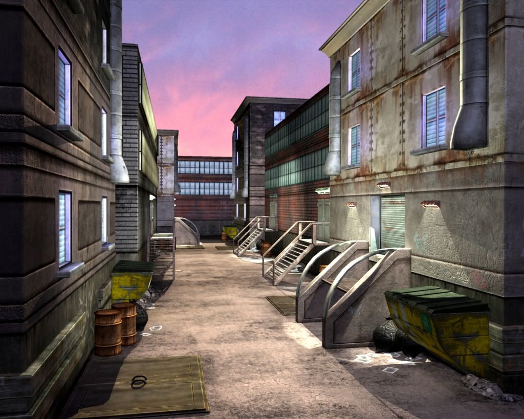
Alley Environment Art Test
Recently had an art test and was only given a week to complete it. The idea was an Alley way of any theme and time period of my choice. So to show some variety and be creative a chose more of a futuristic environment with some modern day materials.
Was hoping to get some feed back so I can keep working on this to improve it. Thanks!
Was hoping to get some feed back so I can keep working on this to improve it. Thanks!
Replies
Also post some more camera angles. To recap, it's maybe a bit too bright for an alley but the feel is there and there's potential in it imo.
the skybox/background doesnt't match the scene, i.e. twilight should have twilight lighting as it seems the
sun is no longer above the horizon, and the whole scene should have inherited that pink/purple hue.
youv'e done a good good of grunge on the buildings - but what about the path/floor - dirty thta biatchha up
more garbage - espically near the bins/dumpbins.
sorry for speaking in layman terms - there is no focus of interest that i can see in the peice - add some
powerlines - water dripping form the shutes on the walls - power supply wires to the right side lights -
make some more prominant graffitti apart form the faint red/blue stuff (i.e. taggers will usualy over-tag
someone elses's tag for territory).
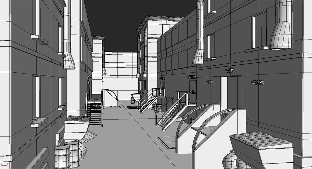
you've gotta somehow find a way to make the instanced geometry not so obvious (the bins/bags/dumps/basement doors) but still effective
i agree with t4paN - get a lightmap that'll break up the peices and bring the lightness down a touch -
i envision a more blade-runner grungy alley (add some fluros?) and more stringy wires between
buildings....despite the time period - there are always gonna be some dirty-ass alleys
i'd say good beta work - good luck with the test
I took the same art test earlier this year. Best of luck. Hope you get it.
The modeling looks super solid. You beveled corners like it's all next gen/current gen and stuff. You added some lips and trim here and there. Nice job on that. I really like the modeling overall.
Texturing seems a bit all over the place though. Color palette doesn't seem well thought out. When I have a rough time with color palettes I work in greyscale and work in colors once the values are reading properly. I'd maybe try an approach like that or maybe someone else will suggest something. Some materials (close concrete on the right) is done pretty convincingly. But then others (brick work and the concrete on the left) don't seem that realistic. Aside from the rusty metal on the right it all seems super clean. I'd dirty it up some more (moodier lighting will help with that too). The windows could use a bit of variety also. At least different color blinds and light intensities. Also the duct work just seems stuck in the walls. I'd add a rust decal around and under it. It'll help weight it down more.
Hope that helps. Good stuff so far. Just a few tweaks here and there and it'll be really great though. Best of luck on the job too!
I just dont see what is futuristic about it. If you told them this alley is your version of "futuristic" they may have a bigger problem then if you told them this is a current day alley. This looks like the alleys today out on west 2nd to me.
Other than that it looks decent man.
I'm definitely gonna keep working this scene and add as much as I can. Thanks for the input and I will try to update this soon.