Tooth Fairy Box Prop_WIP
polycounter lvl 11
Soooo......I have been stuck in Low Poly MMO purgatory this last year at work, and I decided it's time to start learning how to do some "Next-Gen" (or current-gen) work. I've posted on some other sites and have gotten little to no feedback.
I figured I'd give Polycount a try since I know most of you dedicated Poly counters have huge egos and have no problems bustin' up people's work.
So let me know what I am doing right or wrong, and any criticism whether it be good or bad is welcome.
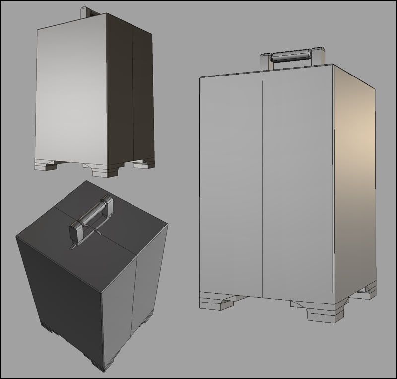
This post is a small prop at 393 Tris (which might be too high for a small box shaped object), with 512X512 Color, Spec and Normal map textures applied.
If it looks familiar, it's because it is created from the concept art for the Tooth Fairy carrying case seen in HellBoy 2: The Golden Army.
Replies
So here is a screen grab from Maya with the 65% completed textures applied.
I am having a little bit of trouble trying to figure out what to do with the feet and handle.
Wood, metal, ect.?
Again, any and all crits are welcome.
Here are the most recent passes at the textures.
I still have to texture the top of the box, the feet and the handle.
Does anyone know what slot of the shader an EMISSIVE map goes into in Maya's Attribute Editor?
Also, does anyone have any suggestions as to how to apply color onto your Spec Map?
Any rules or practices I should keep in mind?
Like I said, I don't have much experience with "Next-Gen" techniques.
The prop looks real good
As far as the map being a 512,depending on where its going to be in an environment and how important it is, im going to say 256 seems the better choice to me.I know people are going to reply saying that unreal props use 512 maps XD
Do you have a normal map acting in that last image? If so, then its really not showing. Were those indents in the box made with an extrude or a bevel?
Also,eek! quick fix with uvs preserved:-
Everything looks wicked.Im hope the 35% will really make this prop look crazy
Dont exactly remember the prop.Mind upping a reference if your trying to recreate that exact design.
Looking forward to updates!
^ that was my reply to your first and second post :P
Again, your screwing up your specular map. The specular DOES NOT work if you just do a lowerbrightness+upcontrast operation. Quite opposite actually. You first have to understand how a specular map works. Darker the image, lesser its specularity (how much it reflects light i'd say) and vice versa. WHen you simply do the operation mentioned previously, it doesnt give you a specular thats accurate. The scratches are actually supposed to be darker, but in your specular map, they are the white-est.This obviously occurs when the brightness is reduced and the contrast upped. Also, i was wainting for you to show an update with around 90% textures done,but ill post it now. Dont forget to highlight the edges in your specular map;
As far as colored speculars are concerned, its blue-hues for cooler objects (metals and the sort) and red-hues for warm objects (skin and the sort). Its somethng you will have to play with to get exactly what you want. Check out this website for all the knowledge into making specular maps:
http://www.iddevnet.com/quake4/ArtReference_SpecularMaps (Note that the artist DOES NOT use the diffuse as a base, rather paints a completely different,fresh specular)
and
http://www.iddevnet.com/quake4/ArtReference_CreatingTextures
Just to show how much important specular maps are; heres an excerpt from the sdk documentation from ID
"I believe the specular map is the hardest part of the texture to paint and the most time-consuming of the three maps. Do a really nice job on the specular and it’ll really make your texture really sing."
Now if those guys are saying/doing it, its pretty much how it should be done
Thanks for the comments, man.
I am agree that 256X256 is the most efficient size for this prop.
We use 256X256 for every 4 feet by 4 feet at work, but I figured since we are working on an MMO that 512X512 would be more "Next-Gen".
As far as the Normal Map is concerned, I do have it displaying in the Maya view port screen grabs.....so I am not too sure as to why it is not more noticeable.
I extruded the edges then scaled them inward about 45 degrees in order to accentuate the extrusions.
After that, I beveled them a couple of times. Any guesses as to why that Normal Map is sucking?
As far as the quick fix with UVs preserved is concerned......what do you mean?
Is that just to save some triangles? Or does your suggestion serve other purposes?
Thanks for the comments and crits!!!
Also,
"Is that just to save some triangles? Or does your suggestion serve other purposes? "
Isnt saving some triangles enough of a purpose?
Here's the the concept/reference pic I found on-line.
Thanks for the help, Butt.
Your advice and crits are EXACTLY what I am looking for.
I will make another pass at the SPEC map ASAP.
393 tris down to what...381? Not really making any difference at all. Normally, I'd say yes, saving tris is great, but for something already so simple in construction, there is no point really.
Looking good Mondo. Maybe up your color variation just a tad around the main/middle metal parts, and what appear to be the braces holding it together from the feet up. Also, not sure the exact aim, but maybe adding a light source into the red circles, adding an IR map for them to give it a glow?
Well,thats kinda silly to think saving 10 triangles would have ANY effect at all. What if it had to be drawn in the scene or has to be instanced (for the sake of argument) 100 times? wouldnt 1000 triangles be of no meaning? Wouldnt that have any affect on the engine AT ALL?
I also dont think "simple" things get to have a loose poly limit rope. If thats your idea of not worrying about things like that, i think that it would add upto a substantial amount in the end. Wouldnt you rather use it elsewhere?
i will in no way stand to see any geomtery wasted.Its a complete waste (not attacking the OP). He might aswell add that geometry elsewhere. If it were there for silhouette/smoothing/vertex colours/any thing of that sort,then its understandable.
Why stand for something thats robbing you of your resources?
by your logic people shouldn't vote, because it's just one vote and it doesn't matter in the grand scheme of things?
Mando - it's looking good. based on the concept, i think your bevels could stand to be wider. also, the profile of the legs/feet don't match either of the confliciting images on the concept.
I know in the production world where time is a huge factor; crunching every last tri might not be plausible, however; since this is personal work its probably a good idea.
So in a way, your both right.
Regardless, I know if it were me working on this project I would want to make it as perfect as possible and follow Butts advice.
(BTW: I kind of hope writing this drops the whole debate so that we can focus more on the important points; Mondo's art.)
Mondo Magic: It's looking really nice so far. I'm looking forward to your next update. Glad you posted it on PolyCount!
BUTT -
Here's the Hi Poly model I baked the extrusions from.
I also cut the geometry of the feet as you suggested.
I saved an extra 8 triangles by doing so, which I guess can add up if the prop was instanced a bunch.
New update to the handle.
The first pass on the handle just seemed a little too boring, and I felt like it took away from the overall presentation of the box.
Hopefully this second pass is a little better suited with the rest of the prop.
All right....so I am pretty much calling this prop done as far as Maya and Photoshop are concerned.
Next step is getting it into UNREAL 3 and playing with some post effects, lighting, ect. and then developing the final layout for my portfolio.
So any advice/links or info on that would be SWEET.
Butt - I tried to redo the spec map as per your crits, but I was not getting the results I was looking for. I will keep it in mind with the next asset. Thanks for the advice and the links. I am definitely gonna book mark those!!!
Medestruit - Thanks for taking the time to comment on my work. I tried to vary up the colors on the main texture, but it started to take away from the focal point, which I wanted to be the red circle thingy.....so I wussed out and defaulted back to the generic approach. I was hoping someone on Polycount would help me out with the Emissive Map issue, instead of merely suggesting that I use it......but I guess it will probably be easier to make it work in the UNREAL Editor. I am assuming that is what you meant by adding an IR Map? Is that short for "Incandescence" in 3DS Max? I am not familiar with the IR Map term, but I definitely want to add some type of post effect to the red circle and maybe even the engraved letters and extrusions.
Sectaurs - I just added some dirt/grime to legs. I didn't know what else to do and I didn't want to follow what the concept had. Also, I tried wider bevels and it just didn't appeal to me visually. Maybe if I had started with wider bevels the end result would have come out better....but it was just too much trouble to realign the textures and everything. Maybe next time!!!
BradM. - Thanks for the compliments!!!
Lamont - I tried adding some color to the Spec...but I am just too new to the process. It came out looking like boo boo....but I did settle on a hint of yellow for a majority of the metal. Do you have any links you can share that explain the process a little better?
This is a penny with a black and white spec map:
This one has the complement color of the bronze of a penny. I could have done more to match the correct colors through the penny itself... but I hope it shows what I am taking about.
What Butt was saying is essentially a common trick to "edge" out your edging in normal maps, similar to how you do it for corners and whatnot. You should ALWAYS use your spec in conjunction with your normal, otherwise you won't get the results you are looking for.
Here's a hacky example, assuming this bevel goes downward, and you are painting this onto your spec map:
Another issue with yours is that your spec area for where your bevel goes down is not acting the same way your normal map does:
Keep in mind that this is very primitive and the more gradual your light ramping would be, the more you would want to have SOMEthing in there. The reason your bevels aren't responding the way you want them to is that there is very little-to-no specular assistance.
Think of your spec map as more of a tool to enhance your normal map, and tell your game engine HOW you want the light to work with your normals, and not just "the color of the specular" and that's it.
Having dark colors or black areas = very little light, and poor normal results.
Thanks, Big Pimpn'!!!!
That makes a ton of sense......which I should know already.
I am definitely getting soft & rusty because of all the MMO crap I had to do this year.
The comments are much appreciated and I will make the changes you've suggested.