Demo Reel IN PROGRESS
Hi, my is Tony and I am currently attending the Art Institute of Vancouver-Burnaby. I graduate in Sept 2008. as a environment artist.
Here is what I am currently working on...
Any comments on how I can improve or make better would be very helpful.
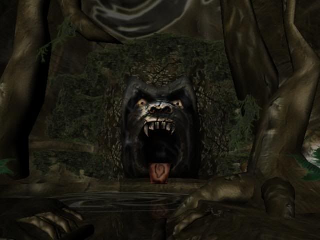
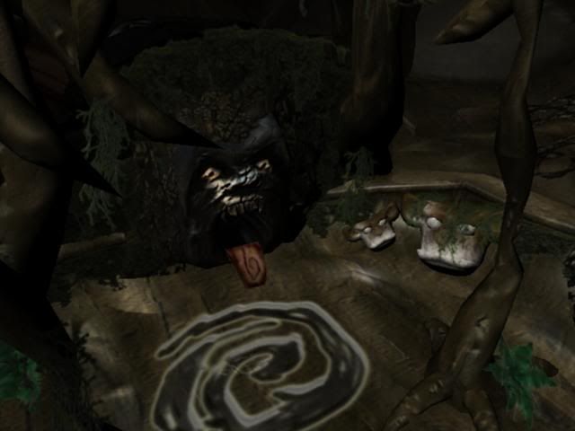
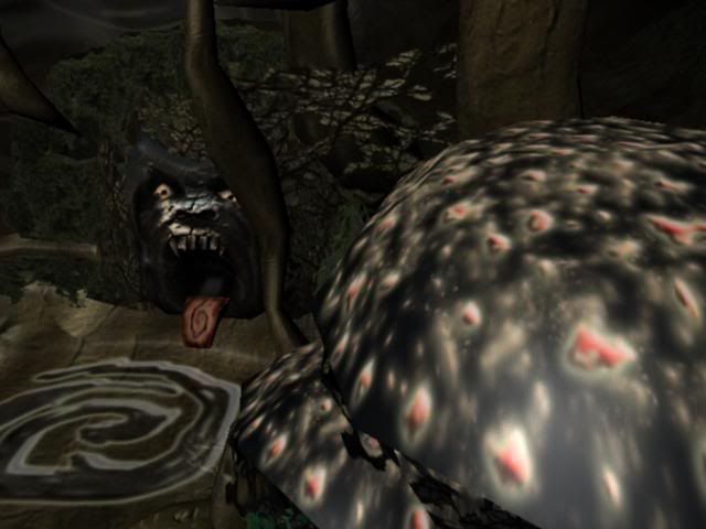
I going towards the hand painted art style in this scene. Here are some screen shots.
Here is what I am currently working on...
Any comments on how I can improve or make better would be very helpful.
I going towards the hand painted art style in this scene. Here are some screen shots.
Replies
also you've got some really bad stretching on.....whatever that thing is in the foreground of the third pic
Do you have a concept you're working from?
You need to take a step back, and just show us just the model with no textures. I have a feeling this will reveal more errors you need to address. Without a solid foundation, you'll be fighting yourself with the "polishing a turd" situation.
First of all we need to see the models in wires/clay so that we can tell what this is for starters...
And its better to start setting up your lights and optimizer it the best you can before texturing them..as I can't even see it.
:: I see a head that's all there is...
And YES! I am working off a concept.
The concept art is by Joby Otero.
http://jobyotero.com/GhostWorld.htm
And get some renders of the model itself.
You should keep at it though man....this stuff takes time and patience. There's lots of environment art books out there based off popular games, compare your work to that and also the work you see floating around here at polycount and other cg boards. Keep it real man! :-)
Though you ask me would I play a game with this in it. YES I would. Of course
this needs alot of tweaks still, but the only reason I made it in the first place because it was very appealing to me. So I went with what I like.
Can you sort of explain what you mean by bland? Do you mean it needs more props? or? ...
Thanks for the feedback so far.
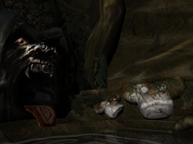
While the room itself has symmetrical features almost everything is unique. You've treated them more as props and pasted them around. For example, those small duck bills in the corner are actually a large hippo statue that fills the right side of the room. The mushroom top trees appear twice in concept but at least six in execution. They lose value, and don't get enough attention.
The gorilla-man face is flat. Look at examples of good character models for tips on edge loops. Search for examples of similar things, such as this:
http://bp1.blogger.com/_LbccUVbSRd8/R5o-fv4jMHI/AAAAAAAABkA/2P6BuWt6BI8/s1600-h/gorilla_knuttz.jpg
The rings of your mushroom trunks are randomly scaled in or out. There needs to be a gradual progression of thickness.
Unless using vertex lighting or texture blending, you probably don't need a lot of the edge loops in the ground. The scene isn't really using the triangles to validate the small roots on the side of the trail. These can be better translated to the texture. I'd use some of these extra triangles to better define your trail edge.
Going for a hand painted style, keep things simple. Look at the texture flat for this tree:
http://ryanhastings.com/treegate.html
It's one base color and a few hue variations of a highlight and shadow color in big, single strokes. Every brush stroke is important and meaningful. When painting in similar styles, I'll often draw on stroke and undo it until it's close to perfect.
This site has a lot more on painting
http://www.itchstudios.com/psg/art_tut.htm
Yea man, and I hope I dont come across as too blunt with these crits and observations...I'm honestly just trying to help you see what we're seeing. I think you need to take a step back and look at what you have so far with a very....very critical eye.
Right now, there is no mood. It has no effect on me what so ever. It doesnt look scary, intriguing...it honestly doesnt have any appeal man. I know you probably worked your balls off on this thing, but keep working on it. Remember that after the Art Institute, there is a industry out there that is waiting for you...but you gotta be able to impress the best. Show them something you can honestly be proud of, not something you made just to get out of school or something you can print out for your mom to hang up on her fridge. Make it jaw dropping, breath taking, punch you in the f'in face amazing. I'm not an environment artist by any means, so I wish I could give you more technical advice. Cholden and others have already given ya some good insight and tips man. Just keep polishing that foundation to better yourself and the sooner you can be honest with yourself, the sooner you'll be able to see some improvements. Good luck! :-)
At your school, do you have access to ZBrush or MudBox? You might want to take it in there a bit too if you can. Create some better normal maps as much of it is looking flat. Keep it up, I like where you're going with this, just needs a lot more love. Good call for posting on this forum.. people and their crits in here WILL help you. Just don't take anything personal. We're all here to help.
Alot of good info from each and everyone of you.
Your right I still dont feel any mood. Sadly I am horrible at lighting and still working on that part. I still am sort of not sure what type of mood I want yet. I will have to decide real soon though.
Yes i do have access to Z-brush. I was thinking since its handpainted I might not need as many normal maps.
Your absolutely correct about the spec maps and diffuse. I got to add those.
Again thanks for the tips.
I just wanted to update what I got so far.
Again I have added in the lights and changed the textures into more cartoony stylish textures.
I am trying to go for a more Crash Bandicoot Game art style.
Again comments are always welcome.
Care to explain on that concept?
I would like to understand that a bit better.
http://images.google.com/images?q=volume%20lighting
keep it up
cheers!
Currently Im working on my other scene... which is a skull platform.
So havent touched this too much.
consider making the wall textures darker around the bottom where walls meet the ground, ,. good work .
Comment on this plz.
But mostly just make it TALLERand Skinnier!
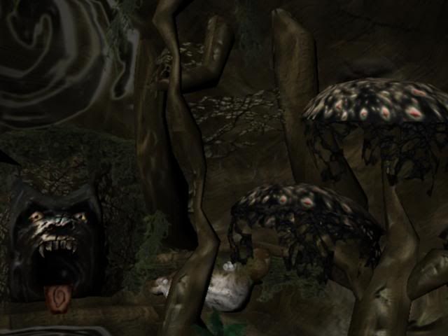
Your models are all still the same, you've adjusted the lighting and added a ton of clutter to the scene. So the composition is a noisey, jumbled mess with a face in the middle. It looks like you have some redeemable props, but then vomited them into a scene with no thought or composition.
Do you mean by stretching out the whole piece? and then pushing it in sideways?
I agree you should put something on the foreground to get a more depthy feel -- I suggest a mushroom (that's alot closer than the others) in the lower right corner.
Cheers & keep it up.