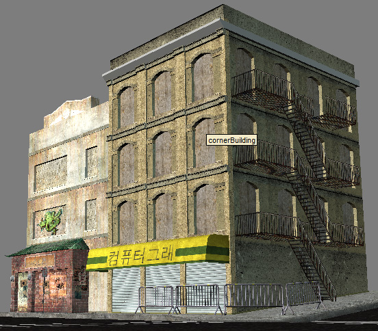
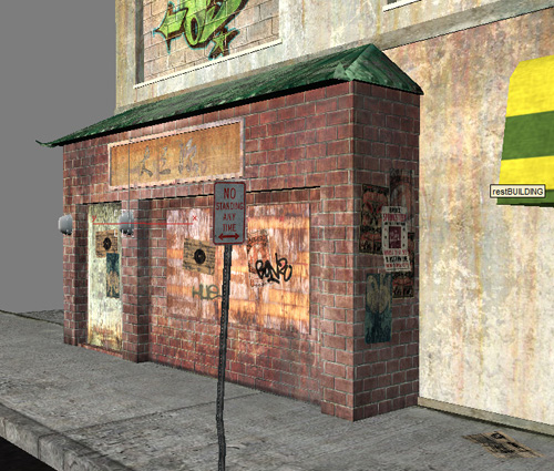
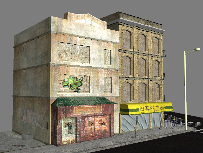
China Town

polycounter lvl 15
Hey guys, been working on this for awhile, and I think it's time for a Polycount Polish. Honest constructive criticism is highly encouraged, harsh if need be. I want to make this amazing, so lay on the knowledge, brothers. I have things I want to do still, but would like some fresh eyes on it.
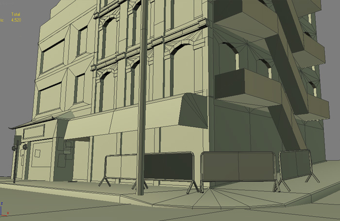
Total Tris - 4,520
Corner Building - 2,436
Other Building - 1,133
Barrier - 180 each
Lamp Post - 125
Sidewalk & Street - 72
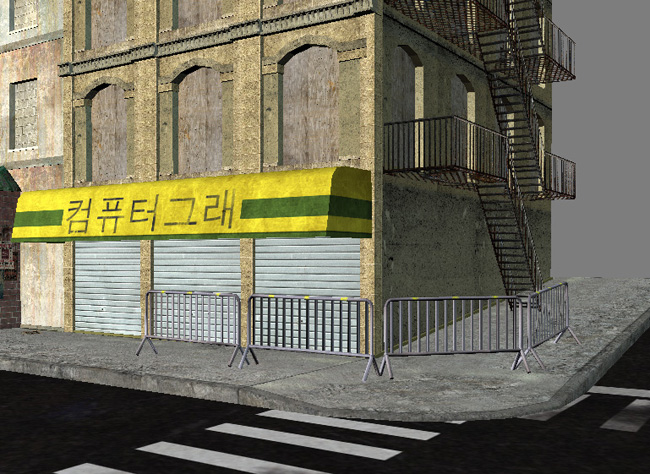
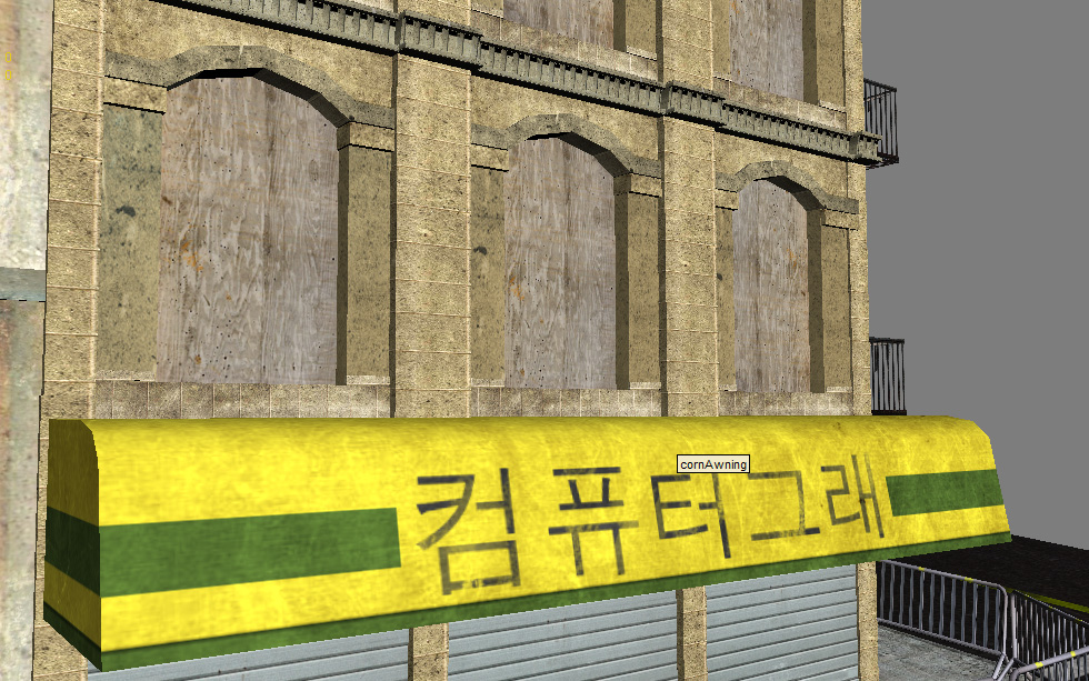
More Views - http://www.codywright.com/images/ct/ct19.jpg
http://www.codywright.com/images/ct/ct22.jpg
http://www.codywright.com/images/ct/ct23.jpg
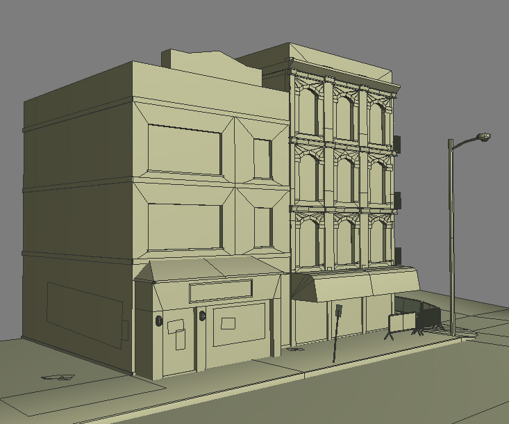
Wire Shot - http://www.codywright.com/images/ct/ctwire1.jpg
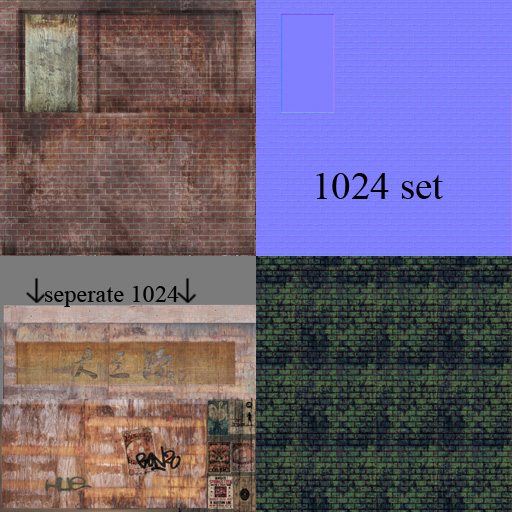
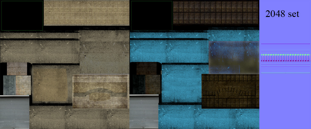
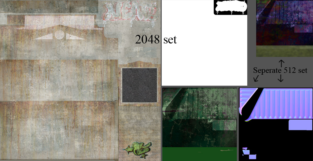
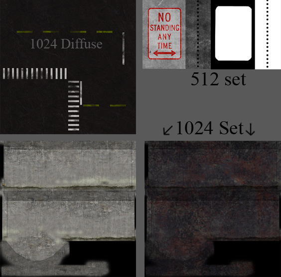
All the other Textures
Corner Building - http://www.codywright.com/images/ct/ctt-cBuild.jpg
Fire Escape and Awning - http://www.codywright.com/images/ct/ctt-fire.jpg
Other Building - http://www.codywright.com/images/ct/ctt-restBuild.jpg
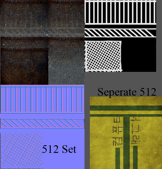
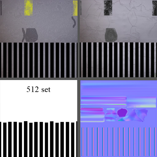
Barrier - http://www.codywright.com/images/ct/ctt-barrier.jpg
Street & Sidewalk - http://www.codywright.com/images/ct/ctt-street.jpg
Total Tris - 4,520
Corner Building - 2,436
Other Building - 1,133
Barrier - 180 each
Lamp Post - 125
Sidewalk & Street - 72
More Views - http://www.codywright.com/images/ct/ct19.jpg
http://www.codywright.com/images/ct/ct22.jpg
http://www.codywright.com/images/ct/ct23.jpg
Wire Shot - http://www.codywright.com/images/ct/ctwire1.jpg
All the other Textures
Corner Building - http://www.codywright.com/images/ct/ctt-cBuild.jpg
Fire Escape and Awning - http://www.codywright.com/images/ct/ctt-fire.jpg
Other Building - http://www.codywright.com/images/ct/ctt-restBuild.jpg
Barrier - http://www.codywright.com/images/ct/ctt-barrier.jpg
Street & Sidewalk - http://www.codywright.com/images/ct/ctt-street.jpg
Replies
Couple of things I noticed.
There appears to be no way to get into the corner building. . . no standard door. It looks like you're building modularly, so I'd just yank one of the roll up doors and replace it with an entry.
The textures are very uniform, as Ozy mentioned. They're very flat textures, with little contrast with in them, I think you could improve these a bit.
You need something to break up the bottom edge of the buildings. Specifically the brick. I'd make a decal with alpha, that has a bunch of dirt and grime, that wraps around the bottom edge of the building.
The textures are very uniform, but so is the geometry, which is why it stands out as tiling so much right now. Every window in the corner building, has the exact same piece of plywood, cut out specifically for that opening, which feels wierd. You need more variation within that plywood, and more variation of exactly which part of each window is actually covered:
http://www.flickr.com/photos/emiana/234743605/sizes/o/
Don't be afraid to add a little more color to one or both buildings. Try painting the corner building a medium blue, and then peeling that paint off, fading it from the sun, and generally destressing that paint, it could add some visual interest to the building structure itself.
You could do a similar thing to break up the sidewalk a bit (dunno your backstory, but it could be an old sidewalk that's never been replaced, just patched up a lot)
Also, if it's chinatown, I tend to think of LOTS of signs and such:
http://www.flickr.com/photos/maurymccown/2507622487/sizes/l/
Very good start, keep it up.
The graffiti's location doesn't seem to be making sense....usually you'd prolly find that on the first floor/washed out as well/..
Also the fences near the side of the curb looks a bit like a bike rack...if you set up a few constructions frames that'd be neat...
And yeah, look up more references on flickr....usually you'd find a few more commercial buildings and alleys as well.
::Next person to get Hangul and Hanja mixed together is gonna get slapped in the face...
Craig Mullins did a painting depicting a China Town like environment on his site too....
@pliang - The first link below is my reference for those barriers; could change them, though.
@Tumerboy - Good call, more signs and billboards on the way.
@oobersli - Below are some of my ref's. More link's below.
pliang look here -> http://www.codywright.com/images/ct/ref1.jpg
more ref- http://www.codywright.com/images/ct/ref2.jpg
http://www.codywright.com/images/ct/ref4.jpg
While this is often good and necessary when it comes to details, I wouldn't be saving and simplifying the overall shape of a Building unless it's for clear performance reasons.
The part in red bricks is probably the clearest example. The source has a set of vertical and horizonal bevels that while still very simple and boring, at least add some depth and shadows.
You just made a flat wall and beveled in 2 boxes. If this was for work and you were given the source as a concept, you would have failed in it's simple execution. If changes are made to a concept it should be only to make things look better, or to make something technically impossible or time intensive, actually doable.
I can imagine you went the same about the rest of the architecture as it looks like something you may see during the rough blocking out phase, but would be lacking as a final piece.
I would pay more attention to the sources and try to better replicate what you see. Always ask yourself how much of the detail and architectural love that you see in the photo you can bring into the game, or how much you can add yourself to a maybe boring source to make it still interesting.
Never start by doing the minimum required to 'have it work' or get by... aim always to make something that's at least as good as the source and compromise only where needed.
Your skill level (and by your's I mean anyone's) will always do enough for the crappification of your work, no need to add to it willingtly.
The textures are way to noisy and do a poor job at representing whatever materials they're supposed to be, and make the geometry harder to read than it should, specially since it's all made of very simple shapes.
The red bricks are the only texture that looks like something. The wood texture is fine, but too new and clean for being in a place like that, doesn't fit in right now.
The stone textures are just a pee yellowish mess with little dark dots.
The yellow thingy with the asian font looks too painted while the other textures are striving to look realistic. This makes the overall look lack consistency.
While i'm not fond of the whitish plaster texture with the orange rust overlay running down it and can think of much more interesting ways to give the base proper weatheration, at least it has some large detail. The stone textures are just plain uninteresting
Alex
This scene uses normal maps, but low detail modeling. You started to model detail around the windows of the big building, but stopped there. There should be a LOT more detail at ground level.
The materials here are tiling textures laid out on bigger texture sheets. You should be using tiling textures. The way you did your normal maps add nothing to the scene. Mainly speaking of your brick and building material. These shapes need a lot more depth.
I don't agree with angling the side street up hill. While it's in some of the ref, without a larger overall scene as a reference point, it just looks like a weird perspective, moreover that something is wrong with your model. You would be better off flatting this to be parallel with the front street.
Greatly exaggerate the shapes and details of the green roof on the brick entryway. In the ref, every shape is big and clear, but in the model it looks like half a box. I'd also stretch the entryway all the way across that building face, and get rid of the untextured door. The bricks on this entryway feel too tall.
The striped awning's sag is very synthetic. The dent in the reference is subtle and small detail. Either go that direction, or greatly exaggerate this bend by having it completely torn out and shredded like something heavy fell through it. The material isn't very well defined where it's metal, cloth or painted cement.
Start presenting various lighting scene. I like to add 3-4 lights quickly to see
how night or day would look. I wouldn't spend a lot of time on it, but it allows everyone to get a better idea of how your materials are working to see it in more of a dynamic manner.
When in doubt, follow the leader:
http://stefan-morrell.cgsociety.org/gallery/399743/
Good crits, Cholden. Thanks, man. I'll keep working.
I'm not really qualified to make any suggestions, but one thing I'd suggest is giving yourself a few more polys to work with. For example that barrier fence is an asset that the player can walk right up to and probably needs more detail than the windows on the third level of your building. So I'd model out the bars on that one. Maybe even make one thats a little bent or worn.
You could also really go to town on that awning. The way it is right now as cholden said its really obviously deformed. Even if you didn't want to go for a high poly bake you could add a few polys into it to push the shapes more for a realistic sag.