AutoShop-WIP
polycounter lvl 15
Hey peeps. Might as well make this my first post. The theme and idea behind this is:
"The auto shop is a rust bucket with few shiny parts to call it operational. It is littered with equipment, tools and boxes to get a half decent job done. Its based in the wet jungle somewhere in the Philippines. The inside of the auto shop looks as if it never left the 1950s."
I diverged slightly from this as I progressed, seeing as I hardly have any actual auto parts, but the core of it is the same, Autoshop in the Philippines.
B/W Props
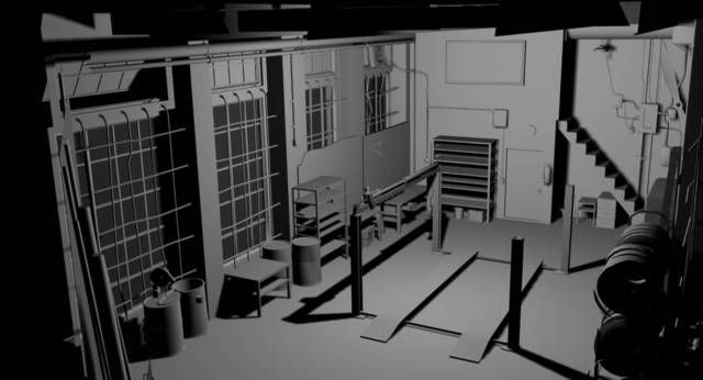
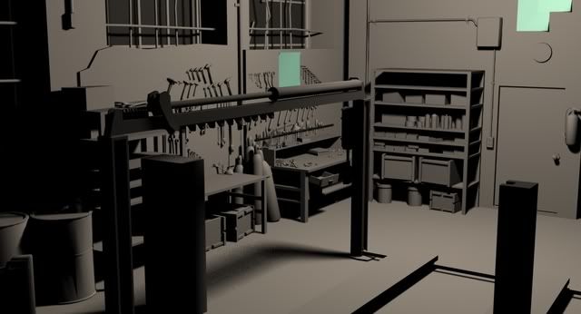
Recent color Additions
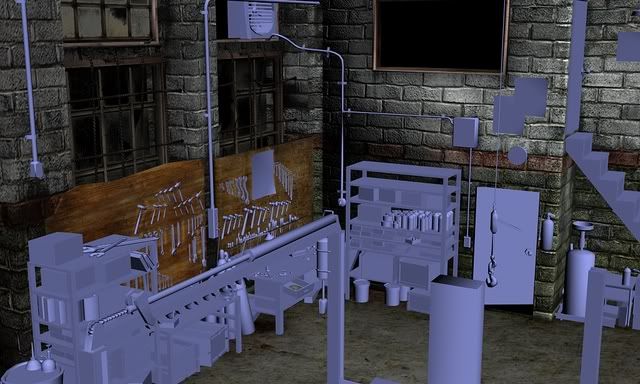
Curious, would it be better to add lights or would it be a hindrance from you viewing the textures? It will not be the final light set up mind you, just a quicky so you can get the basic idea of it.
At this point, it's too late in the game to be adding additional props you might suggest, however, since I'll be using this as a portfolio piece, I'll consider it later on when this class (and stress) is over. Heck, if I even have spare time I'll attempt to put it in before the dead line.
My main concern right now is texturing, so generally, that is what I want the most feed back on.
Comments and hot potatoes are welcomed.
"The auto shop is a rust bucket with few shiny parts to call it operational. It is littered with equipment, tools and boxes to get a half decent job done. Its based in the wet jungle somewhere in the Philippines. The inside of the auto shop looks as if it never left the 1950s."
I diverged slightly from this as I progressed, seeing as I hardly have any actual auto parts, but the core of it is the same, Autoshop in the Philippines.
B/W Props
Recent color Additions
Curious, would it be better to add lights or would it be a hindrance from you viewing the textures? It will not be the final light set up mind you, just a quicky so you can get the basic idea of it.
At this point, it's too late in the game to be adding additional props you might suggest, however, since I'll be using this as a portfolio piece, I'll consider it later on when this class (and stress) is over. Heck, if I even have spare time I'll attempt to put it in before the dead line.
My main concern right now is texturing, so generally, that is what I want the most feed back on.
Comments and hot potatoes are welcomed.
Replies
Be careful with the scale of the textures, the bricks look a little big in comparision to the rest of the scene, maybe scale them down a tad.
Would making the blocks smaller, make the walls "busier"?
Going to scale both ways and to see how it looks.
Here are two sizes that i came up with. The Brick on the left is the original and on the right are the changed ones.
(Disregard the messed up textures on the bars and windows)
Looking at it now, i do like the smaller bricks. What do you folks think?
@sherrell
Thanks mate. Unfortunately no, I'm still in college at the moment. What drew me to do something in the Philippines was when I was looking up reference shots, I loved photos that I found. Decided that it would have that type of atmosphere.
@SHEPEIRO
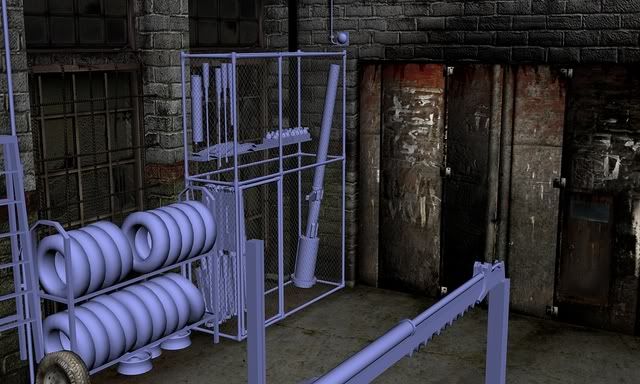
You don't see it too much because of the angle of the camera, but I do have leakage and some water damage near the roof and pipe work.
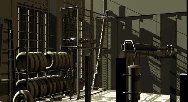
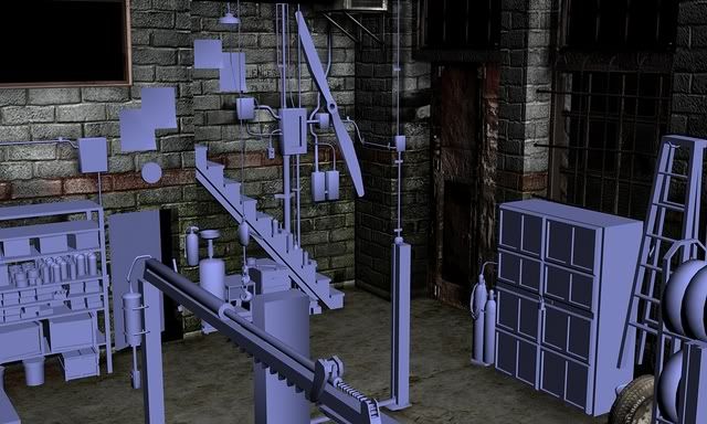
Finished up bricks for now. The shelves will be next me thinks.
Not everything has their final maps yet. Trying to get the base stuff done before I get onto normal (unless of course, it's easy to do)
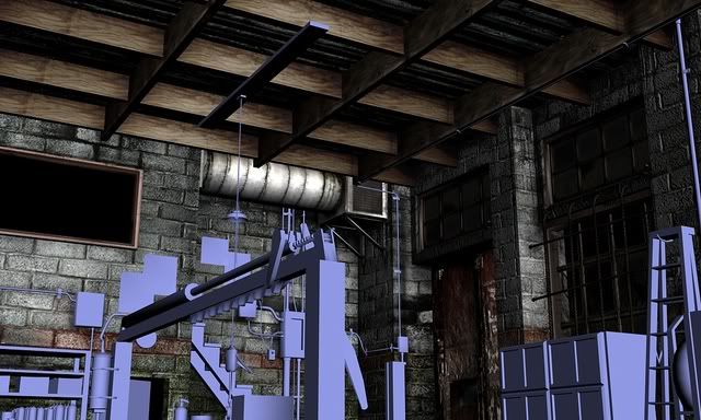
And the roof can actually be bumped up or modeled in a bit but I guess you're further than that...
Cinderblocks, not bricks? If thats the case they are fine
The front door is a bit of a noisy mess but if its a high traffic area thats pretty old it make sense. You might want to work on defining some of the major shapes in the door so it reads better as a door, but without destroying the detail. If that makes sense?
Cinderblocks:
http://www.cgtextures.com/texview.php?id=6423&s=S&PHPSESSID=98ef3f43c6192bb04bec48af8706d6fb
Bricks:
http://www.cgtextures.com/texview.php?id=9320&s=S&PHPSESSID=98ef3f43c6192bb04bec48af8706d6fb
Hmm, I thought there was a normal on the roof~~ Forgot to tunr it on me thinks.
@Vig
I think it makes sense. Can you explain a bit more though.
@Tumerboy
If I put red in, it will change the mood of the whole place. I don't want to go that direction because it gives a different feel then what I'm trying to convey. There are bricks that are red, and even bricks that are orange. I choose a greyish white because thats what I initially had for my idea. Looking though the CG Texture sight that you gave, you can even see bricks that are indeed, white.
Though, I do thank you for pointing it out mate.
Almost finished this last night. Have to do that lock in the middle and change the hinges.
Now, that isn't to say I haven't seen white brick. There are houses in my neighborhood like that, but typically garages like you're doing, are made of cinderblocks. Usually because it's more economical to build.
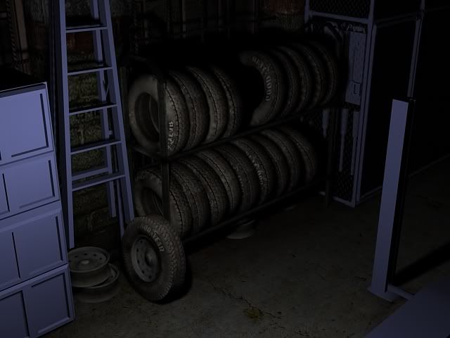
Overall I think things are looking good. The textures on the rims/wheels seemed off. Also, they don't look shaped well enough to hold a tire.
Gotchya. As for the rims, I think I know that your talking about. I have some rims outside of my house and see what these need. Will try to get on them later.
Anyways, I've been lacking in updating this thread, so, here is what i have been doing so far.
I have waaay more to go to :[
Only one more week to work on this then it's off to lighing the think.
garr
I hate boxs X[
I would suggest taking a BW screenshot with the bumbs applied and the nice shadows, overlay a color-only screenshot on top of that and play with these two layers in Photoshop to make your own projection/goal render to stick to. Paint that over in 2D with an artistic eye and finally adjust your textures in your 3D scene accordingly... I'd also suggest adding another light (casting no shadows) opposite your main lightsource to kick out it's darks.
I think I should have stated this sooner. The lighting is not final. It's mainly me being new to the lighting in Max and just trying to understand what it could do (hence different lighting situations). Your absolutely right when you said, "design first, then values, then color". It's a concept I'm just learning this quarter, yet didn't didn't understand when I first started this project. Since this is the first full scale all encompassing scene I've done, it's a mistake I'll have to live and learn by.
If I may ask a question, when i turn off the lights in max, the scene goes black. Is there a way to make it like Maya, were i can choose to to turn off ALL of the lights and not have the scene go black?
I'll try to do what you suggested. I actually have a deadline for this project, which is in 3 weeks, and the texturing has to be done next week. When this quarter is over though, I'll actually have the time to go back in and really perfect it and make it "work".
Again, thanks for the input mate.
somewhere in there is default lighting
nice props by the way, but the walls and ceiling are a completely different texel density,
also what prior said
You've got some issues with inconsistency in pixel density. Some surfaces that should be higher in density are quite low (e.g.: work bench with tools on top). Try and keep things as even as possible.
The lighting - while I doubt its anywhere near final - needs to be updated. If you haven't really thought about the lighting at this point I implore you, as a fan of this piece, please start to. Right now the density of the shadows is 100% with little fall-off and looks wrong. Watch some movies and see how single-source + ambient lighting areas are lit. Movies are a fantastic reference for lighting, among other things.
As well, your scene lacks focus. There isn't anything the eye is suppose to focus on nor is there anything being told to the viewer about this other than its an autoshop. While I think you're achieving the look of an autoshop there really isn't much else there. I think your piece really needs a focus.
Here's a photograph of what I think your current scene is portraying when I say lack of focus:
What's the area of interest in the above photo? Where's the focus? There isn't any, it's just a busy looking picture that doesn't hold interest for very long.
Think of something you can do within this environment that'll tell something interesting to the viewer. You can easily do this while maintaining the level of detail you've got there:
Your scene is a bit more 'closer to the action' than the examples I gave but hopefully my point is made: If you want your environment piece to stand-out and not just be a bunch of props give the viewer/player a focus and tell a story.
It took me forever to find that monkey..
Dude, I wish I saw that button a long time ago!
@AdamBrome
Thanks for the lengthy response mate. Your right about the pixel density. Though I'm unsure about changing the ceiling (as you'll never get that close to view it), areas were i want to get close to need to be upped pixel wise. Lighting, yeah, it is NOT the final lighting. It's just a light to show props without any fancy stuff attached. Just bare bone with texture (though, looking back now, I could have done 3 point lighting. Better then one point at least~~)
Out of all that you said though, you bring up a solid point about focus, and, looking at my piece now, your defiantly right about it. It does look like a bunch of "ZOMGOZMGOZm" and nothing to really ponder about. I believe this is due to the lack of proper lighting and I take heed to what you said in, getting it done asap. Just looking though your own web sight, I see what you mean by having a focus but still retaining a good level of detail (referring to your ammo house). It's something I really have to work hard on achieving these next two weeks.
@Dekard
Kinda do, kinda don't. I have a light built with a cover over it with a orange cord. Could always take the cover off me thinks.
Thanks again guys for the input. You all rock!
Just learning what Max lighting can do. Never new half of this till yesterday. Not completely satisfied with it yet, but its a start me thinks.
Note: the textures are not done yet.
for your next piece, try not to use so many noisy photo refs... in a lot of areas it just looks like a bad photo cropped and plastered onto the thing... LESS CRAZY BUMP
Zbrush more stuff or mudbox or something... i like to use crazy bump for the small details that i don't have time to do a propper normal map of... but i still make a zbrush model of the lower frequency normals.
Just some thoughts... looks great so far though.. IMO...
Thanks for the reply.
For the time I've been given, Crazy Bump was the most efficient thing I could use. I've never used ZBrush or Mudbox before, so learning a new program ON TOP of the dead line...yeah, would have been to much of a strain. I WILL learn the program eventually (actually, in the next few weeks me thinks), so next project will look much more normal .
Thanks for the help mate. Will get crackin on those other issues.
Keep focusing on the lighting and a proper subject for the eye to focus on (right now I think the car lift is the focus, is it??).
I'd advise to not move on to something else but to finish this piece with the critiques given. If you put the effort in now and correct things that aren't as solid as they could be you'll notice yourself tackling those issues properly on your next piece.
you just need some slight re-arrangement of details and props to give stronger images/composition. an do sommit about those bricks, their scale isnt the norm. id seriously suggest toning the detail down on them for the benefit of the comp.
Great work so far.
Oh and the brick scale is off. Broken record I know but really it looks off. Try picking up a brick that big. Those dont have holes like cinder blocks.
I will most defiantly continue on this piece, just not in the same rushed fashion that I was in these past few week hehe. I'm still working out the focus, and i have a feeling that i need to put something on that lift. It is the unintended center piece, and it's been hard to get around that without looking in the other direction or using lighting to get you to notice something else. It would just make sense to put a jeep on it
@SHEPEIRO
Good call on the brick detail, as you are right, they do seem a bit to "noisy". Couldn't put my finger on it till you brought it up.
@IronHawk
Will be playing with angles tomorrow morning when i turn it in. I'm hoping to brining it in UT3 sometime to get better angles.
And the bricks, its such a pain to rescale :[
Will do that on monday me hopes.
Thanks again mates for the helpful crits! Really appreciate it.