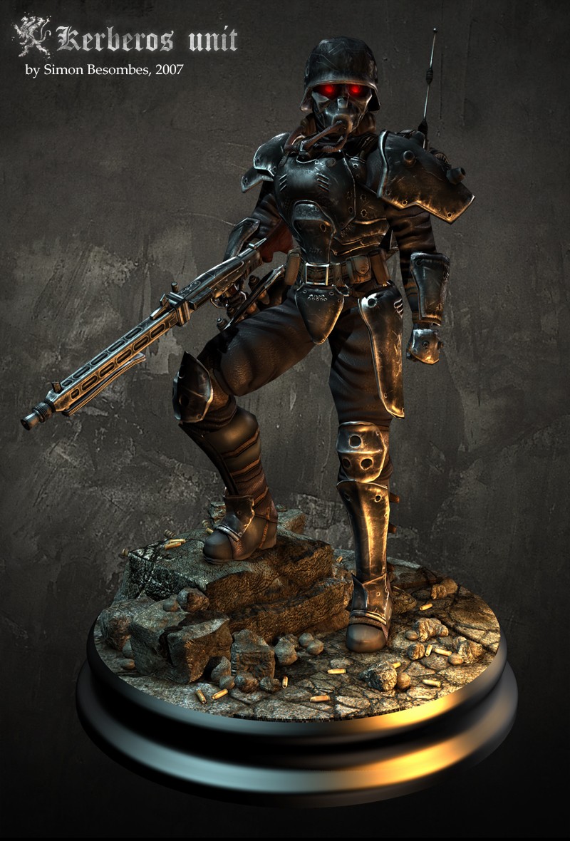
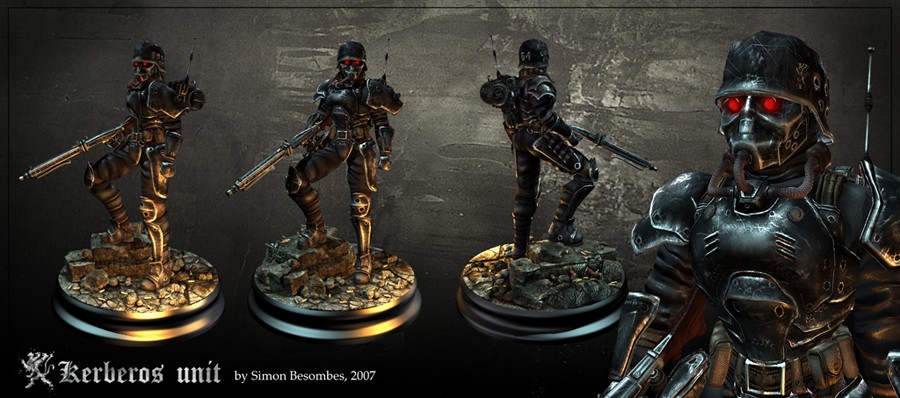
Kerberos Unit, Nextgen character

Hi There! This is my first post here.
Here it is a model based on the Kerberos saga and Jinroh animated movie done during freetime for my portfolio. Hope you like it .
*Polycount: -Character: 5717 tris
-Backpack & Weapon: 1683 tris
-total: 7400 tris
*Textures: normal,spec,diffuse: body 3x2048, head 3x1024, Backpack & Weapon 3x1024.
*Software used: Maya 8.5, Photoshop CS2, UVlayout, Crazybump
Rendered in Maya Hardware

High Resolution
here
Replies
I like it though.
any chance of getting wires, flats, etc? nice model
on a personal level, i think you should tune down the silver edge tearing, but it's no biggie. It's cool anyway
In an other hand, great texture size is good for the normal map and giving the illusion of relief (and then have a decent polycount), more useful to have a big texture for normal than color/diffuse for this model yeah.
Thanks for comments and crits, it helps me to improve my works further in the future
PS: i will post some wires if you wish, what do you means by "flating"? Textures maps screenshots ?
were where you pulling your source on that info?
from epic gdc a while back.
If it is just a texture size problem, it can be downsized in a second anyway, its good to have a too big texture than a too little one... what about the others stuffs ?
thanks for informations, i'm still learning to make lowpolygons models, it was just my third lowpoly then
I think the hands are too small.
Proportionally speaking, the hands strike me as being very small compared to the rest of him. Now, this might just be a natural contrast brought about by the thickness of his armor. Or perhaps by the size of his helmet. But at first blush, I can't help but feel that the hands look a bit on the titchy side.
Aside from that minor quibble, this model kicks ass. I've always loved that character design anyway, and your representation of it is quite detailed and appealing. The polycount seems perfectly reasonable for the kind of finer details that you are getting. (hoses generally eat up the polys) The texture work, though dark, is very solid. (and that character is supposed to be dark) Excellent work.
as richard said, proportions are a bit wacky, but should be quite easy to fix.
Je chipote, je sais, bon boulot quand m
Vahl: I've already heard the same crit about the metal texture from my students teammates. maybe there were too much scratches zone yeah. You speak about "johny's WIP thread" for a good specular map example, interesting, where is this thread ?
Now its not his official wip thread but this is a collection of his best work in his website.
Edit: Oh wait, nvm
http://boards.polycount.net/showflat.php?Cat=0&Board=2&Number=243388&page=1&fpart=1
The wires and flats will come soon. stay tuned.
Only the gears textures sheets are missing: