The BRAWL² Tournament Challenge has been announced!
It starts May 12, and ends Oct 17. Let's see what you got!
https://polycount.com/discussion/237047/the-brawl²-tournament
It starts May 12, and ends Oct 17. Let's see what you got!
https://polycount.com/discussion/237047/the-brawl²-tournament
Advice for finishing this up
polycounter lvl 17
This is one of my first environments inspired by the drakes fortune commercial (don't have a ps3). I was wondering if anyone had any advice for lighting and/or finishing it up.
I still have a couple of things to texture and I'd like to add at least one more plant-life type.
The idea is this is just an undiscovered cave..I don't suppose its terribly original, but it's been a learning process for me for things like rocks/vegetation/stonework etc.
Meshes are built to import into UE3.
Some things I have problems with, the rock texture to me doesn't seem right (its blended with a redish sand texture too btw). The texture looks fine in photoshop, but for some reason it just doesn't seem to want to look good on the material. I think its my mapping thats messing it up.
I also can't seem to create the soft shadows that I can get in UE3 in max. I've used lightmaps and occlusion on the objects themselves, but when it comes to creating soft shadows or contact shadows from light from the torches I'm not sure how to do that.
I also don't know how to properly cast the shadows from the vegetation. Every time I turn the shadows on I get the whole shadow of the plane. Again I know how to correct this using the UE3 material editor, but not in max.
Also there is specular on all the objects but for some reason when I put the whole scene together it looks a bit flat. Not that rock and sand and stone is very specular, but meh.
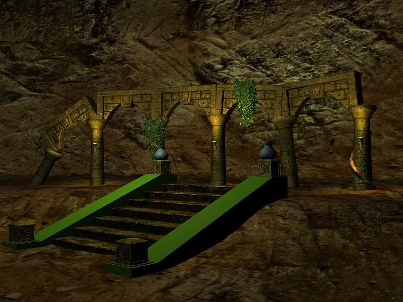
Any comments/advice is welcome! I'm still learning!
I still have a couple of things to texture and I'd like to add at least one more plant-life type.
The idea is this is just an undiscovered cave..I don't suppose its terribly original, but it's been a learning process for me for things like rocks/vegetation/stonework etc.
Meshes are built to import into UE3.
Some things I have problems with, the rock texture to me doesn't seem right (its blended with a redish sand texture too btw). The texture looks fine in photoshop, but for some reason it just doesn't seem to want to look good on the material. I think its my mapping thats messing it up.
I also can't seem to create the soft shadows that I can get in UE3 in max. I've used lightmaps and occlusion on the objects themselves, but when it comes to creating soft shadows or contact shadows from light from the torches I'm not sure how to do that.
I also don't know how to properly cast the shadows from the vegetation. Every time I turn the shadows on I get the whole shadow of the plane. Again I know how to correct this using the UE3 material editor, but not in max.
Also there is specular on all the objects but for some reason when I put the whole scene together it looks a bit flat. Not that rock and sand and stone is very specular, but meh.
Any comments/advice is welcome! I'm still learning!
Replies
Look to modeling to improve the rocks. Model in destinct shapes to reflect the texture. Hard edges, strong shapes to catch lighting, cast shadows on itself, etc. Will have a huge impact, as well as modeling large, medium and small stones to compliment the transition into ground. The small stones are excellant for edges where two models meets (side of stairs or where columns meet the ground). Will greatly improve the transition.
Archways are very unnatural. A row of bricks to actually carry the arch would be more accurate, and give your keystone a purpose.
When crumbling the archways, do not just take your mesh pieces and rotate them. Actually cut in / off chunks and bricks which have crumbled to pieces.
Another sweet tip for making stairs appear more natural is add a few extra edges down the middle, and adjust the verts slight to remove ALL straight up/down lines. Noise in max is a great filter for doing this quick. It's also handy for rocks too.
Lightbeams, hanging foliage from ceiling, slight atmospheric haze, foreground rocks/foliage/anything great for composition. I'm also a huge fan of blue light on one side, orange light on the other side, and make your torch lights subtle. Don't let things be totally black, but let it get dark to hide low detail section.
Every time I turn the shadows on I get the whole shadow of the plane
[/ QUOTE ]
Max handles this with "Area Shadows" and under optimizations check on "transparent Shadows". In most cases rendering shadows from objects with transparencies actually takes longer to render then if you actually modeled each leaf. But since you're making beauty renders of game art you'll have to bite the bullet on this one. Personally since UE3 has such a great range in lighting I would use the engine to light the scene. It would speak louder to employers then pretty max renders.
Suggestions:
- If this is an underground scene, change the ambient lighting from yellow/orange/warm to blue/purple/cold. You have a chance to play cool colors off warm, so mix up the colors of your lights.
- Use darkness as a tool to mask out the uninteresting areas of your scene.
The best way I can suggest you do this is in two passes,
Pass A: Ambient pass to establish a low level of lighting with cool colors.
Pass B: Bring in the warm torch light in tiny areas to boost visibility in eye catching spots.
Your advice for bringing it into UE3 is probably a good one. I definitely know a lot more of the engine than rendering in max (for beauty type rendering). So I think I might experiment with that when everythings modeled/textured.
Also thanks chold. I definitely agree with the unnaturalness of the archways. I think I had something else in mind but it ended up this way. That aspect for now I think I'll leave however I did take your advice for breaking up some of the objects. The only thing I'm not sure about is once an object is unwrapped its hard to break it apart, I collapsed these stacks and added verts and breaks in nonvisible/uninteresting areas so that you wouldn't notice.
And I'm definitely going to add some rocks as you suggested.
Would I have to create complete and broken pieces as completely seperate meshes/unwraps/textures normally?
Here's an update. I took the lighting out as I think I'm going to go with completely in doors ala the soft-torch light. I also took the sand texture off the rock for now and pushed and pulled the rock face in accordance with some of the ridges of the texture itself, I think its a subtle improvement.
funny im doing stuff of a similar nature at work at mo.
id just like to add
ALLWAYS think about the purpose and intent of the environment your working on, and let this guide your design and lighting, ATM i cant tell what the origianl purpose for this was or what the gameplay might be. Is it an ALter? where do the stairs go etc. if it is an alter(reason for stairs) then whhat is the point of the arches.
currently the composition of the peice is totally lacking. its a bit like a flat stage, and it leads the eyes to the sides rather than into it. id suggest making the stairs go up to a dais surrounded by the arches in circle formation or sommething, with a nice "thing" highlighted in a "jesus" ray from above. bring the sides round so that the rigt hand side pulls just infront of the camera so that you get some nice foreground detail.
a tip for stopping that sweaty specular look being a problem is to give it a reason, ie have some water dips and plants hanging down from the opening above
the parts are good the whole just needs some work
Shepeiro
Originally I wanted this thing to be sort of the reverse angle, as in the stairs lead down to something in the lower part of the cave and this was sort of the archways surrounding it.
After looking at it via the comments here I switched it around a bit. I re did a rough new cave wall the uvw mapping is pretty bad but temp I also backed it up so its not as close to the pillars/arch. Then I put the arches in a circular formation that the stairs lead up to.
I'm not too good at human modeling so I think I'll avoid putting a statue on there, but I'll find something. I also played around with some light cones and wasn't too happy with the result, so again I've removed all the lighting for some potential further comments.
With a darker ambient light setup, little things the texture seam Rayne13 mentions will almost be hidden. Not that it makes up for having a texture seam, but if you can hide something that big think about what else you can do with darkness.
Further crits:
- The rock texture you are using has shadows and lighting in the defuse material. More then likely because the rock texture was taken from a photo of rocks that where outdoor, during the day. Those lighting and shadows are fighting with just about any kind of lighting set up you create that isn't outdoor sunny and at the same angles as the original light source.
It's a bitch to remove lighting and shadows from photos, you end up wishing you has just hand painted the thing from scratch. Personally if I'm going to use photos I try to take them myself on an overcast day, they work the best since you get detail info without harsh lighting and shadows, not to mention they are orginal. Outside of taking the photos yourself you can scare up some free textures made for this sort of thing, there are a few sites around that have some pretty good quality textures.
In short your rock material is helping to kill your lighting you need to switch materials.
- The background rock area looks like an inverted sphere. You'll be better off to model a rock wall in all its bumpy craggy goodness.
I also remodeled and remapped the rocks. I tried to take some of the heavy contrast down on the rocks. I do take my own reference pictures (when I can) but I don't have immediate access to something rock-like so I had to go with a reference from cgtextures (or varous other placecs). I think the cave-walls are looking a lot better.
Again, I've removed the lighting from this update.
I'm not too sure what I'm going to do about the blandness in colours. I think the "pots" will be made from terracotta style material and might have some colour to them, but since everything is sort of the moldy-grimy-worn stone it ends up looking similar and I think I'll break it up with the lights coming from the torches on the pillars. Hopefully a blue-ish ambient light and red-ish torches will provide enough variance.
Thanks for the continuing help on this! Further comments welcome!
This way, you're not worrying about all that cave, so it it enhances the scene without having to carry or kill it.
I added some rocks/ruble which I have to texture, and I still have to texture the torches. I also removed the pots in favor of metal flame torch light thingy's. Its hard to see in this screen, but I'll add a simple plane with some flame to explain the light source when I'm done.
I started messing with some ambient passes, and I really liked the idea of moving to a bit of a wider aspect ratio. Comments welcome!
Also I don't know much about how to soften up the light cone.. It seems a little too obvious atm.
A few quick things:
Beware of letting it get too dark overall. The outer rocks are looking like a good brightness, but see about getting your key features, steps, etc. a tad brighter. Small local touch lights could do the trick.
I'm not sure how you're doing your light beam (there's tons of ways to handle it). Try to get a softer edge to it. This leads to my last point...
Avoid noticeable sharp edges. For example, the top edge of the diagonal pieces surrounding the stairs are obviously 3 sided. Nothing says low poly like an obvious box. A SMALL bevel to those edges, modeling in a cracks, nicks, chunks out, etc. will give it a more natural, softer appearance. Same goes for the sides to those arch sections. It's an easy fix that can take your scene from looking like an old game to a realistic environment.
Anyway, keep it up!
I'm not sure about light cones, I figured they were simple enough I didn't bother doing much reading on them. I just created a conical primative and dumped a transparent yellow-ish gradient on it. I'd even go as far as adding in a few streaks on the texture (both transparent and different shades). But to me that won't eliminate how straight and direct the outline is? Any tips there?
Also, In changing the pots to fire pit metal things I've added in a flame light on the lower right metal thing (damn these things need names). I think adding 4 flames on all posts of the stairs would be excessive, so I beat one up and dumped another one on the ground, I think I'm going to wear down one of the posts too to fit with the story.
I also brought up the brightness of the ambient lights just slightly, maybe 1 level too much.
Comments?
looks way better!
If you are using a volume light effect on the center spot light, under the Spotlight Parameters rollout, adjust the Hotspot/Beam to be a lower value then the Falloff/Field, or increase the Falloff/Field. This will give your beam the soft edge Cholden and Rooster are taking about. Kind of like this. Think of the falloff as where the light reaches 0% and the hotspot is where the light is being cast at 100%. The farther apart you move these two setting the softer the gradient you'll get. Be careful since the the area your light effects the more CPU power it will eat up.
The color of the beam-fog should match the overhead lighting color. Right now you have white/blue for the overhead natural lighting, a good idea, but the beam looks yellowish?
Since there is a 3rd light source this paint over I did for someone else a few months back, might be more appropriate. It's pretty much the same light setup just different environment. you might need 4 passes to do it.
1st pass(Ambient/fill): Very dark/blue lighting, The lights set to not cast shadows as calculating shadows takes the most CPU power. The less lights casting shadows you have, the better.
2nd pass(natural/key): White/light Blue lighting, possibly casting very soft shadows.
3rd pass(warm lights/rim): Very small light, maybe omni's
4th pass(Shadow lights): But vig you're nuts. I searched the help file for shadow lights and it doesn't explain what they are or how to use them!? A shadow light is any light set to a negative intensity (with shadows off). thats right you can create shadows without having to casting light, very helpful when trying to darken areas without screwing with your ambient light setup. Because you're using a 3D app you can use these kinds of cheats to save yourself render time and make a more convincing final render. It helps to think about real world lights and try to mimic that in your scenes, but also knowing weird tricks like this will help you bend your scene to your will.
Change the cone/beam to a square and adjust the aspect ratio to get a rectangle. This works great for faking ambient shadows in corners and where two surfaces meet at near 90 degree angles. The light does not fan out from a single point (like in a spotlight) it starts from an area. You can actually produce a invisible wall that emits light. You would need dozens of omni and spot lights to do the same thing. Example, If you have light coming from a window, set a direct light to rectangle, and adjust the size to fit the window.
- This suggestion is just scene management and doesn't really effect the lighting set up, but it saves time so I use it. Change line color of the lights to suit the purpose the light serves. See below...
Lastly, I tossed together a simple scene that outlines what I talked about above. The lighting is over the top of what you would normally want to shoot for, but I did that for illustration.
In case you wanted to dissect the scene, you can get the 3ds Max file HERE.
Note: The file was created in Max2008 if you get an error about missing plug-ins click open and it should work.
There is one shadow casting light, the spot light. It is also casting a volume light, the rest of the shadows are faked with shadow lights. Even the bounce lighting is faked by an omni. This scene renders in a 10th of the time it would take to do this with more advanced techniques. Since shadow casting is so CPU intensive it pays to know these types of tricks as they translate well to most 3D engines and animation in one way or another.
I'm writing up a tutorial based on the scene above that will flesh out these techniques. Hopefully work, personal projects and my own apathy will cooperate.
Thanks for the tips on lighting, I've tried to use a few here but I can't seem to get the shadow lights to work. I try to set some omni lights to negative intensities but they don't seem to work. And for some reason my max won't open your example. (I'm on max 9, sp1). But the screens help a lot! I definitely understand whats going on here. I'm used to lighting in unreal engine 2, and there was a lot of similar things to fake lighting there too!
I removed the mesh for the light cone in this one and changed the colour of the above light to match the ambients properly. I added a volume light effect to get a cone/haze and I think it looks ok. It doesn't look as contrasty as previous incarnations which seems to reduce the drama.
I really want dramatic shadows though on the cave walls, both to help the foreground pop but also to show theres shape to the walls in the background. I think using your shadow light technique would work perfectly but I can't seem to get it to work. Is there any other specific settings I need to look at?
Also, does anyone have any tips for drawing fire? At this point I'm not going to work with emitters, and I'm not importing into UE3. But I don't want a lame fire graphic to take away from the rest of the image. But I also need to get this piece finished up so I can take what I've learned here and move on to another peice!
Thanks again for comments and help!
For dramatic lighting you want to keep the dramatic lights from shooting light into the scene at the same angle as the camera. Think of it like shining a flash light in someones eyes. Very little shadow detail will be visible. However if you move the light out from behind the camera and off to the side, you're likely to pick quite a bit of dramatic shadows. Kind of like when someone put that same flash light under their chin and their face becomes ghoulish.
http://www.warpedspace.org/lightingT/part1.htm
This advanced lighting tutorial talks about that on the first page, skip down to Fig 2.1 and 2.2 for examples. So you might want to rethink the camera angle so the torch on the stairs isn't casting light into the scene at the same angle. Or redesign the stairs so the torches are in a different spot closer to the left/right of the scene not right in front of the camera.
For shadow lights make sure they aren't set to cast shadows. It's more like trying to subtract light from a surface then it is casting a shadow. The thing about shadow lights is they need to be powerful enough to subtract the light hitting a surface. If you have two lights aimed at a box and they are both set to 1.0 the box is receiving 2.0 worth of light. If you try and add a weak shadow light that is only .25 it will only manage to pull the lighting on the cube down to 1.75. If you want a shadow you'll have to crank the shadow light up much higher. It might help to test them out in a simple cube like my example above they can get tricky to work with when you start dealing with different types of lights.
Now is the time to start thinking about what things are off camera and how they would effect your lighting. Hinting at things that are not visible is a great trick and really helps sell the whole world around the render not just what is visible within it.
- Is there something hanging across the gap in the ceiling breaking up the natural fog light?
- Is there something off camera in the cavern, casting a shadows into the scene? What about other VERY soft torch lights casting light into the scene from off camera?
Suggestions:
- Chamfer the railings on the sides of the stairs, their edges are very straight and chiseled for something that looks pretty old and weathered.
- The white natural lighting and the warm torch lighting seem to be dominating the scene and the ambient lighting seems kind of weak. If you pull back the natural and torch lights and let the ambient take over the torch and natural lighting will have more to contrast with and should look more dramatic. Also the torch lighting seems to butt right up against the natural light cone, it might be good to get some ambient light between the two.
http://www.allanmckay.com/tutorials.html
Allen McKay has a video tutorial on how to set up fire using Max's Particle effects, its easier then you might think. The beauty of it is, once you set it up save it to a file and every time you need fire, just merge the file into your scene and tweak the settings. It's actually more convincing and easier to set up then hand painted planes. I actually use particle effects to make animated planes and thats the fastest way I know how to make them, heh.
The guy knows his stuff and has worked on some really high end stuff. If you watch his game reel you'll recognize a lot of stuff.
Some subtle changes here, I got the shadow lights working, and they are in there in some spots in and around the cave, basically a couple of spots that I thought would increase the drama. On the far left wall and in behind the arches in the back. I could really see someone getting carried away with the shadow light concept though, so I'm weary about using too many of them.
I also thought a bit about the environment overall and added in a subtle torch light off to the right side. There would probably be another set of stairs sommewhere over there leading away from the dias and as such would probably support torches too.
I chamfered the edges on the stair railings, if I was doing it all over again I'd probably pay a bit more attention to the texture/model on the stairs. But at this point I think I'm going to done stamp the modeling part and save learning for my next piece.
I also decreased the brightness of the torch, moved it to the left side to take it away from the cone of the main light coming from above. I brought in the ambient lights a bit on the right side so that it wouldn't be too dark over there and added some subtle ambient light between the main torch and the main spotlight.
Comments welcome! Thanks again everyone for helping me realy punch this up!
When you look at the first image its hard to believe this last image was done by the same guy, amazing progress.
If you're like me, you'll start thinking about lights, shadows and camera angles as you block out the next scene you work on. I look forward to seeing what you crank out next =D
As for the Allen McKay video codec thing I remember having the same issue, I think he used divx or TechSmith?
Edit: Just checked the fire tutorial and he used the techsmith codec, you can grab the TSCC here:
http://www.techsmith.com/download/codecs.asp
I also rendered out a little movie of the camera panning up the stairs a bit to add to my demo reel when I get more pieces done.
On to the next now, thanks again for the help on this one!
One crit though, the flames in the lantern/oilburner looks weird because its dull or shadowed. It should be illuminated.
Overall, nice work!
i would suggest in future to do some more blockout modelling and lighting befor wading in on fully modelled stuff, but it turned out good in the end anyway.
reminds me of an old project of mine... when i was in 7th grade.. it was utter shit... even at the end... i wish i was a part of these boards back then! they mighta brought out the same improvement in my piece back then!!!
damn man!
thats like.. exponentially better!
amazing!
Just watch your flames, make sure they aren't effectived by lighting (BRIGHt FIRE!)