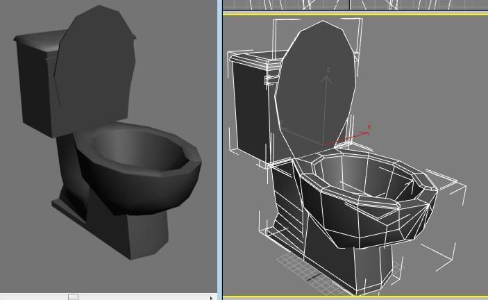
the second lid looks a little thin. You also shouldn't need all those points coming to a point at the front of the bowl, round out those edge loops in the front and it can make it a bit rounder at the front there. Just delete those edges in front and create new ones that wrap around the bowl...
For starters, having the bounding boxes option turned on when doing a screen grab s kinda confusing (especially when they are both white). Not the end of the world, but for the future would be helpful to have turned off.
Also, I know this isn't 100% necessary, but you would probably have much better results (especially if you do a high poly to normal map from) if you made the bowl and the base all one mesh, instead of having them as different elements. Having the base run into the bottom of the bowl without welding will cause seams, and this will be even more noticeable if you throw a reflective shader on it as well.
Lastly, even with the seat down, it feels like anyone who sat on it would fall right in. That "C" Seat (dont know what to call it really) should be covering more of the bowl so that someone doesn't just slip and fall right into their own poo
You've got a pretty bad "star-face" on the front of the bowl which brings it to a point when it should loop smoothly around the front. It is important for unwrapping and especially for lighting. If lit per-vertex the light will bend oddly around the front of the bowl. You've also got a lot of segments curving the back of the base, compared to the amount of segments in the rest of the model. If you're worried about polycounts use those unneded faces on the back to round out your bowl and lid which need them more.
nothing bores me more than seeing, bathrooms, and trash cans, and mail boxes in portfolios. portfolios should be to show of the absolute most awesome stuff you can do. not filled with mundane filler work that no one will really pay much attention to.
Very true it boring but i need the practice, you would be surprised how long it took me to start a project i couldent think of a good theme and then i played prey and sai hey! ill make a disgusting washroom. Im actually having alot of fun with this just because to me anyways its not boring to work on maybe i have a fetish for pee stains!Anyways heres an update guys just looking for crits on the textures
All the objects have the same color scheme. I did this because i didnt want anything to look out of place in the scene, im working on the toilet paper as we speak and after that the mirror and stall.
The hard edges on your toilet make it feel a lot less believable. I've yet to see a toilet ever have a hard angle like that. You should really either smooth it out with a chamfer or two, or give it the same smoothing group all around.
In general, the textures are pretty boring IMO. I am not really convinced with the grunge. And the areas that aren't entirely grunged up, seem to be in really good shape for the most part. I get the feeling these are supposed to be really nasty fixtures. You are thinking too hard about where to put the grunge, and it shows. Nothing feels random about it.
Also, use some Ambient Occlusion. If you are you using it, I can't see it. It's especially noticeable on the soap dispenser. The push button has no ambient occlusion, and also no sort of border suggesting it can be pushed in. It looks like it is just floating there.
little update on the scene i would really love any crits/painovers :P
mirror,stall.light fixture all need to be put in.Also everything is handpainted there is no photosourced images in any of my textures.
also on a tottally unrelated note the cursure that moves the objects around is invisible or somthing i cant seem to get it back? i can still move them left and right but i cant move them up or down?anyone know how to get it back?
The thing that I think is lacking right now is contrast, in color and lighting.
In addition to that, the tiles on the wall look too pillowy, reminds me more of quilting than tiles, the edges need to be sharper and more defined. It might help to break up the tiles with a border of tile of a different color/texture/shape as well. You could also add grafitti, some dirty TP on the floor where it got stuck to someone's shoe, a condom despenser..little details like that will make it interesting. Keep it up!
thanks man condom dispenser sounds like a good idea:P yeah im not liking the wall tiles either, graffiti sounds like a good idea so does the TP thanks for the crit man very much appreciated.
I agree, the tiles feel really pillowy. I actually am not a fan of tiles on the wall anyway, at least not all the way up to the ceiling. Try going up half way, then having a row of tiles that is half as tall as those (essentially rectangular) acting as a trim/border, then maybe have a drywall/plaster up to the ceiling.
Grafiti would be a must in a bathroom like this, or at the least damage, scrapes, litter, stains, etc. There are plenty of good references on flickr.
It feels a bit long. It's not very wide which I think works, adds a bit of claustrophobias to the scene, which could be cool, but you lose that with how far back it goes. You could probably bring that back wall in several feet, and squish the stalls, urinals, and sinks really close together, to add more to that feel. Will also eliminate a lot of the dead space you have on the right wall.
The lighting is awful, for some reason actually hurts my eyes, but thats probably just me being tired
I posted a bathroom scene a while ago here, you can see it on my blog ( http://3dpowers.blogspot.com ). Feel free to take a look at the scene again, maybe it'll give you some fresh ideas. It's not the greatest unfortunately, and I dno't call it "finished" but I lost the files in an HD crash and have yet to bother recovering them.
Well, its not really modeled like a real toilet, you have the lid just kinda floating on the rim. No hinges, no space between them. Go look at a toilet man lol. They also have caps at the bottom base to hide the bolts holding it down. I cant believe you need more input when obvious improvements are so easy to see. Your modeling is also causing some light anomalies on edges. Check smoothing groups, or add more polygons to soften the light anomoly.
Also your resume on your site is a tad odd. I know your from BC, so that may be it but in America no one cares about your hanging out with friends and playing street hockey as a hobby. Also UT2k4 last I checked didn't support normal maps, but you have that job duty listed. Unless its some custom shader i'm not seeing.
I can't really take time and crit it closely, but I agree with some of the critz above and I think that there's problem with scale in the scene as well. Basiclly, what You need is some references that You should fallow.
Replies
Agree with the comments Dekard had.
A couple things that feel really odd to me. The bottom looks pretty odd to me. I know there are plenty of different designs for toilets, but having it be very flat just feels off. I would expect a design more like this on a toilet. http://www.supplierlist.com/photo_images/34588/Jet_Siphonic_Close-coupled_Toilet.jpg
Also, I know this isn't 100% necessary, but you would probably have much better results (especially if you do a high poly to normal map from) if you made the bowl and the base all one mesh, instead of having them as different elements. Having the base run into the bottom of the bowl without welding will cause seams, and this will be even more noticeable if you throw a reflective shader on it as well.
Lastly, even with the seat down, it feels like anyone who sat on it would fall right in. That "C" Seat (dont know what to call it really) should be covering more of the bowl so that someone doesn't just slip and fall right into their own poo
I want it to look worn and used bu have no ideas any suggestions?
grunge areas where grime and scunge would build up.
check out a public toilet for ideas.
I want it to look worn and used bu have no ideas any suggestions?
[/ QUOTE ]
Digital camera, rubber gloves, public restroom.
the toilet looks ok.. but its just a toilet.
Like Rhinokey said its good practice though
All the objects have the same color scheme. I did this because i didnt want anything to look out of place in the scene, im working on the toilet paper as we speak and after that the mirror and stall.
In general, the textures are pretty boring IMO. I am not really convinced with the grunge. And the areas that aren't entirely grunged up, seem to be in really good shape for the most part. I get the feeling these are supposed to be really nasty fixtures. You are thinking too hard about where to put the grunge, and it shows. Nothing feels random about it.
Also, use some Ambient Occlusion. If you are you using it, I can't see it. It's especially noticeable on the soap dispenser. The push button has no ambient occlusion, and also no sort of border suggesting it can be pushed in. It looks like it is just floating there.
mirror,stall.light fixture all need to be put in.Also everything is handpainted there is no photosourced images in any of my textures.
also on a tottally unrelated note the cursure that moves the objects around is invisible or somthing i cant seem to get it back? i can still move them left and right but i cant move them up or down?anyone know how to get it back?
The thing that I think is lacking right now is contrast, in color and lighting.
In addition to that, the tiles on the wall look too pillowy, reminds me more of quilting than tiles, the edges need to be sharper and more defined. It might help to break up the tiles with a border of tile of a different color/texture/shape as well. You could also add grafitti, some dirty TP on the floor where it got stuck to someone's shoe, a condom despenser..little details like that will make it interesting. Keep it up!
Grafiti would be a must in a bathroom like this, or at the least damage, scrapes, litter, stains, etc. There are plenty of good references on flickr.
It feels a bit long. It's not very wide which I think works, adds a bit of claustrophobias to the scene, which could be cool, but you lose that with how far back it goes. You could probably bring that back wall in several feet, and squish the stalls, urinals, and sinks really close together, to add more to that feel. Will also eliminate a lot of the dead space you have on the right wall.
The lighting is awful, for some reason actually hurts my eyes, but thats probably just me being tired
I posted a bathroom scene a while ago here, you can see it on my blog ( http://3dpowers.blogspot.com ). Feel free to take a look at the scene again, maybe it'll give you some fresh ideas. It's not the greatest unfortunately, and I dno't call it "finished" but I lost the files in an HD crash and have yet to bother recovering them.
Keep it up though.
Josh
Also your resume on your site is a tad odd. I know your from BC, so that may be it but in America no one cares about your hanging out with friends and playing street hockey as a hobby. Also UT2k4 last I checked didn't support normal maps, but you have that job duty listed. Unless its some custom shader i'm not seeing.
"I am a level/texture artist on the ut2004/UT3 mod Jurassic Rage"
thanks for the crits guys ill give the scene an overhall