Home 3D Art Showcase & Critiques

New Guy on forums! Some Enviromental WIP's posted

polycounter lvl 11
Offline / Send Message
Joe March polycounter lvl 11
Hey, I'm Joe who is new to this whole ordeal and I wanted to get some good crits on my stuff, which I heard from a friend (Alter-Nate) that it is a good site to go to. So have at it. I have a few models to post

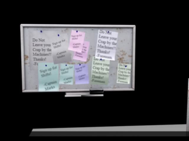
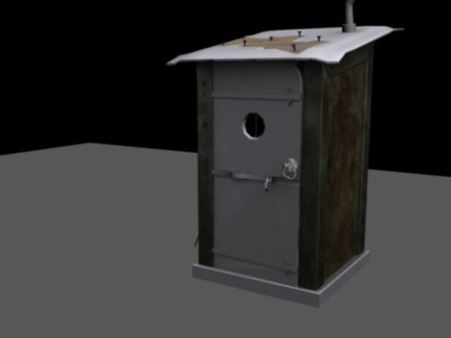
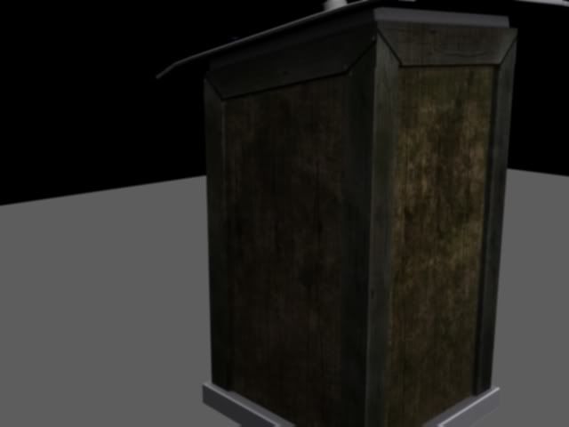
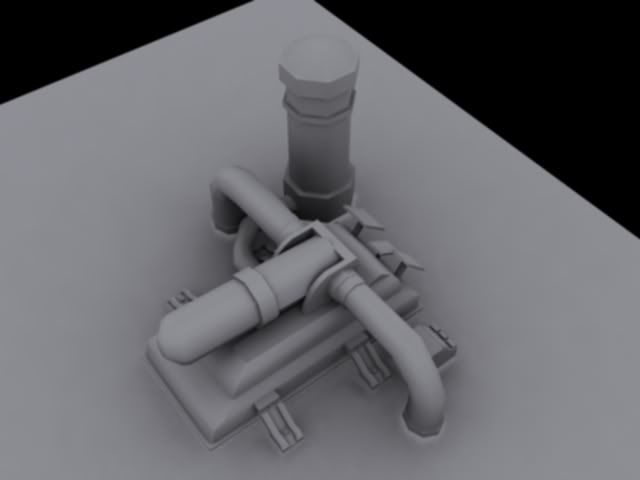
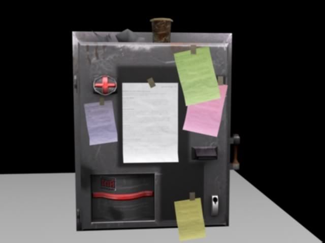
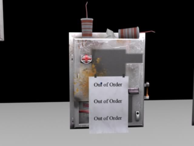
The First few are a couple of machines for vending, The others are an out house, bulleting board,A giant chest, and a water filter thing. These are all works in progress, so a lot of them have the give to be changed. There is a ton more to come!

-Joe M Machine_thing2.jpgMachine_Thingy.jpgBulletin_Board.jpgOuthouse_WIP.jpgOuthouse_WIP2.jpgWater_Filter_thing.jpgChestofDrawers.jpg
Replies

  • Joao Sapiro
    Options
    Offline / Send Message
    Joao Sapiro sublime tool
    the images appear slightly blurred, but i have to say that the modeling is nothing special, its very basic, adn teh textures are also very basic and boring.Also do not render with GI lightning, btw DONT render, just give viewport grabs, thats the closest you have of a game engine ( althou more crappy ehehe)

    good luck !
  • Ghostscape
    Options
    Offline / Send Message
    Ghostscape polycounter lvl 13
    The water filter is the only thing here with some really interesting geometry.

    I have no idea what the first two things are supposed to be. You say they're vending machines but they don't look like anything I've ever seen before. Why do they have red crosses on them?

    Your bulletin board has a bunch of notes but they're just copies of the same thing. That looks like crap.

    Do something more with the notes, make them torn, handwritten, etc.

    The outhouse looks too short and too wide.

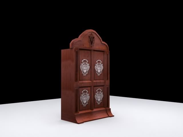
    Same with the armoire/chest thing.

    Everything looks blurry, why?

    Don't render with GI, you're usually better off baking the GI into the diffuse.

    If you're going to make normal maps, spec maps, etc, viewport grabs are a must.

    Don't leave a bunch of empty space in the pictures you're displaying - the armoire is only taking a third of the space it should be taking up more than that. crop the unused edges.
  • Joe March
    Options
    Offline / Send Message
    Joe March polycounter lvl 11
    Thanks a lot for the crits, I'm definatly going to go back in there and really fix'em up, again thats the beauty of it all.
  • Joe March
    Options
    Offline / Send Message
    Joe March polycounter lvl 11
    Outhouse1.jpgOuthouse2.jpg
    SHot_14.jpg

    These are some updates to the outhouse I was doing from before, crits are welcome. Things I would like help with is organizing UV space, and understanding pixel density, I'd also like some ideas which can pop this out more, because it seems really boring. Thanks.
  • Ghostscape
    Options
    Offline / Send Message
    Ghostscape polycounter lvl 13
    If you post your UVs we can critique them but its kind of hard unless you post them smile.gif

    What don't you understand about pixel density? It's best to maintain a uniform pixel density in most cases (especially in environment work) as uneven pixel density will make sections stand out weirdly as they will appear to be more sharp than their surroundings. You want your pixel density to match screen space at the average viewing distance - IE 1 pixel on the textured model should be 1 pixel when it's viewed in game at the average viewing distance. Obviously if someone is using a sniper rifle to zoom 20x into the doorknob of your outhouse it's going to look like shit, but if they're going to be 7 feet away most times then it should look good at that distance.

    Rigt now your pixel density is all over the place, with the wooden door having 2x the resolution of everything else, which is making it look poor. Most people use a checkermap while unwrapping to make sure their pixel density is consistent.

    The purple glowing magic runes really do not mix well with the wooden old-timey outhouse look.
  • Ott
    Options
    Offline / Send Message
    Ott polycounter lvl 13
    Joe, spend more time learning about floating and cutting your geometry. You've expended so many polygons on tiny little details and making sure everything is watertight, that you have missed the overall realism of the rest of the prop.

    Spend those triangles on actual boards instead of the normal map. In fact, don't even use normal maps until you get really good at poly flow, UV mapping, texture painting, and modeling. An "ok" normal map will do nothing with poor polyflow and bad textures.

    For example, the polys on the top of the outhouse, and the base square. The top could have 1/4th the current polys at least, and the entire base of the outhouse where you have everything sealed perfectly could be nothing more than a slightly chamfered square butted against the rest of the geometry.

    Forget everything they told you about sealing every single polygon and start modeling things smarter. Nowadays, unless you are TOLD to seal it, float your stuff.
  • MoP
    Options
    Offline / Send Message
    MoP polycounter lvl 18
    Ott is right, but to counterpoint one thing he mentioned about normal-maps, I'd say try to cram even more of the detail you're modelling now, into the normal map.
    You've got a ton of polys being used to make those horizontal metal strips on the front of the door, you'd be better off making that all flat and putting the detail for that into the normal map. It's the kind of thing nobody would notice in a game, and would mean you could have hundreds less polys, and exactly the same texture size, with the same visual effect.
  • Richard Kain
    Options
    Offline / Send Message
    Richard Kain polycounter lvl 18
    Welcome Joe. You're off to a pretty good start. You seem to have a pretty good grasp of form and shape. You just need a bit of practice in the technical limitations and optimaztions of game modeling. A lot of your models seem to have more polygons then they actually need. Optimizing a mesh so that it takes up as few polygons as possible is part of good game modeling. Your outhouse, for instance, could be carved down considerably. For models, you want to eliminate any polygons that don't directly contribute to the structure of the object. The metal crossbars on the door could be done as a five-sided cube. That's just ten polygons, where previously you were using much more. Add fine detail in the texture and the normal map. Keep the basic geometry as simple as possible.
  • Joe March
    Options
    Offline / Send Message
    Joe March polycounter lvl 11
    Thank you all for taking the time out and explaining a lot to me, right now, I might just end up remodeling it for a better result, but I wanted to show the workflow, so I can understand the mistakes a little better (At the moment it really just seems ambiguous.) These are the UV's I used. Maybe it's just how I focus or something, but I tried to get it as best as I could, and I am wondering if there is a way to really get the space into your map with out screwing up the pixel density, because that seems to be a recurring issue, and really making the textures seem a little livelier.(It's a bit boring, and plain.)

    OuthouseDiffuseMap.jpg
    Normals_Outhouse.jpg
    http://i186.photobucket.com/albums/x166/Angturus/Outhouse_Speculars.jpg

    You see, now I'm getting a better grasp of the mistakes I make and what to look for, but more feed back is welcomed, and I'll show the finish product soon enough.
  • Joe March
    Options
    Offline / Send Message
    Joe March polycounter lvl 11
    Blegh, I botched it, I'll post the spec map later. I realized I didn't even describe the setting and why the object is the way that it is, and It'd add to some clarity. This is a prop for the larger background of a magical character who had pretty much went demented from trying to raise his dead wife, under the severe amount of paranoia, he began spell locking everything, forgetting his spells, and making the entire yard into a lab area. What I wanted to do, was to really make it feel like he had began to graffitti his spells everywhere, posting notes, making larger runes, smaller runes and such, and really bring that absent minded kind of insanity into everything. Apologies for not being elaborate.
  • Joao Sapiro
    Options
    Offline / Send Message
    Joao Sapiro sublime tool
    if thats the case try to make like the runes were scratched on, search for some references of wood with scratches.

    Also i can see you used crazybump to make the normal , meaning that it isnt a true normal map , try model an highpoly.
  • Joe March
    Options
    Offline / Send Message
    Joe March polycounter lvl 11
    Thanks Johny, I was actually thinking of trying that with the suggestions given.
  • Ott
    Options
    Offline / Send Message
    Ott polycounter lvl 13
    Pixel density is one thing Joe, but you also don't want to waste as much texture UV space as you have. Almost every square inch (pixel) of that map should have something in it. Even if a few pixel areas can be given LESS density, if the polygons aren't going to be seen as much.

    Is it the top of the building? Bottom? Pixel density might not be as important for those areas.

    For a lot of props you have to sort of "bend the rules" when it comes to the pixel density, simply because you wont have nearly as much texture space for small props as you would for say, buildings, characters, vehicles. Think of what areas are the most visible, give that the biggest chunk of UV space, and then practice fitting the lesser important stuff into the smaller areas.

    Again, keep it "pretty" close, but keep that in mind when you are spacing out your UVs.
Sign In or Register to comment.