I need crits on my portfolio

polycounter lvl 12
I sent these images in to a potential employer and they replied saying it wasn't bad, but it wasn't impressive either.
If they were impressed, I'd be pretty skeptical considering I don't think they're particularly impressive either. But in the future, I want to make sure that they are impressed. So I need you guys to help me out! Here are the images I sent them:
I did this as freelance work for a small game company, weighing in at around 10,000 verts and a 512x512 texture map. I did not design him(however, I personally think his design is very bland) but the person I was doing it for was strict on not changing or adding anything. This fella is my first and only finished character I have ever made so I don't have anything better to show at the moment as far as my character art goes.
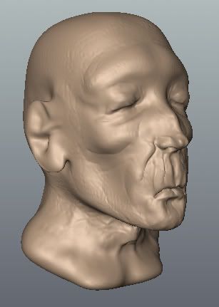
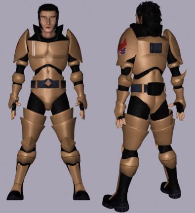
I've been fiddling around in Mudbox for a couple weeks now, and this is an example of the quality of my current ability. I included this to show that I know how to use sculpting programs for creating normal maps.
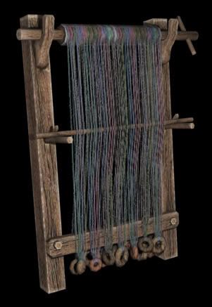
I believe this loom is around 1000-1500 verticies(mostly due to the wood weights at the bottom) along with a 512x512 diffuse map. This was made for the HL2 modification Pirates, Vikings, and Knights 2. I included this because I felt it was very solid work and demonstrates my current ability with environmental art.
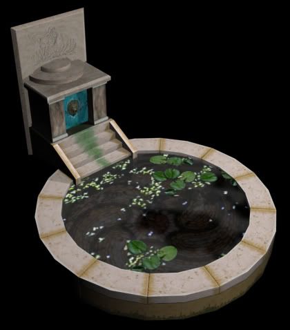
Same as above, 256x256 and a little less than 250 verts.
This piece is around a year old, and I've improved a lot since then. Regardless, I sent it along to them since I felt it had a really unique style to it and that it had a lot of appeal.
Did I send anything I shouldn't have? Was there any noticeable faults that I should fix or tips I should keep in mind for the future? Any critique is welcome
If they were impressed, I'd be pretty skeptical considering I don't think they're particularly impressive either. But in the future, I want to make sure that they are impressed. So I need you guys to help me out! Here are the images I sent them:
I did this as freelance work for a small game company, weighing in at around 10,000 verts and a 512x512 texture map. I did not design him(however, I personally think his design is very bland) but the person I was doing it for was strict on not changing or adding anything. This fella is my first and only finished character I have ever made so I don't have anything better to show at the moment as far as my character art goes.
I've been fiddling around in Mudbox for a couple weeks now, and this is an example of the quality of my current ability. I included this to show that I know how to use sculpting programs for creating normal maps.
I believe this loom is around 1000-1500 verticies(mostly due to the wood weights at the bottom) along with a 512x512 diffuse map. This was made for the HL2 modification Pirates, Vikings, and Knights 2. I included this because I felt it was very solid work and demonstrates my current ability with environmental art.
Same as above, 256x256 and a little less than 250 verts.
This piece is around a year old, and I've improved a lot since then. Regardless, I sent it along to them since I felt it had a really unique style to it and that it had a lot of appeal.
Did I send anything I shouldn't have? Was there any noticeable faults that I should fix or tips I should keep in mind for the future? Any critique is welcome
Replies
The mudboxed head shows the work of someone who played it for 5 minutes, smoothed the model alot , barely working on low frequency detail and adding random stamps. Aslo the wood texture presents white highlights as if it was metal yet wood ?
The piece with the wood weights you could have used alpha planes , and loads of them to break the 2D feel of it in my opinion , no need to model the wood weights .
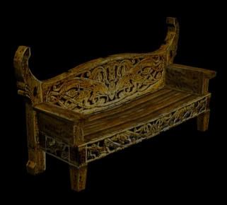
The bench is my favorite
The water fontain has a great feel to it , but something i cant quite tell is lacking. Also dont render with pure black as background.
Generic space armor guy looks unfinished. Also for 10k faces? there is nothing to him. The body looks ok...but the anatomy of the head looks way off.
I wouldnt put the mudbox head in your portfolio. It doesnt show you know how to use mudbox...it shows you're learning how to use it...and I dont think it is even redeamable as a wip. Not to discourage you from practice, but portfolios should be your best pieces...and your usually judged on your weakest piece.
Good luck with the job hunt...Dont give up...just keep pushing your work
Some good things: I agree with Low Odor, your loom and other environment props are your best pieces, I like the wear on the textures and also think that maybe some more wear would be nice where hands have obviously used it.
Crits: As for the character stuff, I believe Johny and L.O. hit everything, just put your best foot forward in your portfolio and you already made excuses for both which shows that you know they arent your best. Also your fountain is pretty clean, I can see some grunge at the bottom of it but more grunge would be better, such as at the edges of the water stairs and general dirt and grime on areas of the stone. You can make some awesome grunge maps/brushes in photoshop and add the grunge (subtle or heavy) in areas where it would gather.
L.O. said youre only judged on your weakest piece and I believe he's right. Concerning your portfolio quality is better than quantity.
I hope this stuff helps and hope I wasnt harsh, crits make us all better at what we do.
Any way, thanks for the heads up! You guys rock
Have a good look around for reference and see what looks good and perhaps draw some ideas/inspiration.
The head looks pretty weird too as if you didn't use much reference.
I think you have more ablitity in the props/environment area personally. the loom thing looks nice
Alex
Either way, keep at it, keep working on new/more pieces. Also, do you have a portfolio website? If not, that's something to think about doing in the future, that and what kind of job you want, chracters, environments/etc. Good luck, post updates.