Portfolio mockup
polycounter lvl 18
OK, so I finally decided to stop ignoring the fact that I need a website so I did a mockup during some downtime at work. I'm lookin for feedback before I start slicing it up and turning it into HTML. On the whole though, I'm thinking it might be a bit too graphic design-y? Whatcha guys tink.
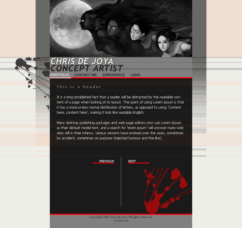
Here's an alternate version with the header vertically oriented.
http://img.photobucket.com/albums/v353/chrisdejoya/mockup2.png
Here's an alternate version with the header vertically oriented.
http://img.photobucket.com/albums/v353/chrisdejoya/mockup2.png
Replies
Or I could just have a mess of thumbnails and open the images in pop-ups from there.
*edit
damnit, you posted while I was writing
Why don't you just crop the moon/women-faces image from the top image of your initial page, and place it on the top right of the content page, then just make that the default loading page?
Cool stuff though - keeping it simple is a good idea, that way you showcase nothing but the art.
Just a question though, the last time I did a website it was ok to use tables to layout something like this. But I notice most people now are using div's. Why's that? Is using tables for layout purposes taboo now?
Divs can be arranged to overlap rather than always on a grid.
:shrug: tables are still in use, but div's have their own set of versatile uses.
Im not a pro designer, but thats why I like divs. OOH and internet explorer effects.. not that they work in mozilla.. sigh.
As for CSS layout that is nowadays preferred, using divs and spans with class id's, I must say that I think there's good reason for that. The source code for pages done with external CSS files applied is way shorter than for pages created with table layout. This way you also define styling of all your elements into a single CSS file and apply it to all other pages, which also means all styling info will need to be downloaded just once. I did my first pure CSS website a month ago (my portfolio) and it was much quicker to put together. Also, if you're using Dreamweaver and don't plan to implement some PHP to swap images, but would have html page for each image, I'd highly recommend using Dreamweaver's templates, they will save you a lot of time.
Keep it up, I can't wait to see your finished site!
Your face on avatar remind me eminem=D