Home 3D Art Showcase & Critiques

tokyo RUBBLE ROBOT

polycounter lvl 18
Offline / Send Message
konstruct polycounter lvl 18
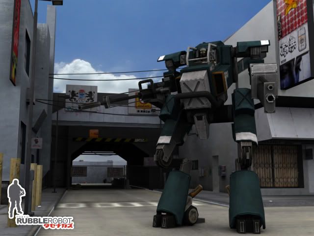
did this for a cgtalk challenge. missed the deadline by a few hours. SO ANGRY- but i figure it should see the light of day-:

renders.jpg

render4.jpg

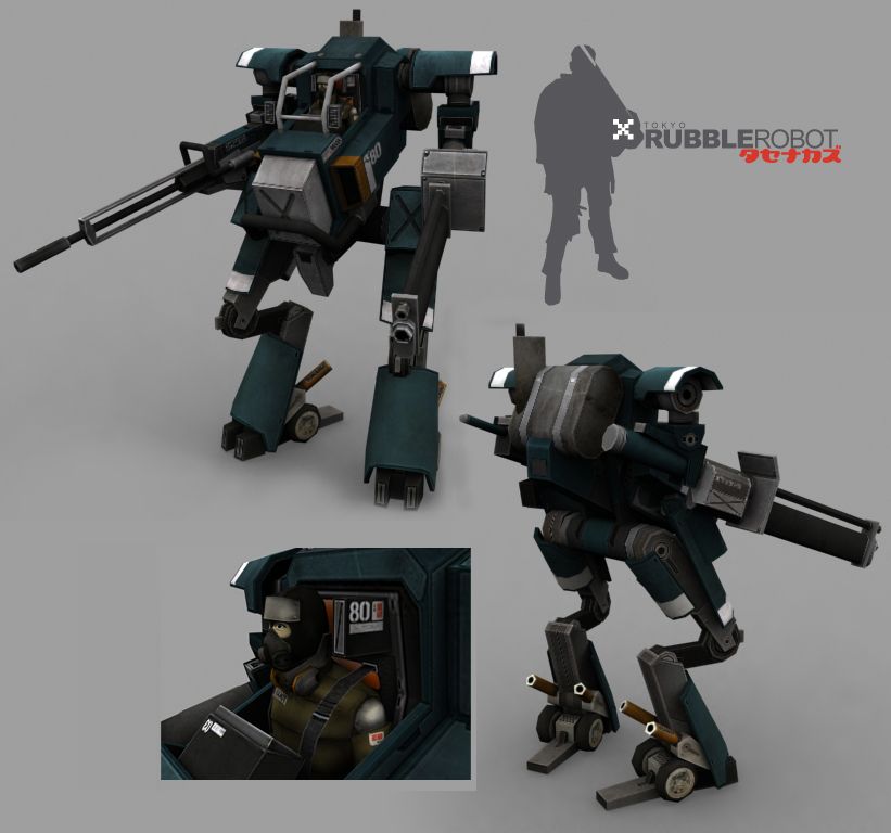
crits please, im still kinda working on it- adding things, taking things away etc.

Replies

  • Thegodzero
    Options
    Offline / Send Message
    Thegodzero polycounter lvl 18
    Nice work! Mind if we see the flats, and an ortho render of it?
  • usagi
    Options
    Offline / Send Message
    usagi polycounter lvl 18
    looks good, nice work. i think it could use some highlights, especially on those grey metal parts. id imagine those would be pretty shiny
  • Thermidor
    Options
    Offline / Send Message
    Thermidor polycounter lvl 18
    just a specular map would do surely ??
  • konstruct
    Options
    Offline / Send Message
    konstruct polycounter lvl 18
    WHooHOO i didnt get booted from the comp.

    ortho.jpg

    Mechcolor.jpg

    mechcolor2.jpg

    i think i need to touch up the blue a bit (brighter)
    and ive never used other maps besides difuse and opacity. anyone wanna shed light on that?
  • Illusions
    Options
    Offline / Send Message
    Illusions polycounter lvl 18
    Well...first off he needs to be grimed up a bit more...secondly...I saw your entry a few weeks ago on CGTalk, and I really liked the style of your mech...

    As for other maps...you mean specular and normal?

    Specular uses greyscale information to dictate how strong of a highlight that area will recieve from the area lighting. Think of it like an opacity/alpha map. The more white an area is, the brighter the highlight. As for a normal map, it uses rgb color info to create a very advanced bump map...it basically tells the game engine how an object should be lit based on the normals the colors dictate. You can either paint this, or render it off of a high polygon model similar to your low polygon model smile.gif
  • konstruct
    Options
    Offline / Send Message
    konstruct polycounter lvl 18
    sorry i guess i should have been more descript. :P

    i know what they all do- (just learned normal maps during the competition but didnt use them for time contraint reasons)

    but i guess i was asking more how spec maps should be used.
    should i just grab my texture, greyscale it, and play with the contrast? (taking in mind to ignore things like decals, & paint job stuff) or is there more to it.
  • Illusions
    Options
    Offline / Send Message
    Illusions polycounter lvl 18
    Contrast, levels, and some black and white painting... smile.gif
  • rawkstar
    Options
    Offline / Send Message
    rawkstar polycounter lvl 18
    nice work dude. I like your metal stuff, it looks really cool. but you need a spec map for this. basically the lighter it is the brighter the highlights will be. sometimes greyscaling is enough and playing with contrast, sometimes you gotta add a little bit. but in this case just try to make the light grey metal parts look really shiny while the rest should just be a little glossy and not as shiny. just to have different shine levels since its all made out of metal. smile.gif hope this helps, hit me up on msn if u got qs.
  • ElysiumGX
    Options
    Offline / Send Message
    ElysiumGX polycounter lvl 18
    hey konstruct,

    I'm one of the judges for the comp, so you'll get a full critique from me later. The model looks great. If you want to continue adding to the texture, I would suggest adding more details to the painted areas, such as scratches and damage, or even decals to give it style. Right now it looks very plain.

    I agree with everyone else that a spec map would really improve the model. Keep most reflective highlights on the metal (whites), and less around the painted areas (greys).
  • jack_blackSISCO
    Options
    Offline / Send Message
    jack_blackSISCO polycounter lvl 18
    Something to remember, if this were say for a pC platform, your map size is perfect, but if it were meant for console, then obviously you'd need to down-rez to 246. Only thing I can say is that either way, you could have gotten away with using allot less space on the texture by reusing open texture areas of the flat in various non seen obsolete dark areas of the mesh. Tight model though. Very nice.
  • Herr-Maestro
    Options
    Offline / Send Message
    Herr-Maestro polycounter lvl 18
    I'd have to say a lil weathering is in order for that mech, I'd say give it a lil weather washing, and add a person or two like behind the mecha for added effect, and maybe just as a suggestion, give the map around the legs? a bit of a impression to simulate wieght. its is after all just tarmac. Plus I've seen madox-01 enough times to know that type of tweak would add to the current scene OH so well. wink.gif
  • Mark Dygert
    Options
    Offline / Send Message
    Domo arigato mr rubble robotOoo... wait that doesn't make any sense. I'll translate for my addle brained self:

    Looks great!thumbup.gif the mesh seems constructed well. I do have questions aobut the mechanics of the hips and how they would actually work in real life, but hey its for a game, as long as you can rig it, and it looks great, who cares?! Not that many people will ask "but would that really work in real life?" when they see it ingame.

    The textures and renders seem a bit dark on the mesh. Might be coming from the renders or the smoothing groups? Hard to tell You seemed to pack a buch of detail on the skin in areas no one will easily see. WHile that is great, it also takes texture space away from the important areas. The blue armor plating looks like it lacks detail while the nuts and bolts seem to oooze detail. The detail could be there and I just can't see it because the renders lack an ambient light?

    It might help if you did some renders with the texture at 100% self illum?

    I think you did a great job painting the textures, but to give that them a little extra pop, I would play around with the brightness and contrast. I think part of the darkness came from drawing on a white background? If you did start with white as a background you might want to choose something a bit different. Like the main color of the model you are working on, or maybe even black or dark grey.

    Brightness/Contrast Changes
  • Irritant
    Options
    Offline / Send Message
    Irritant polycounter lvl 18
    Nice looking model, very nice texture.

    I'd agree with those saying dirty it up a bit, and one way or another, add some specular highlights in some areas.

    Good job.
Sign In or Register to comment.