The BRAWL² Tournament Challenge has been announced!
It starts May 12, and ends Oct 17. Let's see what you got!
https://polycount.com/discussion/237047/the-brawl²-tournament
It starts May 12, and ends Oct 17. Let's see what you got!
https://polycount.com/discussion/237047/the-brawl²-tournament
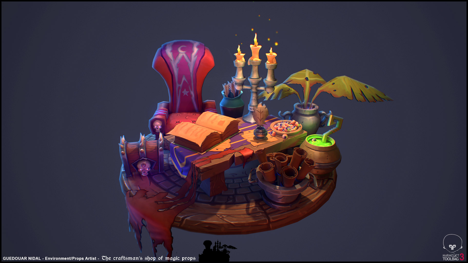
[HandPainted] Druid Desk
Hi everyone ! I would like to share with you my latest hand painted project I did.
Is based on a concept art from Room & Studio. ( https://www.artstation.com/artwork/oqXqJ )
Feel free to tell me what do you think guys and if you have any comment to improve it !
Enjoy

Is based on a concept art from Room & Studio. ( https://www.artstation.com/artwork/oqXqJ )
Feel free to tell me what do you think guys and if you have any comment to improve it !
Enjoy


Replies
Only things that really stand out to me are the rows of stone bricks on the floor. Perhaps losing a row or 2 could help? Either way pretty minor. The back of the chair could maybe use some love as compared to the concept art. (may just be the angle) Only other thing is the book cover is really thin, which makes that extra large top page seem even more unusual.
Overall I think you nailed it though. Love the floating eyeball.
In the concept the shapes of the objects are more quirky and exaggerated. Look for instance how thick and unevenly shaped the scrolls are in the concept, and how large and rounded the goopy drips on the candles are, how aggressive the angle changes on the candle holder itself.
You also missed some of the colors from the concept. To be specific, you made everything much more saturated. The concept might seem saturated too, but in truth most of it is somewhat toned down, with several stand-out items that have more saturation. This contrast of having some brightly saturated objects set against toned down ones is what really sells the concept as colorful. If everything is super-saturated, nothing stands out in particular, and ironically it will lose punch and actually seem less colorful.
To give some examples, the chair in the concept is a dark faded red, edging towards purple. In yours, the chair is bright red. The purple cloth on the chair is also much brighter and saturated in your version. On the other hand, the blue trims on your chair are much brighter and washed out.
Also in the concept, the red cloth on the table is an orange red, whereas yours is plain red. I would also remove that black outline around the cloth; it's not there in the concept and it takes away from the overall look.
All the woods in the concept are much more desaturated than you have, and also a cooler brown. The candle holder is made from a dark metal with greenish oxidation. The pot with the plant has a purplish hue to it. You didn't include the coins, which in the concept is the most saturated element, used to tie the table and ground together.
You could do a lot for your texture simply with some color tweaks, paying more attention to the subtleties in the concept.