The BRAWL² Tournament Challenge has been announced!
It starts May 12, and ends Oct 17. Let's see what you got!
https://polycount.com/discussion/237047/the-brawl²-tournament
It starts May 12, and ends Oct 17. Let's see what you got!
https://polycount.com/discussion/237047/the-brawl²-tournament
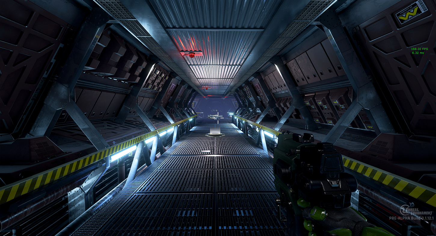
Hadley's Hope (Aliens Based UT Map)
I have been working on a small Aliens based unreal tournament 1v1 map and its almost complete i would like to send out an alpha version of the map first though just to make sure everything is working properly but I really cant wrap my head around unreal's build process / content submission system or even epics forum for that matter.


more screenshots here: https://www.artstation.com/warby
Replies
-----------------------------------------------------------------------------------------------------------------------
-----------------------------------------------------------------------------------------------------------------------
https://www.dropbox.com/s/m0ma592v6s...sHope.zip?dl=1
-----------------------------------------------------------------------------------------------------------------------
-----------------------------------------------------------------------------------------------------------------------
...and development progress:
Lightingwise I think the corridor feels too evenly lit right now. I'd try to add some more contrast between the intersections and the straight parts of the corridor to break some of the monotony and add some more interest to it. You could also make some of the lights completely busted and have others flickering.
The vents are too brightly lit (seemingly without any real light source) and the colors are way too saturated. I understand what you were trying to do with them, but I think you overdid it. It looks like it's way too easy to miss the vents as there is very little to really call attention to them being there and accessible unless you stand right outside of them and can see the red light.
Assetwise I think you need to make some pieces you can layer on top of the corridor pieces to break up some of the monotony (pipes, cables, screens or decals are some go to examples for that). You could even make some busted vents or corroded parts of the floor/ceiling to pay some homage to the source material or just make an opened access panel with some tools lying around.
The most egregious asset would be the cornerpieces with the big level 1, no one would ever label a corridor like that, no one need to see they're on level 1 eight times per intersection. At most you could justify having it once per corner, however even that would be a bit on the nose as having it on two opposing corners would be enough to see it from any angle.
Just my two cents.
However I gotta ask have you actually seen the movie ?!
Lighting in ventshaft:
Level numbers on intersection: