Home 3D Art Showcase & Critiques

Substance Designer - Improving thread

polycounter lvl 10
Offline / Send Message
Dragonar polycounter lvl 10
Hi everyone !

I started to learn Substance designer on my own and I would like to create a new thread to share with you guys and get your comments/advices.

So please feel free to give me any comments/advices or tips for my substances textures.

Thanks a lot.

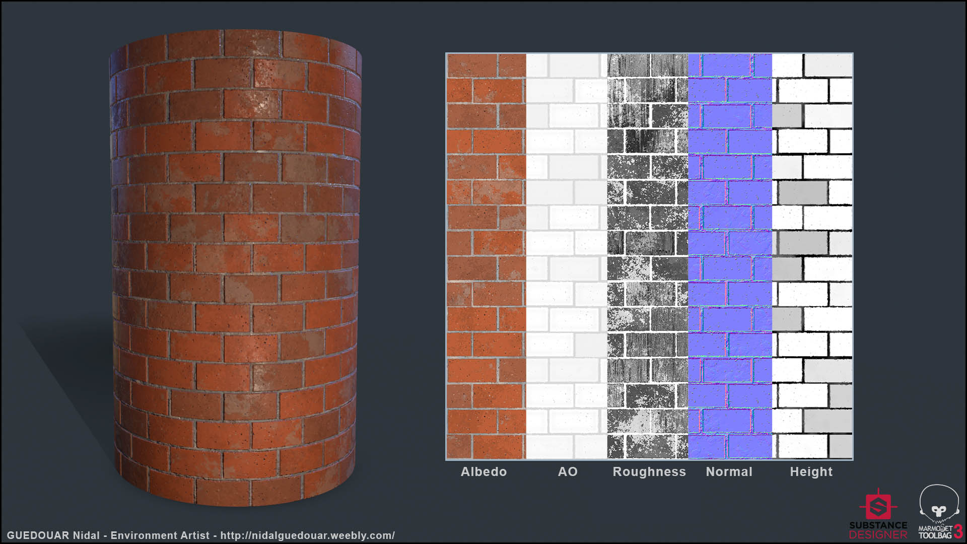
Here this is the first one :

Replies

  • Marshkin
    Options
    Offline / Send Message
    Marshkin polycounter lvl 9
    Welcome to the wonderful world of Substance Designer! 

    I think this is a very solid start. Have you done any reading on PBR at all? For starters your roughness mask is probably still too dark, making the material look more shiny then it should be. 
    Right now your bricks are very straight, you'll want to add some irregularity between them, as well as to their edges so they're not perfect. Even newly put down walls contain imperfections. 

  • rexo12
    Options
    Offline / Send Message
    rexo12 interpolator
    Marshkin said:
    Welcome to the wonderful world of Substance Designer! 

    I think this is a very solid start. Have you done any reading on PBR at all? For starters your roughness mask is probably still too dark, making the material look more shiny then it should be. 
    Right now your bricks are very straight, you'll want to add some irregularity between them, as well as to their edges so they're not perfect. Even newly put down walls contain imperfections. 

    To add on to this, Allegorithmic has some very useful (free) books on PBR - theory and it's art application. 
    https://www.allegorithmic.com/pbr-guide

    Your Albedo and Roughness maps (besides it being too dark)  are very well done, the only thing i can suggest less uniformity in the bricks, like the poster above. 
  • Prime8
    Options
    Offline / Send Message
    Prime8 interpolator
    Nothing wrong with the roughness, there are tons of different types of bricks, shiny once like this too. Maybe you can show your reference.
    Though it looks like the smooth surface is from the dirt and not on the brick.
  • Dragonar
    Options
    Offline / Send Message
    Dragonar polycounter lvl 10
    Hi guys ! I make some modification on my texture. I'm pretty happy about the final result and I think I can start to thinking to make an other one. If you still have any advice/tips to improve it, don't hesitate for sure.

    enjoy !


    @Marshkin Thanks for your welcoming and your advice. Yes I already did PBR render, I just didn't realize that my Roughness was really dark for a brick-wall. About the "imperfection" , I agree with you so I added a bit more. The things is I want to create a "normal" wall . I mean not dirty/old wall. I think right now it's nice but don't hesitate to tell me what do you think ;-)

    @rexo12 Thanks for the link dude. I knew this book and it's really useful ! Like is said , I think right now is nice. But don't hesitate also to tell me what do you think.

    @Prime8 Thanks dude for your comment. I agreed with them , it's a bit too shiny before even if I agree with you that you can find different type of wall. But for my case I aiming a normal/street wall, nothing super dirty/old. About my ref it was something in CGTEXTURE ( here),
    but to goal is not remake it 1 for 1 but more take the mood and try to remake it. I hope you gonna still like it with less roughness.


  • Maximum-Dev
    Options
    Offline / Send Message
    AO seems a little incorrect. You have some bricks looking darker than other ones, realistically only grout part should be slightly affected. But whatever, that's not gonna make a visible difference. Looking pretty nice. :)
  • Dragonar
    Options
    Offline / Send Message
    Dragonar polycounter lvl 10
    @Maximum-Dev Thanks dude :smile: . I have one question about the AO. I have this variation on the AO because as you can see on my Heightmap , I have some brick go a bit more inside the wall. So even with that is not logical to put that kind of detail on the AO ? If not can you tell me why please :smiley: .
  • gem2492
    Options
    Offline / Send Message
    gem2492 polycounter lvl 5
    Ambient occlusion is a shadow cast no matter what the lighting is, so it is usually applied on cavities or at the edge where two objects intersect.  It won't really make sense for some of the bricks to have darker AO because no object is going to cast a shadow on them at all lighting situations, even if they are a bit more inside the wall. However, it makes sense for the grout part to have AO because they are a bit deeper.
  • Dragonar
    Options
    Offline / Send Message
    Dragonar polycounter lvl 10
    @gem2492 ah ok thanks a lot dude . Ofc I knew what a AO is but I never saw that in that way and when you thinking about that it's logical. :smile:
  • gem2492
    Options
    Offline / Send Message
    gem2492 polycounter lvl 5
    No problem. Happy to help :)
  • Maximum-Dev
    Options
    Offline / Send Message
    Dragonar said:
    @Maximum-Dev Thanks dude :smile: . I have one question about the AO. I have this variation on the AO because as you can see on my Heightmap , I have some brick go a bit more inside the wall. So even with that is not logical to put that kind of detail on the AO ? If not can you tell me why please :smiley: .
    Don't think of it in term of depth difference like that. Think of whether some bricks would receive less light than some others under the light. They all receive the same amount of light regardless of whether some of them are a few centimeters in or out.
  • Dragonar
    Options
    Offline / Send Message
    Dragonar polycounter lvl 10
    Hi everyone ! Here a new substance designer texture. A Maya/Aztec floor , tell me what do you think about this one :smile:

    enjoy


    @Maximum-Dev Thanks dude , it's +/- what gem2492 said. Now is a lot more logical why my AO is wrong on my pervious texture. I hope you gonna like the Maya/Aztec one ^-^
  • Larry
    Options
    Offline / Send Message
    Larry interpolator
    Good job again. Did you sculpt that symbol or did you find the image and converted it to black and white?  This kind of texture should serve as a decal, what I mean is that you cannot tilw this texture (or..can you?) But it would serve better if you had a tileable rocky floor and place the symbol on top of it, in places where you like
  • Dragonar
    Options
    Offline / Send Message
    Dragonar polycounter lvl 10
    @Larry Thanks dude. The only SVG I used is the symbol on the center . With this technics I can change easily with an other one.
    The rest are created 100% in substance directly. About the decal question , yes I can create an alpha only with the center and use that as a decal. But I choose to create 2 texture to have a perfect integration, so now I have one texture WITH the "mask" and one without ( only the rock floor), ofc they till each other. I hope I answered your question :smile: .
  • Auldbenkenobi
    Options
    Offline / Send Message
    Auldbenkenobi polycounter lvl 11
    Looks cool, but the green moss stuff look as though it's just overlayed and doesn't really conform to the shapes of the central pattern.
  • Seal40k
    Options
    Offline / Send Message
    Seal40k polycounter lvl 6
    Looks good but I would add more color variation to the moss and add a dirt layer. Besides the moss the Stone looks overall very clean.
    Also more roughness variance would help to make your material more convincing.
  • Prabh
    Options
    Offline / Send Message
    Prabh polycounter lvl 7
    Looks good to me :smile:
  • Maximum-Dev
    Options
    Offline / Send Message
    Color wise it's very flat. You should introduce some micro/macro color variation.
    The moss looks like some green noise overlayed without anything else, as each individual map shows. You should create a moss material that has it's own unique Color/Roughness/Normal/Height and then blend that on top of the floor.
    The mask used for blending the moss isn't very suitable. Moss would usually respect the shapes of what it grows on so random mask looks a little weird. You should probably make the moss follow the shapes a little. For example.
    Grout also looks like flat color, it'll look much nicer with rough normals there.

    Keep up the good work. :)
  • Dragonar
    Options
    Offline / Send Message
    Dragonar polycounter lvl 10
    Hi all update of my maya texture . I hope you gonna like it .


    @Auldbenkenobi, @Seal40k , @Maximum-Dev : Thanks guys for your advice ! I  agree with all of you. I changed the color palette of the rock  texture and also create a compltly new one for the moss. Tell me what do you think guys. And if you have any substance tips don't hesitate.

    @Prabh Thanks amigo :smile:
  • Maximum-Dev
    Options
    Offline / Send Message
    That's definitely looking better than the previous try. :)
    For the moss I'd say it's still quite bland. I think the issue is the mask. Usually the moss either is there or is not, there are no in-between. Ref. So gradients have to go away. Maybe try increasing the contrast on your mask, you don't want much greys in it.

  • Seal40k
    Options
    Offline / Send Message
    Seal40k polycounter lvl 6
    Also, your roughness map can still be improved. Maybe its just the angle of the light but I am somehow missing a clear breakup. Right now it looks like the light is just reflected evenly over the whole surface.
  • Dragonar
    Options
    Offline / Send Message
    Dragonar polycounter lvl 10
    @Maximum-Dev @Seal40k: Yeah I think you are right but when I do that something is wrong for me...I don't know why but I feel something is wrong from my mask. About my roughness I think is fine but if you spot something don't hesistate to tell me.

    So there this is the way I doing my mask. I start with my height then I put a level to delete the contrast and then invert. To finish it and define the level of moss , I use a Histogram_scan.
    Below that you can see the final result of my textures with the mask.
    Thanks a lot guys for your support !


  • Maximum-Dev
    Options
    Offline / Send Message
    I don't see as much moss in the Albedo as I see in the Marmoset render. Something went wrong there?
    Also I really think it'll look a lot better once you come up with a solid moss material. Example. More example.
    The normal and height from moss should have lots of volume to it. As I see in Height and Normal maps moss is barely making any difference there.
  • Dragonar
    Options
    Offline / Send Message
    Dragonar polycounter lvl 10
    Hi all ,

    there an update of my Maya texture , I think it's cool like it is but I don't like the propagation of the moss :( If someone have an idea to improve it , please let me know.


    And here my new texture . I hope you gonna like it guys.


    @Maximum-Dev : again dude , thanks for your support. I saw your reference and I try to apply your advice. But it's really hard ^-^. Now I'm pretty happy but I still don't like the propagation of the moss. If you have any idea to improve the mask , please feel free .
  • Maximum-Dev
    Options
    Offline / Send Message
    I can only tell you how it should look like but I can't tell you "how to" do it because I don't go deep in substance designer myself. ^^
    The moss definitely needs to be tiled a lot more. And matching the moss color with those of references all over google should help a lot.

    The new material looks great. I only find two annoying issues.
    1) Grout is using the same albedo details/shapes where realistically it should be different material.


    2) Roughness on golden parts can have some subtle variations.
  • Seal40k
    Options
    Offline / Send Message
    Seal40k polycounter lvl 6
    could you please elaborate what kind of mask you are currently using?
    Looks like the moss is only showing in the edges, it should be present on the main surface as well.
  • Dragonar
    Options
    Offline / Send Message
    Dragonar polycounter lvl 10
     @Maximum-Dev ok np dude. Btw you have " the eye of tiger" because I have the feeling you see EVERY micro details of my material ^^. It's really cool ty again for that. And I fixed what you said and now it's look great for me but maybe you gonna spot something :p . About the maya one I changed  the tiling and the color but I'm still have the feeling that something is wrong.


    @Seal40k I already post it 2 post before but there is it. It's starting in the edges ( so this part is logical ) but if I increase the mask it gonna be present EVERY where. So if you have any idea to improve , feel free dude :)


  • Seal40k
    Options
    Offline / Send Message
    Seal40k polycounter lvl 6
    why don´t you just take your existing mask and blend it with another noise (BnW Spots 1 or 2 maybe with some tweaks)?
    This way you can control the spread in the edges with your old mask and add the additional spots seperatly.
  • Dragonar
    Options
    Offline / Send Message
    Dragonar polycounter lvl 10
    Hi all ,

    here a new texture with Substance designer. A white poplar tree. Feel free to tell me what do you think :)


    @Seal40k Hey duide , thanks for the idea ! It's look better now. If you have others tips , don't hesitate and ty again.


  • Dragonar
    Options
    Offline / Send Message
    Dragonar polycounter lvl 10
    Hey guys ! It's a look time I didn't post something here. So here we go with sand texture.
    As usual don't hesitate to tell me what do you think :)


Sign In or Register to comment.