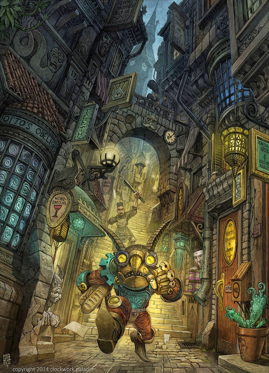
Goblin City Street Scene
Hello!
So my next personal piece is going to be a modular scene inspired heavily by fantasy artists, such as Sean Andrew Murray's Gateway world and Harry Potters diagon alley.
Sean Andrew Murray:


Harry Plopper:

The last time I attempted an environment piece was almost three years ago, so I'm going to be making a lot of mistakes and i'm still trying to wrap my head around textel density and all that modular haloova. On top of this I'm also learning 3ds max through this project, so I'm feeling ultra out of my depth and having to google answers every three clicks! So this is the start of it:

And I made a start on substances (and figuring out how to get substances into ue4, which turned out surprisingly easy! Yay for algorithmic!)

So things I'm not sure on overall is that mine currently has much more of a village vibe going on rather than city, which I don't necessarily mind but we'll see how it goes. Also, I was planning on sorting my textel density out at 3 meters for every 1k, which would mean all of my walls can fit in the UV space. While tileable textures are going to be used a lot in this scene, I also want to be able to add decorative parts to add character.
This is probably going to be one mess of a project, I've already gone through several iterations as I've figured out what to do, but hopefully I'll get something pretty badass at the end! Any feedback you've got, no matter how simple, let me know because I probably don't know it yet!
My next steps are gonna be figuring out how to get two UV sets for an object in Max, one for textures one for lightmaps, and I'm probably gonna start refining the walls that I've got before I add too much and go out of scope. Any C&C welcome!
So my next personal piece is going to be a modular scene inspired heavily by fantasy artists, such as Sean Andrew Murray's Gateway world and Harry Potters diagon alley.
Sean Andrew Murray:


Harry Plopper:

The last time I attempted an environment piece was almost three years ago, so I'm going to be making a lot of mistakes and i'm still trying to wrap my head around textel density and all that modular haloova. On top of this I'm also learning 3ds max through this project, so I'm feeling ultra out of my depth and having to google answers every three clicks! So this is the start of it:

And I made a start on substances (and figuring out how to get substances into ue4, which turned out surprisingly easy! Yay for algorithmic!)

So things I'm not sure on overall is that mine currently has much more of a village vibe going on rather than city, which I don't necessarily mind but we'll see how it goes. Also, I was planning on sorting my textel density out at 3 meters for every 1k, which would mean all of my walls can fit in the UV space. While tileable textures are going to be used a lot in this scene, I also want to be able to add decorative parts to add character.
This is probably going to be one mess of a project, I've already gone through several iterations as I've figured out what to do, but hopefully I'll get something pretty badass at the end! Any feedback you've got, no matter how simple, let me know because I probably don't know it yet!
My next steps are gonna be figuring out how to get two UV sets for an object in Max, one for textures one for lightmaps, and I'm probably gonna start refining the walls that I've got before I add too much and go out of scope. Any C&C welcome!

Replies
So, long time, no post. I have been in a dark place of much learning and have redone this this about three times.I have learnt a lot though! This is where my environment is at the minute,
So at the minute, I want it to feel like its some dodgy shop thats open in the middle of the night doing dodgy stuff. Its very... the steps especially are just piled together cuz ive been messing around and moving a lot of stuff around and trying to get a sense of composition and stuff. But I don't know any major mess ups I've done at the minute.
I've kinda got the theory down, now I need to make it look cool.
The shop doesn't even look like a shop, I want a gargoyle sprouting water above the sewer bit, a gate at the side and a lamp post. I also just need to make things more interesting and less uniform, also, I need waaaaaay less bricks. All my textures are some form of brick. My plan for that is to make a stucco texture and get some vertex painting on the go, but I just have no idea how thats gonna go so I'm gonna learn.
The focal point of the scene I think is gonna be this guy. I'm probably gonna have to make the sewer bit bigger with less bars so he looks like he could fit through, but I was thinking of having him in the scene rooting around in rubbish. I'm just not sure if hes gonna look ridiculous small, I was thinking about the size of a rat. I'll have to whack a quick zretopo on him and get him in too see how he looks scale wise.
Still a long way to go! Any C&C, tip tricks or advice welcome!
Anyone doing any environments stuff I reeeally super recommend checkin out a guy called Dinusty on youtube. Hes awesome.