[UE4] Hall of light.
Update.
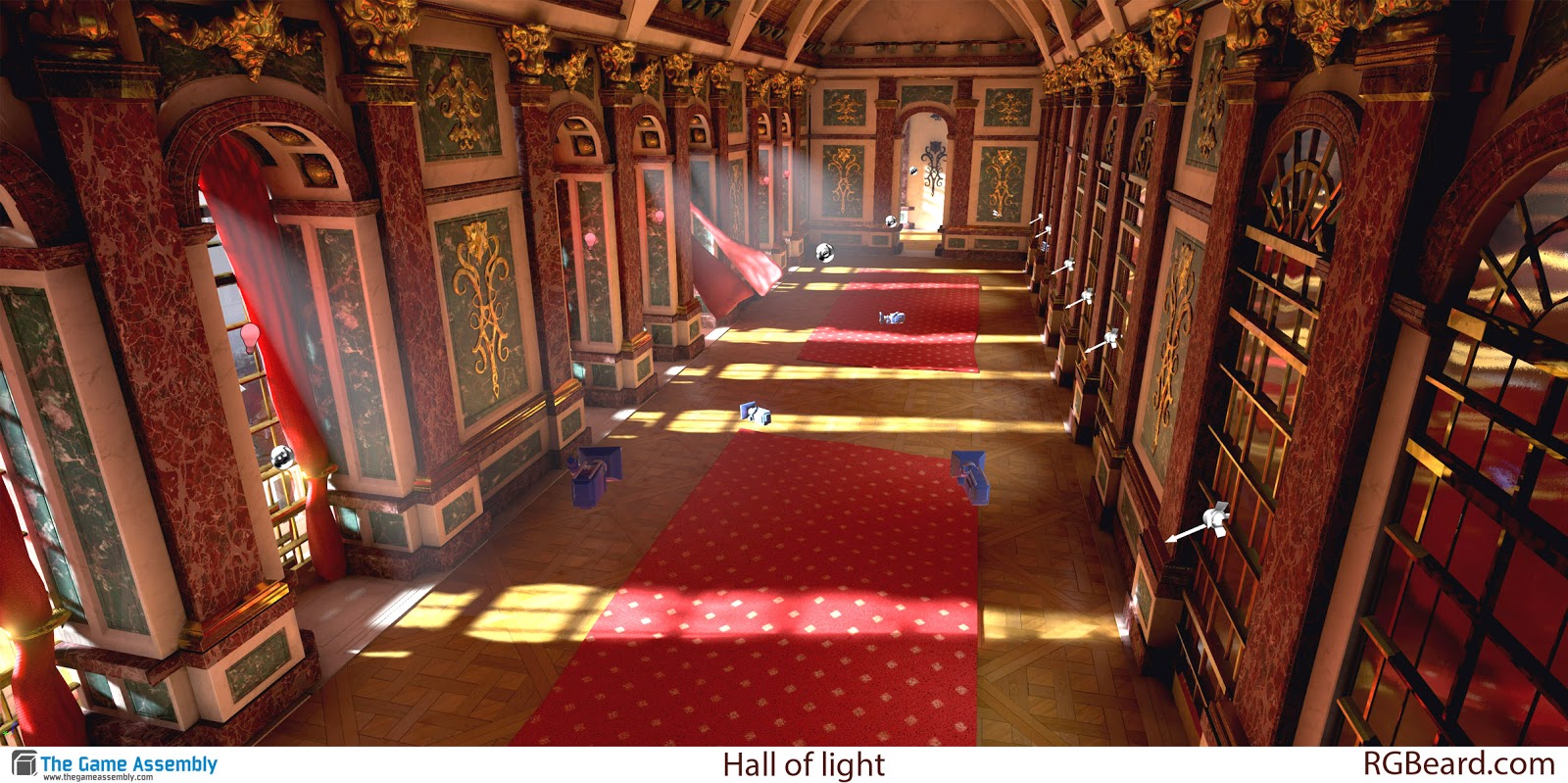
Worked on the scene for one more week. Final image:
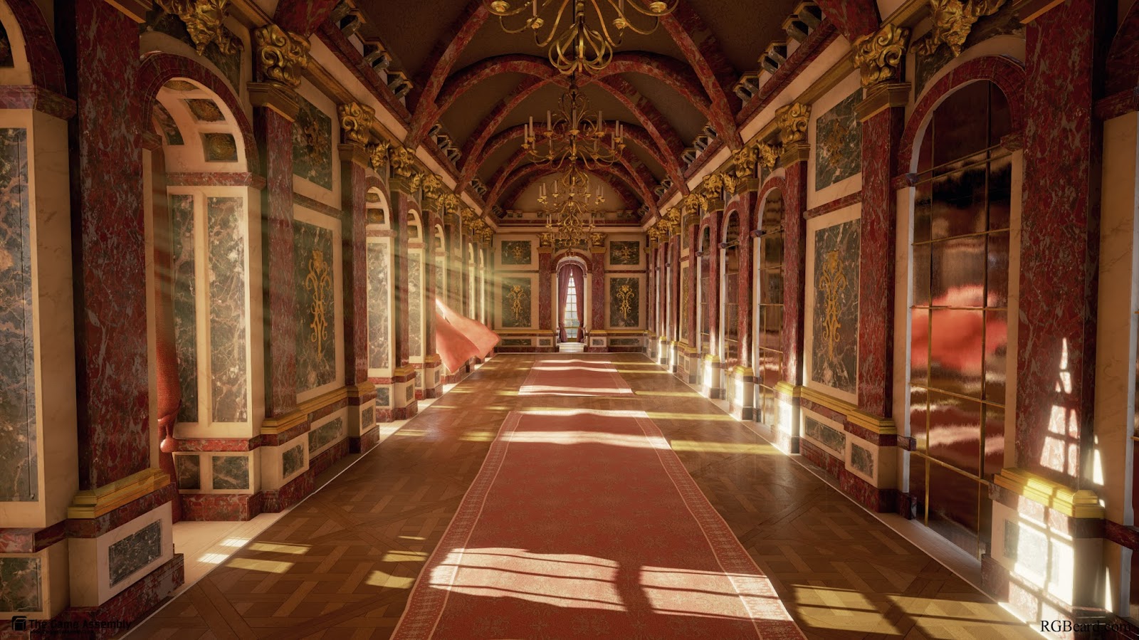
Start:
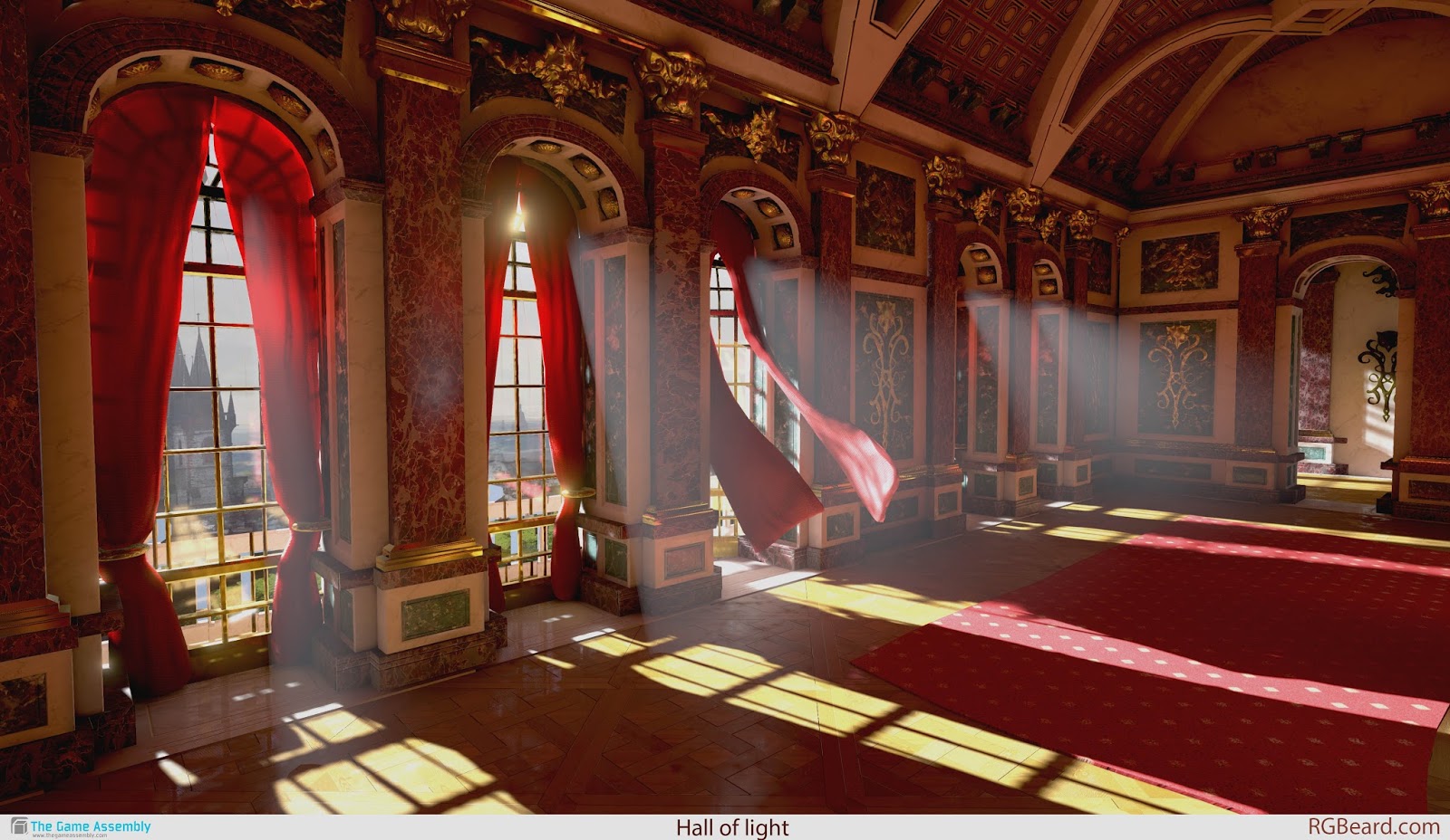
This is a portfolio project I did under the duration of 5 weeks, half time in school and on my spare time at home.
I wanted to make something with contrast from the work I have done in the past.
The goal was to create a warm hallway with natural lights and a happy and inviting mood.
Then also put in some storytelling of what might be happening there.
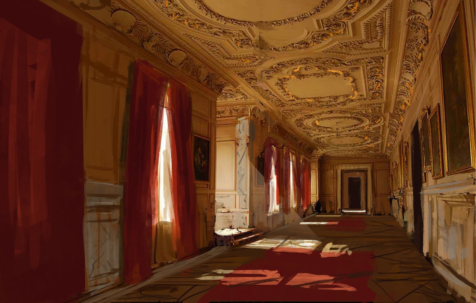
First I made a concept that I then mixed with some self directed art direction.
Concept:
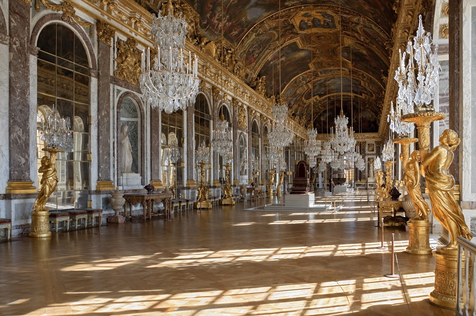
I wanted to combine my concept with the hall of mirrors:
I learned a lot from this project.
Keeping track on planning and re planning if things don't turn out they way I think.
Distributing geometry, We have learned in school to kept things as lowpoly as possible for performance. But during this project I have been starting to rethink that. And use the geometry where it counts and not being to afraid to keep things higher if needed.
Keeping it simple with the light and fake bounce and translucent like if you can't find another way to do it.
Material saturation and value. Keeping the albedo more PBR correct will help the lighting a lot.
Keeping things snapping to the grid earlier so the modularity is figured out at the start of the project.
I think there is more to learn from this so any feedback is appriciated.
Jeremy Estrellado and his discord has been awesome during this project.
He is a great educator and you can find more about him here: http://estjeremy.tumblr.com/
Progression gif (:
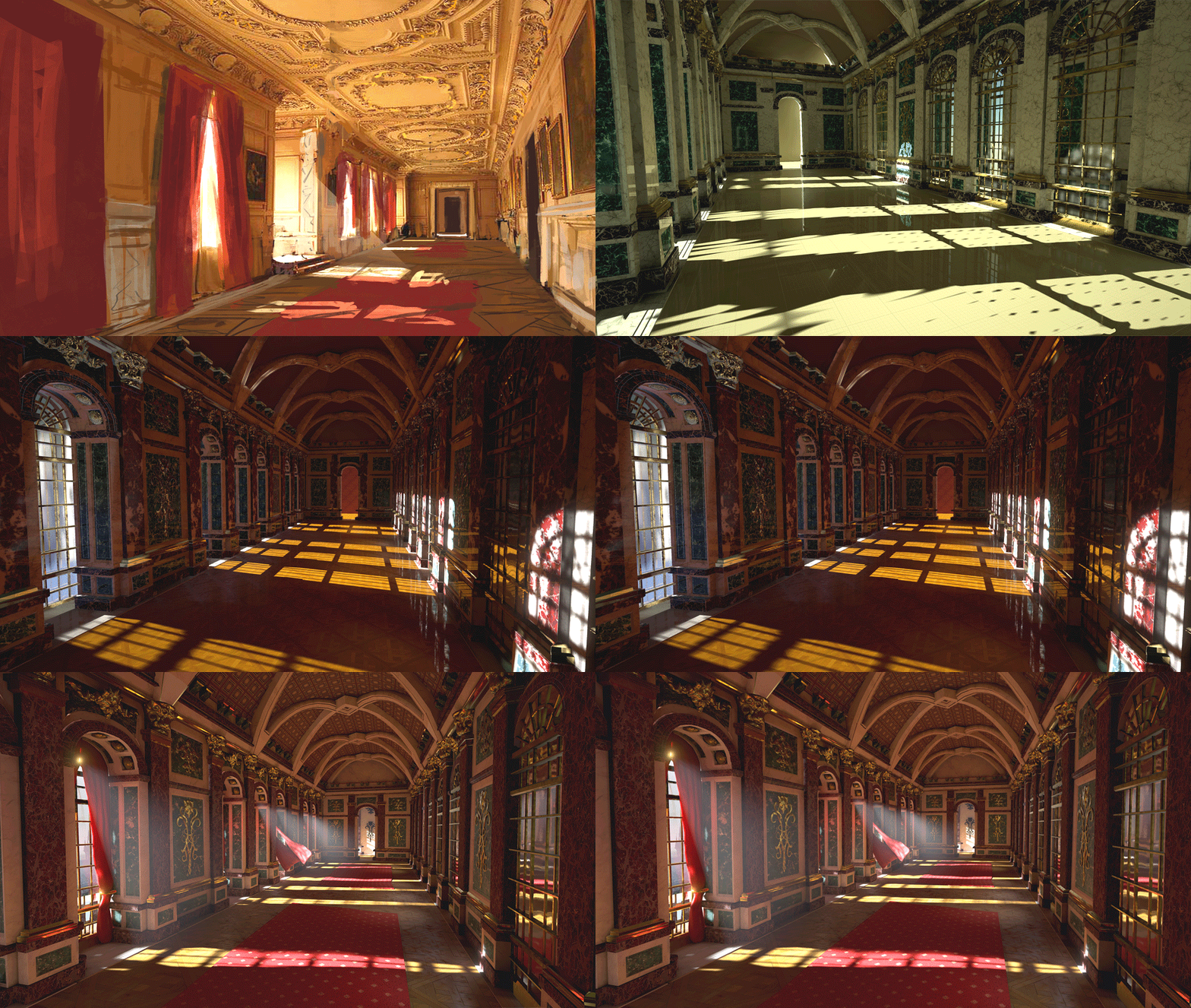
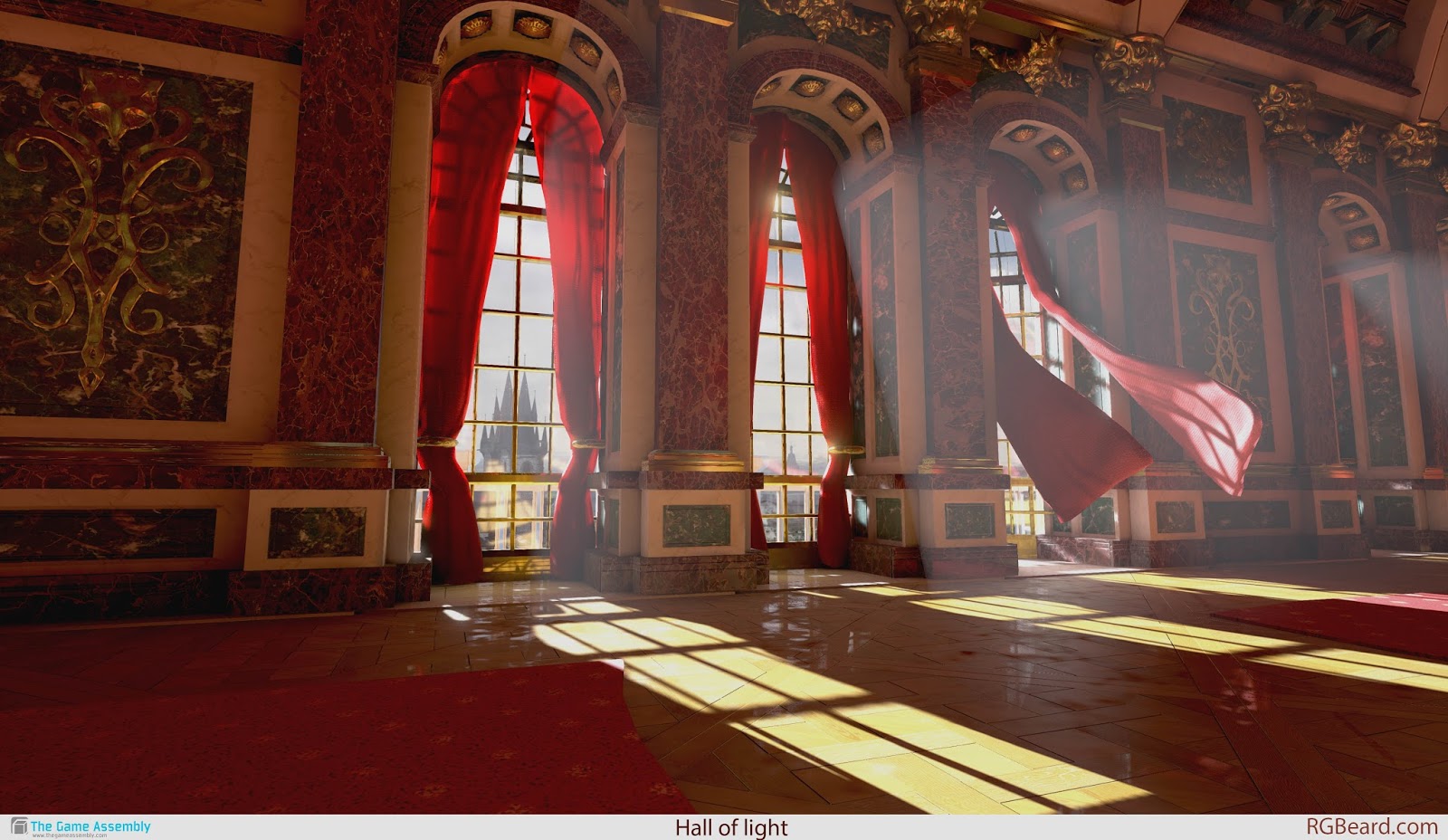
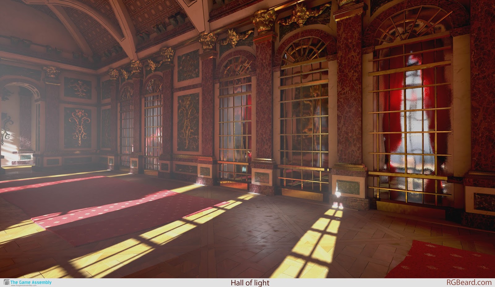
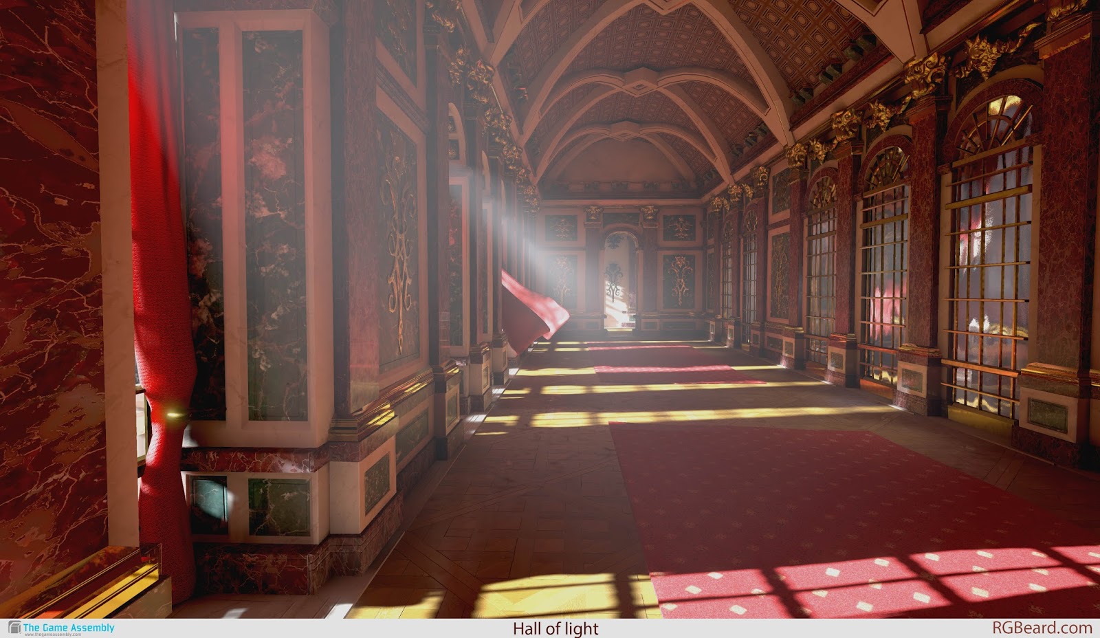
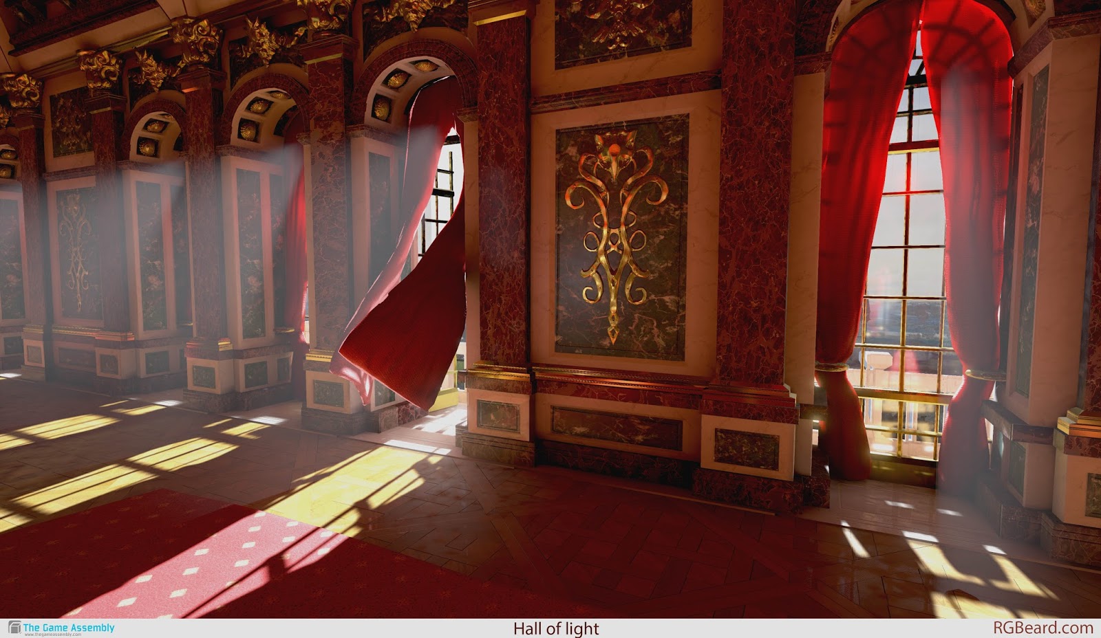
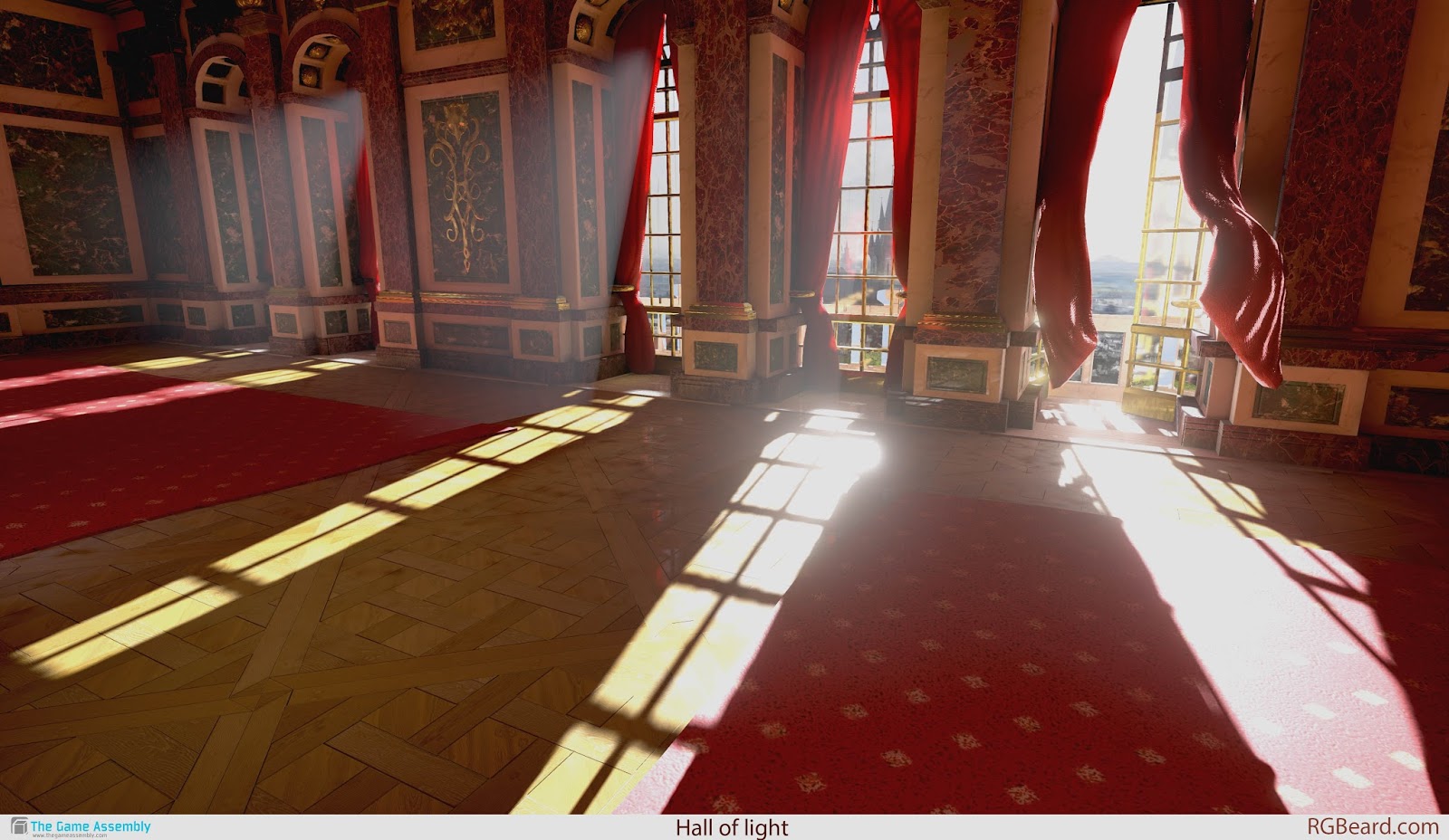
More angels of the scene:
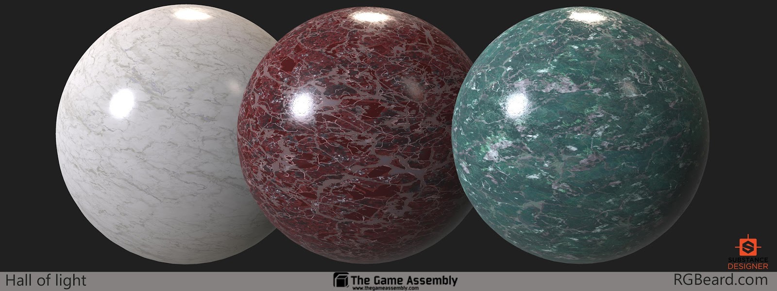
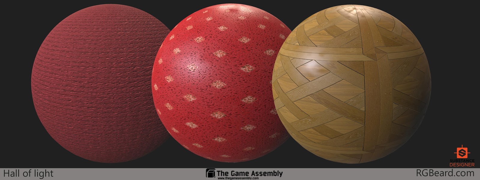
Materials done for the scene in Substance designer:
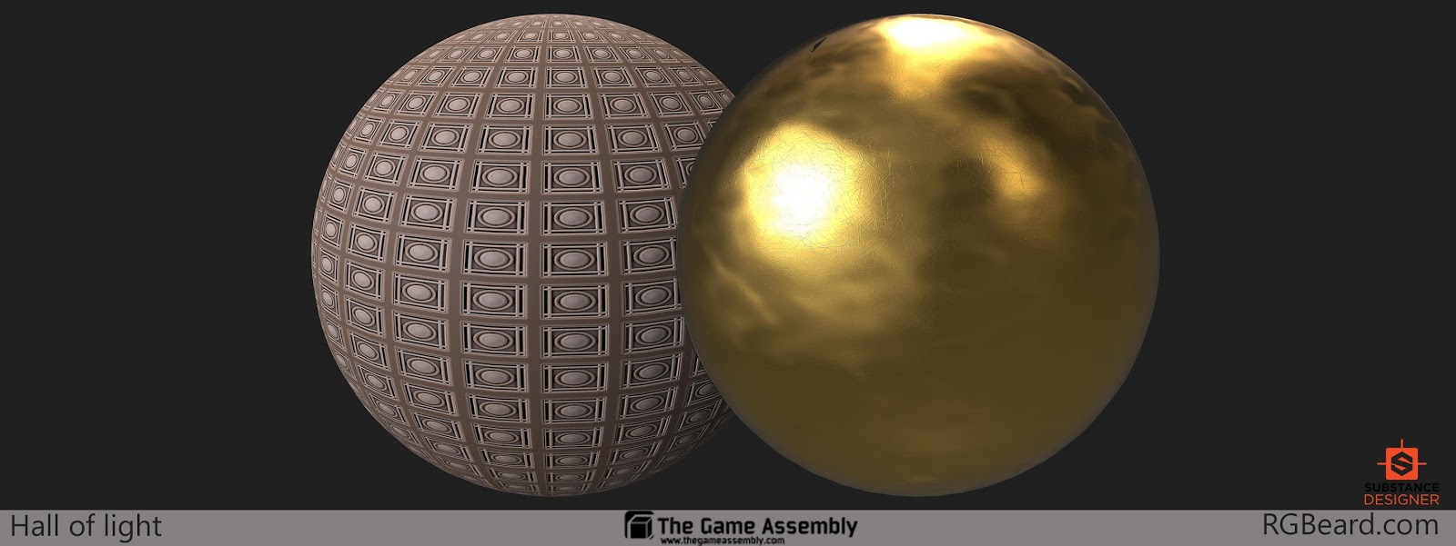
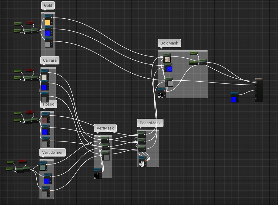
I blended the materials mostly with maskes exported from Substance Painter.
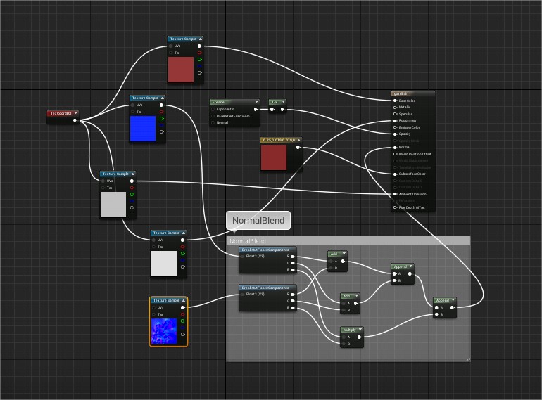
Curtain material where I blended the baked normals with the fabric normals. And some fresnel for the subsurface.
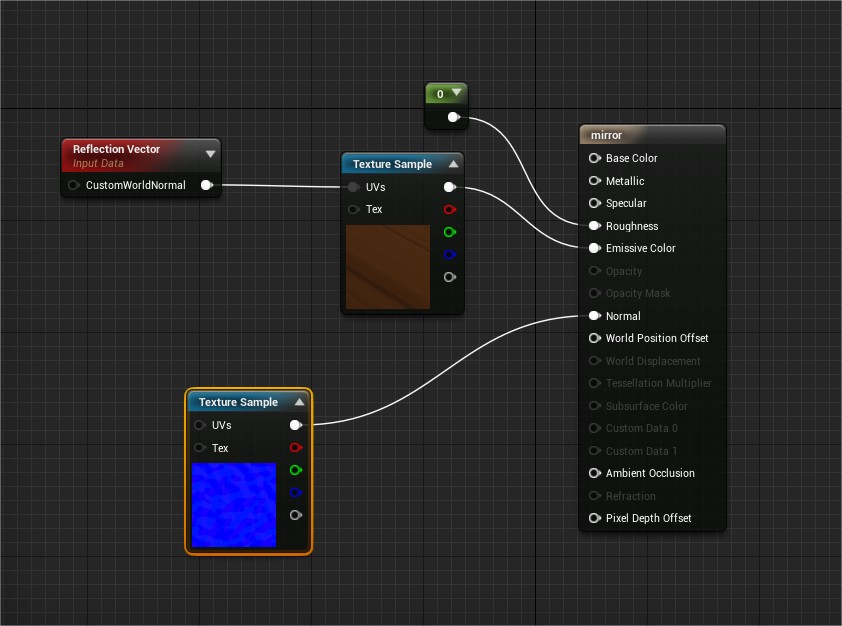
The mirror reflections where done with a sceneCapture render target. Then a normal map to distort it.
Lighting:
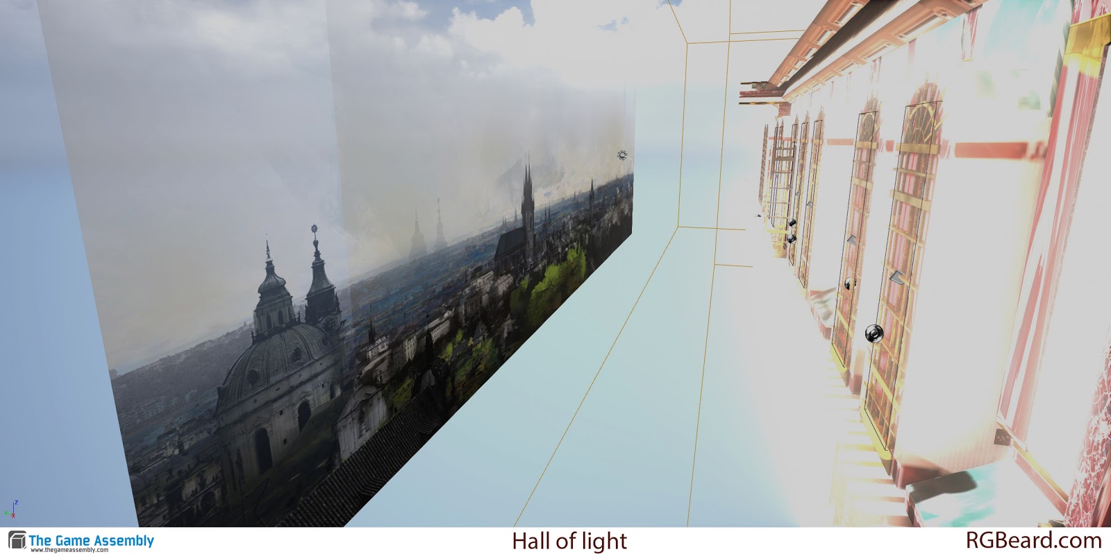
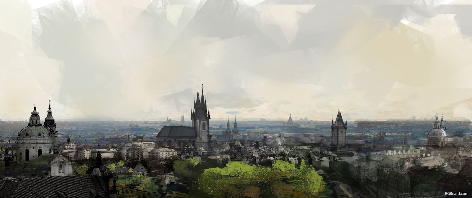
I photobashed a matte painting for the background and put it on a plane with a gradient i the alpha, then made it transparant.
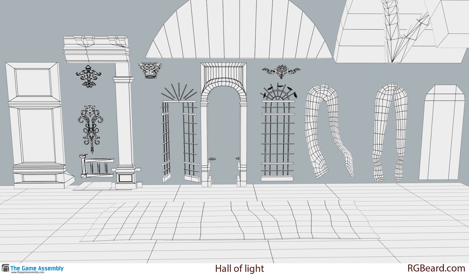
Wireframes and how the modules were laid out.
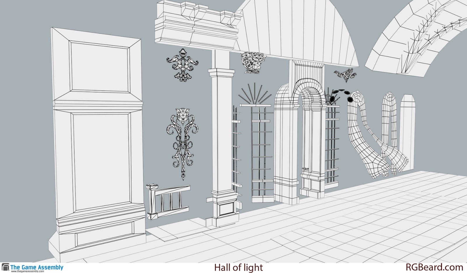
https://www.artstation.com/artwork/oKOkW
That was a long post, thank you for looking through it all (:
Feedback would be great.
Worked on the scene for one more week. Final image:

Start:

This is a portfolio project I did under the duration of 5 weeks, half time in school and on my spare time at home.
I wanted to make something with contrast from the work I have done in the past.
The goal was to create a warm hallway with natural lights and a happy and inviting mood.
Then also put in some storytelling of what might be happening there.
First I made a concept that I then mixed with some self directed art direction.
Concept:

I wanted to combine my concept with the hall of mirrors:

I learned a lot from this project.
Keeping track on planning and re planning if things don't turn out they way I think.
Distributing geometry, We have learned in school to kept things as lowpoly as possible for performance. But during this project I have been starting to rethink that. And use the geometry where it counts and not being to afraid to keep things higher if needed.
Keeping it simple with the light and fake bounce and translucent like if you can't find another way to do it.
Material saturation and value. Keeping the albedo more PBR correct will help the lighting a lot.
Keeping things snapping to the grid earlier so the modularity is figured out at the start of the project.
I think there is more to learn from this so any feedback is appriciated.
Jeremy Estrellado and his discord has been awesome during this project.
He is a great educator and you can find more about him here: http://estjeremy.tumblr.com/
Progression gif (:

More angels of the scene:


Materials done for the scene in Substance designer:


I blended the materials mostly with maskes exported from Substance Painter.

Curtain material where I blended the baked normals with the fabric normals. And some fresnel for the subsurface.

The mirror reflections where done with a sceneCapture render target. Then a normal map to distort it.

Lighting:


I photobashed a matte painting for the background and put it on a plane with a gradient i the alpha, then made it transparant.

Wireframes and how the modules were laid out.


https://www.artstation.com/artwork/oKOkW
That was a long post, thank you for looking through it all (:
Feedback would be great.

Replies
With the concept, there was a nice, airy, somewhat neutral color, contrasted with that red. from the curtains and carpets. It served as a nice, punchy contrast, as well as a device to get me to look down the hallway.
Where you ended up is a bit more confusing of a space. Very little contrast, so I keep focusing on the wooden floor instead. I think you were heading in a better direction in an earlier image, from your gif, where the walls were a bit more nuetral.
You could make the carpets a little thinner, so they cover a little less of the floor, and more strongly point you in a line towards the door. Additionally, I think the red on the ceiling could be toned down, or made to be a different color. It sort of blends in with the wall, which further pulls away from the directionality of the space.
looking good
My main problem with this scene is the color choice for some parts, you go too much on red in your texture so it give a feeling of a small and oppresive corridor. The GI give too much information on red... Try to desaturate more, and if you check your picture from Versailles, there is more white stuff on the ground and ceiling.
Your drapes are already red, so they will give a lot of red information on GI, so try to balance with the other props (like carpets). And may be down the intensity of your sun, it bright too much the ground and you lost information on it
Good feedback (:
I wrote some more about it in this 80 level interview:
https://80.lv/articles/hall-of-light-lighting-setup-for-a-marble-scene/
Yeah those scratches must have come from moving away all the furniture (:. I agree with you, they need more work.
It would be better to add more dirty old ones!