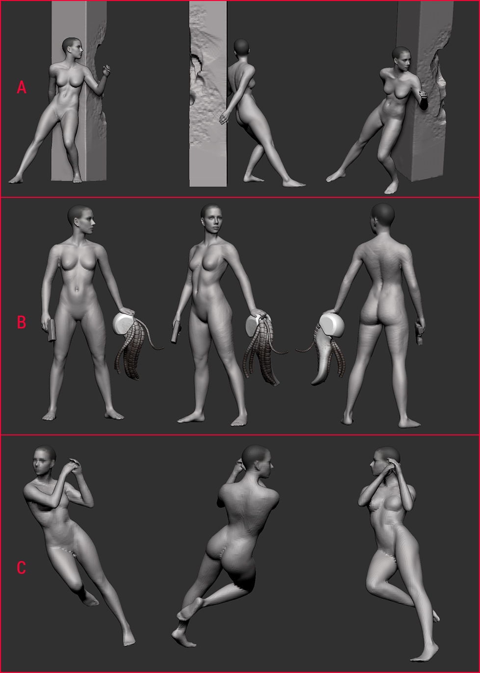
@takai - I like pose a as well, but I felt like the pillar obscured the character a bit. I also like that it has the pillar, which is a pretty awesome moment in the movie. I might do a second version in this pose if I have the time, possibly with the jacket open and in motion.
@TeriyakiStyle - not sure about the print. I'd like to do one, but I don't really have time right now to learn the ins and outs of making models for print.
This is not Major Motoko Kusanagi. Looks like a cheap american-made rip-off. We all know that Americans can't built cute robots, only the Japanese can do it. >:)
A Moderator warning: It's OK to post a negative joke, but you must include some constructive criticism. Please Respect Your Fellow Artists. Thanks.
Sure, will do. But to be honest i can't find much to criticize. The likeness is well done. If there is something which could be modeled better i don't see it. The pose is more personal taste, i guess. I like pose B the most, but it is very static. I would have shifted her weight more on one leg so she stands slightly off center, which would curve her spine a little bit. Basically (i would) make a more sexy pose or a more dynamic one, like as if she is right before sprinting or jumping. What is that thing she is holding in her hand? I hope its a severed Cyborg head - if its a HMD/VR device i would kindly advice to not go overboard with the cables and tubes. (its cyberpunk, put more cables and tubes on it, goddamit >:) ) Thats all i can say without seeing shaders and textures and shit.
Hey man. You are pretty close to the likeness ! I modeled her digidouble for a sequence in the movie. In your last screencap, I'd say the nose dorsum doesn't look wide enough and her eyelids are a bit too thin, especially the lower one where the crease between the fatpad and the end of the eyelid should be a bit lower.
Otherwise, face silhouette and mouth are pretty great !
Keep it up !
Thanks for the feedback man, Very pointed and much appreciated.
That amazing man, must have been an honor to work on a movie like GITS. Out of curiosity, how much scanning is involved in something like that?
It was fun but we had a very short deadline. There is actually a lot of scan involved. We had her body but not her suit, and there is a lot of cleanup and improvement to be brought to the scan for it to 1. work in the pipeline and 2. Look good, but it speed up the process a lot. All big blockbusters have shitload of scans now.
This is killer work. There are a couple of things bugging me about her face though. And while it could be the uncanny valley effect, i think it can be pushed a little further still.
Firstly, it's a nightmare trying to find neutral faces for this woman. Here's one of the best i found:
Her chin is slightly flatter than what you've made, i think the jaw angle in general needs to be a little shallower as well, and there's definitely a slight asymmetry there, with the jaw pulled to one side.
Realizing there are slight difference in the angle of her face, and camera perspective etc... It looks to me like her nostril could use a little more work, your planes are slightly off in comparison. but the most noticeable thing to me is her nose.
There's some definite angling to the nose that you're missing.
Hey man, thank you for your time! the shots in your critique are the pretty old ones from the first iteration a couple months ago, I've resculpted her from scratch a couple times now.
ill check to see I'm not making the same mistakes you pointed out with the new one, which I probably am, her face is definitely not there yet either way.
Ill also try try to add some more orthographic shots in case anyone spots stuff.
looks promising I'm bothered by her clavicle facing the camera. It's too long and the acromion feels too far out giving that sort of broken shoulder vibe
Took me awhile, but shes finished. Glad be done, although I thought her in-movie outfit was a fun concept to work with. Some areas, like the shoes, don't match the movie, I was just changing where I didn't have detail or just felt like it.
Sorry for the huge image dump, and sorry that these are in no particular order.
@Mitchellangelo I used Maya nhair, then converted that into polygons and exported to zbrush. I wasn't sure how thick I wanted the hair, so using nhair gave me the control to change it. I could change a couple sliders and reduce the number of hairs and make them thicker, or increase the number and make them thinner. Made it easier to find the medium, and also control the style, until I had it locked in.
Replies
Cheerio
@TeriyakiStyle - not sure about the print. I'd like to do one, but I don't really have time right now to learn the ins and outs of making models for print.
Looks like a cheap american-made rip-off.
We all know that Americans can't built cute robots, only the Japanese can do it.
>:)
But to be honest i can't find much to criticize.
The likeness is well done. If there is something which could be modeled better i don't see it.
The pose is more personal taste, i guess.
I like pose B the most, but it is very static. I would have shifted her weight more on one leg so she stands slightly off center, which would curve her spine a little bit. Basically (i would) make a more sexy pose or a more dynamic one, like as if she is right before sprinting or jumping.
What is that thing she is holding in her hand? I hope its a severed Cyborg head - if its a HMD/VR device i would kindly advice to not go overboard with the cables and tubes. (its cyberpunk, put more cables and tubes on it, goddamit >:) )
Thats all i can say without seeing shaders and textures and shit.
Otherwise, face silhouette and mouth are pretty great !
Keep it up !
That amazing man, must have been an honor to work on a movie like GITS. Out of curiosity, how much scanning is involved in something like that?
This is killer work. There are a couple of things bugging me about her face though. And while it could be the uncanny valley effect, i think it can be pushed a little further still.
Firstly, it's a nightmare trying to find neutral faces for this woman. Here's one of the best i found:
Her chin is slightly flatter than what you've made, i think the jaw angle in general needs to be a little shallower as well, and there's definitely a slight asymmetry there, with the jaw pulled to one side.
Realizing there are slight difference in the angle of her face, and camera perspective etc... It looks to me like her nostril could use a little more work, your planes are slightly off in comparison. but the most noticeable thing to me is her nose.
There's some definite angling to the nose that you're missing.
Looking forward to seeing this finished man!
ill check to see I'm not making the same mistakes you pointed out with the new one, which I probably am, her face is definitely not there yet either way.
Ill also try try to add some more orthographic shots in case anyone spots stuff.
Again, appreciate it.
Took me awhile, but shes finished. Glad be done, although I thought her in-movie outfit was a fun concept to work with. Some areas, like the shoes, don't match the movie, I was just changing where I didn't have detail or just felt like it.
Sorry for the huge image dump, and sorry that these are in no particular order.
Congrats on finishing this, was totally worth the wait!
@Mitchellangelo
I used Maya nhair, then converted that into polygons and exported to zbrush. I wasn't sure how thick I wanted the hair, so using nhair gave me the control to change it. I could change a couple sliders and reduce the number of hairs and make them thicker, or increase the number and make them thinner. Made it easier to find the medium, and also control the style, until I had it locked in.