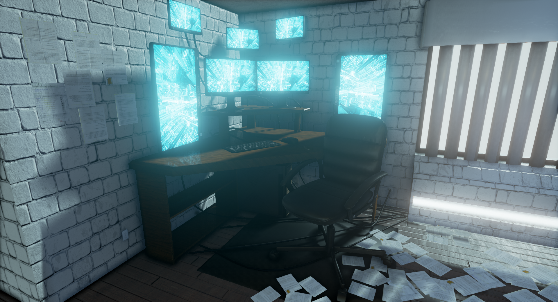
This is pretty cool, but you really need to fix some of the issues. Like fixing the wall that's not casting shadows.. removing some of the hard edges and tweaking your albedo values to pull it together. If you are showing the space behind the windows/blinds you need to show something is there, otherwise it's an immediate illusion breaker.
Hey Cay , thanks for the reply. You mentioned tweaking the albedo values, were there particular models that stood out? If so which ones and in what direction would you change them? For the outer wall I have cast shadows on, not sure what to do there? Here is my lighting set up.
Do your wall/ceiling meshes have backfaces.. as in.. is it a cube or just a plane? If what you are using is a plane and there's no backfaces you can try ticking "Shadow Two Sided" in the Details Panel. You might still get some light bleeding, but that's another issue entirely. If you want to play it safe make it a solid wall. What I mean regarding the Albedo is.. different assets don't look like they are in the same scene. Your wall texture looks too bright, your couch might be too dark. Your wooden floor could be slightly darker and your wooden desk (beneath the monitors) might be too dark. In general keep them as bright as you can before it breaks the look, but don't make anything pure white. It's extremely visible I think because your ceiling isn't working properly and you have the "sun" shining in.
I'd say your wall texture is very bright.. and your couch looks ok but you could try making it lighter.. it's really about trying and looking at it seeing what works and what doesn't. If you can make a material that allows you to tweak them in the editor, that would make things a lot easier for you.
I found a few concepts of chairs that I liked and wanted to take from, this is the first part of the chair, the 2nd part will be creaing some mechanical hook ups for the brain that start from the back of the chair and flow upward and hang over the persons head, ready to connect to cyberspace.
Looks great dude. I'd continue to think about the lighting -- darken the room a bit more and make more use of the strip lighting and the open blinds around the room. The concept does a great job of illuminating certain areas with the use of the strip lights, they guide the eye around the room. As with the open blinds, they seem to just give the room a little bit of global illumination. Keep it up! =D
Looks better, but the main thing with the concepts lighting is the colour, get the light coming through the blinds to be more of a deep blue. might even be worth faking your own bluey God rays from the windows. Hope this helps!
Here is a chair that Im building that I want to put in the scene. It borrows heavy from a concept I found. Im working on the computer parts for it. My thinking is having a computer and chair mesh into 1 tool where the user would sit and jack into the matrix.I having problems with making it cool. I looked at my own computer and thought about the parts that go into that. Any suggestion would be awesome. thanks
I am liking this one already but I think it has a couple of areas to help it that little bit more.
I think the wall bricks are a bit distracting as they are very large and also quite soft looking around the edges. With such a modern/sci fi theme the building materials would be a bit more futuristic so I think either large concrete slabs or metal plates would work better.
I also think changing the light colour coming from the windows to a blue hue as well as putting something over them to get rid of the bright white light eminating as they really steal your eye at the moment so you lose focus on the awesome models you have done.
The bricks definitely need to be scaled down quite a bit, but i'd keep them rather than change them to metal plates. scifi doesn't mean there can't be a compromise from modern to old. Actually i would rework the bricks texture entirely. Right now they look more like boulders stacked together than bricks.
im trying to rework the lighting from scratch and having issues. Im working in LIGHTING ONLY and im starting to like it but when i go to detailed mode and lit mode its starting to look very dark. Any suggestions?
Uhm.. yeah your lit mode is essentially all shadow Are you using a skylight? Use the skylight like an ambient light to lighten up the shadows. It also seems like there's no light coming from any of your light sources either. Like the computer screens. In your lighting only mode, I can see the blue, but in Lit mode it's not there at all. Are you trying to light with only emissive? Typically using emissive as a source gives off a weaker lighting, it's better to just use a point light and place it near the light sources
Replies
What I mean regarding the Albedo is.. different assets don't look like they are in the same scene. Your wall texture looks too bright, your couch might be too dark. Your wooden floor could be slightly darker and your wooden desk (beneath the monitors) might be too dark.
In general keep them as bright as you can before it breaks the look, but don't make anything pure white.
It's extremely visible I think because your ceiling isn't working properly and you have the "sun" shining in.
http://polycount.com/discussion/63361/information-about-polycount-new-member-introductions/p1#make
Neat scene!
Nice work!
I am liking this one already but I think it has a couple of areas to help it that little bit more.
I think the wall bricks are a bit distracting as they are very large and also quite soft looking around the edges. With such a modern/sci fi theme the building materials would be a bit more futuristic so I think either large concrete slabs or metal plates would work better.
I also think changing the light colour coming from the windows to a blue hue as well as putting something over them to get rid of the bright white light eminating as they really steal your eye at the moment so you lose focus on the awesome models you have done.
Hope this helps