The BRAWL² Tournament Challenge has been announced!
It starts May 12, and ends Oct 17. Let's see what you got!
https://polycount.com/discussion/237047/the-brawl²-tournament
It starts May 12, and ends Oct 17. Let's see what you got!
https://polycount.com/discussion/237047/the-brawl²-tournament
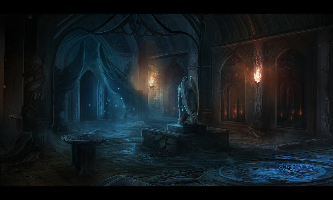
"Altar Ruins" [UE4]

polycounter lvl 6
Hey Polycount, I've been working on an Unreal 4 scene based on this concept for the past couple months now. I've got one month left to reach the finish before summer hits so that I can use it in my next demo reel! I'm trying to hit a realistic style somewhat realistic style and include a variety of surfaces/props to test and show my material knowledge.
Concept:
 The Sanctuary' by AlynSpiller
Final Video:
 https://www.youtube.com/watch?v=peYzhgcCa2Y
Thanks for looking guys and if you have any suggestions/critiques they are much appreciated!
Concept:
The Sanctuary' by AlynSpillerFinal Video:
https://www.youtube.com/watch?v=peYzhgcCa2Y
To-do:
- Create wall mounted torch
- Create standing torch
- Edit fire particle system to fit light fixtures
- Tweak door's wood textures (looks great in Quixel, not so great in Unreal)
- Texture main arch
- Tweak ceiling bricks textures
- Add roughness map to grates
- Texture step underneath grates
- Redo entrance-way (The general shape is a bit too chubby)
- Tweak marble tiles near entrance-way
- Texture ceiling rafters
- Tweak statue model (female cloth doesn't resemble males. male's beard isn't interesting enough)
- Texture statue
- Dirty/destroy marble & glyph
- Add more sand/rubble piles
- Edit fountain shape
- Texture fountain
- Fix mirror functionality
- Re-texture pillars and trim
- Texture dome
- Create curtain
- Retexture floor tiles (currently stylized looking. oops)
Thanks for looking guys and if you have any suggestions/critiques they are much appreciated!
Replies
Does anybody have any suggestions for some material to research for the main walls/pillars material? Can't tell if it's slate or concrete, or something else entirely!
Any thoughts?
I'm reworking a couple of textures, and I think this new slate material is coming across a lot better.
C&C welcome
Any materials really sticking out as needing another pass?
Why are they so shiny?
Updated lighting and atmosphere, added a couple little particle FX too! Just a couple tweaks left")
A good practice is to grab a shot from a movie, or a photograph from a cinematographer or photographer (even a video game) that you feel captured the mood you want, and try to imitate that, or atleast use that as a jumping off point.
Nice work!
@wester Yeah you're definitely right. I remember watching a Sycra video on Youtube and he said the same thing about warm & cool colours - that being that it doesn't just mean red/blue. However, I guess with the concept being blue/red I tried to stick to it somewhat, but then through trial and error found some other moods/atmospheres I wanted to explore. Your advice of picking an existing image to at least guide the atmosphere and lighting is something I will certainly use in the future. Overall my planning on this project was pretty lacking, so I've been making notes on questions to ask myself during the pre-production of my next piece.
The issue of the unclear focal point stems from my initial aim to use this scene as a sort of demo playground for my demo reel rather than a set art piece. I sort of wanted to show off different skills, materials and models which is why I try and draw the eye to a bunch of different places - which ends up in a muddled feel as you say. Thanks for the feedback, it's given me a lot to think about for my next project, and also some stuff to correct with this one.
@snoop Thanks for the input snoop! I'll be tweaking the lighting/mood.
@supersnakelx Haha yes it is! Really like the carvings and general style, so I decided to remake it - with a bit of a size upgrade! Thanks for the kind words.
@Benvox2 Thanks dude! Learning a couple particle fx tricks is super fun, and has a really nice payoff at the end of the day. I want to continue to look into cascade stuff as I think I'm only scraping the tip of the iceberg. Yeah, it's way too clean, you're right. I should go back and dirty it up a bit - it was one of the first things I made in the scene.
I was sort of pushing the dreamy, ethereal mood, but the general feedback is pointing towards it not working out. I think I'm going to try and find a bit of a stylized/realistic balance!
@mrgesy Appreciate the comments and kind words. I'm going to give a shot at relighting and changing the mood to be closer to the concept - as you guys are totally right in that the purple is sort of drowning everything else out. Tweak time!
I really appreciate the response guys, can't wait to wrap this up and start applying for some junior positions!
For fire I followed the ImbueFX tutorial for UDK and then there's a little pupdate video for UE4.
The water coming from the fountain was just trial and error - same with the falling dust/glowing particles.
I'd say just search Youtube for what you want to achieve and you'll find something! Once you learn a couple of particle methods you start to use knowledge from each in new systems - and thats when the fun begins.
Oh! And for the atmospheric fog etc I just read this article and then messed with things. Definitely give this a read - it's pretty inspiring and helpful too!
https://80.lv/articles/joel-zakrisson-creating-contrasting-moods-in-ue4/
Good luck ^_^