[UE4] Black & White Architecture
polycounter lvl 2
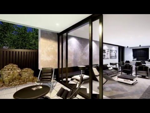
I'd like to share with you my ArchViz project which was finished at the
end of the 2015 year (it took me 2 months). The main goal was to create
interactive presentation for Virtual Reality , which will be focused on
archviz branch. The whole scene contain about 125,000 triangles.Control
is constraint only for using pad and 3d interface which allow to change
materials.
Here is the link for video presentation, which show all detail:
 https://www.youtube.com/watch?v=RYBJ2x1uzsE
Hope you like it")


Here is the link for video presentation, which show all detail:
https://www.youtube.com/watch?v=RYBJ2x1uzsEHope you like it
Replies
I think that the garden is too bright given the weather conditions, in my eyes the lights seem a little bit faked.
Also I don't undertand why the bedroom seems to be in a very high floor given the exterior image and the living room is just street level when they are both at the same level (I don't know if I explained it properly xD).
It made me laugh when I saw the super cool house and then the air matress lol it looks like the owner is a single guy that just can't bother to buy a proper bed.
I didn't really liked the UI font and the Matrix 0s and 1s behind. I think it would be better if you just change the font to a more futuristic looking one and get rid of the 0s and 1s.
But don't get me wrong, in general it looks awesome