The BRAWL² Tournament Challenge has been announced!
It starts May 12, and ends Oct 17. Let's see what you got!
https://polycount.com/discussion/237047/the-brawl²-tournament
It starts May 12, and ends Oct 17. Let's see what you got!
https://polycount.com/discussion/237047/the-brawl²-tournament
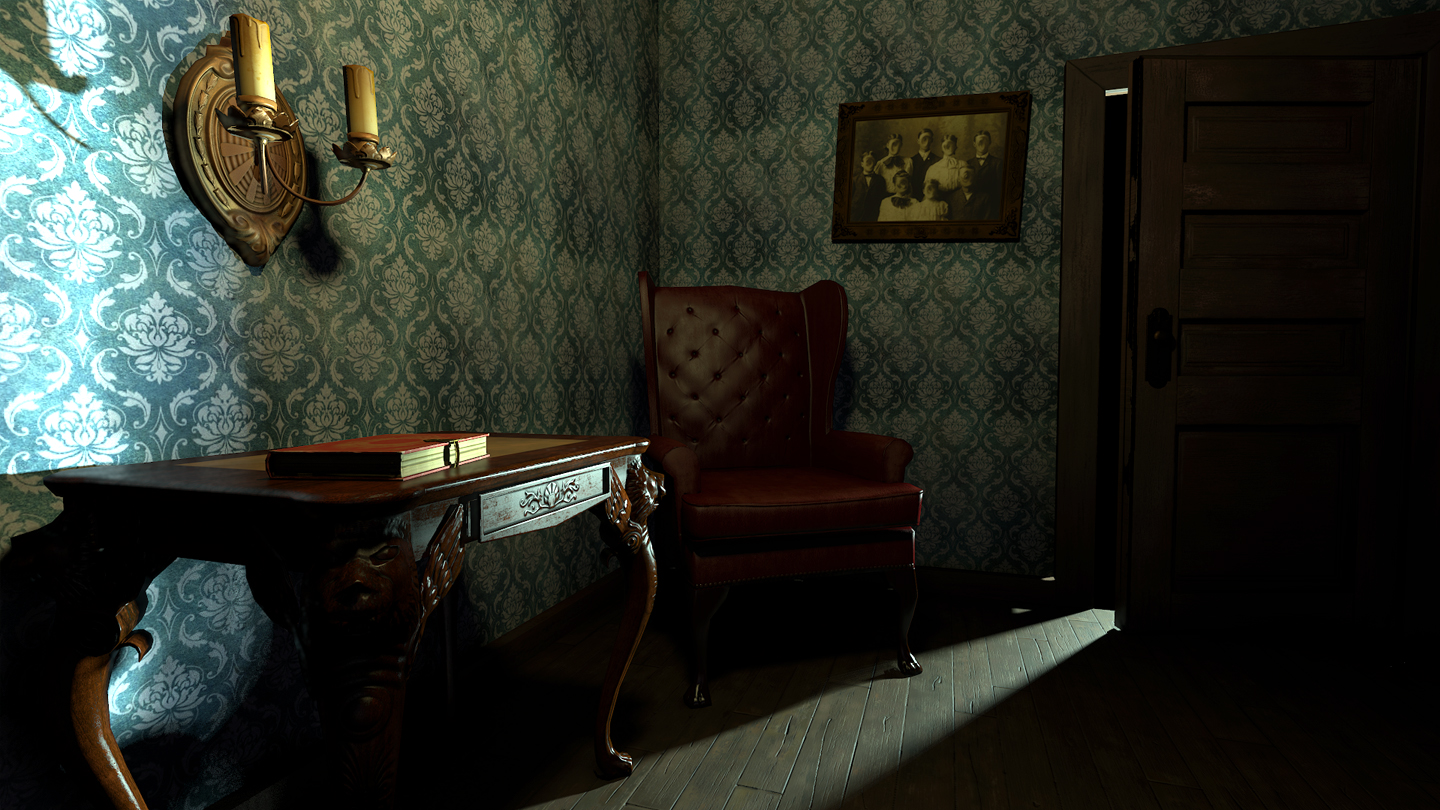
Old Victorian creepy interior scene
Hey all -
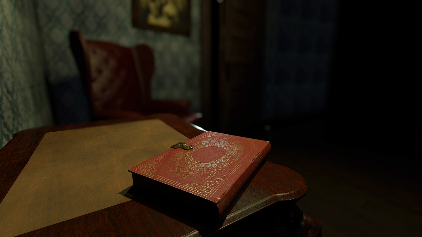
Been working on this scene and would like some feedback. Anything I should add to make it more interesting? Looking to make this a portfolio piece, so please critique away!
Rendered in Marmoset. Though I do plan on bringing this in to Unreal at some point.
I can post individual assets and flats if needed!


Replies
@griffiti - The thing to me thats missing from the composition is lack of personality in the scene. I can't figure out whats missing or what could spice it up a bit. As for composition, I was trying to guide the eye to the table and the book on the table by using the light coming from the door. In turn this would also guide the eye to the candle holder right above the table.
I also don't know if I can do layered shaders in Marmoset? I have never done it in Marmoset before...hmmm. But good advice on that one, the wall always did look a little stale to me.
@mats effect - Good call - I threw a plane behind it this morning to get the light to reflect back and it makes a ton of difference. No the outside lights up. I guess I wasn't really thinking about that area since I was focusing mainly on the interior of the room.