Charmed House (Halliwell Manor)
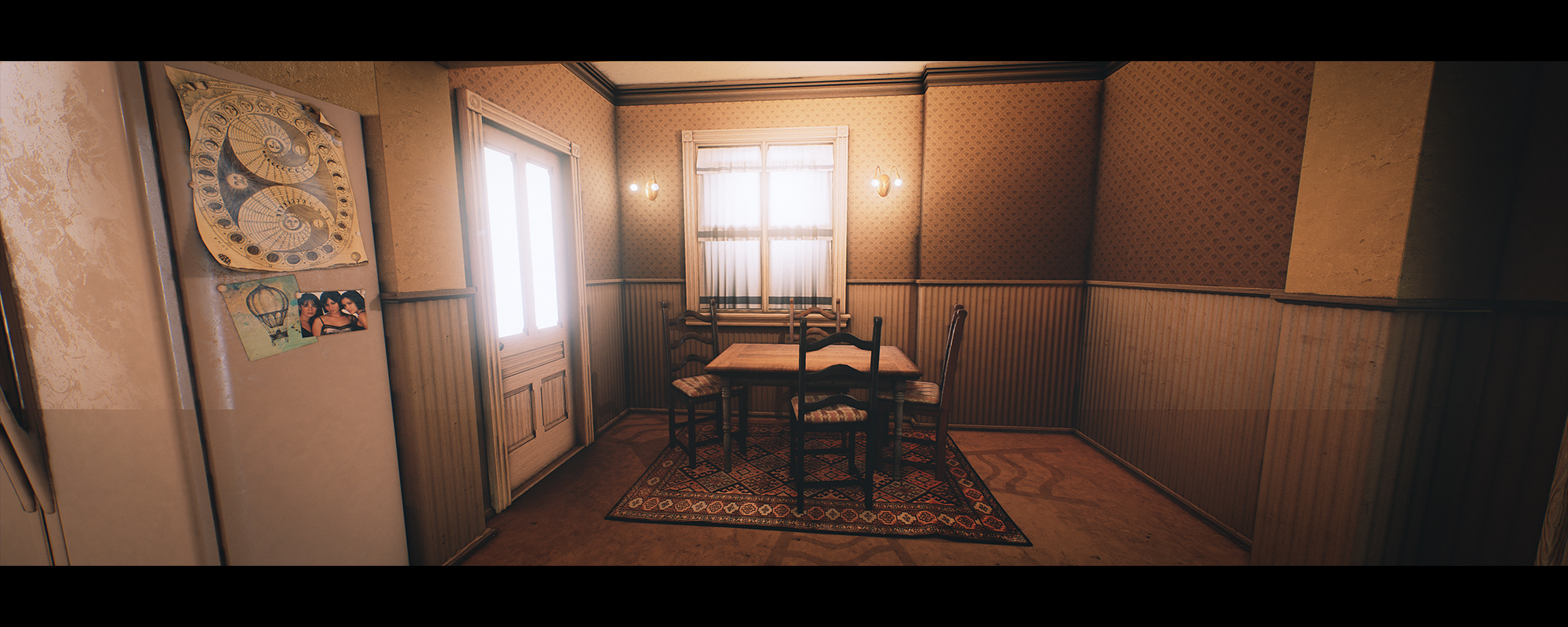
Hello! I'm new here so I hope I do everything correctly. I've recently started a project for a game level based on the house from the TV series 'Charmed'. I've been at it for about a month while doing studies and thought I'd post it here for some critique. So far I am about halfway through completing the kitchen area. I'm modelling it in 3ds Max and have taken these screenshots from Unreal 4. I'd appreciate any thoughts or comments. Thanks guys!
Here's the reference images I've used for the kitchen:

And my version:
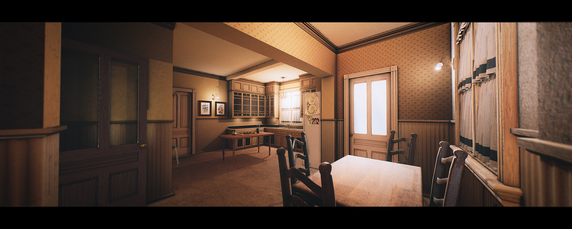
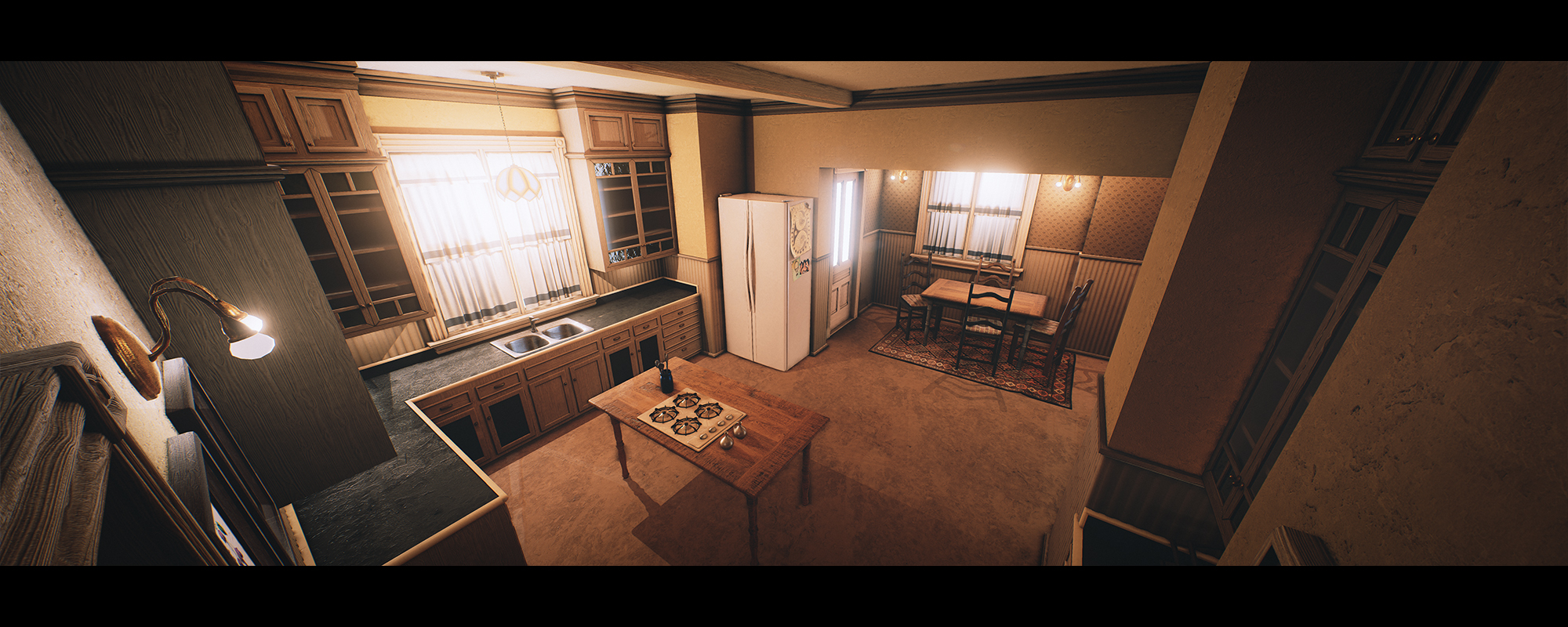
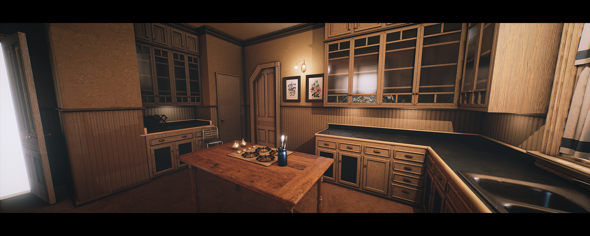
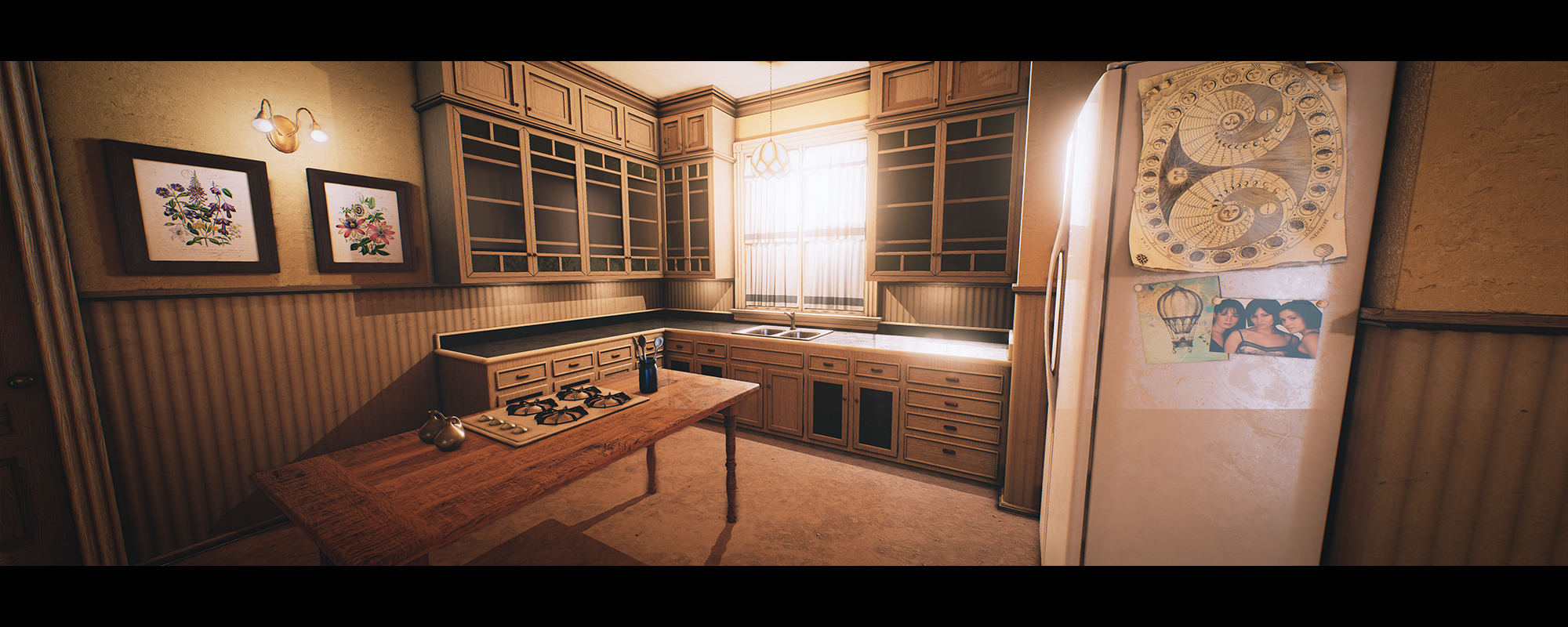
Here's the reference images I've used for the kitchen:

And my version:


Replies
One of the smaller nit-pick items that stood out to me is "texture detail" bumps seem a bit extreme in some areas. Such as the wood grain int he first image and the counter top in the second.
Also the stove top on the table makes no sense to me and where it would get its fuel/power from, but it is true to the reference
Can not wait to see how this progresses!
Nice work with the scene, it's definitely coming along really well. There's a couple of critiques I'd like to put out for you that will hopefully improve the scene.
- Chamfer the edges of the wall corners, there's a really sharp edge between a lot of them and it's kinda telling that it's still CG and you could push the realism a lot more since nothing in the real world is truly sharp edges like that.
- The shadows projecting from the desk and chair seem be a bit harsh and too sharp, see if you can soften them a bit.
- Your ambient occlusion is a bit too heavy in my opinion, it's a pretty common thing to go a bit overboard with the ambient occlusion but doing it wit subtlety is the key. In real life, soft shadowing and indirect lighting doesn't really work like that so I'd recommend to tone it done and make it softer.
- Put some normals on your glass since it's a little too perfect at the moment, it needs some slight surface detail to make it look more realistic.
- The bloom coming from the windows and doors seem a little bit excessive, it doesn't really make sense too because it's a really dark room and the outside of incredibly bright. My mind doesn't really accept it as you'd expect either the outside to be darker or the inside to be brighter.
- In your last image, you've got some weird cut off with the normals? There's like this lighting seam along your fridge and the wood panels on the wall to the right.
Anyways, hope this helps. Good luck!
Here's a before and after:
[ame]
Here's a picture:
One thing that caught my eye in the kitchen is the table with the stove top. It seems a bit odd that there is no space underneath for parts, or wires for what would connect to the burners. Even if it was electric and not gas, there would still be some components within the table. In modern kitchens, this stuff in normally hidden within the base of the island.
Maybe just give that table some more thickness (like the one with the chairs) or something to imply there are parts to the stove top under there... just a suggestion
Any tips and tricks that you did for the lighting?