Sephiroth
hello! I'm beginning a new project to enter into the Retrogasm competition, rub by Hazardous and his associates.
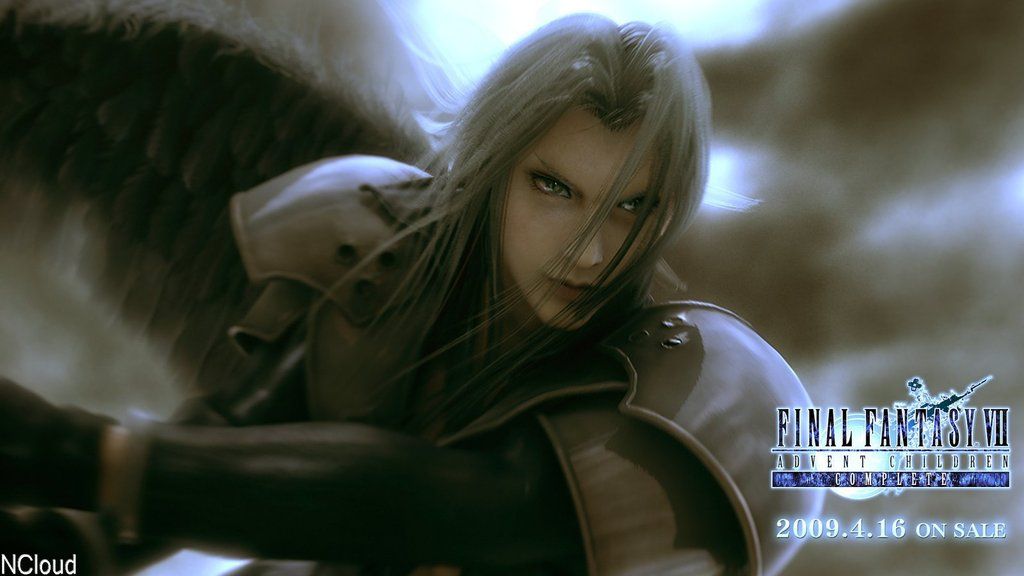
I have chosen to create Sephiroth, one of my all time favorite characters from one of my favorite games.
Presenting...

I would love to have constant feedback as I'm going so that I can create the best possible fanart I can!
I have already made a little bit of progress, and I'll post that shortly. Hopefully someone will show some interest!
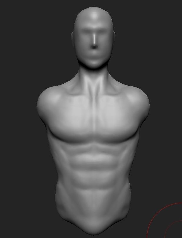
For now, here's the blob of clay I started with.

I have chosen to create Sephiroth, one of my all time favorite characters from one of my favorite games.
Presenting...

I would love to have constant feedback as I'm going so that I can create the best possible fanart I can!
I have already made a little bit of progress, and I'll post that shortly. Hopefully someone will show some interest!
For now, here's the blob of clay I started with.

Replies
Please let me know what you would change so far to make him more Sephirothy!
I provided a crappy paintover of the hair and eyebrows as it makes the translation easier.
Sephiroth is by far my favorite villain, i've even made him uh... a couple of times haha.
My biggest feedback right now is the shape of the body. He's very effeminate, not a "powerhouse" type guy, so i'd go with a more "trunk" like shape rather than the almost V shape the body has right now. His bulky shape is made up from his outfit and shoulder pads.
In terms of more nitpicky stuff, the neck area looks really unnatural, traps don't really curve the way his are. You're also missing or misrepresenting some of the major abdominal muscles, like the external obliques which are a very large flat muscle:
don't fuck this up, or i'll be pissed.
I'm not very experienced but I'm going to do my very best.
I'm actually just working on the face really, I just quickly gave him a torso based on this. I have a hell of a lot of anatomical stuff to fix, but really, It's his coat I'm scared of!
Thanks for the reply.:)
Hey, I did some quick work on it, is this a bit better? Also, what do you think of the face so far?
This is what i had in mind about the body proportions. You still need to soften a lot of stuff out (in my opinion), Sephiroth is clearly very fit, i'd say "peak", but he's not a beefcake.
As for the face, i think the eyes are a little too high up and too far apart. i'd also give him a "flatter" expression on his mouth for now. nailing the eye shape is super important for this guy, he basically needs big pretty girl eyes :P
Whats this comp? on fakebook?
Also agree with proportion comments.
I narrowed him out a lot as suggested, and I think you're right, it looks a lot better. I feel he does still need to have shoulders though. Every topless version of him does, and he looks very strange with almost sunken shoulders, we will see how it looks when more assets start coming together.. I made some small changes to the face. I moved the eyes together as suggested. Also, although his chin is not as pointy in his art as everyone seems to think it is, I did make it a little more point and angular, without sharp edges.
I spent so long fixing and then breaking his face, I ended up adding a placeholder playdough hair so I could better 'see' his face.
I'm still working on the anatomy and details and such but,I would love some feedback on his face and the proportions so far, thanks!
at the very least, model the arms in an A pose, i feel a T pose here would actually be worthwhile. Not sure how far you're planning to go with posing/animation or whatever, but remember that his idle-battle posture is this:
So his arms would be better suited at a higher angle. Granted, his jacket/shoulder pads would hide a lot of issues, but this is a "good practice" kind of thing.
http://crazyferretstudios.com/portfolio/hidden/viewer/ArmRef.html
here's some reference from a 3d scan, pay attention to bicep shape. sorry about the hard lines in places... my bad, polygroups.
I just recently got to work on cloud again, hard to get back in the groove. The dang textures/normal maps are what get me..
Keep it up though! I want to see this one finished