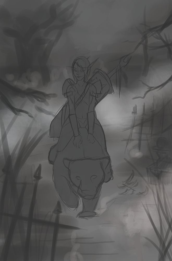
Eerie ambient death knight
Hi poly! I'm doing an illustration for a friend, it's his wow death knight and he loves jaguars, so I wanted to have her riding a jaguar in a sort of eerie/myst ambient. Both their eyes will be covered by blue smoke-y light but first I want to be sure that the composition works. I went for nothing fancy, just to keep it simple and focus on her and the jaguar.
So what could I improve about the composition before I finish the full values on them and start with coloring? Thank you!
P.S.: I'm having some problems with the mid and background too, I don't really know what to put there, now it seems like lost in the myst without anything noticeable Should I leave it that way to make the viewer focus on her or maybe add more trees?
So what could I improve about the composition before I finish the full values on them and start with coloring? Thank you!
P.S.: I'm having some problems with the mid and background too, I don't really know what to put there, now it seems like lost in the myst without anything noticeable
Replies
You should practice making value thumbnails when making decisions on composition. It's very hard to judge good composition based on elements in the picture alone.
It's actually quite a complicated picture to perform, so hide as much as possible with smoke and fog!
I tried to do a quick paintover to give you some ideas
A couple of tips:
* keep contrast where the focus should be
* have good value hierarchy to help guide the viewer
* when you have fog and smoke, hide stuff.
* don't make the composition too balanced, have small stuff and big stuff, not even stuff.
* judge the abstract shapes in the picture, the more cohesive and pleasing the bigger abstract shapes are, generally the better the composition is.
I'll apply the contrast and myst tips when I return next monday from a trip. Ty again, you were so useful!
So I changed it to a wallpaper version at 16:9 rate since my friend asked to have it as that and I thought that I could practice backgrounds more doing it.
This is what I got so far, her colors aren't final, they're just a reference to what I'll overpaint. I'm thinking about making the jaguar white instead of orange but I don't know how that would affect the composition.
I went towards a more swamp feel rather than woods, but I'll add some more myst I think. I'm still not satisfied at all with the background, any tips, please?
to answer the question, that background has a lot of detail and crispy edge treatment from the photos you've used- it will sit in more if you either a: bring more of the high-frequency noise/crisp edges into the rest of the painting, or b: knock down those edges with blurs/smudges/whatever. In terms of value, the bright yellow greens there are jumping out a little bit. I think your next big step on this should be to ignore the background for the moment and hone in on the focal point though- if the render on the death knight and jaguar get tightened way up, everything else will work a bit better anyway.
looking good. keep at it!