Home 3D Art Showcase & Critiques

Fox and chicken: handpainted diorama

polycounter lvl 11
Offline / Send Message
Savannakhet polycounter lvl 11
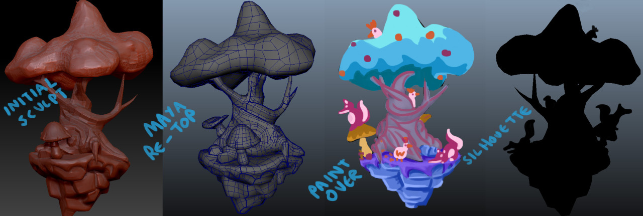
TLDR: Latest version

matthew-wells-foxtreeren-07.jpg

I'm making a small diorama that will features some foxes and chickens playing hide and seek.

My goals for this piece are:

Trees: I'm not very good at them so I'm making one the central focus of the piece

No Alphas. I want to do low (ish) poly foliage which doesn't use alpha/mask maps because these are pretty expensive in some engines.

Story: My scenes are always a bit sterile so I want the scene to 'tell a story.' It'll be quite simple: some foxes playing hide and seek with some chickens, but hey, you gotta start somewhere.

Characters: I don't do these much either, so I'm going to start with a fox and a chicken; again, simple to begin with.

This is what I have so far.

tumblr_nl5p7vyHSM1tdmr7bo1_1280.jpg

Replies

  • Odow
    Options
    Offline / Send Message
    Odow polycounter lvl 8
    cute^-^

    maybe do something more round for the tree top like this one. I think some flower on the grass could be cute and add a Pop of color

    Also game engine are strong enough to support tree nowadays, i remember seeing in a blizzard contest post that they allowed up to 1k poly for a tree in WoW and wow isn't the most next gen game by far, you could almost play with the computer you had during vanilla and it will still be okayish.

    4c6f0aa2748e078c841415dd6b56e51a.jpg
  • Savannakhet
    Options
    Offline / Send Message
    Savannakhet polycounter lvl 11
    Um, havn't had much free time lately for one reason or another. Here's an update..

    tumblr_nm1kiqWnLe1tdmr7bo1_1280.jpg
  • Savannakhet
    Options
    Offline / Send Message
    Savannakhet polycounter lvl 11
    It's coming along slowly: I need to rebake shadows/ao and the canopy is still very very WIP

    tumblr_nn1zl2Vyj11tdmr7bo1_540.jpg
  • ChillyWalrus
    Options
    Offline / Send Message
    I really really like the way this is going. The scene, the style, the colors and the details.
    As you said the canopy is still wip. The only thing I'm not sure about are the chickens. Color-wise they are pretty close to the mushrooms. I'm having a hard time telling them apart from objects behind them.
    Looking forward to seeing more.
  • Savannakhet
    Options
    Offline / Send Message
    Savannakhet polycounter lvl 11
    I've shifted the colours so that the chicken and foxes don't get lost against the tree. The Canopy is too low rez mext to the rock, so I'm going to have to jiggle the UVs about a bit.

    tumblr_nnnr2orMPB1tdmr7bo1_1280.jpg
  • urgaffel
    Options
    Offline / Send Message
    urgaffel polycounter lvl 17
    Looking good but I quite liked the white chickens you had in the paint over. It would help them stand out more compared to the fox and the background. Maybe make the fox more red/less blue? With those changes you could bring some red/brown back to the tree trunk which would help separate the diorama a bit more. At the moment it's all very purple/blue which makes it all merge together to an extent. Maybe try out some colour schemes with solid colour and no detail to help pick the right combination?
  • Savannakhet
    Options
    Offline / Send Message
    Savannakhet polycounter lvl 11
    Ok, I've tried out some alternate colour schemes:

    tumblr_no1tz8uurg1tdmr7bo1_1280.png

    Anyone have any opinions on which one or which combination would be best? I'm tending towards E or F at the moment.
  • pangarang
    Options
    Offline / Send Message
    pangarang polycounter lvl 11
    Hard to choose because it's all up to personal taste at this point. But in terms of my preference ...

    I'm partial to C and D.
    A, E and F have too much blue overtones.
    B's palette doesn't work for me. Tree trunk colour contradicts everything else.
  • KWAN
    Options
    Offline / Send Message
    I would pick D or E , the colors work and the fox and chicken don't get lost in the comp.
  • dry0n
    Options
    Offline / Send Message
    dry0n vertex
    I like D the most
  • Kaine123
    Options
    Offline / Send Message
    Kaine123 polycounter lvl 10
    Give her the D
  • .nL
    Options
    Offline / Send Message
    .nL polycounter lvl 3
    I was going to tell you to F it up. But no. It needs the D.

    But in all seriousness, D w/the bark of C, is what I'm thinking might look best.
  • Christian Nordgren
    Options
    Offline / Send Message
    Christian Nordgren polycounter lvl 11
  • Nuclear Angel
    Options
    Offline / Send Message
    Nuclear Angel polycounter
  • PacoCasares
    Options
    Offline / Send Message
    PacoCasares polycounter lvl 11
    But in all seriousness, D w/the bark of C, is what I'm thinking might look best.
    Second this, or, put it up to see how it looks like
  • Savannakhet
    Options
    Offline / Send Message
    Savannakhet polycounter lvl 11
    Well, the consensus seems to be D.
    .nL wrote: »
    D w/the bark of C, is what I'm thinking might look best.
    Second this, or, put it up to see how it looks like

    Gave this a try, but I don't feel that it works too well.

    tumblr_no7l6tHPUs1tdmr7bo1_1280.png

    Also adjusted the colour of the mushrooms/hen in a few variants
  • pixelpatron
    Options
    Offline / Send Message
    pixelpatron polycounter
    D 2 has the best contrast, yet I'd go darker with the grass (darker than the tree)...and I'd try a different treatment for the tree texturing. As far as the tree canopy top; I'd prefer to see separate tree bushes/elements (The tree top looks more like a sombrero atm.)

    Make the bottom jaw of the fox flat, it'll read better and help the silhouette.

    attempt a less shadowed version of this type of texture for your tree? (leaves only, your trunk is better...)
    f1398263-f833-470f-a0d4-abeb8b066ecf_scaled.jpg
  • Lucas Annunziata
    Options
    Offline / Send Message
    Lucas Annunziata polycounter lvl 13
    Consider getting a little bit more lighting info in this?

    l2m4fQ2.gif

    GRADIENTS ALL DAY!
  • Savannakhet
    Options
    Offline / Send Message
    Savannakhet polycounter lvl 11
    I Had a free afternoon so I looked at the Lighting, making the foxes jaw flatter, doing some proper leaves (the sombrero-canopy isn't working)

    tumblr_npmlnc2nGN1tdmr7bo1_1280.png

    I'm going to redo the grass texture next. I want a nice chunky feel to it but the present texture doesn't support that: the fine blades of grass look weird on geometry that curves round into the rocks. I'll make it a bit swirly to tie in with the swirly pattern motifs on the tree.

    Any thoughts/opinions?
  • DavidCruz
    Options
    Offline / Send Message
    DavidCruz interpolator
    I'd attempt to achieve a version as Lucas suggests, it helps make the colors pop and that gradient technique can be done to everything shown.

    It would really look great if you managed that, I would also suggest alternate rows of the leaves so variations that possibly follow the gradient from the peak to the base.
    So say 3 - 5 rows of different leaf colors following the gradient pattern for a nice effect.
    Shouldn't be impossible find a spot to drop 2 more leaf uv's and give them the same gradient lighting value as the bush bg.

    Looks really cool and as long as you continue it will only get better.
    GL!
  • pixelpatron
    Options
    Offline / Send Message
    pixelpatron polycounter
    Tree not quite there....I'd suggest figuring out a small bush as a mini side project (you can use the same assets textures you've started with....)

    Figure out something that looks good on a small scale prop, then apply your knowledge to the bigger asset. Try different things, scale, leaf spacing, vertex coloring, alphas, alpha as a base for the main shape....etc.

    Some good homework is to find some samples of the tree you want to emulate and go for that. (the stylized trees in Mario Kart 8 are amazingly simple yet very beautiful/convincing.

    mariokart-8.02.jpg
    71BBPUMc4iL._SL1280_.jpg
  • SeveredScion
    Options
    Offline / Send Message
    SeveredScion polycounter lvl 12
    I love how this is coming along!

    I don't really think the original leaves work well with the new leaves. The new leaves look great and read as leaves, even from a distance. The original leaves look like a symbol that's supposed to represent a leaf. On the old leaves, the light outline and light interior lines contrast strongly with the dark fill, and that contrast behind the new leaf-shaped leaves gives me the impression of a watermark or a corporate logo. The style of lines on the old and new also clash to me - old has thick uniform lines like chisel-tip marker, new has thin varying lines like felt tip calligraphy brush. At the very least I'd advise making the hues of old and new match more closely.

    I see the challenge in defining the extents of the grass in the dioroma while creating a contour that fits the scene. The spiral motif is a good way to solve that. And it makes sense to include the spiral motif elsewhere to add harmony/unity/balance to the composition. However maybe this is just me but I feel like spirals are kind of overdone in handpainted wood, and are pretty unrealistic, moreso than the other stylization in your scene.

    One other thing, the fern/aloe looking plant (the one at the left in the "current version" and at the right in the "paintover")...it looks great, but it appears to be a way higher mesh resolution than everything else in the scene. It's jarring seeing that plant looking smooth and curved while other plants and the tree roots are noticeably faceted. Neither is wrong or right in my opinion, just a weird resolution inconsistency.

    OK now that I've picked it apart, I'll say, I really love this scene! The color scheme is great and your handpainting is really playful and appealing! Keep at it!
  • Savannakhet
    Options
    Offline / Send Message
    Savannakhet polycounter lvl 11
    Ahh yes, where were we?

    I've made the canopy 'fluffier' by trying to mimic Airborn's trees. I've also painted over the grass texture with the swirl motif, which looks OK in some places and like a carpet from the seventies in other places.

    tumblr_nvpq8sRM8U1tdmr7bo1_1280.png
  • Savannakhet
    Options
    Offline / Send Message
    Savannakhet polycounter lvl 11
    One other thing, the fern/aloe looking plant (the one at the left in the "current version" and at the right in the "paintover")...it looks great, but it appears to be a way higher mesh resolution than everything else in the scene. It's jarring seeing that plant looking smooth and curved while other plants and the tree roots are noticeably faceted. Neither is wrong or right in my opinion, just a weird resolution inconsistency.

    Mmm, I don't think it's too bad. I take your point about the old leaves looking incongruous though.

    tumblr_nvprhaz6A31tdmr7bo1_540.png
  • SeveredScion
    Options
    Offline / Send Message
    SeveredScion polycounter lvl 12
    Oh man, that canopy looks way better! Love it!
  • Savannakhet
    Options
    Offline / Send Message
    Savannakhet polycounter lvl 11
    Bit of fine tuning after getting feedback from a friend. I made the leaves smaller and the texture less sharp looking, also I got rid of the old canopy texture underneath.

    tumblr_nvtlaubqPg1tdmr7bo1_540.png
  • Savannakhet
    Options
    Offline / Send Message
    Savannakhet polycounter lvl 11
    [SKETCHFAB]fb6c3db8eda04c8184665dd6efa7c2f9[/SKETCHFAB]

    Also, I've loaded it onto sketchfab.
  • JamieRIOT
    Options
    Offline / Send Message
    JamieRIOT polycounter lvl 6
    This is looking gorgeous.
  • Savannakhet
    Options
    Offline / Send Message
    Savannakhet polycounter lvl 11
    Ok, I think i'm done. Here's a Marmoset Render:

    matthew-wells-foxtreeren-07.jpg

    The perils of making a predominately vertical model in a horizontal 1080p world.
  • SeveredScion
    Options
    Offline / Send Message
    SeveredScion polycounter lvl 12
    I love how this turned out. Looks super nice! The choice of hues and saturation, the shape of the leaves ...yeah!
Sign In or Register to comment.