The BRAWL² Tournament Challenge has been announced!
It starts May 12, and ends Oct 17. Let's see what you got!
https://polycount.com/discussion/237047/the-brawl²-tournament
It starts May 12, and ends Oct 17. Let's see what you got!
https://polycount.com/discussion/237047/the-brawl²-tournament
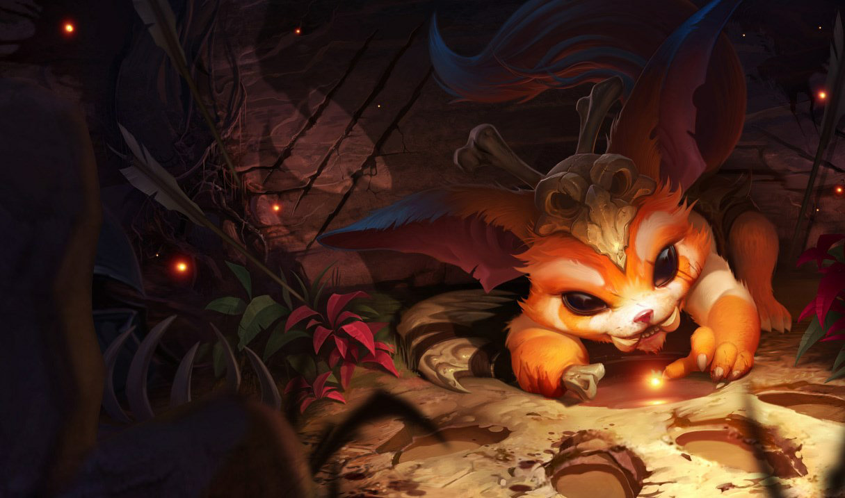
[Riot Art Contest] - Gnar
Hellou  decided to do Gnar Splash Screen.


Replies
Still thinking about doing a different concept or even choosing different champion. :poly118:
Can I PM you for some art advice? I _really_ like your style.