Catell-Ruz: Dofus, Descent, Hearthstone stuff...
Hi there!
I'm a French concept artist and illustrator: I mainly work on video games and boardgames. I worked 3 years as a full time 2D artist at Ankama on Dofus (an MMO game) and I am now a freelancer. I'm a noob here, but I hope to have some critics from the Polycount community to improve my art: there are so much talented artists here!
Some of my works:
Dofus (2012)
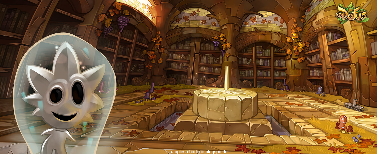
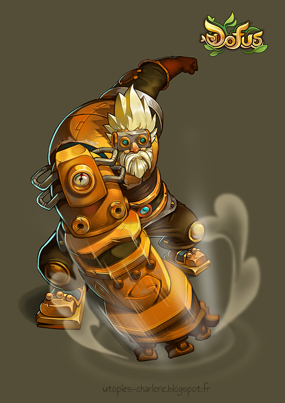
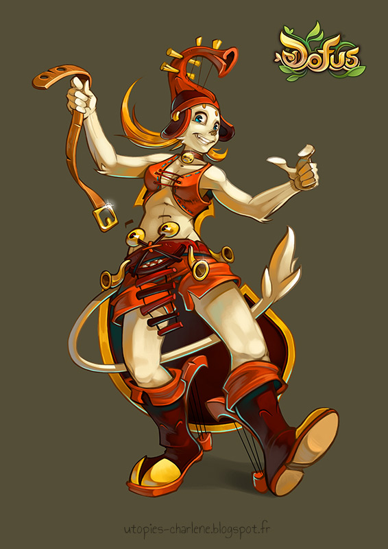
Hearthstone fanart (2014):
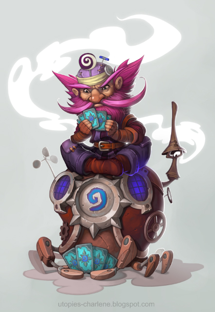
Descent: Journeys in the Dark Second Edition (2011-2012):

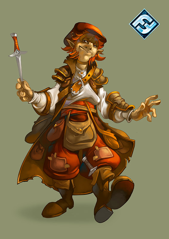
Unannounced casual game (2014):

I'm a French concept artist and illustrator: I mainly work on video games and boardgames. I worked 3 years as a full time 2D artist at Ankama on Dofus (an MMO game) and I am now a freelancer. I'm a noob here, but I hope to have some critics from the Polycount community to improve my art: there are so much talented artists here!
Some of my works:
Dofus (2012)


Hearthstone fanart (2014):

Descent: Journeys in the Dark Second Edition (2011-2012):


Unannounced casual game (2014):


Replies
Welcome to polycount, cool to see more 2d guys starting to hangout here.
What sort of things are you looking for critique on? For the most part this stuff is pretty solid, but i guess you are looking for feedback to push you to the next level?
I've only seen the Dofus art books, but I'm curious how you guys concepted your iso tile environments. If there's a particular method that you follow.
Looking forward to seeing more of your art. Thanks!
Muzz: Glad you like it! Well, I'm looking for critics to help me to make better colorization, something closer of the concepts of the American fantasy games like WoW or LoL. I think the three main things to improve in these illustrations are the anatomy, the back lighting and the lineart (that is still too visible), but maybe there are other problems!
Stinkhorse: Thanks!
MagicSugar: Yep, Ankama is an amazing studio: I must confess I would have wanted to work longer for them ( I prefer working as an employee instead of working as a freelancer!^^) but I moved far from the studio. Their animation department made the animated series "Wakfu" and "Kerubim", and they are working on the Dofus movie now.
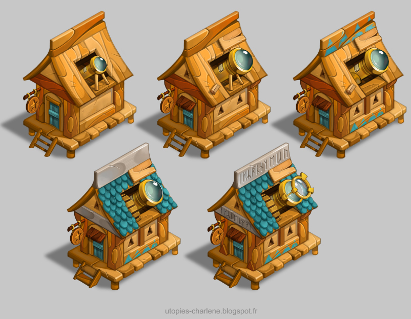
For the iso tiles, we used to make the sprites with an isometric grid to build quicker the elements with Flash software. Then, I think it's like the 3D games: we had a data base where we were able to use some older sprites: we just had to pick up the elements we wanted. (the "Symbols" in Flash are like a PSD in Photoshop, you can have many layers and elements in them)
For example the roof tiles on these towers come from older Dofus sprites. Then I changed the color, the perspective with the Flash tools.
Here is an example of the concept arts we used to make before creating the in game sprites.
Anyway, here are some personal works I made recently...
@Catell-Ruz, oh yeah. Saw that Zynga's hiring for sr. concept artists. Not sure if that's something you'd be interested in. Check their linkedin for details.
Star Wars franchise also has a mobile game going. Not sure if that division's hiring though. Star Wars Commander.
Thanks for posting about the iso tile work. I'm always curious about that workflow.
So I've been thinking about how exactly would you give constructive feedback to work this solid and still push you to do more, and i came to the conclusion that it is really difficult because the work you are showing here is so strong on every level. So really offering feedback on work like this would be in the realm of nitpicks and not terribly useful.
Instead I'll say that if you want constructive feedback, and not just from me or polycount, you really need to be showing us the work where you are trying far more ambitious things than you are currently doing, and showing us where it isn't quite working, and then we'll be able to help a bit more. For example if you want critique on anatomy, posting some life drawings and more realistic attempts at anatomy would be a great place to start.
Ontop of that I'd say that while it's not a problem persay, I'll notice there is very little in the way in the variance of style between the dofus work and your own work.
Does that make sense?
In the Iso buildings you got there, specially in the wooden house, I'm missing a bit more contrast in between shadow and light sides. But could be that the style guides were specifically asking for a smother contrast.
Agree with Muzz in any case, more personal stuff! XD
I just realize that I have a lot of your building related stuff in my pinterest reference files XD.
The runes here:
This is the same as writing "QWERTYUIO" on it as a decoration. Runes are part of an actual alphabet. If you use literal historic runes as you did here (though some are inverted), or any other actual exotic alphabet, then the text should mean something - otherwise, like I said, it's the equivalent of writing "FGHJKL" as a decorative element...
Attention to detail like that - going and looking up actual old norse words for the runes as opposed to just jumbling them together - would show dedication. If this is not desired, I suggest using "fantasy runes" instead of the actual historic runic alphabet which you used here.
Imagine taking Sanskrit and writing "FGHJKL" in Sanskrit letters on your model. Same deal. few people in the US or Europe can read it, but others can. Same deal with Chinese fantasy words on those signs that are so trendy.
That is true, it is not worse than putting horns on helmets in a game that's supposed to portray vikings. I'll give you that. I'm just saying it irks me. Every. Single. Time. I. See. It. (I'm a Dane and loosely interested in Norse history)
It just makes me think "wow, these developers didn't even do their basic research."
I wrote a blurb in case anyone is even remotely interested to do runes right. I'll leave this thread alone so the art can be discussed without further "derailment".
MagicSugar: Thanks for the tips! I think I'm too young to be a senior artist, but it would be so cool to work for Blizzard: I'll try to see if there are other available positions!
Muzz: Thanks! Yes, my personal works look like to Dofus stuffs, in fact that's the reason why they had decided to employ me some years ago, because my universe was already close to their game, before I started working for them... But it would be cool to explore other univers, and I agree, drawing realistic characters could be a good starting!
IosuPalacios: Good advice for the lights and the shadows, now that you mention it, I realize this concept is different and less contrasted than the other buildings of this series. Too late to correct it, but but I'll pay attention to it next time!
kneedeepinthedoomed: You're right! I used this alphabet because the studio for which I worked asked me to put some "magical" runes. I didn't think it could have been more interesting and probably more respectful to translate some real words instead of using this alphabet just as decorations without meaning, and that's a mistake. I thank you very much for this advice, I'll use it in my next works!
Here are some other character designs and buildings I made a few months ago for a personal project... Unfortunately, I think I won't have enough free time to finish it.
Here are some other fan arts: the first one is for Wildstar, and the the second one is for Hearthstone, again!
My favourite class was the sram and sacrier :P
@Kryzon: Something between 4 or 5 days? I must confess I made these houses on my free time, in the evening, when my freelance work was finished.
Here are more concepts!
this is really awesome stuff, they look so inviting to 3d model.
They are! I can attest to that
well at first I have to say that I really admire your work, it's really playful and creative and affects my imagination/fantasy in a very pleasing way..
It's really a kind of complicated task for us to criticise your stuff, especially for myself, since I'm nowhere near your skill-level and it's a kind of blasphemic attempt to try it as the noob that I am^^
But I tried.. and I looked over these pages and recognized a few (VERY small) things here and there. It's really my subjective opinion and if some things stated are likely complete bs so correct me please.
So..
#1 - MATERIALS
You could probably work on materials, metal/fur/fabric/skin f.e. (I'm very fine with wood^^) .
You do an outstanding job at separeting things with color and form, but at second look it kinda feels a little flat (maybe this has to do with the artstyle)
Example: Especially the characters.. The first "numa"-character's clothes could use some more texture to extend that slight rotten look..
I think you know what you can do about it
#2 - CLOTHES
You do a very good job on placing details on your character's wardrobe to make them look interesting and pleasing viewers eyes, but perhaps you could make them more reasonable..
Those knee- and shoulderpad-stuff is really fun to do I admit that, but sometimes it makes no sense and doesn't add to the character but only for it's visual pleasure. (i'm not sure if my words and grammar are always correct, it's not my native language, so don't mind me^^)
Example: That "Descent"-robber. He doesn't need shoulderpads imo.. (he has a dagger in a throwing-position in his hand and it would for sure hinder his throw-attempt)
His collar could be not buttoned as the character doesn't appeal to be a guy whom would care such stuff.. in fact it makes him look more reserved..
Fashiondesign researches could be helpful to get new ideas, to get away from to comfort-zone..
#3 - FACES/EXPRESSIONS/HEADS/PERSPECTIVE
Characters again.. Here again I see a kind of comfort-zone you (reasonably) don't want to left. Every character head/face seems slightly (REALLY slightly
Don't get me wrong, your're covering it perfectly with light/shadow and whether a front or a slightly tilted left/right look of the faces but I recognize it, since it's my very own problem with drawing characters..
It shows with the mage from "Descent", it gets fuzzy in this part of the image..
You also seem not to vary much with the expression in their faces, stating from the work in this thread.
Furthermore I recognize that your characters scream for more exaggeration then you would allow them to look like. That has probably to with the artstyle you have dedicated to, but I would suggest you could explore this section of your art further..
I'm very fine with the buildings (I'm not into architecure that much, I guess someone else could give advise about reasonable vs. not reasonable)
Maybe it's not major or you have stuff where you clearly prove me wrong, but these are the things you could lay a hand on if you want to improve your art.
In short: Distinction through Materials / Design vs. Characterbackground / Appeal through Anatomy/Variance..
Well.. but really really topnotch work you have there, I really appreciate it.
Cheers