Mine shaft, or something..

polycounter lvl 11
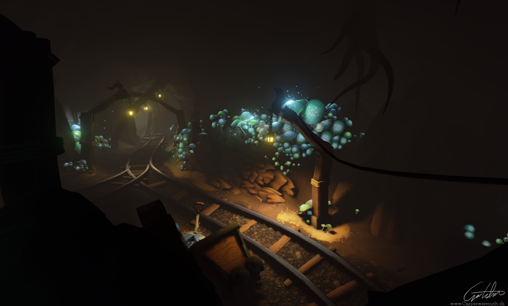
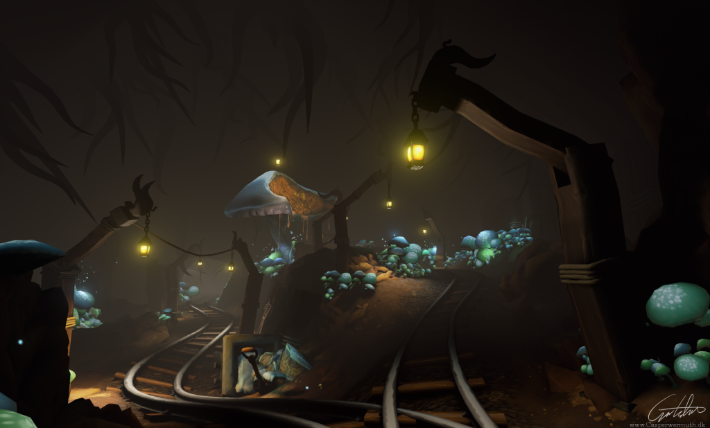
Latest screengrabs:
// Back to being chronological")
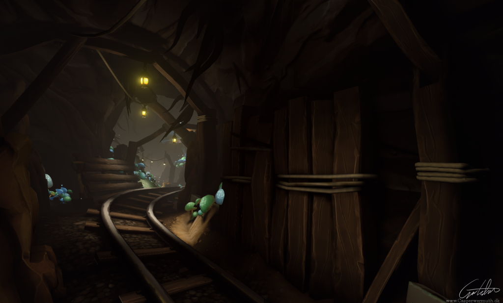
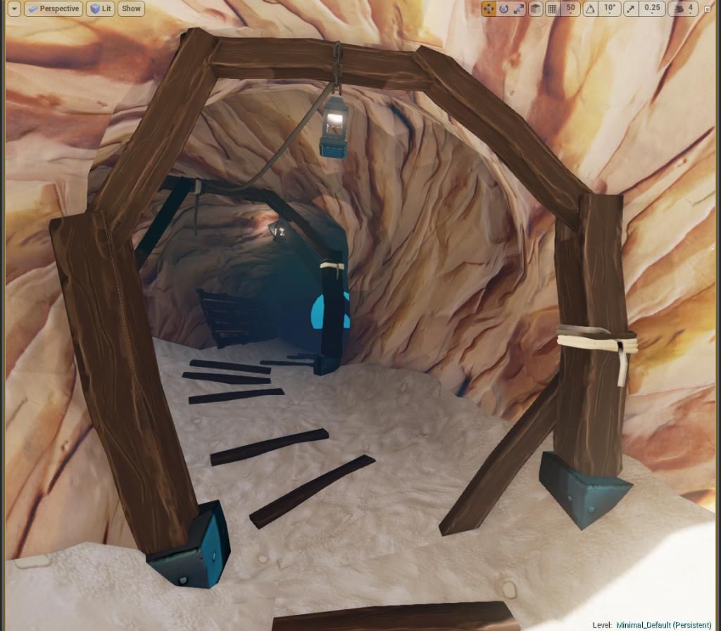
I was just playing around in ZBrush, trying to set up sexy hotkeys and UI, and ended up having made a rockwall. So now I intend to make it into a small environment.
Like the "Scifi hallway", this will be a "rock hallway, I guess ¯\_(ツ)_/¯
I don't expect much feedback yet, as I am so early in, but if someone wants to give some, I would love to hear it. I have never done stylized stuff before. (which this is supposed to become an attempt at)
// Back to being chronological
I was just playing around in ZBrush, trying to set up sexy hotkeys and UI, and ended up having made a rockwall. So now I intend to make it into a small environment.
Like the "Scifi hallway", this will be a "rock hallway, I guess ¯\_(ツ)_/¯
I don't expect much feedback yet, as I am so early in, but if someone wants to give some, I would love to hear it. I have never done stylized stuff before. (which this is supposed to become an attempt at)
Replies
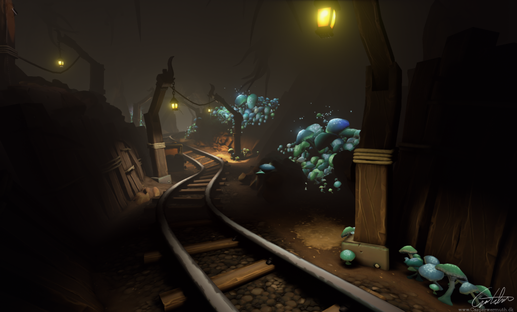
Im thinking about adding some tents or something to that big room.
And of course a mine cart!
Does anyone know why my terrain is getting lit in this weird manner? It seems to completely ignore what is going on in the scene. Any ideas on this?
Maybe the answer is... fungae! (?)
The problem is the lighting. Everything looks so washed out and lacks contrast. In the top screenshot I don't get the feeling that the light is emmitted by the small lamps at the ceiling.
Next thing is terrain: u need some small rocks as geometry on it. And something more that dry sandish floor. Also very bright.
Also please provide higher resolution images, We cant say shit now
Anyway subbed.
Don't scrap it, still much could be learn't from this one.
Good luck!
EDIT: Oh, didn't seethe replies! Thanks a bunch guys!
Thanks for the specifics. Will take a look at each point before next post
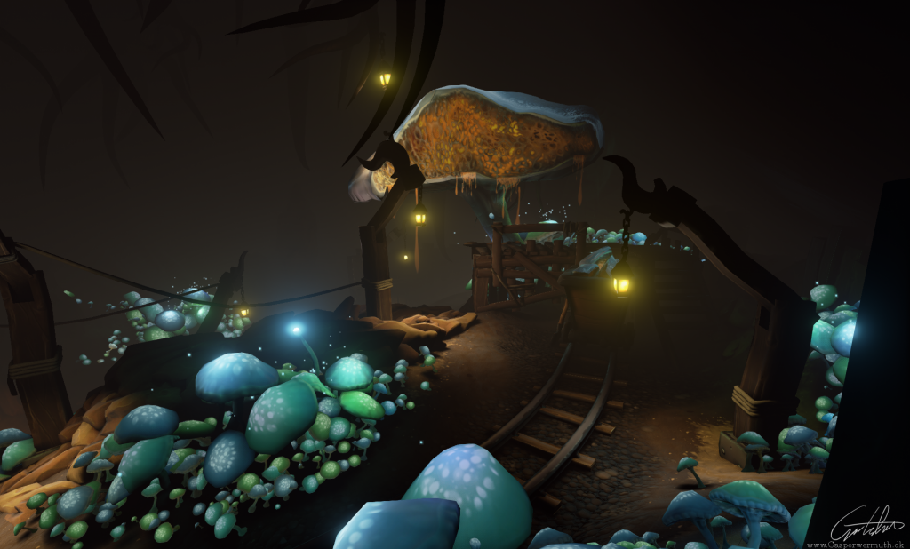
I dont know if this most bright point on entrance is good. Dont know what to do with it. But it catchs too much attention.
Yeah, I intent to make the top of the rails more polished or brighter, and the sides more rusty looking, to see if that works. You are definitely right on this one. As for the bright entrance, it is simpply because the terrain ends. It is fixed now. Thanks for pointing it out
Thanks, axxic. I will look into that
Also I love the set up of your scene! The layout is really appealing to the eye.
The lightbounce thing helps give more contrast, but it makes the overall lihgting much less sexy, obviously.
How else can I achieve it, the contrast?
Here, for example, the light bounces up to the ceiling, whereas I like it much better unbaked, where the cave is just black with the roots as silhouettes.
I tried playing with some terrain blending for variation. Right now it is just a solid 3 vector to test it out, as I was hoping to create some moss, or whatever, but I dont quite think it works.
The weakest point is by far the overall lighting, in my opinion.
If anyone have any idea about how to add that more contrasty light, I would really appreciate it
Other than that, I might want to try some glowy stuff (particles?) around the mushrooms, and a "hero mush" that is being farmed near the mine cart, is the idea.
EDIT: For some reason the image isnt enlargable. Im using Photobucket, and it is uploaded big res there. Anyone know how to solve this?
Progress so far:
Putting in some other colours would take this a lot further too, perhaps only have 2 or 3 laterns to control focal and complimentary smaller lights (Mushroom ambient glow or a skylight?)
Have fun, you can still push this a lot further
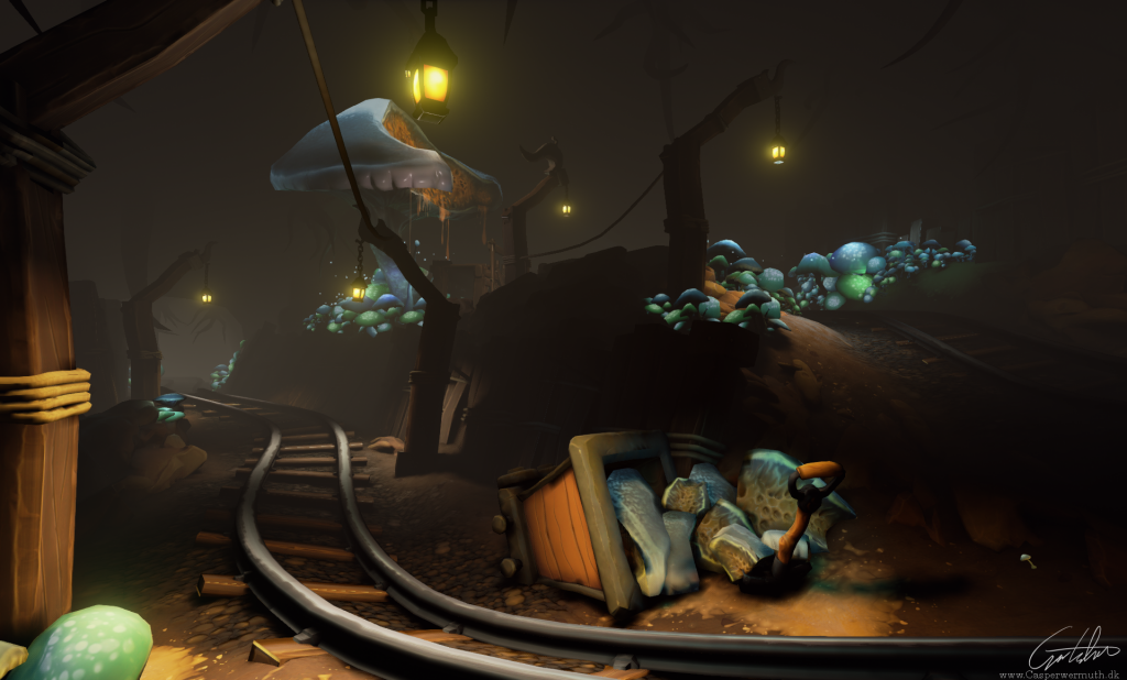
I have wanted since the beginning to put something under those tracks, but I wasnt quite aware what was fitting. What is turned mud?
Good idea with the lanterns! I think I will try to play with their intensity instead of removing them, though. Great idea!
Again, thanks a lot for taking time to do this.
So it's not quite where I want it yet, but I can easier adjust it from now on.
I will get to your lantern advice, Jester
Thanks a lot, Stirls! Means a lot to me
If anyone knows how I can increase the diffuse boost, without affecting the ceiling, I would love to know. Can I somehow cap the distance? I want the lightbake to be more... vibrant near the floor, but keeping the silhouettes in the ceiling.
Ideally it would look somewhere inbetween this update and the last
Edit: Don't use .jpg for your screenshots, the compression artifacts don't do them a favor.
Thanks, Xazas. I'm trying PNG this time.
Working on the "hero" shroom, which is being mined. still wip.
No idea why the images cant be enlarged. The uploaded file to photobucket is bigger than this. Can anyone enlighten me?
As it looks now the thing that stand out to me is the mine doesn't look like it's being worked in. The addition of detail assets would help: pick axes, shovels... or maybe for mushrooms a pair of hedge clippers. Hard hats, lunch boxes, apple cores. Stuff that gives the scene the feeling that people are currently working there.
Also in the second photo, it looks like you have a gap in the wood planks running along the dirt, in front of the scaffolding. I was thinking to add some break up from the mushrooms maybe using the railroad ties to make a step path built into the slope might look cool.
a reference to what I had in mind.
Also, nice paintover @Chrisradsby!!
Love the way the tracks wind through the screen shots.
I agree, having some of the mushrooms giving off a complementary glow to the lanterns could make it look even better.
Looking forward to more
Thank you, Beefaroni, really appreciate it
EDIT: Oh, and thanks Uberren
Do you have any ideas or tips on this?
https://www.youtube.com/watch?v=n5q2qjp6KoQ
here's a video that talks about basic emissive use.
Also for using a small light with mushrooms. Did you try turning off Cast Shadows in the the light's properties? That way it's more of a general glow than a light coming from a particular direction or point.
But at the momemt this lighting issue is holding me back. I posted it in technical talk as well, but in case someone is looking here, can you help me understand this difference in lihgting?
For some reason, having something in the AO map slot causes my materials to get really dark. Might be the case with you as well...?
In this case, I DO want them to be as dark as the background. Another thing, if I rotate the static mesh, it "pops", so at this and this angle it is dark, and 1 more pixel to the left and it will be light as the others.
Any idea what that could be?
PS: Can I somehow change the title of the thread?
Also did a proper emissive map for the mushrooms.
This is the status so far.
But I'm kinda missing another color.. most of the scene is brown(yellow) or blue. How about a little green or something like that?
Dunno if there's other foliage beside shrooms inside a cave...
As I am moving to another country soon, I think I will wrap this up very soon.
Any final comments and adjustments you think I should include before wrapping it?
One thing I have left to critic is that some areas seem pitchblack. In some areas that feels pretty nice because you're getting some silhouettes but in others it feels like to dark shadows, especially on the left hand side of the last image you posted. But that might just be me being a little nit-picking.
Thanks
You are completely right. The rails are built with splines, so it is a single straight piece of rail that is twisting through the scene.
I don't know how the workflow would normally be in this case. Is it possible to insert a piece in the middle of a spline? Or would I have to chose, when the scene is "final", to export those rails, and do a unique asset that will then match?
Fenyce
Thank you!
Oh, you are right! That looks completely off. I wonder if it is a bake error. Will check it out. Thanks for pointing it out