Borderlands - Jakobs Weapon Locker
[edit] I'm done, woo! Here are some neat shots:
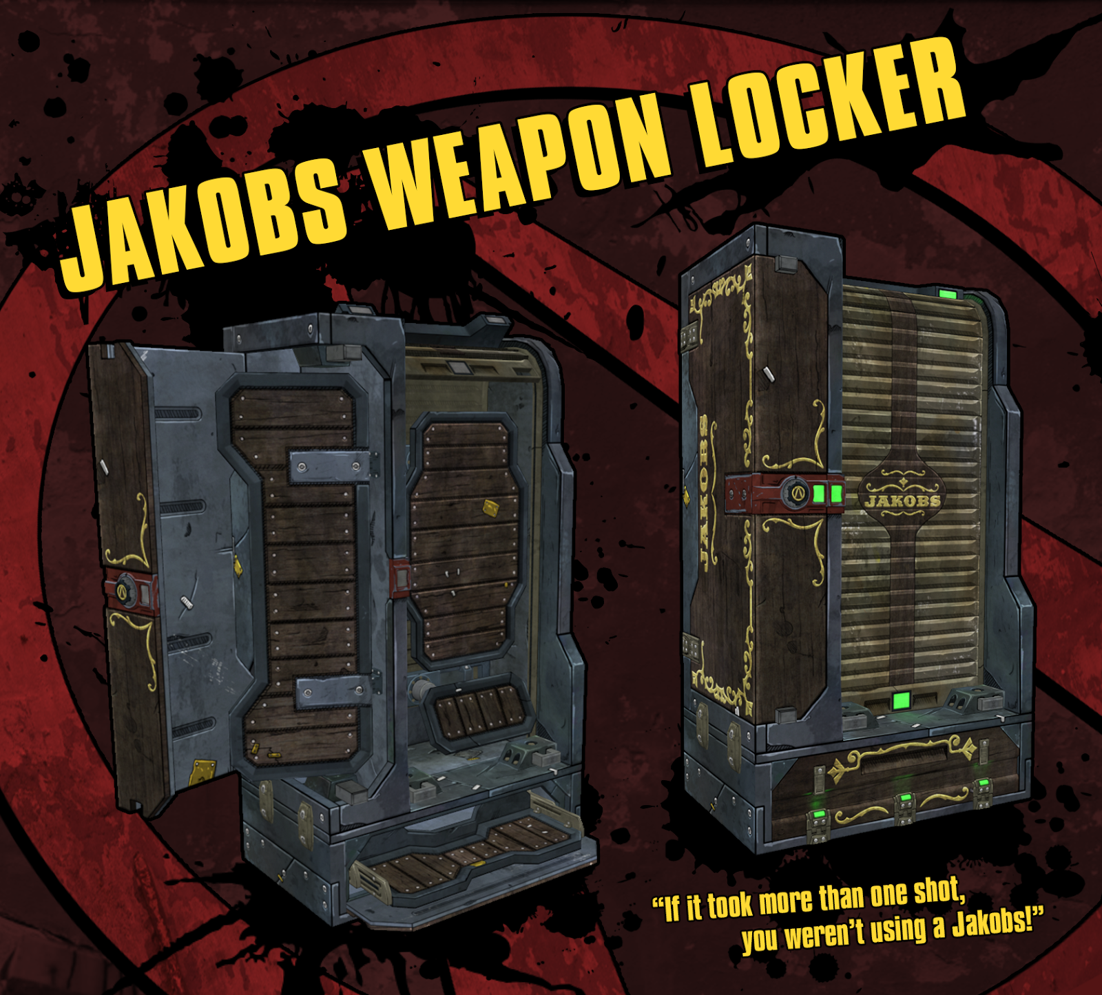
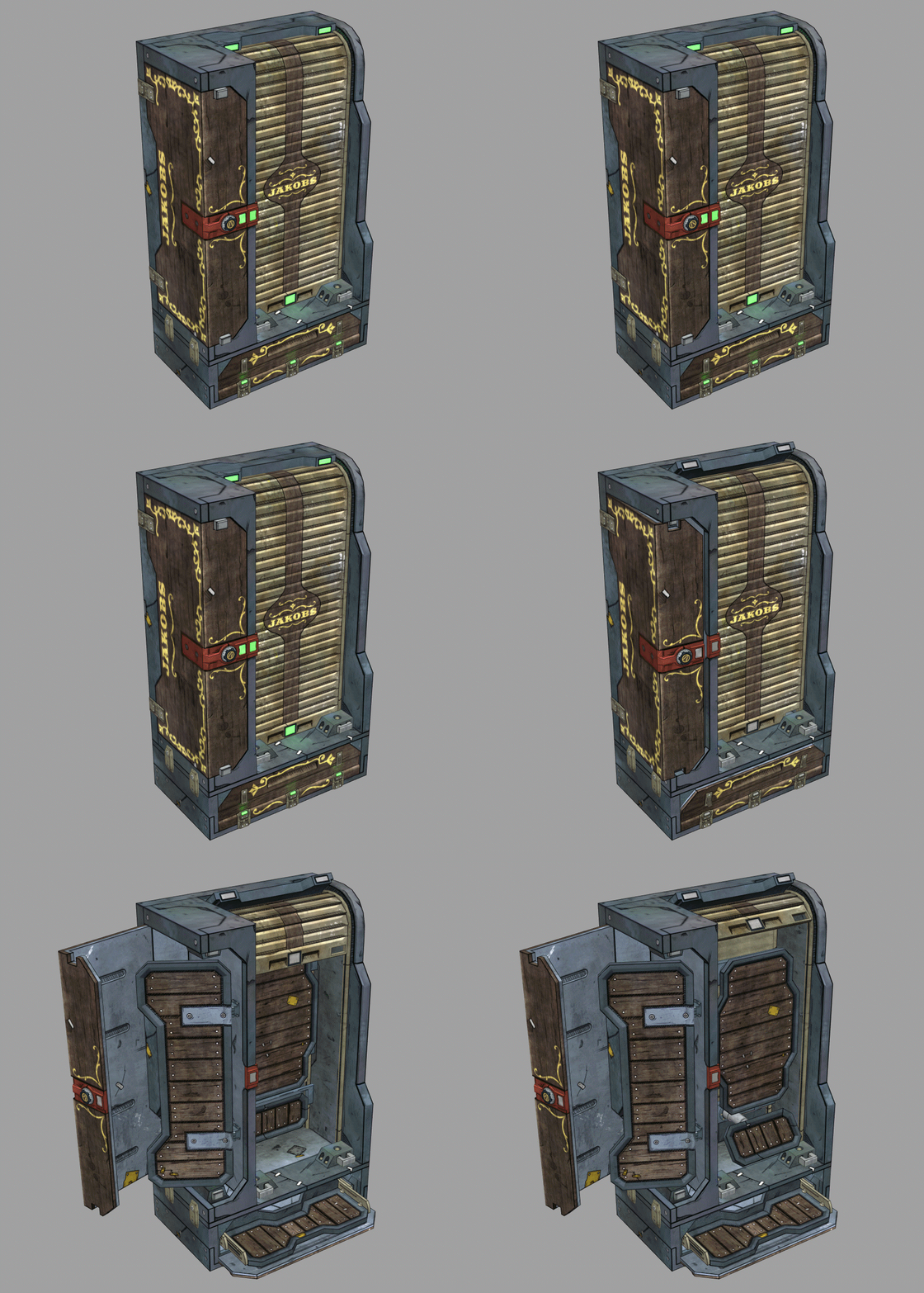
Here's a 3D turnaround, it's not embedding for some reason:
[sketchfab]d90a1b9a9f194d0f87c52f49f750e0ab[/sketchfab]
Original Post Below

Hey everyone! I'm cross-posting from my original thread so it's more convenient for people to follow my projects. As the title suggests, I'll be working on a Borderlands-style weapon locker that is inspired by the Jakobs line of weapons.
The only branded containers in the game are from DAHL and Hyperion, and of course Bandits have their own set of containers; but nothing from Jakobs, Vladof, Tediore, Torgue, Maliwan, or even Anshin (the company that makes health kits and shields).
My play style usually centers around hard-hitting weapons like shotguns and sniper rifles, right down Jakobs' alley, so I thought it would be fun to design a weapon locker for them.
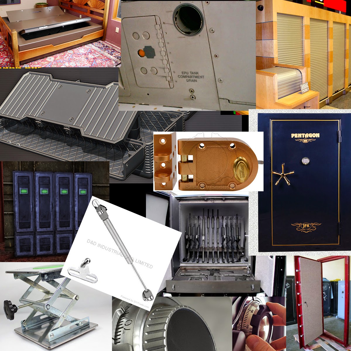
Here's some of my reference imagery, mostly for the mechanisms that will make the locker look believable:

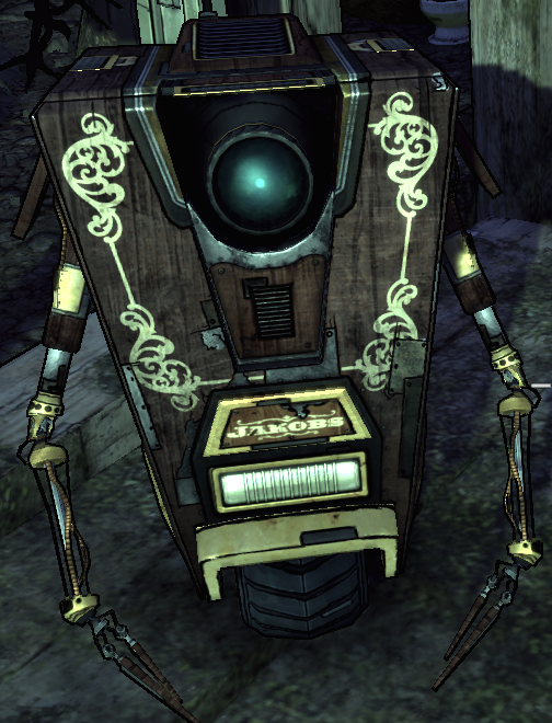
There isn't a whole lot of thematic art to go off when trying to design something for Jakobs, but based on the Western-y feel of the logo and the Claptrap skin, I see a lot of swirly vine trim patterns and wood paneling happening in my textures.
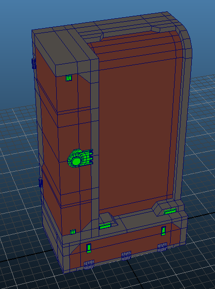
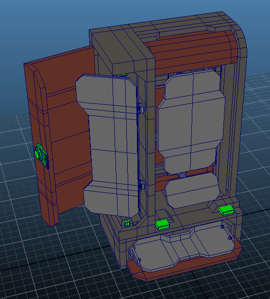
Here is a basic blockout of the weapon locker, I'll be working on the high poly over the next couple days.
The red color indicates compartment doors.
The green color indicates locking mechanisms.


Here's a 3D turnaround, it's not embedding for some reason:
[sketchfab]d90a1b9a9f194d0f87c52f49f750e0ab[/sketchfab]
Original Post Below

Hey everyone! I'm cross-posting from my original thread so it's more convenient for people to follow my projects. As the title suggests, I'll be working on a Borderlands-style weapon locker that is inspired by the Jakobs line of weapons.
The only branded containers in the game are from DAHL and Hyperion, and of course Bandits have their own set of containers; but nothing from Jakobs, Vladof, Tediore, Torgue, Maliwan, or even Anshin (the company that makes health kits and shields).
My play style usually centers around hard-hitting weapons like shotguns and sniper rifles, right down Jakobs' alley, so I thought it would be fun to design a weapon locker for them.
Here's some of my reference imagery, mostly for the mechanisms that will make the locker look believable:


There isn't a whole lot of thematic art to go off when trying to design something for Jakobs, but based on the Western-y feel of the logo and the Claptrap skin, I see a lot of swirly vine trim patterns and wood paneling happening in my textures.
Here is a basic blockout of the weapon locker, I'll be working on the high poly over the next couple days.
The red color indicates compartment doors.
The green color indicates locking mechanisms.


Replies
Combining the Old West and the metallic angular edges of sci fi does present some challenges
I'm also going to see what it looks like with a squared off corner instead of that rounded edge on the right. I personally like it how it is, but it was brought up.
Here's an update. I know, the door and drawer are still eye sores, but that's next for tomorrow! I also still have yet to add the majority of smaller details like bolts to support all the wood panels and casing segments, and things like that.
Here's some final shots of the HP:
I darkened the overall model to show where the lights will be that the player can see
Here is the general color pattern (colors will probably change slightly but this should be the general pattern the player can recognize from a distance)
last but not least, your getting to a point where you should start thinking about better renders for you stuff. You put in the work, time to show off a bit
http://wiki.polycount.net/Model%20Presentation
I more or less do the third one down, with a three point light set up.
Yeah, I'll totally make a nice presentation for my final renders and such. Right now for WIP stuff I don't want to spend too much time on it if I'm just going to redo it all later.
Thanks for the links, I'll be sure to check the presentation ones out especially
Lots of containers in-game are red, yellow, or green, but none of those colors really go well with the brown trim of the wood paneling I have going on. I think beige turned out pretty well, but I'm curious what you guys think about the general color scheme.
The material definition looks way off for what I'd guess is supposed to be metal. Right now it looks kind of like concrete, I would try making the diffuse darker, giving it a subtle tint of blue and a small, subtle amount of (blue) specular.
You could give the lamps some shine by making a new layer with a blurred version of their material mask with set to the screen blend style (or one of the others next to it).
The wood on the outside of the corner door doesn't really make any sense. In reality that wooden part would be constructed with two separate wooden panels as that would be a lot easier to manufacture and take up less space before assembly which would make the locker cheaper to produce. So in other words split that wooden panel into two at the corner.
I've been fighting with a good color to go with the wood paneling. Anything I've tried that's too saturated ends up looking terrible. I'll have to go back and see how BL does specularity on their props... Nothing really stands out in my mind that has any aside from guns.
Nice catch on the corner of the wood panel. Originally that material was supposed to be that thin synthetic crap you see in old station wagons, but it's actually a thicker material now so it should definitely have some sort of split. I'll throw in a line there during my inking stage to fix that right up
[edit] I'm finished! I added the final shots to the original post.
I posted all the final content on the original post, but here's a texture sheet just to bump the thread:
As for adding this piece to a small environment or stocking the locker with weapons, probably not, at least not right now. If I make some weapons/ammo in the future I might repaint them to fit the style and throw them in.