I think that the Handle is to thin and that your material could need some work.
I dont know what Material the "Blade" could be. Do you have Spec and Gloss?
There is a lot of wasted geometry in there. Along the sword, the geo you have there its not really affecting the shape of the blade in any way that I can see and its way to much. I would delete a lot of edge loops.
You can also get rid of a lot of tris along the curvature of the blade, like the half circle at the bottom of the blade and the hole on the top of the blade. The way I like to do so for assets that don't need to deform is this way.
Hopefully this makes sense. You can minimize the overall polycount quite dramatically on models that way.
I would also have to agree with Gazu, the material seems rather dull at the moment. Make sure to play with the spec and/or gloss of that blade, and don't be afraid to go overboard, you can always lower it and it gives you a better sense of the material. And since you mentioned that you're using marmoset you can test the material in quite a few different lighting scenarios.
The last thing I would say its about the presentation, specially the background. Being a darker model, specially the handle, it gets lost in the image. This is also true when using darker wireframe on the model. A gradient can be very useful or just using an overall lighter color. Presentation is very important. For a nice idea for better presentation for this type of models I would reference Polygoo.
So, some quick things. Others are totally correct on your tri count. There is no reason the sword should be that heavy handed on tri count because you're not actually deforming anything. Every tri should have a purpose whether it be to lend to the silhouette or for animation deformation. Every ring you have between the half circle indent at the base to the hole at the tip could be deleted without any noticeable impact.
Your texture doesn't read as metal right now. It reads as a "picture" of dirty streaked metal. A quick google search of Zabuza's sword gives a ton of results for how his sword looks. It's pretty clean overall, without various nicks or wear on it. If you're using spec and gloss maps, most of your metal texture will come from those maps as opposed to your albedo. If you're using diffuse only, there are still ways to make it look like metal without slapping cgtexture stuff on it and calling it a day. Look at how traditional 2D artists paint metal for some ideas. There is a ton of stuff on drawcrowd and artstation for reference.
Everything is a triangle as far as the renderer is concerned. Don't avoid them -- learn about them.
This sword could probably lose two thousand tris without any drop in quality -- it's basically made of massive flat surfaces that you've broken up into quads. And you could shift the polygon density towards the largest curve -- the tip of the blade, which looks pretty low poly considering the rest of the density.
Here man, I made a quick 're-make' on your blade to show you a more omptimized way of doing it (only spent like 2-3 minutes on it tops, so it's not perfect lol):
This one sits at ~150 tris and of course you could spend a little more, but I hope you get the point
Just to clarify: If you're working on a low poly, it's fine to have tris EVERYWHERE, to be honest, they already are tris, just that the crossing edge is hidden by default. Even ngons are fine as long as it's a flat surface really. won't cause any smoothing problems, but it looks kinda sloppy so it's probably best to get rid of those anyways.
I honestly do not know how to make the material look more metallic. I have tried to boost up the spec map. I made a new spec map based off a 3d motive tutorial and still nothing. I added scratches and have been spending all day trying to make this look better but in my opinion it now looks worse.
I figured out how to adjust my spec in Marmoset. I also made the blade thicker. Here are the results. I think it is an improvement this time. Yeah morale boost! Now I can go to sleep lol.
The only things that stick out is that it looks like you've used the Photoshop cloud filter and the scratches on the blade don't say anything in terms of use. Look up some references of damaged or worn combat knives...
Otherwise good work, I can see you've progressed since your first post.
Well done.

 Hey I had some time off work so I did some modeling. Let me know what you think.
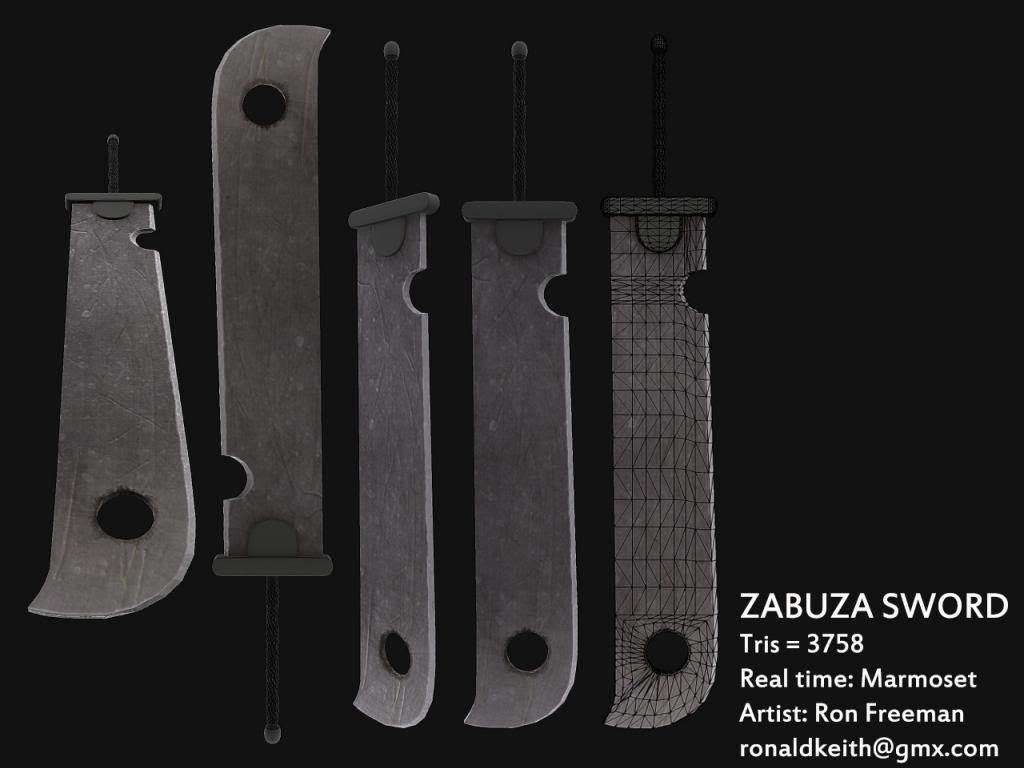
Replies
I think that the Handle is to thin and that your material could need some work.
I dont know what Material the "Blade" could be. Do you have Spec and Gloss?
I've always been a fan of Zabuzas sword.
There is a lot of wasted geometry in there. Along the sword, the geo you have there its not really affecting the shape of the blade in any way that I can see and its way to much. I would delete a lot of edge loops.
You can also get rid of a lot of tris along the curvature of the blade, like the half circle at the bottom of the blade and the hole on the top of the blade. The way I like to do so for assets that don't need to deform is this way.
Hopefully this makes sense. You can minimize the overall polycount quite dramatically on models that way.
I would also have to agree with Gazu, the material seems rather dull at the moment. Make sure to play with the spec and/or gloss of that blade, and don't be afraid to go overboard, you can always lower it and it gives you a better sense of the material. And since you mentioned that you're using marmoset you can test the material in quite a few different lighting scenarios.
The last thing I would say its about the presentation, specially the background. Being a darker model, specially the handle, it gets lost in the image. This is also true when using darker wireframe on the model. A gradient can be very useful or just using an overall lighter color. Presentation is very important. For a nice idea for better presentation for this type of models I would reference Polygoo.
http://polygoo.com/
I hope this helps out for this and future models.
Cheers!
Your texture doesn't read as metal right now. It reads as a "picture" of dirty streaked metal. A quick google search of Zabuza's sword gives a ton of results for how his sword looks. It's pretty clean overall, without various nicks or wear on it. If you're using spec and gloss maps, most of your metal texture will come from those maps as opposed to your albedo. If you're using diffuse only, there are still ways to make it look like metal without slapping cgtexture stuff on it and calling it a day. Look at how traditional 2D artists paint metal for some ideas. There is a ton of stuff on drawcrowd and artstation for reference.
1. The bare metal edge of the sword is a lot thicker than the one you have.
2. You have a different handle design it seems.
3. Last I think the hole isn't quite big enough and swoop up on the tip isn't steep enough.
I hope these images help you!
I really want to avoid the animated look.
I agree about the handle. I will try a different texture for it.
Thanks for all your feedback
This sword could probably lose two thousand tris without any drop in quality -- it's basically made of massive flat surfaces that you've broken up into quads. And you could shift the polygon density towards the largest curve -- the tip of the blade, which looks pretty low poly considering the rest of the density.
This one sits at ~150 tris and of course you could spend a little more, but I hope you get the point
Just to clarify: If you're working on a low poly, it's fine to have tris EVERYWHERE, to be honest, they already are tris, just that the crossing edge is hidden by default. Even ngons are fine as long as it's a flat surface really. won't cause any smoothing problems, but it looks kinda sloppy so it's probably best to get rid of those anyways.
I honestly do not know how to make the material look more metallic. I have tried to boost up the spec map. I made a new spec map based off a 3d motive tutorial and still nothing. I added scratches and have been spending all day trying to make this look better but in my opinion it now looks worse.
Thanks for those ref pics.
I figured out how to adjust my spec in Marmoset. I also made the blade thicker. Here are the results. I think it is an improvement this time. Yeah morale boost! Now I can go to sleep lol.
Here is the wireframe I have it down to 886 polys without loosing any detail
Here is the final version unless something really needs to change, I'm going to move on to the next project.
Otherwise good work, I can see you've progressed since your first post.
Well done.