Stylized textures practice

polycounter lvl 6
Hello Polycount,
around 5 days ago, I've started to learn to hand paint stylized textures which is a thing I've wanted to learn for a long time now (since I really love the style) but never really got to it.
I thought it was time to start so I started watching a lot of tutorials. I've never drawn textures (or anything else) before this so this is a huge learning experience for me.
Here is the progress I made throughout the last 5 days.
These were the first sketches Ive created after watching a few tutorials to try things out a bit:
This was the first complete texture I've created (day 2):
This was the second one (on day 3) when I also started the diorama (which is still heavy WIP):
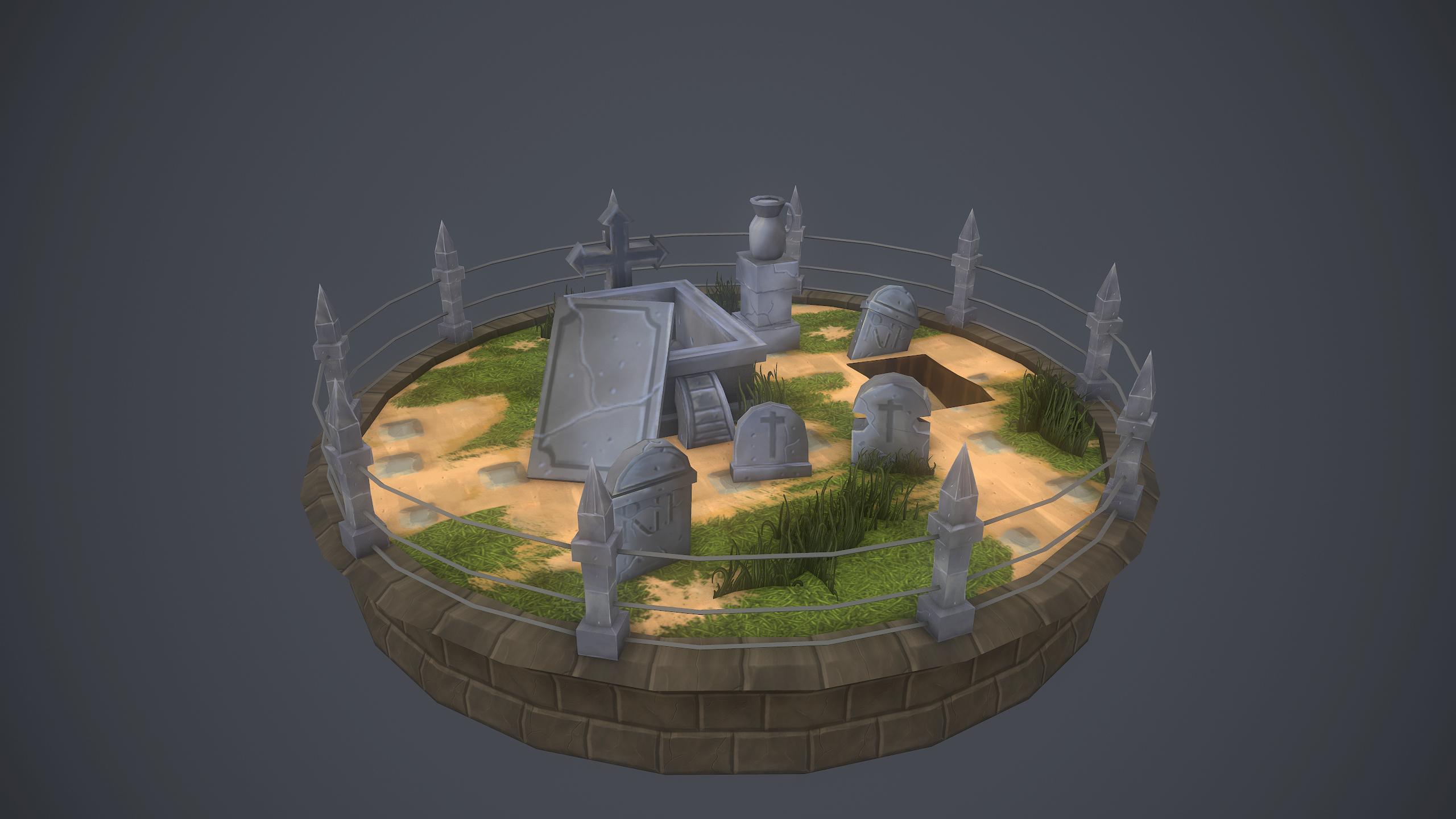
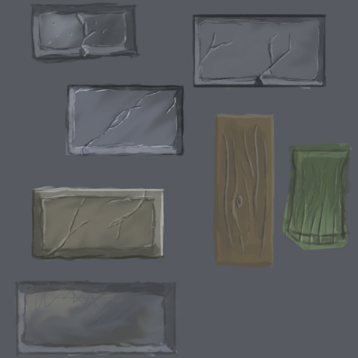
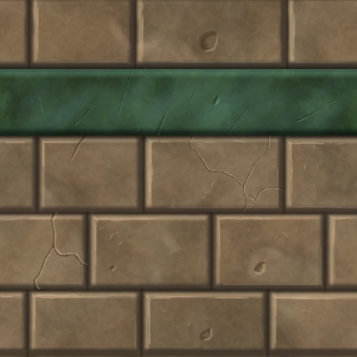
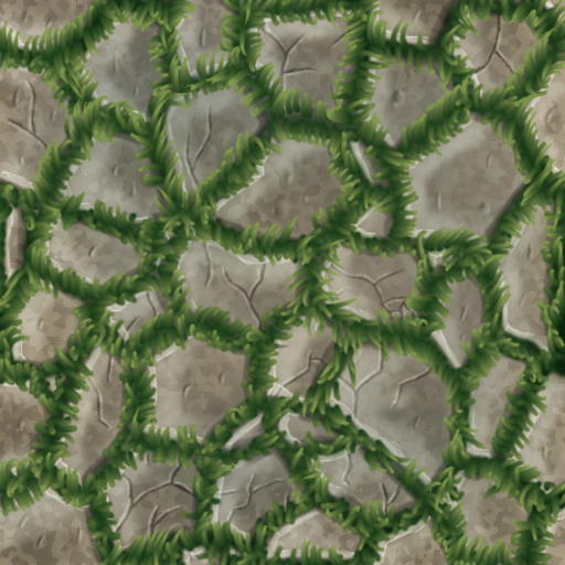
These are the textures the diorama uses currently (besides from the coffin inside the grave):

And after another day with lots of tutorials (day 4), today I created these ones (not tileable yet since I wanted to learn the general techniques first):

As you can see I've also watched the awesome tuts from Jamin Shoulet (of which I'm also definatley going to purchase his bootcamp videos asap!) which really helped a lot.
I've also saw other practice threads here which contained great crits and a lot of amazingly helpful replies so I thought I could start my own and get some thoughts on my textures while as well documenting my progress here.
So enough talking...please tell me what you think! I really look forward to your C&C!
Thanks a lot for your time!
around 5 days ago, I've started to learn to hand paint stylized textures which is a thing I've wanted to learn for a long time now (since I really love the style) but never really got to it.
I thought it was time to start so I started watching a lot of tutorials. I've never drawn textures (or anything else) before this so this is a huge learning experience for me.
Here is the progress I made throughout the last 5 days.
These were the first sketches Ive created after watching a few tutorials to try things out a bit:
This was the first complete texture I've created (day 2):
This was the second one (on day 3) when I also started the diorama (which is still heavy WIP):
These are the textures the diorama uses currently (besides from the coffin inside the grave):
And after another day with lots of tutorials (day 4), today I created these ones (not tileable yet since I wanted to learn the general techniques first):
As you can see I've also watched the awesome tuts from Jamin Shoulet (of which I'm also definatley going to purchase his bootcamp videos asap!) which really helped a lot.
I've also saw other practice threads here which contained great crits and a lot of amazingly helpful replies so I thought I could start my own and get some thoughts on my textures while as well documenting my progress here.
So enough talking...please tell me what you think! I really look forward to your C&C!
Thanks a lot for your time!
Replies
Work large to medium to small. Right now you're working all medium to small.
@Jeff Parrot:
Thank you! I'll try to apply this immediately!
Just in case I got this wrong, I guess you mean that I'm missing the big, defining shapes right?
@AtticusMars:
Thanks. I guess you want to tell me that I should not use the cloud filter in my textures, correct me if I'm wrong.
I'll try to avoid it from now on and paint the surface information myself.
I gave Jamin pretty much the same feedback. Clouds looks bland but more importantly it leaves a massive pattern over your entire texture so if you absolutely must use it as a base then you should go back once you've laid out your shapes and paint the pattern out.
As a base texture it looks very linear and only gives you a gradient of two colors to work with which is fine in some cases but I like to have a variety of hues in my pictures.
I think you'd probably be better served just looking up general guides for rendering paintings (you can skip the anatomy/perspective junk obviously), rather than ones specifically geared toward handpainted textures. This is my personal favorite.
Rendering materials is the same whether its a tiling texture or an illustration
Yeah clouds filters makes a lot of high-frequency noise which doesn't help to read the texture from a far point of view. It's all grainy and busy so definitely try to stay away from it.
IMHO, strongest piece is the round cemetery. It reads quite well from a certain distance which is a good thing. Few critics :
- Don't add black outlines to your grass billboards unless you want to create a very specific cell shading effect or something like that (in that case you add that same black outline everywhere else)
- If you want to put grass billboards on a grass ground, the two textures have to be as similar as possible so they blend together as nicely as possible.
- Don't create 1pixel wide cracks and stuff like that because 1) they don't read at all from long distance point of view 2) they don't look realistic nor stylized at all. Instead, do some wide cracks (and vary the size ! it's all about variations) so you can't paint some stuff inside, such as lighting and shadows, dirt, grass, whatever...
- You don't want to create details everywhere. Use edges/cracks and specific areas to add sharp details but leave the rest a bit cleaner so the eye can rest and so your texture has good readability.
Hope it helps ! Keep it up !
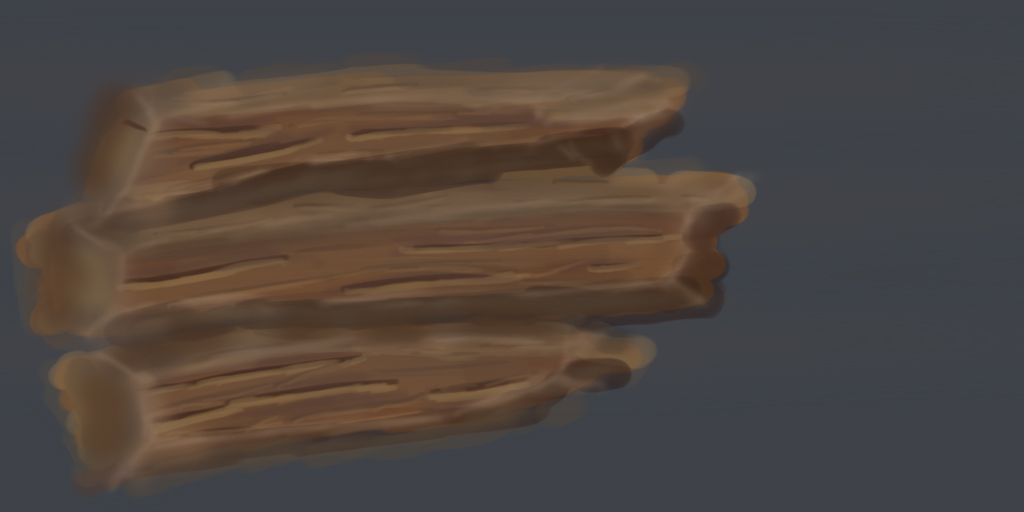
I only had 30 minutes to spend on this so I rushed it but I think the important elements are there. With more time it just would have had tighter details.
Main lessons here:
1: When it comes to stone I try not to make my edges perfectly straight
2: I never distribute my highlights evenly across an edge, I figure some parts of the edge will catch the highlight more than others. I noticed you seemed to be trying to do this, personally I think you were being a little too subtle.
3: I make a lot of my texture just by scribbling like a madman on my tablet, works pretty well and definitely makes it look "painted"
4: I paint mostly with a hard edged round brush, soft edged brushes are useful for painting stuff that is actually round or smooth (tubes, smooth stones, spheres, etc) but I find I usually model those forms so I don't normally have to render them in.
5: Focus on the important details and block in the rest, a scribble might not look like a stone texture but if you get the edges and shapes to look right, people will buy the rest of it.
6: I sharpen all my shit pretty aggressively
7: I'm pretty bad with color but I try to paint with warm light and cool shadow, this isn't a rule for painting textures. A lot of it depends on the circumstances, if you need to reuse textures a lot in different settings it might be better to go with warm/warm, cool/cool, or even just white light black shadow. What's most important though is that you keep it consistent, if you paint warm light and cool shadow into one texture you should make sure all the textures you use in the environment share that lighting setup otherwise it can look off.
A lot of this could be chocked up to personal preference, I think a lot of times I overdo my highlights, they look alright when you're looking at texture flats but don't work as well when they're put together in a scene. That's something you should keep in mind and be willing to dial stuff back if it's too overpowering.
Also I've seen other threads about painting textures where people say never sharpen. I don't understand why but figured I should mention dissenting points of view exist :U
Good luck
Thanks again! I tried it and I think I achieved a better result with a bigger brush!
@Cremuss:
Thanks a lot for your critique! I really admire your hand painted art and it was one of the main reasons I finally got started with it!
Alright, I'll avoid the clouds filter from now on. I used it mainly because it was used a lot by Jamin Shoulet and it made sense to me to generate some information you can use to get your inital details down.
I'll redo the complete textures for the diorama (or maybe pause it until I got better with the shading of the materials) as soon as I get back to it!
I still have a problem creating wider cracks (sounds dumb I guess) but for some reason they look so overdone and not really like cracks to me anymore when they're wider. But I try to get familiar with that asap!
@AtticusMars:
Wow! Thanks a lot for this super helpful paint over and video as well! I watched it and tried to replicate your techniques and apply your crits! I still have problems with the uneven shadowed bevels, really trying to get a grasp of this though.
Also thanks a lot for that material shading tutorial! Its really helpful but I'm still missing lots of practice so its a bit difficult for me to apply it 1:1 but I try my best.
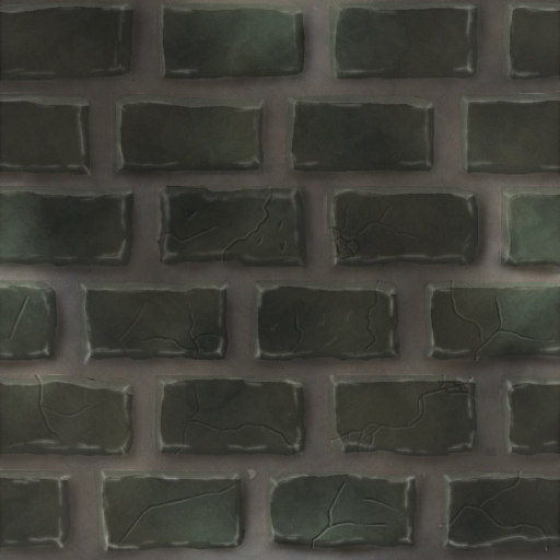
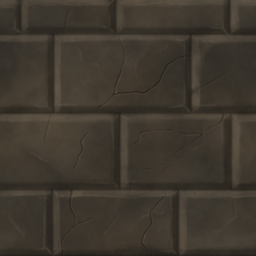
Based on all the crits I've got so far, I made another brick texture.
I'm still very unhappy with my highlights in general because they look too much like pencil strokes, at least to me.
Keen to hear what you think!
Thanks again!
Stay loose and really focus on big confident strokes.
Something you may want to try is Lazy Nezumi. It's similar to lazy mouse in Zbrush, but for Photoshop and other applications. I absolutely love it and it is great for line control.
http://lazynezumi.com/
thanks for your crits!
I really try to make the cracks wider in the next texture and get familiar with those wider cracks and bigger details.
Lazy Nezumi looks amazing! Definatley going to try this out and see how I can work with it!
Thanks a lot for that tipp!