Spectral color and perception
polycounter lvl 11
Feel free to add to this. I'd like to spread some awareness of the spectral properties of light because I think it'd help artists (and anyone who deals with lighting and materials really) to be aware of. I'm not an expert so please correct me if there's anything wrong or unclear, but hopefully you'll find this crashcourse somewhat... illuminating.
[warning lots of images]
Example
If you've ever wondered why alexandrite shines green in sunlight but pink under an incandescent lightbulb or why an object that looks vibrant in sunlight will look dull and sickly in flourescent lighting, then you've wondered about spectral color.
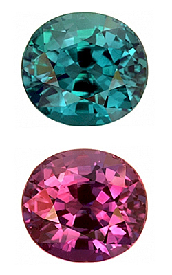
[alexandrite in daylight vs incandescent light]
Visible spectrum
The first thing to be aware of is that light is not made of just red, green, and blue. If you shine sunlight through a prism you can start to get an idea of this.

[spectrum of white light]
Light has potentially infinite primary colors but we only have three types of sensors in our eyes, so our perception is based around combinations of only the responses of those three sensors (which happen to have responses around red, green, and blue). So while our perception of colors can be described by combinations of three 'primary' colors, the actual world works separately from this. Let me go into some detail.
Light
I recommend browsing through the wiki on light here, but some relevant information is that each quanta of light (a photon) has its own wavelength. You might imagine photons as oscillating. At a low frequency they are oscillating with lower energy and with a longer length between the peaks of the waves, and at higher frequency and with higher energy the peaks of the waves are closer together. The variable here is the photon's wavelength, the distance between the peaks of the oscillation.

Emission
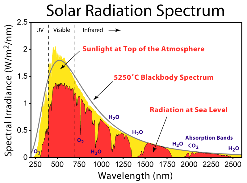
An emission source will emit photons stochastically (randomly in that you can't predict from where and at what angle and wavelength), but it will create a distribution over time. The sun emits at many different wavelengths but if you were to measure the output over time, the amount of photons of a given wavelength will follow a certain distribution. This distribution can be modeled fairly well in most cases by Plankian black body emission which uses the temperature of the source as the factor. The elements that make up source will also contribute by giving spectral spikes in their respective areas.

For an idealized emmision source the distribution can be modeled by 'blackbody' radiation. The distribution of wavelengths for a blackbody source can be modeled based on the temperature of that source in kelvin (I'm sure you've seen things like 6500k for display color temperatures).
The heat of the sun and the elements that make up the sun will determine which wavelengths of photons are more common and which ones are not so common. When you emit enough of these photons you get a somewhat predictable distribution that generally mirrors black body emission. The scattering of the atmosphere and the specific elements in the sun add some variation from the ideal.
related link: if you're interested in sun and sky models http://cgg.mff.cuni.cz/projects/SkylightModelling/
Cones
So there are infinite wavelengths that you could potentially have. You could have 500nm or 501nm or 530nm or anything inbetween from about 380nm to 700nm for the visible spectrum, but the human eye only has 3 different types of color sensing cells. These cells are called cone cells, and each type is responsive to a certain range of the spectrum. These are cells with peaks in short (S, 420–440 nm), middle (M, 530–540 nm), and long (L, 560–580 nm) wavelengths and are reffered to as S, M, and L.
While these cells peak in responsiveness at different wavelengths, their ranges of response also overlap some which is why when you view sunlight through a prism (and therefore break the light up into its different wavelengths) you can see more than just blue, green, and red (blue, green, and red are the approximate colors of the wavelengths of each cone cell's response). You should be able to see a variety of colors due to the fact that the cell responses overlap, even when receiving photons purely of a given wavelength.

[This graph shows the normalized response of each type of cone cell based on pure wavelength. The colors in this graph are mostly to aid in readability.]
for more information look here https://en.wikipedia.org/wiki/CIE_1931
Perception of color
If you were to combine photons of different wavelengths you could trigger the three sensors in a variety of different ways and perceive different colors that are not identified by the emission of a pure, isolated wavelength. Magenta is an example of this. Our perception of Magenta occurs when the S and L cells are being stimulated but the M cell is not, so when you have a combination of short and long wavelength photons without the middle range. Our perception of white occurs when all three cell types are being stimulated equally, and our perception of saturation is based on how close to 'white' our cones are stimulated.

[This graph (CIE1931) shows the pure wavelength values labeled around the perimeter and the combinations of wavelengths in the middle. The perception is limited to what your display can show.]
The problem with our vision is that you could omit any number of spectra from the light and still perceive the same color as long as your cone cells are being stimulated in the same way. For example flourescent light and an led light and the sun light may all seem white but when you observe the spectra being emitted you realized they're completely different light sources.
The reason why this matters is because different materials react to specific wavelengths of light. Their molecules absorb specific wavelengths based on their chemistry and the wavelengths they don't absorb are the ones that are sent out into the world to interact with other materials and maybe eventually get to our eyes. So while you might look healthy and pink in the sunlight, under flourescent light the blood in your skin may not be getting the spectra of red that they don't absorb (and therefore the color you'd see) and therefore you might look sickly and somewhat greyish green under the artificial light in comparison to under the sun's continuous spectrum.
The same thing applies to the gemstone alexandrite. You can find out more about it here http://www.chemistry-blog.com/2013/08/22/alexandrite-effect-not-all-white-light-is-created-equal/

[comparison of 'white' lights]

[high cri vs low cri cfl bulbs, both 'white']
related link: lux render renderings of different spectra - lux renderer
Response by intensity
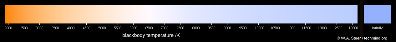
The last thing to take note of is that the human eye's response to color is also skewed based on light intensity. In dim light the color perception of red is less active and color perception trends towards blue. In bright light the cone cells skew in responsiveness towards red. The effect is known as the Purkinje effect and it can be described by the Kruitof curve.

[Kruithof Curve. There is text here but it may blend into the background.]
An example of the effect is how moonlight is often described as being 'blue' but if it is actually measured it is a pale yellowish color. Red flowers in a dim environment will seem darker and less intense than the other colors comparatively. Daylight, which is modeled as having a color temperature of approximately 6500K and an illuminance of 10,000 to 100,000 lux, looks white, but if it were viewed at a low illuminance (such as a 6500k indoor light), it would appear bluish.
This is why pleasing indoor lighting (such as with an incandescent bulb) tends to have lower black body color temperatures (which are more reddish but look pleasing to our eyes in low light). Office lighting might be something like 400 lux at 3000K to 6000K, and home lighting might have an illuminance of 75 lux at 2400K to 2700K. Flourescent lights that advertise as being like 'daylight' with their color temperatures at around 5500k to 6500k will look unpleasingly blue (and probably make everything look dull and horrible because of their incomplete spectrum).
for more information look here http://en.wikipedia.org/wiki/Kruithof_curve
RGB -> spectrum?
One more thing to take note of is that once you package down a real spectrally based color into RGB you can't go back. You have destroyed information because there are infinite ways to spectrally represent an RGB color (as seen in the image of the spectra of 'white' light sources above). The are ways to convert an RGB color into a feasible spectral color though. For more information I'm linking a great powerpoint presentation which goes into much more detail than I did here about the color models and describes Yinlong Sun's "Hybrid Method" for converting them http://www.sidefx.com/index.php?option=com_content&task=view&id=1240&Itemid=132
[warning lots of images]
Example
If you've ever wondered why alexandrite shines green in sunlight but pink under an incandescent lightbulb or why an object that looks vibrant in sunlight will look dull and sickly in flourescent lighting, then you've wondered about spectral color.
[alexandrite in daylight vs incandescent light]
Visible spectrum
The first thing to be aware of is that light is not made of just red, green, and blue. If you shine sunlight through a prism you can start to get an idea of this.
[spectrum of white light]
Light has potentially infinite primary colors but we only have three types of sensors in our eyes, so our perception is based around combinations of only the responses of those three sensors (which happen to have responses around red, green, and blue). So while our perception of colors can be described by combinations of three 'primary' colors, the actual world works separately from this. Let me go into some detail.
Light
I recommend browsing through the wiki on light here, but some relevant information is that each quanta of light (a photon) has its own wavelength. You might imagine photons as oscillating. At a low frequency they are oscillating with lower energy and with a longer length between the peaks of the waves, and at higher frequency and with higher energy the peaks of the waves are closer together. The variable here is the photon's wavelength, the distance between the peaks of the oscillation.
Emission
An emission source will emit photons stochastically (randomly in that you can't predict from where and at what angle and wavelength), but it will create a distribution over time. The sun emits at many different wavelengths but if you were to measure the output over time, the amount of photons of a given wavelength will follow a certain distribution. This distribution can be modeled fairly well in most cases by Plankian black body emission which uses the temperature of the source as the factor. The elements that make up source will also contribute by giving spectral spikes in their respective areas.
For an idealized emmision source the distribution can be modeled by 'blackbody' radiation. The distribution of wavelengths for a blackbody source can be modeled based on the temperature of that source in kelvin (I'm sure you've seen things like 6500k for display color temperatures).
The heat of the sun and the elements that make up the sun will determine which wavelengths of photons are more common and which ones are not so common. When you emit enough of these photons you get a somewhat predictable distribution that generally mirrors black body emission. The scattering of the atmosphere and the specific elements in the sun add some variation from the ideal.
related link: if you're interested in sun and sky models http://cgg.mff.cuni.cz/projects/SkylightModelling/
Cones
So there are infinite wavelengths that you could potentially have. You could have 500nm or 501nm or 530nm or anything inbetween from about 380nm to 700nm for the visible spectrum, but the human eye only has 3 different types of color sensing cells. These cells are called cone cells, and each type is responsive to a certain range of the spectrum. These are cells with peaks in short (S, 420–440 nm), middle (M, 530–540 nm), and long (L, 560–580 nm) wavelengths and are reffered to as S, M, and L.
While these cells peak in responsiveness at different wavelengths, their ranges of response also overlap some which is why when you view sunlight through a prism (and therefore break the light up into its different wavelengths) you can see more than just blue, green, and red (blue, green, and red are the approximate colors of the wavelengths of each cone cell's response). You should be able to see a variety of colors due to the fact that the cell responses overlap, even when receiving photons purely of a given wavelength.
[This graph shows the normalized response of each type of cone cell based on pure wavelength. The colors in this graph are mostly to aid in readability.]
for more information look here https://en.wikipedia.org/wiki/CIE_1931
Perception of color
If you were to combine photons of different wavelengths you could trigger the three sensors in a variety of different ways and perceive different colors that are not identified by the emission of a pure, isolated wavelength. Magenta is an example of this. Our perception of Magenta occurs when the S and L cells are being stimulated but the M cell is not, so when you have a combination of short and long wavelength photons without the middle range. Our perception of white occurs when all three cell types are being stimulated equally, and our perception of saturation is based on how close to 'white' our cones are stimulated.
[This graph (CIE1931) shows the pure wavelength values labeled around the perimeter and the combinations of wavelengths in the middle. The perception is limited to what your display can show.]
The problem with our vision is that you could omit any number of spectra from the light and still perceive the same color as long as your cone cells are being stimulated in the same way. For example flourescent light and an led light and the sun light may all seem white but when you observe the spectra being emitted you realized they're completely different light sources.
The reason why this matters is because different materials react to specific wavelengths of light. Their molecules absorb specific wavelengths based on their chemistry and the wavelengths they don't absorb are the ones that are sent out into the world to interact with other materials and maybe eventually get to our eyes. So while you might look healthy and pink in the sunlight, under flourescent light the blood in your skin may not be getting the spectra of red that they don't absorb (and therefore the color you'd see) and therefore you might look sickly and somewhat greyish green under the artificial light in comparison to under the sun's continuous spectrum.
The same thing applies to the gemstone alexandrite. You can find out more about it here http://www.chemistry-blog.com/2013/08/22/alexandrite-effect-not-all-white-light-is-created-equal/
[comparison of 'white' lights]
[high cri vs low cri cfl bulbs, both 'white']
related link: lux render renderings of different spectra - lux renderer
Response by intensity
The last thing to take note of is that the human eye's response to color is also skewed based on light intensity. In dim light the color perception of red is less active and color perception trends towards blue. In bright light the cone cells skew in responsiveness towards red. The effect is known as the Purkinje effect and it can be described by the Kruitof curve.
[Kruithof Curve. There is text here but it may blend into the background.]
An example of the effect is how moonlight is often described as being 'blue' but if it is actually measured it is a pale yellowish color. Red flowers in a dim environment will seem darker and less intense than the other colors comparatively. Daylight, which is modeled as having a color temperature of approximately 6500K and an illuminance of 10,000 to 100,000 lux, looks white, but if it were viewed at a low illuminance (such as a 6500k indoor light), it would appear bluish.
This is why pleasing indoor lighting (such as with an incandescent bulb) tends to have lower black body color temperatures (which are more reddish but look pleasing to our eyes in low light). Office lighting might be something like 400 lux at 3000K to 6000K, and home lighting might have an illuminance of 75 lux at 2400K to 2700K. Flourescent lights that advertise as being like 'daylight' with their color temperatures at around 5500k to 6500k will look unpleasingly blue (and probably make everything look dull and horrible because of their incomplete spectrum).
for more information look here http://en.wikipedia.org/wiki/Kruithof_curve
RGB -> spectrum?
One more thing to take note of is that once you package down a real spectrally based color into RGB you can't go back. You have destroyed information because there are infinite ways to spectrally represent an RGB color (as seen in the image of the spectra of 'white' light sources above). The are ways to convert an RGB color into a feasible spectral color though. For more information I'm linking a great powerpoint presentation which goes into much more detail than I did here about the color models and describes Yinlong Sun's "Hybrid Method" for converting them http://www.sidefx.com/index.php?option=com_content&task=view&id=1240&Itemid=132
Replies
I'm really interested in the scientific properties of color. Even if I don't know the exact terminology, I'm making notes of how color is affected under certain environmental pressures.
http://www.manufato.com/?p=902