Home 3D Art Showcase & Critiques

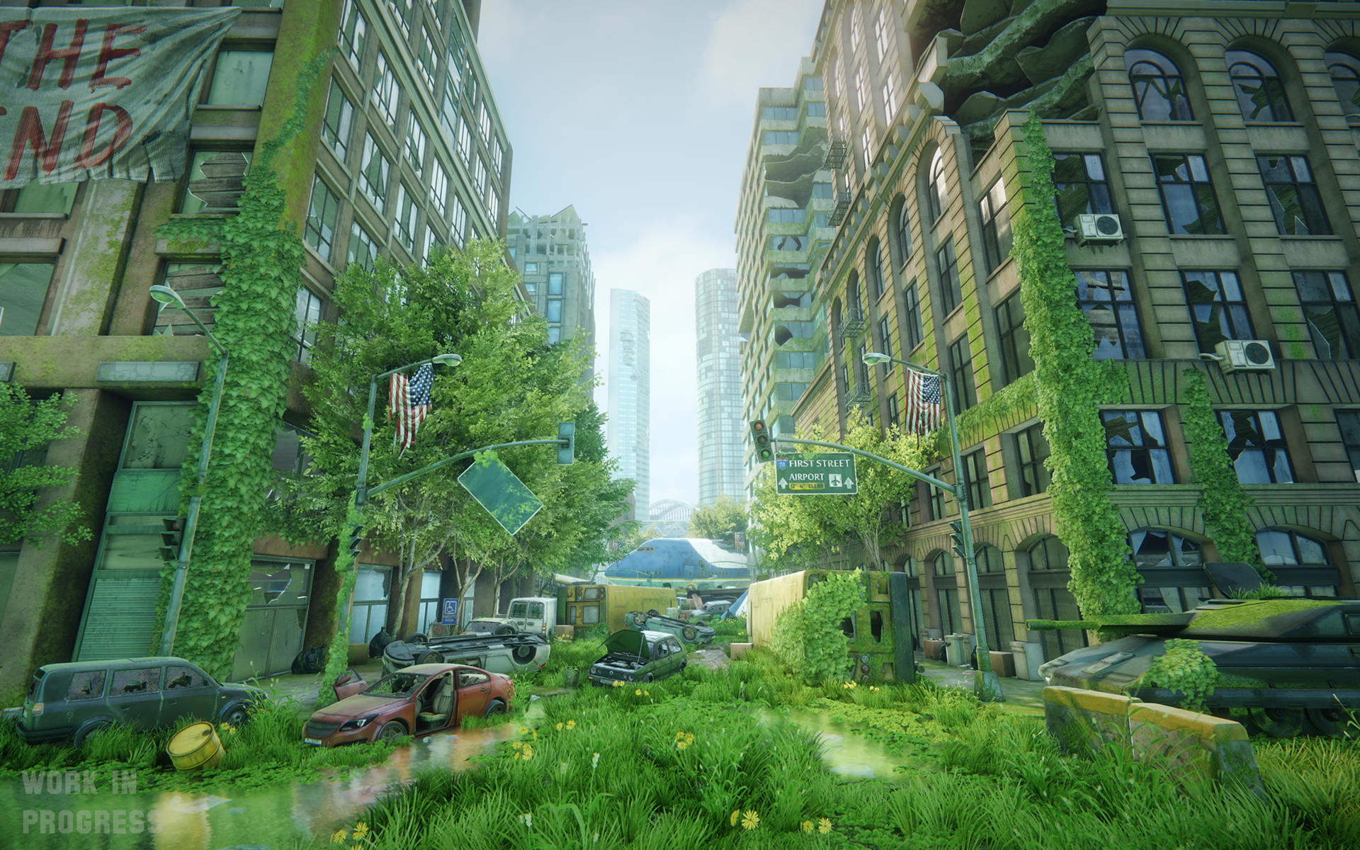
[CE3] Overgrown Street [WIP]

frmdbl
polycounter
Offline / Send Message
frmdbl polycounter
Hi Polycount,

here's an environment I've been working on for a while,
it's based on a concept by Rolf Bertz with a couple of deviations.

Looking forward to your feedback and suggestions.

12885822344_efe65a3e1a_o.jpg
12885381355_91d0c4fe10_o.jpg

Replies

  • Shrike
    Options
    Offline / Send Message
    Shrike interpolator
    Looks pretty nice so far
    There are some minor things, first use JPEG at best, thats like 20 MB you posted here and really slow for some people

    The grass/vegetation is very uniform green and looks like it did grow in a garden, just too clean to be plausible and also very saturated. Its like you used the same color for all the plants.
    Also that tank is totally out of place. The shape is not really believable and its just lower in detail and has another style as the rest of your scene. I also noticed the airplane way too late, but if you turn down saturation of the vegetation a bit, it will be more pronounced aswell.
  • Joost
  • luge
    Options
    Offline / Send Message
    luge polycounter lvl 4
    a few issues i see are like what Shrike said, the foliage is all the same color, looks weird and unbelievable. another issue is that some things are way too clean in comparison to the rest of the scene. like the signs. they should more rust and wear to them, the rest of your scene is overgrown and damaged. you even have parts of buildings broken apart, but the signs look almost perfect, they look almost brand new in color. so I'd add some more rust, and wear away some of the color there, its been out in the sun for a very long time obviously. maybe board up some of those windows as well.
  • Fenyce
    Options
    Offline / Send Message
    Fenyce polycounter lvl 11
    Through the grass looks kinda beautiful right now, I think it's a little to saturated... It ruins the realistic feel of the scene. It gives it an overall slightly stylised feel. Maybe you should at least reduce the saturation at some spots. Beside that I really love the amount of foliage and probs!
  • LANKUS MAXIMUS
    Really nice environment. Well executed. I echo a few of the above crits and have a few minor points..

    Definitely approach the foliage and look into adding some variation (Dead or burnt leaves?). The blocks of light green throw the image off a bit.

    Also, I personally think that you could create a much nicer focal point at the top right hand corner of the first image. The exposed ribs of the building look really cluttered up at moment. Almost looks like the side of a flagstone because of all the layered slabs. I'd loosen it up. Create a bit of interest there rather than packing it up with concrete.

    Anyways. All the best. Awesome scene :)
  • frmdbl
    Options
    Offline / Send Message
    frmdbl polycounter
    Sorry about the pngs, just changed that, I was used to automatic conversion on imageshack.


    Ok, thank you, I hear you in terms of the vegetation, I'll work some more on adding variation to it and perhaps on the overall color.


    I wanted to go for a slightly minimal style, cause most of the objects are mirrored and stronger damage accentuated it and generally it's easy to make as scene like that very noisy. I've tried different options.

    Another thing was that once I used a blend layer with moss I couldn't use one with dirt in it, so again I tried to be kinda subtle with the textures.


    @LANKUS MAXIMUS

    Thanks I'll look into changing that upper right corner.
  • Stormfreek
    Options
    Offline / Send Message
    This is ace man, however will like to see how you will add variation into the foliage and the colour palette! Great work nonetheless!
  • Daves
    Options
    Offline / Send Message
    Daves polycounter lvl 9
    Looks great! The others said it, too much green ;) And in my opinion the Cars could need a bit more Rust/Scratches and maybe Bulletholes ( It´s America ;) ) . Same for the air conditioners, they have a lot of Rust etc. in the Concept.

    But, to make it clear, thats all
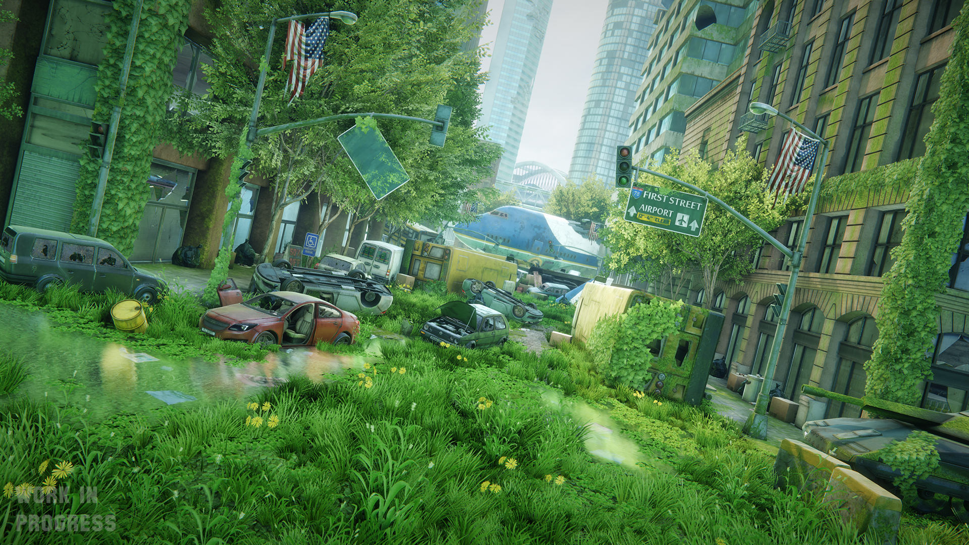
 ;) Everything else is great
  • ZacD
    Options
    Offline / Send Message
    ZacD ngon master
    Echoing what everyone else said, needs more hue and saturation variation in foliage, most plants are different colors, even the color of grass changes over a field.

    Quick gif

    iumW8Mp.gif
  • Dubzski
    Options
    Offline / Send Message
    Dubzski polycounter lvl 11
    Great start dude, awesome models and textures. Like everybody else has mentioned the scene needs a fair bit of colour balancing to complete.

    I won't repeat what's already been said, i will add however that as soon as you knock back the green & bring in other saturated colours this scene is gonna pop so hard ^_^.
  • Genko
    Options
    Offline / Send Message
    Fantastic work. I think the shadows could be a little stronger personally.
  • frmdbl
    Options
    Offline / Send Message
    frmdbl polycounter
    @Daves

    I added a bit of dirt and rust here and there, they mostly show closer up, I mean I tried some more variants but whenever I noticed the repetition I toned it down.

    @kaikaisushi ZacD Dubzski

    Thanks, I tweaked the color settings to a bit more reddish-yellow tint, I changed the grass texture quite a bit, played a bit with vertex alpha on vegetation and added a sort of a dry grass.

    @Genko

    I think you're absolutely right, the problem is I think that most of the environment is in shade so there isn't that much contrast there, I changed the TOD and sun's position on some of the new screenshots.


    13155507185_6e4b850a03_o.jpg13155510945_c4fde9623e_o.jpg
    13155802694_7ed646d9cb_o.jpg13155647443_c8db865eb9_o.jpg
    13155797084_7e6d6925d8_o.jpg
    13155643193_333b67d4c5_o.jpg
    13155639533_33106a12f1_o.jpg
    13155644413_bccb1f151c_o.jpg
    13155805944_9291ff3bb0_o.jpg
  • Fenyce
    Options
    Offline / Send Message
    Fenyce polycounter lvl 11
    Great work and great improvement! The lightning looks a little uninteressting through, just like a cloudy summerday. Especially the first two renders look a little boring. Maybe you should play a little more with the light to make your renders even more pop!
    But you did a great job so far! I love those detail shots!
  • Noren
    Options
    Offline / Send Message
    Noren polycounter lvl 19
    To be honest, I thought I was looking at an illustration and I thought that it looked awesome! So it really depends on where you want to go with this piece.
  • JamieRIOT
    Options
    Offline / Send Message
    JamieRIOT polycounter lvl 6
    I like this. A couple of crits; the tank almost looks too low poly/texture detail and doesn't seem to fit in to the rest of the scene as well as it could. Also there is a seam in your tree texture (third image on the left-hand side).
    The colour adjustments you have made are an improvement over the first shots, but I would love to see some stronger lighting, the scene is looking a little flat and is missing that 'pop'.
    Keep going, really nice work so far.
  • MeshModeler
    Options
    Offline / Send Message
    MeshModeler polycounter lvl 11
    frmdbl wrote: »

    With that sharp edge on the tank it almost looks like its covered in moss wrapping paper..
  • paranoidMonkey
    Options
    Offline / Send Message
    paranoidMonkey polycounter lvl 13
    Great work overall.

    I would suggest you to play a bit more with the values, light and dark as the scene feels a bit too flat, as JamieRIOT say.

    I would completely remove the tank, it just don't add anything positive to the scene.
    Another thing that really stands out negatively is the 2 plant covered building corners. The leaves are too similar in size and direction, it looks kinda fake.

    I'd say the rest is top notch.
  • ofca
    Options
    Offline / Send Message
    ofca polycounter lvl 9
    Hi there
    Overal look is great.
    Can you share some stats?
    How many Drawcalls?
    How many tris?
    How many mb on textures and cgf?
    Thx!
  • Daves
    Options
    Offline / Send Message
    Daves polycounter lvl 9
    Big improvement :) The first thing, that didnt fit for me, was the Ivy on the buildings on the left and right. They are ~2-3 times bigger then the others, looks a little strange.
    When you look at the Concept, the airplane has much more destruction and a different angle. But when you think about it, why is an airplane barely damaged after landing there? ;)

    and like paranoidmonkey said, the tank is the least perfect thing in the scene, could need a little more love because its in the front of your viewpoint.

    I really like that scene now, you could nearly put it in an aaa game with some polishing and lighting correction here and there.

    How long did you work on this?
  • e-freak
    Options
    Offline / Send Message
    Looks good so far! - I'd try and work with a more angled sun to cast some interesting shadows and work on the atmospherics a little (time of day settings).
  • IchII3D
    Options
    Offline / Send Message
    IchII3D polycounter lvl 12
    Really nice scene and composition, great shots. I think where it falls down is the individual asset quality. I'm assuming this is down to the sheer scale of the scene and the amount of work involved. It seems evident you spent more time on some assets than others. I would be worried a little about your sense of scale, the ivy leafs read to me as been massive, the same can be said for your concrete barriers. A lot of objects feel off for me when comparing to real world expectations. This makes the scene a little less realistic and could potentially effect immersion.
  • frmdbl
    Options
    Offline / Send Message
    frmdbl polycounter
    I see the point in terms of the tank, I thought I'd make it a bit simpler and more futuristic. I was inspired by this.

    It is a bit blocky compared to the concept and in general, though I don't know that I want to change it at this stage.
    @paranoidMonkey
    I'll see how the scene looks without it.

    In terms of the ivy, the one on the right was initially way smaller, but read a bit noisy to me so I copied the one on the left and moved it about.
    I think it looks better than the original.

    @Daves

    I've worked on it for about 3 months now, probably too much, but the core of it I made quite early on. Of course I didn't work on it fulltime, but a few hours most days certainly.
    To be honest I'm kinda burnt with it right now:)

    @IchII3D

    I agree about the quality of some assets, the scale of the scene is indeed pretty big, especially the cars took me a lot of time and I kinda couldn't push them where I wanted texture-wise.

    In terms of the scale I camera matched the concept and tried to follow it as close as possible.


    I think today, I'll play with the lighting and TOD, correct those small obvious mistakes, make a couple of nice shots and leave it for some time.
  • IchII3D
    Options
    Offline / Send Message
    IchII3D polycounter lvl 12
    Look on the right hand side of the image bellow and compare the size of the leafs on the wall to those on the tank. This is what I meant by scaling issues. The scene itself is the right scale, but the objects that are contained within it feel off in proportions.

    http://farm4.staticflickr.com/3706/13155647443_c8db865eb9_o.jpg

    Think about standing in that scene and to me it looks like those leafs would be bigger than the mid section/head of a human. The leafs in reality would probably be about the size of your hand.
  • frmdbl
    Options
    Offline / Send Message
    frmdbl polycounter
    The ivy leaves are much bigger than they would be in real life and are in the concept, I wasn't saying otherwise.

    With the barriers I'm not so sure, I made them slightly smaller.

    Played a bit with ToD, I don't think they add much though.

    13178660903_6d63a0d93a_o.jpg
    13178656093_f3d47ab516_o.jpg
  • Polynaut
    Options
    Offline / Send Message
    Polynaut polycounter lvl 7
    I think you nailed the concept! Great job. You could tweak a project like this all day if you let yourself.. so be careful! :)

    With that said, each revision keeps getting better and better.
  • lukepham101
    Options
    Offline / Send Message
    lukepham101 polycounter lvl 7
    I think the bloom is killing your scene at the moment, it's way too distracting. With the second one the fog isn't really adding anything. I feel you should go the same lighting route as the concept as try and get some nice shadows in there by changing the sun direction. Getting some volumetric lighting through the buildings and perhaps even on some of the trees would really help in atmosphere. Warm colours like sunset lighting would add to the mood too. Dude, just fix the lighting and I think this scene will be fantastic. :)
  • AlexCatMasterSupreme
    Options
    Offline / Send Message
    AlexCatMasterSupreme interpolator
    I think that it's looking good, i'd change that car from green to blue, make the sky more blue, and put more orange in the bloom, and add a focal point in the background since that's where your eye goes, and then do something about that tank looking like its 50 polys. Overall the scene is super great and your foliage is godlike, but I would def change those things. The red car is the biggest focal point right now since it's next to the water. I really think that's all you need to do and you could call it good. Maybe add some more atmospherics and some particles would really push the scene a bit farther.7xehT.png
  • luge
    Options
    Offline / Send Message
    luge polycounter lvl 4
    i'd bump up the general saturation of the scene, it looks a little flat to me and washed out. and the tank still seems random and like a distraction. but thats me.
  • Tits
    Options
    Offline / Send Message
    Tits mod
    I am loving this a little bit too much :)
Sign In or Register to comment.