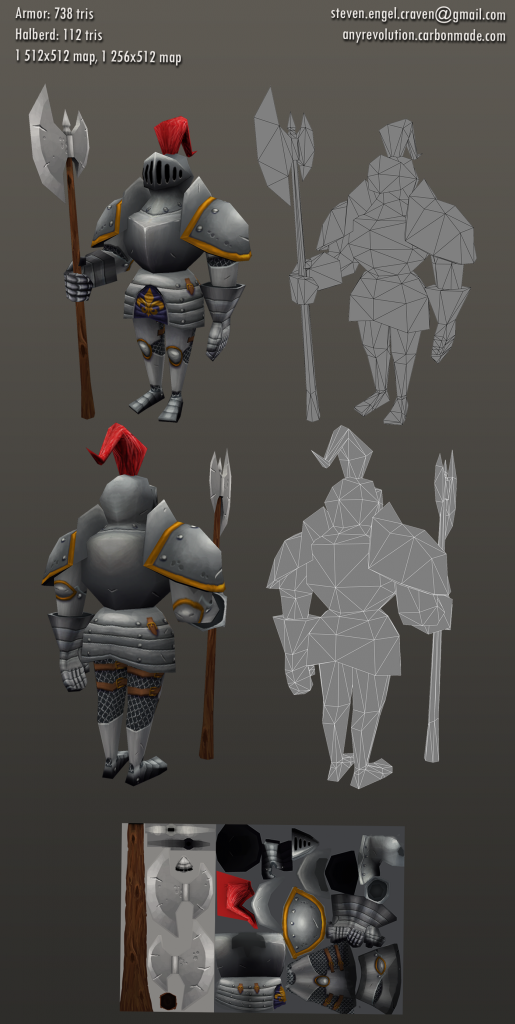
Great start! I think you should spend some more time on your texture. Really work in some color to all of the grey metals. There are a lot of good opportunities to bounce that gold around too!
The other thing that I noticed is the contrast difference between the top and bottom half of the body. You can notice it a lot on the back side of the body. The bottom part of the body looks like it lacks the AO that the top part of the torso receives.
There is some distortion happening on the gold trim of the shoulders, adding more geo or turning the faces will alleviate that.
Working in a top down lighting will have push the presentation of it all. Work in those gradients!
I agree with Carl. It's starting to look really nice, but could definitely be pushed further in value/contrast, and I'd look at beefing up some of the bevels/edges to help the pieces read better. Maybe add in a bit more bounce light as well.
Hopefully this will give you some ideas to play with.

Replies
http://www.polycount.com/forum/showthread.php?t=61079
as a reference. I won't really know for sure until I try out a test rig.
The other thing that I noticed is the contrast difference between the top and bottom half of the body. You can notice it a lot on the back side of the body. The bottom part of the body looks like it lacks the AO that the top part of the torso receives.
There is some distortion happening on the gold trim of the shoulders, adding more geo or turning the faces will alleviate that.
Working in a top down lighting will have push the presentation of it all. Work in those gradients!
Sorry for the wall of text, hope this helps.
It will also help to bring a slight touch of yellow into your highlights as well as blue in your lowlights
Hopefully this will give you some ideas to play with.