Super pimp, awesome, generic male head
So i´ve been working on this head for some time, and though it might be time to get some more feedback in here.
My goal was to create a super realistic generic realtime head.
But people weren´t realy wow-ed and i didn´t realy know why, cause i got as close to my refs as i could get and tried to keep everything as physically "realistic" as possible.
So now i decided to put some more work on this and screw physics and photoreference and just go with my gut and videogame references.
This is where i currently am:
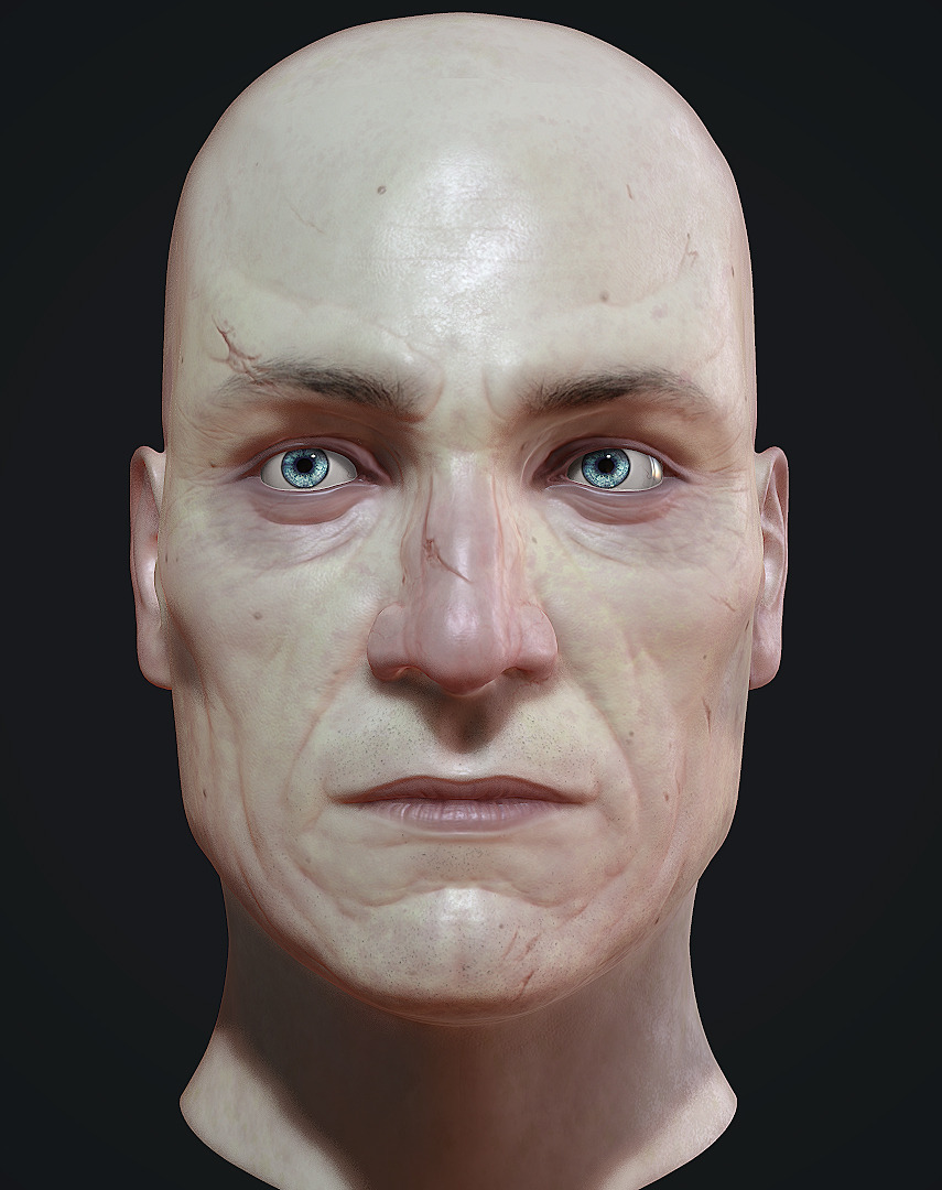
if anyone is interested in the process of how i made any given part of him i will gladly put together some breakdowns.
i am hoping to get my foot into the door at crytek, and this dude is supposed to deliver the package.
so yeah c&c is more then welcome.
this is how he looked before i started the rework:
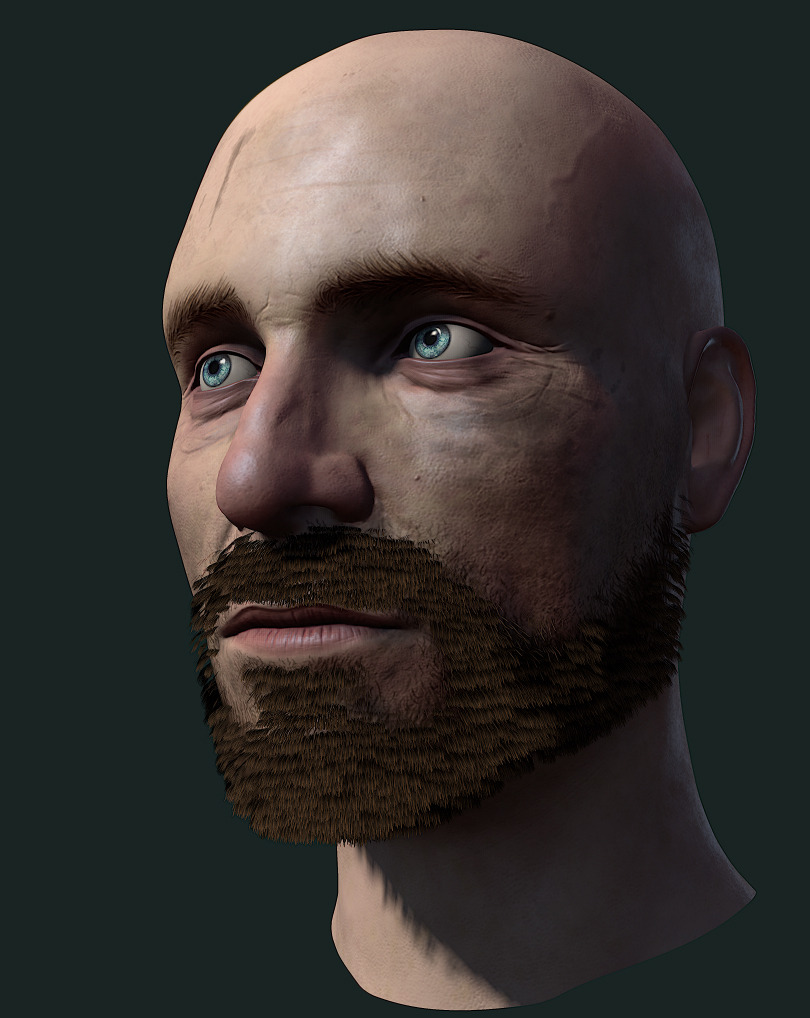
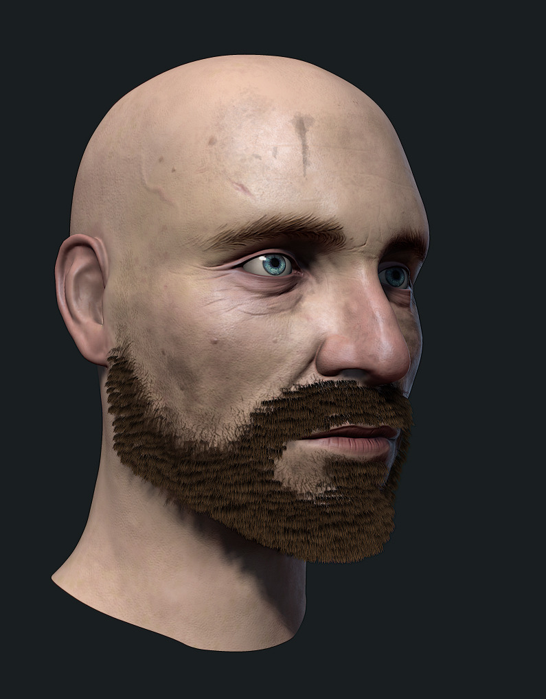
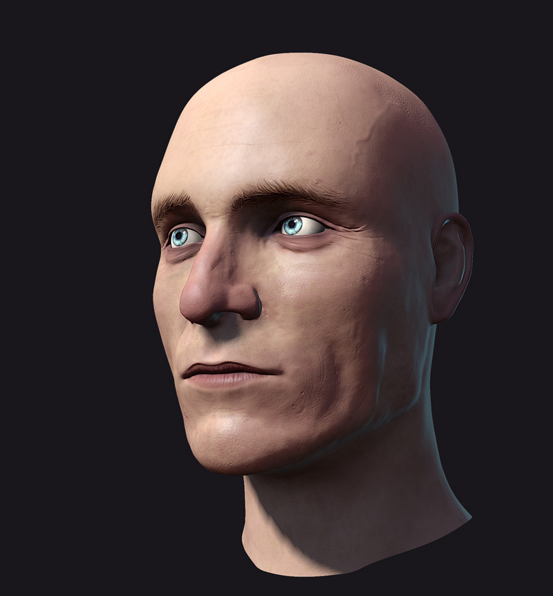
My goal was to create a super realistic generic realtime head.
But people weren´t realy wow-ed and i didn´t realy know why, cause i got as close to my refs as i could get and tried to keep everything as physically "realistic" as possible.
So now i decided to put some more work on this and screw physics and photoreference and just go with my gut and videogame references.
This is where i currently am:

if anyone is interested in the process of how i made any given part of him i will gladly put together some breakdowns.
i am hoping to get my foot into the door at crytek, and this dude is supposed to deliver the package.
so yeah c&c is more then welcome.
this is how he looked before i started the rework:


Replies
To be honest it looked better before the rework =/ Here's some things that may explane why it didn't wow people :
- he doesn't have eyelashes
- he's too generic. I know it's what you were aiming for but it's quite hard to impress someone with something very common.
- he's bald, it would be a good idea to give him a nice haircut that shows that you can actually make hair.
On the other side I really like his eyes and skin details in the normal.
there are tutorials and everything, but i didn´t find any ones that were realy usefull.
i will be iterating on the beard as i go forward, i know it can not stay the way it currently is.
it is made up of 2 chunks, one makes the bulk of the beard and the other are 5 single hairs that i used to cover the transition between the alphaplanes and the headmesh.
on the other hand i don´t think the example you linked looks a lot better. it is black so it has no shading whatsoever, and the ingame shot is so small and blurred that you can´t even see it good.
what i would consider a good example is joel from the last of us:
but i know they had like 4 complete itterations on him and he was made by seasoned character artists in several months time.
i just have no idea how to do hair "realistic" with planes and everything.
i would like to avoid having to move every single hairplane into position by hand, the current hair is mostly done with fibermesh in zbrush.
i am trying my best but as you can see its not that stellar so i am asking for feedback.
hope that didn´t sound defensive, cause its not
But the work is so good, can yo upload the maps you used? and can you show the wireframe?
here you go
clockwise starting from top left:
diffuse, spec, transmission, gloss
We should take a look at the models from Crysis 3.
Look at this guy!
You can clearly see where the bones are in this guy's face. His brow ridges are clearly defined and you can trace the outline of his orbits very easily. The bridge of his nose shows where there is bone close to the surface, and it then transitions pretty sharply into cartilage and skin. Look at the area where his cheekbones meet his jawline; tons of definition!
With that in mind, this guy is old and thin and isn't representative of most people. He has very sunken cheeks and his skin looks very thin.
Let's look at someone thicker:
It's a little harder to tell where this guy's bones are because he's significantly fleshier, but you can still pick out the structure. He has thick brows, but they follow the same general structure as the guy above. The eyebrow follows the curve of the bones underneath and there's a fleshy sac overhanging the top eyelid.
You can outline some of where his orbit is by tracing the line below his eyelids. That line then continues into the flesh of the cheek after intersecting a line on the other outside edge of the orbit.
One interesting thing you can see in this guy's face is the shape of his nose and how distinctive it is compared to the one above; the tip is very bulbous and has clearly defined lobes at the tip that aren't apparent in the first example.
One last example, to point out a few other things:
Take a look at the ridge running from the end of this guy's eyebrow to where the hairline starts. That's where the jaw muscle attaches. You'll also notice that the center portion of his forehead pushes forward more than in the other two examples. This helps reveal some of the underlying skull structure as the flesh and muscles of the forehead are very thin.
Again, you can easily trace the outline of his orbit by looking at the lines of the bags under his eyes.
One last thing to note is the structure of his neck. He has clearly defined muscles, but the skin isn't shrink-wrapped over the top of them. The skin flows and stretches over the top. You can't see every fiber of muscle, but the large forms are there under the surface.
Something you need to take away from looking at these examples is that they all show underlying structure. I've mostly just pointed out where bones are, but there are other things to consider as well:
Where are the muscles, where are the tendons, where are there pockets of fat and pieces of cartilage?
Where is the skin thickest, and where is it thinnest?
How old is the person I'm trying to represent, and how would that affect the various wrinkles, creases and cavities of the person's face?
Now, enough about basic internal structure. Let's talk details.
This guy's face lacks real planes. Play around in Zbrush at a low subdivision level with Clay Tubes and Trim Dynamic and go nuts. You can always tone things down later on as you want to refine things.
You have inconsistent amounts of wrinkles in this guy's face. His eyes' wrinkles and creases don't match the level of creasing around his nose and mouth and on his forehead. Really dig in that nasolabial fold to make him look older, and be sure to do the same with the junction between his chin and lower lip. If you want him to look younger, pull back on some of the eye creases to match the rest of the face.
His nose looks mushy, almost as if it's just kind of hanging off his face. Look up pictures of people with crazy noses and try to inject some of the personality and shape you find out there. The nose is one part of a person's face that can be really weirdly shaped without looking like it isn't real, so don't be afraid of making it strange.
His ears are just completely wrong. I'm sorry, I know that's harsh. The ear is a collection of complex shapes all nestled together, so do yourself a favor and google some ear anatomy. It's very easy to find some drawings that break the ear down into simple chunks, so don't hesitate to use as much reference as you can find. Ears are full of variation just like noses, but they're something a lot of people struggle with and it's easy to screw them up.
As much as it sucks to have to do it, arranging hair planes by hand and giving them a large amount of variation and direction is a necessary evil if you want them to look good. Right now it looks like this guy has brown golf course grass growing out of his face, and it's not helping you any. Look closely at those Last of Us references and dig up the Zbrush screenshots they dumped on Zbrush Central a while ago to see how they do hair planes. It's pretty enlightening, and it'll make you feel inadequate (I know I certainly feel that way when looking at them), but it's super worth it.
This guy's skin is looking sickly and pale. Throw some warmer tones in there and don't skimp out when working with those skintone masks and stuff. The first Vertex PDF has a very good section on facial color zones you might find helpful. Also, please take the time to hand-author your textures. Using a base from something like Knald is an excellent start, but it doesn't have the human touch that can push something from ok to good to excellent.
i know my bit of facial anatomy, but for this dude i sort of threw most of that away and tried to catch up as close to my refs as i could. my reference was michael fassbender. my goal was not to get a 1 to 1 resemblance but still try to hit the facial proportions.
as you can see the original sculpt turned out rather boring so i decided to redo the pores and put some more definition on the eyeregion, maby as a sign of prolonged stressexposure.
i gues i have to dig a lot deeper there, i would rather make him look older then younger. so i´ll toss my old refs and get some more extreme examples that display more definition.
about the ears you are totaly right too. i just took the ears from one of the default zbrush meshes and slapped them onto him.
totaly forgot how crap they look, cause i focused on tweaking all the other stuff most of the time.
yeah beard is still on the todo list.
i was thinking on experimenting with some subsurface maps and stuff but i decided to wait until marmoset 2 is released so i can tailor my maps to its shading.
ah and that knald transmission is just like that cause it instantly worked pretty good i thought, the translusancy is pretty subtle anyways.
thank you for all the suggestions, back to work
perspective
orthographic
Also, on the note of the hair, I felt Gears of War had hair that more accurately reacted to the light, even though the Last of Us looks better in most situations, the details are stylized and painted on. Also keep in mind that The Last of Us built upon the same technique, so that tut is totally valid, even if you paint the texture differently, if you use the same basic workflow you should get a decent looking beard.
i realy am not, i am just telling you how and why i did it the way i did it.
i know its not perfect and i am here to improve myself, not to get a pat on the back.
i take all the crits serious and try to implement them in the time i have.
i don´t think the tutorial isn´t valid, its just not very indepth.
i would like to know why they did the hairpatches the way they did them, not just the final result.
wich patches were placed where on the face? what if my beard isnt pure black?
how to effectively place the planes, any scripts or plugins used etc.
all of this would be very interesting to know, but nothing is mentioned in the tutorial, and the render displaying the result isn´t the bomb either.
meanwhile i did some sculptering, trying to implement swizzles crits, although googling faceial anatomy was not realy fruitfull.
any facial anatomy tuts you guys would recommend?
there are basicly resources for everything, but nothing is realy focused on art.
the only ones that are, are super basic plane structures of faces that are way too simple to be of good use.
i tried to preserve my layers, thats why i was sculpting on highest subdiv, but while polishing i recognized that the result was way too blobby and the process too slow.
so i tossed my layers and details and started over, going to attach the ears to the head too while i´m sculpting on the low subdiv.
also i decided to go smaller on the beard and just give him a goatee.
better go small and get it right this time.
hope you guys like it, if not, let me know. ima fix this dude up.
i adjusted the lp to the new shape and throw my old diffuse at it.
ears are missing cause i changed them too much so i am going to have to recreate a new lp for them.
turned out quite okay, but adjustments will have to be made.
also maroset 2 is fabulous for rendering the hp
Keep working on it!
still a lot of work ahead but hes ... heading in the right direction.
rob i think you are right, the whole eyesocket just looks a bit too round to be real. although i think the skin smoothness works in my favor here.
it looks like i went a bit too far, going to smooth it out a bit and see what that brings.
in the mean time, i remade the brows and went over the diffuse again. some hair and hopefully a beard comming next.
and a shot without shadows, only cubmaplighting. the eyematerial doesnt realy work with those settings but for the final render im going to be working with pointlights anyways.