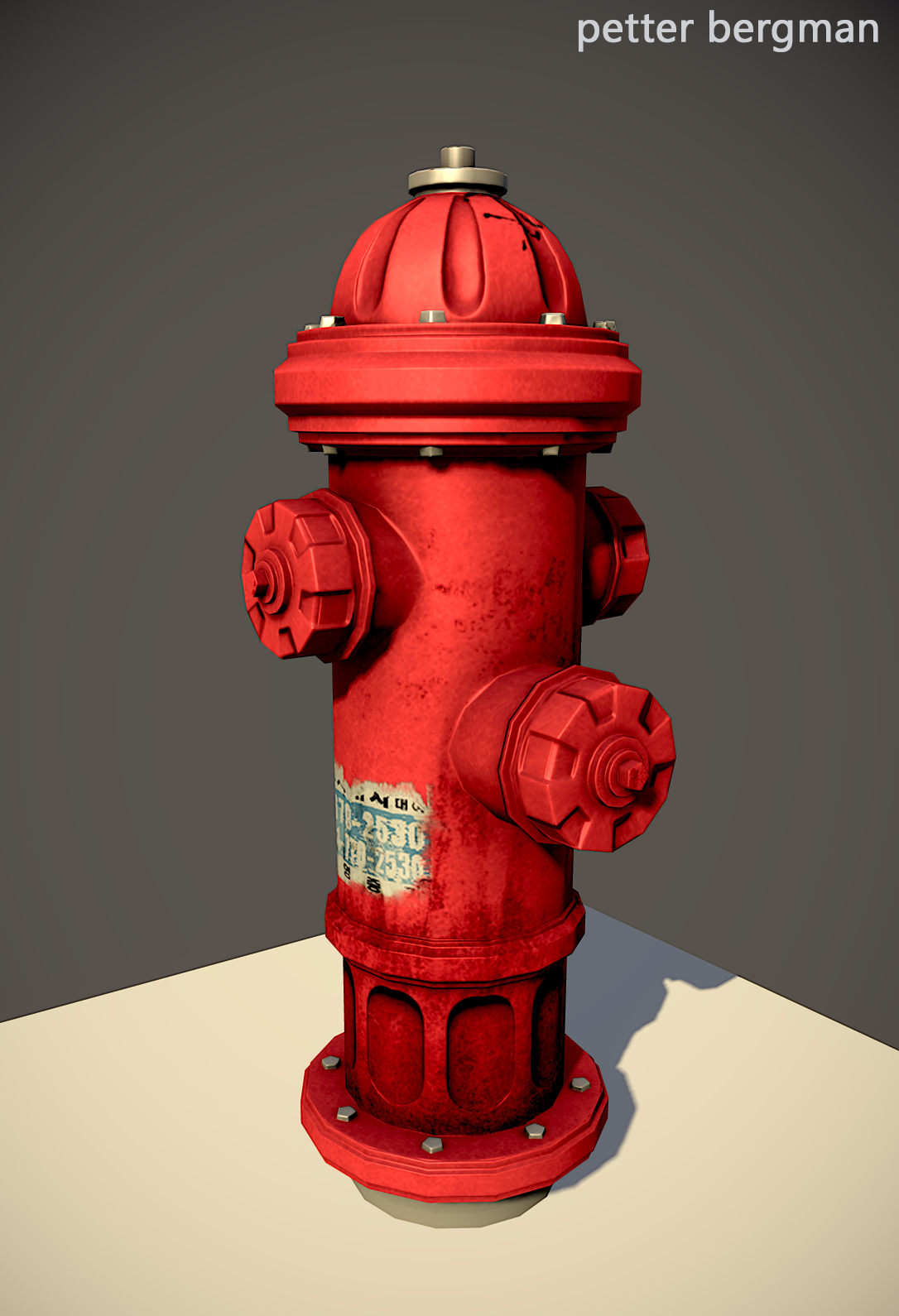
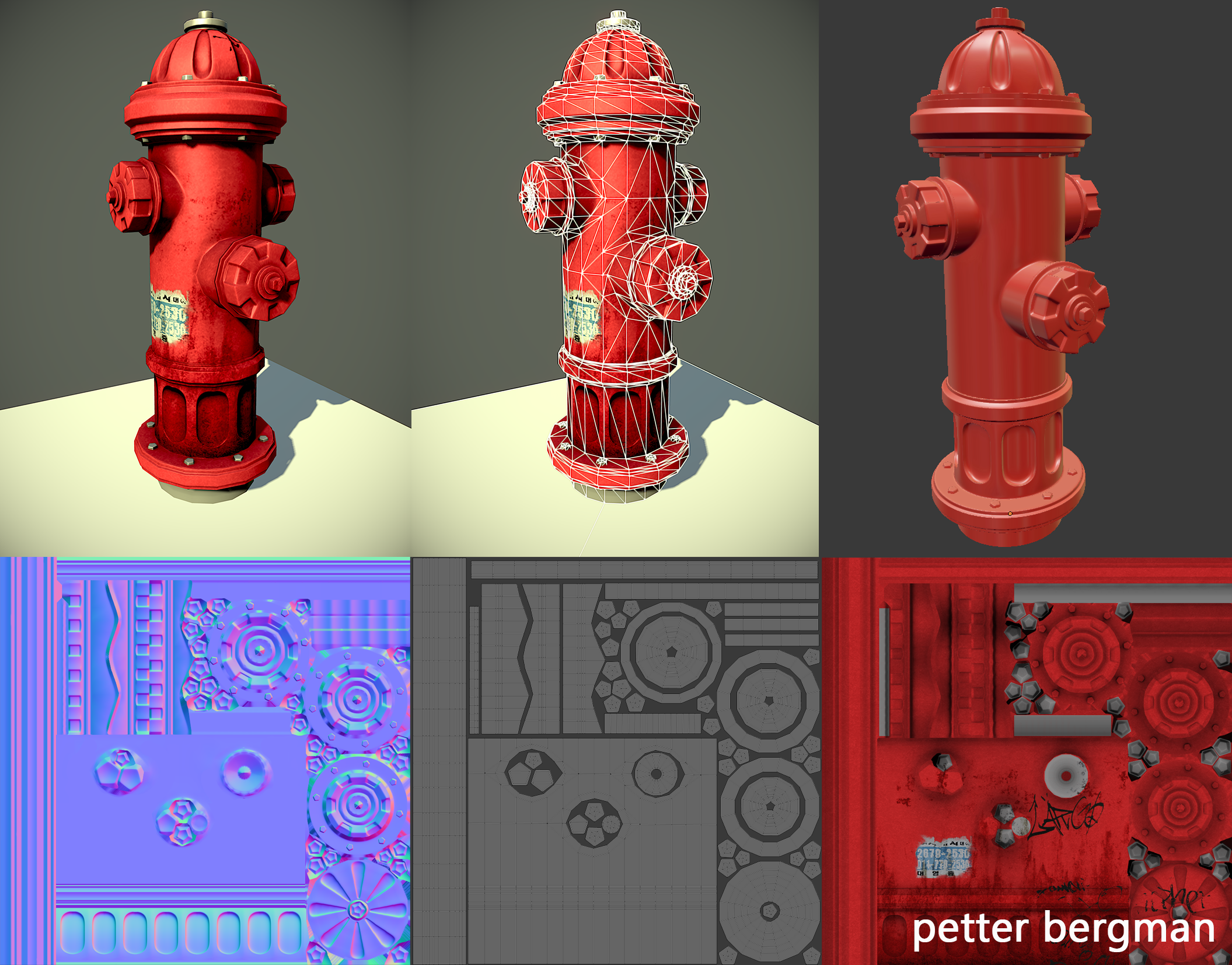
I would recommend to ad some additional edgeloops to the cylinders on the side. They do look a bit to lowpoly unlike the main cylinde, but that depends on the camera distance it is intended for. For such a close shot/perspective it is too lowpoly.
The dirt you added to the main cylinder doesn't continue at the bottom ring. This is creating a visible seam. Also add some leaking to the other cylinders and screws as well.
And the tag on the top looks odd. I don't think a person would do his tag on such a surface. I'd remove that single tag and place some urban stickers. Also the tags on the main cylinders are all on the same side - move 'em all around it, looks less regular.
I became obsessed by hydrant lately. It's a nice one here! As mentioned by mkZ3R0 the polycount of the side pipes is quite low compared to the main axis of your hydrant. From what I see since you wanted a welded mesh between the main body and the side/front part (which is a good thing) you have been limited by the number of faces of the main part of your hydrant.
You could try to improve your bolts and metallic parts. I don't know if your rendering software allow gloss map but you should consider that (if you have one actually maybe it lacks contrast between your different materials). From a recent personal experience you could try to lower your grey diffuse brightness a little and boost your specular brightness on metal. Then keep in mind that your painted metal is dielectric and the specularity should be close to white (invert from your diffuse color (so a bluish tint)). On the opposite your naked metallic parts are conductor and their specularity could be of the same color of their diffuse (or a different color for aesthetic choices).
Looking cool! I definitely recommend adding more paint chips and scratches also visible drip effects in the specularity, those will ground it in the real world more. Also the edges and bolts would have a distinct difference from the weathering it receives as well as chips and rust.
Think about where it would be too, a rainy city? Dry city? Suburb? How old is it?
I also agree with chillydog in that a hydrant wouldn't likely be tagged like that, the most I've seen them vandalized with is stickers and stuff.
Definitely add some wear and tear on the areas that would be most used, so a lot of those bolts/plugs? on the body have probably been unscrewed/screwed back in several times over their life, so you'd have paint missing, exposed metal, rust, etc. That first picture brittany posted has sort of what I'm talking about in the lower right corner. Looking good though, best of luck!
Replies
The dirt you added to the main cylinder doesn't continue at the bottom ring. This is creating a visible seam. Also add some leaking to the other cylinders and screws as well.
And the tag on the top looks odd. I don't think a person would do his tag on such a surface. I'd remove that single tag and place some urban stickers. Also the tags on the main cylinders are all on the same side - move 'em all around it, looks less regular.
You could try to improve your bolts and metallic parts. I don't know if your rendering software allow gloss map but you should consider that (if you have one actually maybe it lacks contrast between your different materials). From a recent personal experience you could try to lower your grey diffuse brightness a little and boost your specular brightness on metal. Then keep in mind that your painted metal is dielectric and the specularity should be close to white (invert from your diffuse color (so a bluish tint)). On the opposite your naked metallic parts are conductor and their specularity could be of the same color of their diffuse (or a different color for aesthetic choices).
Think about where it would be too, a rainy city? Dry city? Suburb? How old is it?
I also agree with chillydog in that a hydrant wouldn't likely be tagged like that, the most I've seen them vandalized with is stickers and stuff.
Here's some ref for ya!