[CE3] Caterpillar 797B Mining Scene
polycounter lvl 7
LATEST UPDATE:
Hey guys,
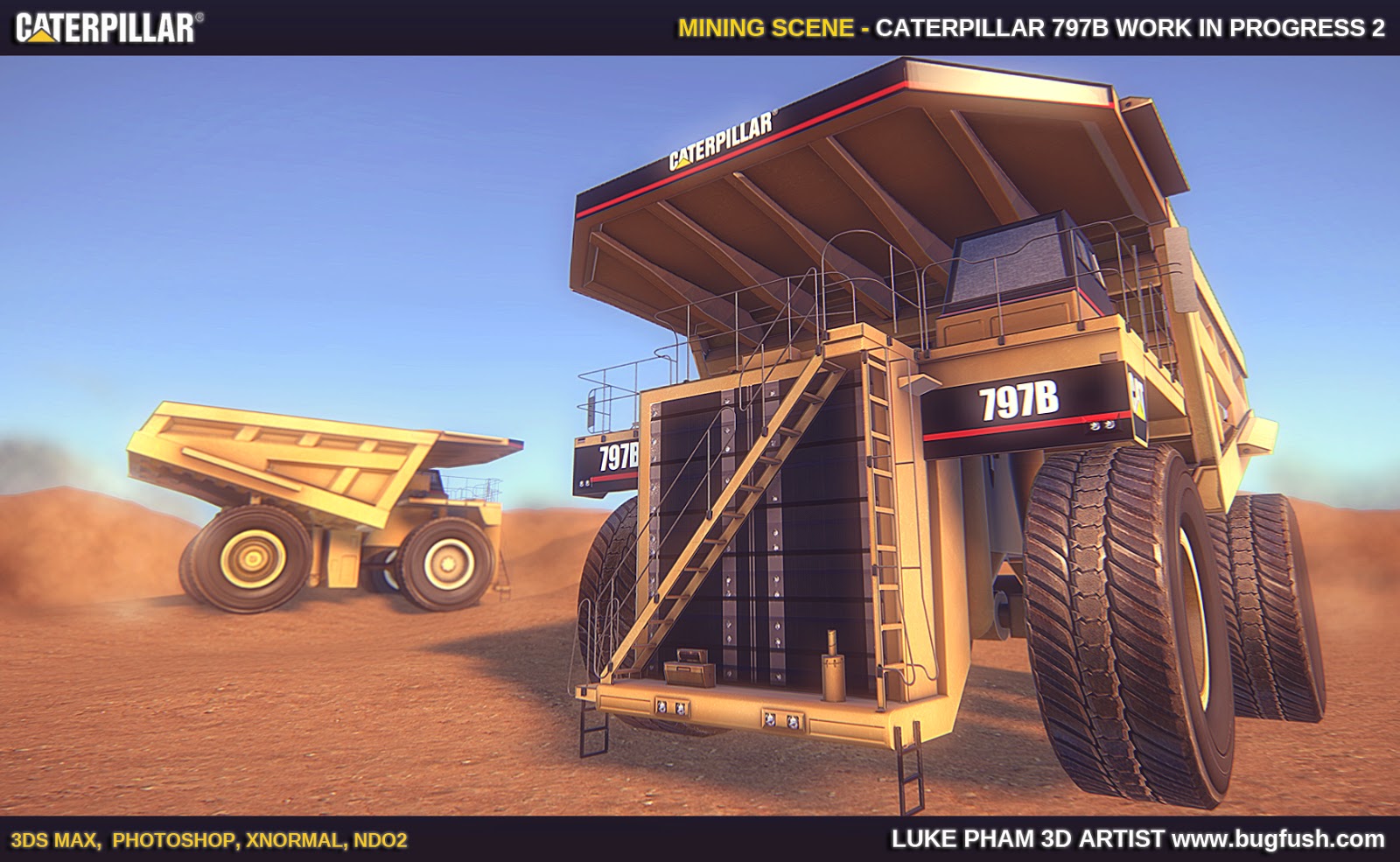
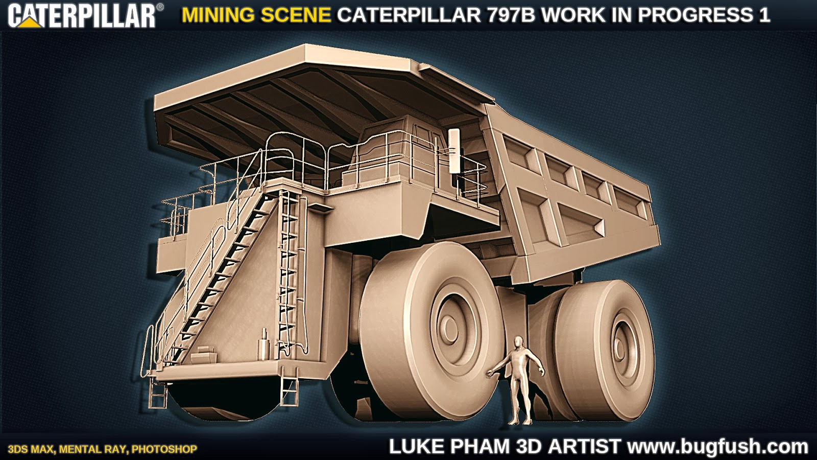
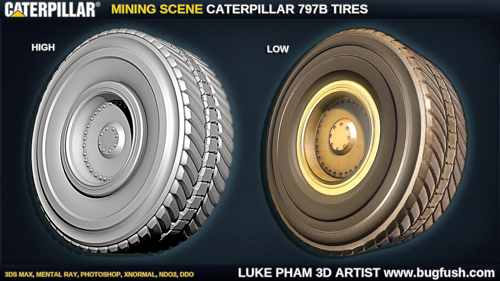
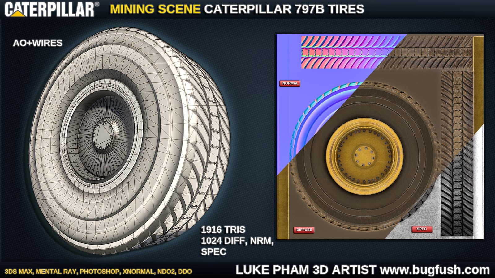
Haven't posted much personal work lately and wanted to get down into business and finish something all the way through! I've been doing a lot of critiquing of other people so it's time to stop talking shit and let people rip into my work haha. Anyways without further a due, this is the result of a weekends work. Plan is to model a Caterpillar 797B Mining truck, make a mini mining scene and plug it into CryEngine 3. Modelled the low poly so far, finished off the high poly of tires and baked them down, dDo'd and nDo'd it up. First time incorporating dDo into my workflow too, it's awesome! Anyways feel free to comment, critique, or ask any questions, any feedback would be much appreciated! Next is to finish off the high poly of the truck now and unwrap the low.")
Hey guys,
Haven't posted much personal work lately and wanted to get down into business and finish something all the way through! I've been doing a lot of critiquing of other people so it's time to stop talking shit and let people rip into my work haha. Anyways without further a due, this is the result of a weekends work. Plan is to model a Caterpillar 797B Mining truck, make a mini mining scene and plug it into CryEngine 3. Modelled the low poly so far, finished off the high poly of tires and baked them down, dDo'd and nDo'd it up. First time incorporating dDo into my workflow too, it's awesome! Anyways feel free to comment, critique, or ask any questions, any feedback would be much appreciated! Next is to finish off the high poly of the truck now and unwrap the low.
Replies
Just a suggestion, feel free to ignore
Your text is also rougly 30% too big , and id ditch the outter glow on the text, flat looks more professional, but thats maybe personal preference
For the tires, this is a insane big model right, I would consider putting atleast the middle screws in geometry and make them slightly bigger, rims are very aesthetic objects, and most of the people think of really big screws from remembering big vehicules, like a Bus and so on, and I would play with that. Yours are really tiny and flat.´Also this should be about perfectly on a players eye height.
http://rvlife.redsroads.net/wp-content/uploads/2011/04/IMG_6910.jpg
this comes pretty close to the stereotype we all know from movies and shiny american trucks, look how big they are, and your tire is easily 4 times that
Edit, oh damn more crits, now where I look at it, the concavity of your rim could be a bunch stronger, it looks really flat and for the back ones, it uses double tires, and usually the outter tire has a really deep rim which connects directly to the rim of the inner one (which has a normal rim) or something like that
Don't fall for the optical gimmicks.
He's probably joking but I think it looks good to have those even if it is unrealistic, I wouldn't add anymore bloom though.
@Kridian - Hahahaha, what you said makes me laugh!
@AlexCatMasterSupreme - Thanks man! I guess I just wanted to add some post processing effects, to push it a little bit further even if it strays away from reality a bit and looks a little stylized. I won't be adding any more bloom don't worry, if anything I might tone down a few effects to make it more subtle. Hopefully in the next update everything will look better.