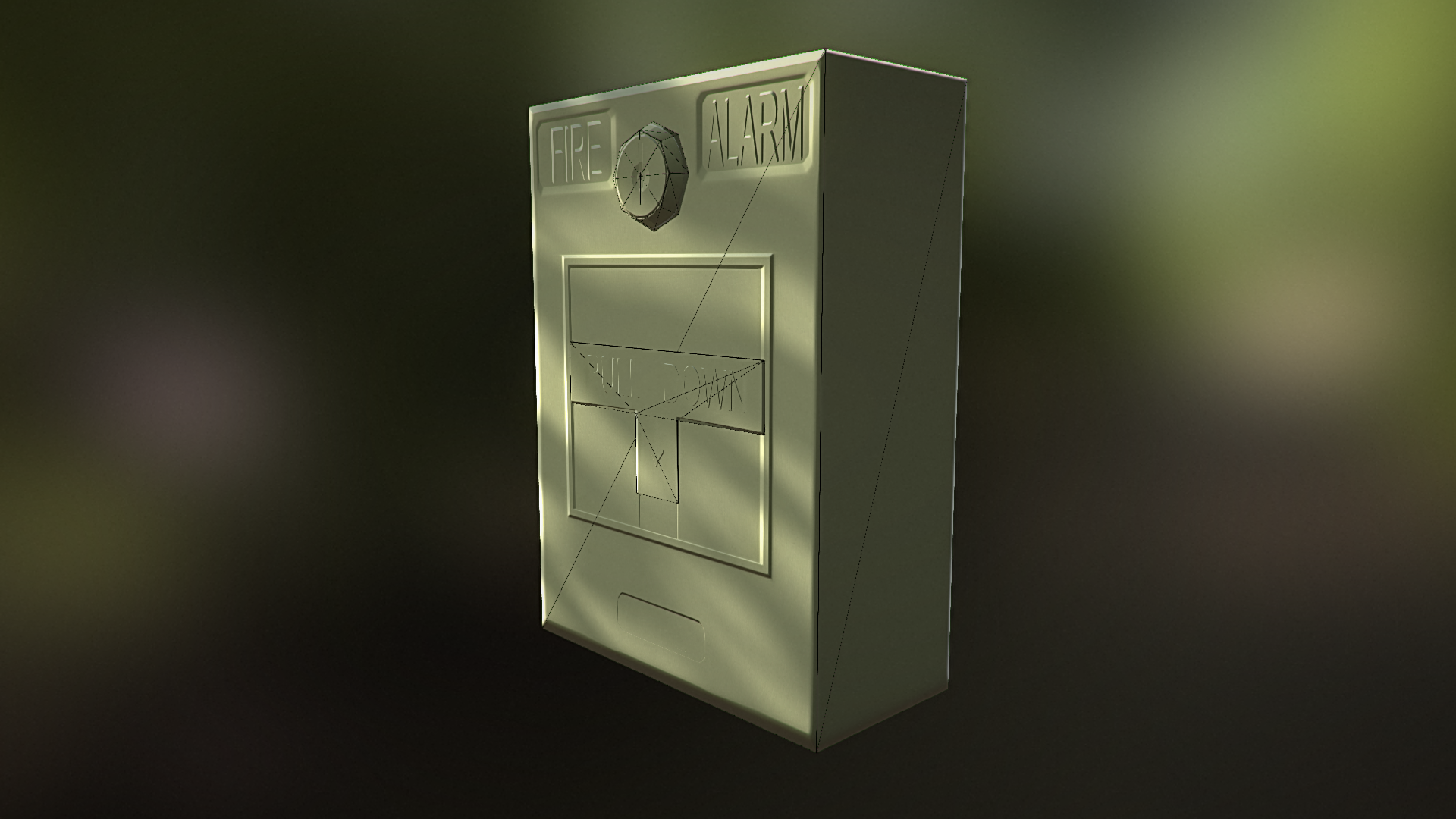
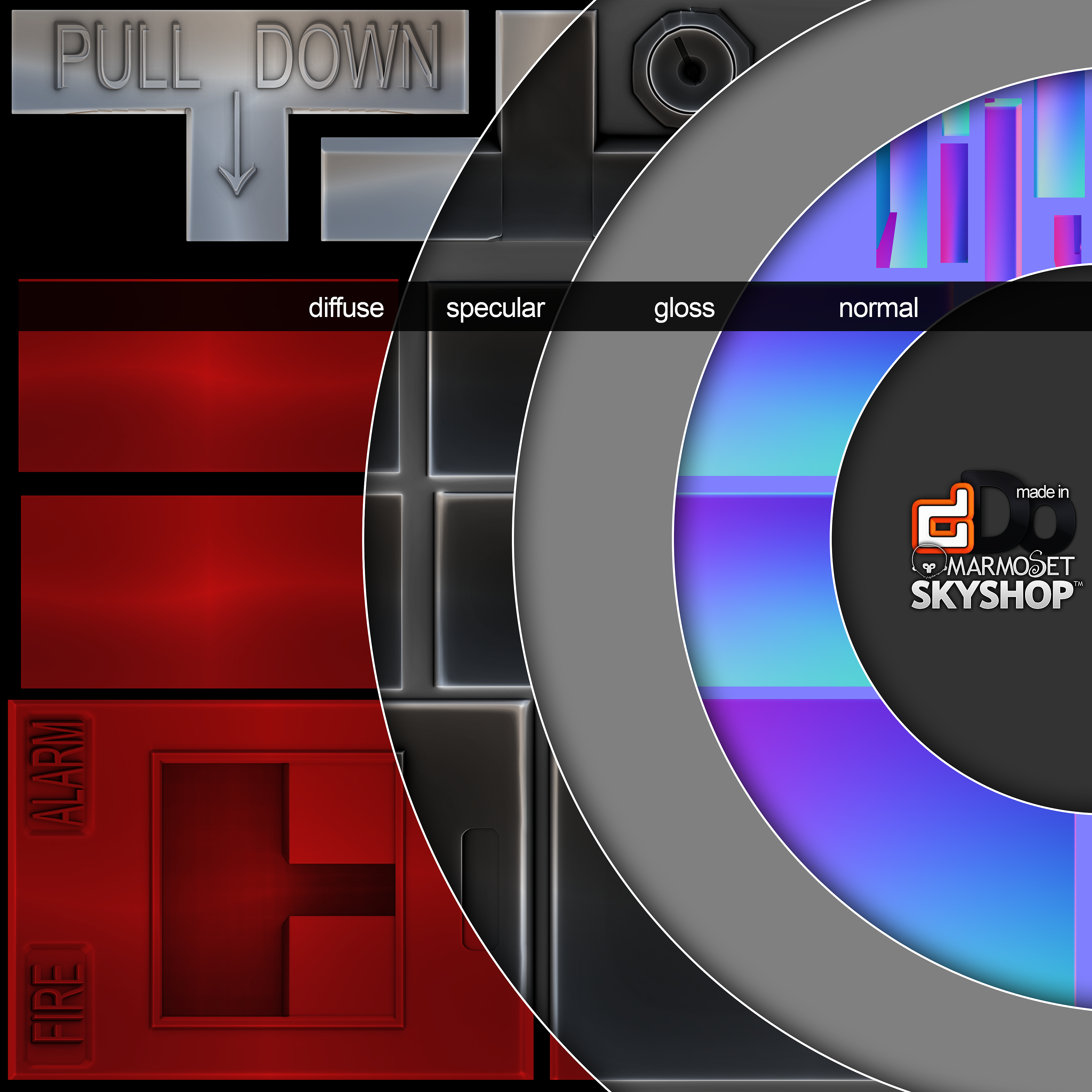
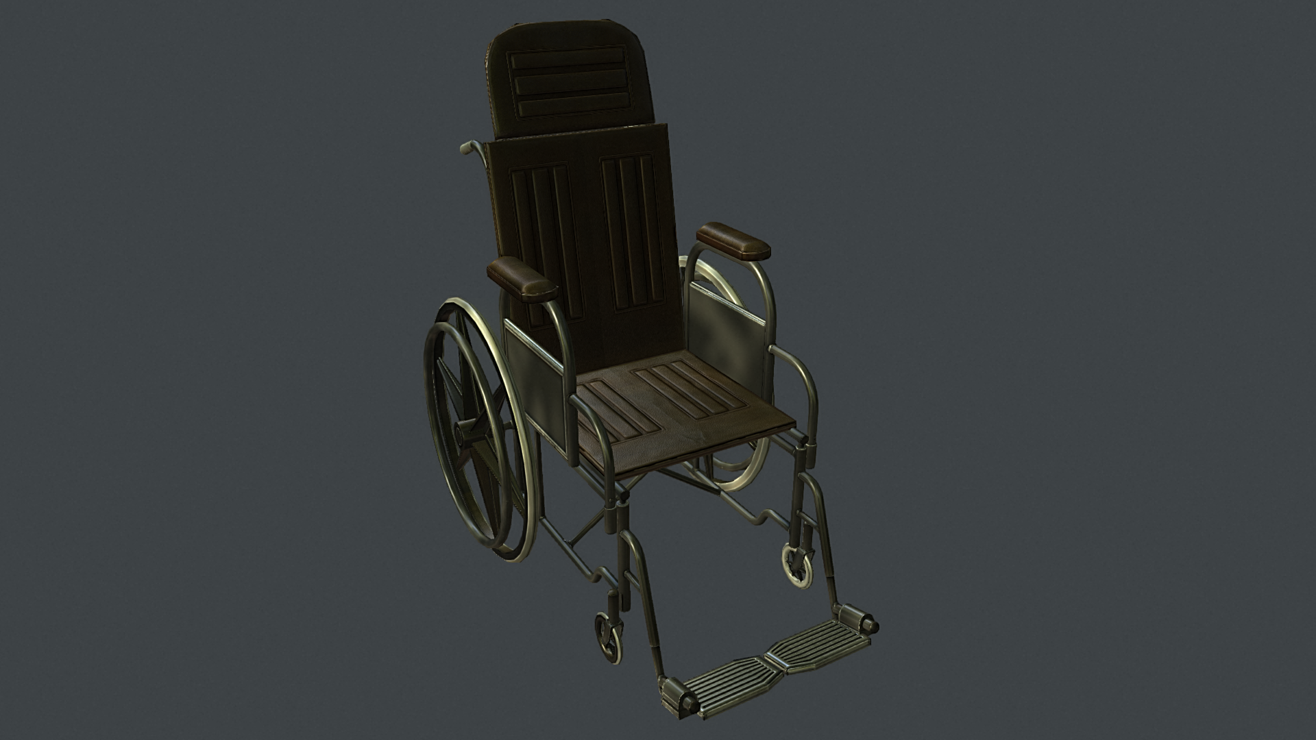
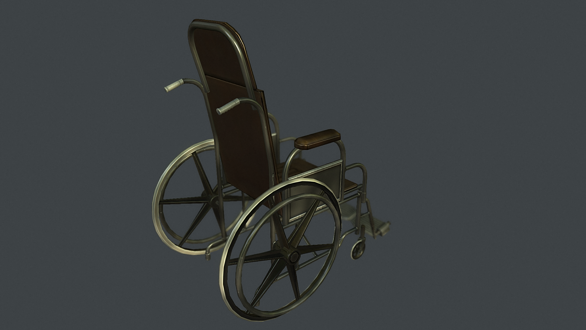
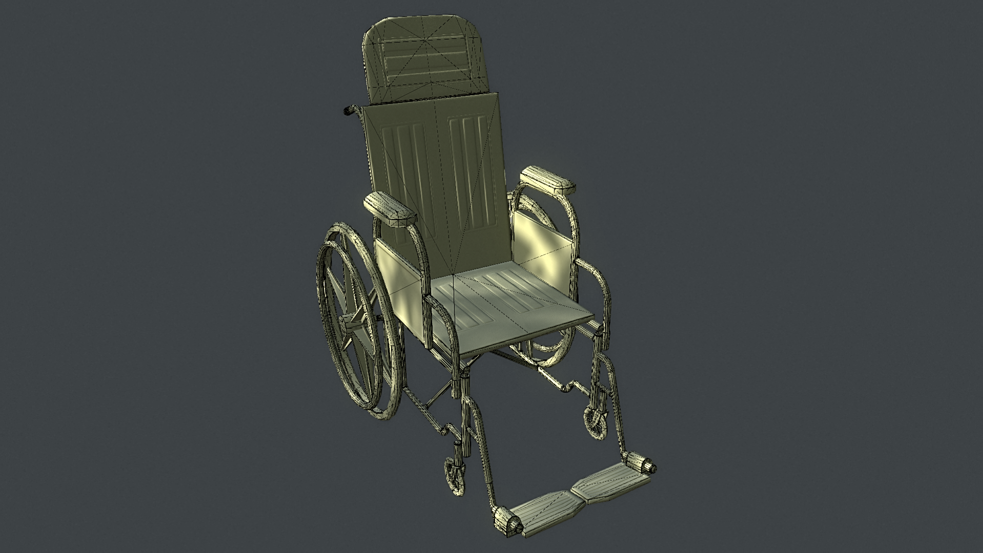
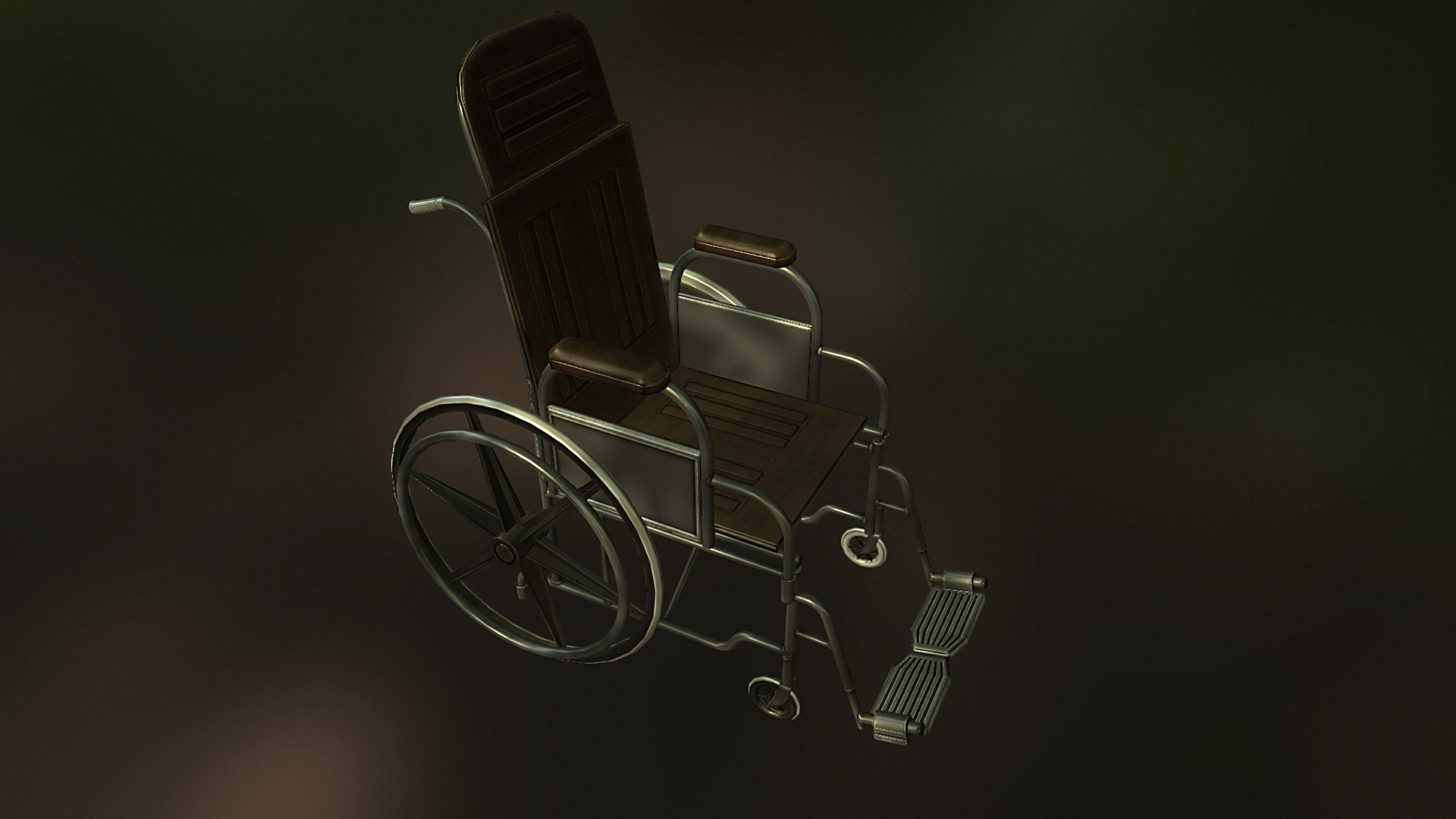
Hello all again here are a few shots for some environment props that i have been working on.I hope to make this thread a mark of my progression as an Environment Artist with the help of your critiques and comments. Please comment on any of the pics and let me know what you think and help me become a better, knowledgeable and successful environment artist.
The problem I see, and correct me if I am wrong, these all look like they didn't take you to long to make. They are all fairly simple models that look like they were run through one of the default settings in dDo and then called done. dDo can do some amazing things, but you still have to do some manual work to get good textures out of it. You clearly have a grasp of the complete workflow, modeling, texturing, and all that good stuff but remember your portfolio is to impress people!
I think if you want to do some props for your portfolio you should aim for something more interesting both for modeling and texturing. For example, I love Paul's portfolio and use it for inspiration all the time http://www.peperaart.com/. Doing something like a mechanical engine, or a scifi contraption, or a crazy looking door I think is something you should consider. It doesn't need to be as crazy complicated as the ones that he does, but pushing towards that would be a lot more interesting. On the organic side some rocks, foliage, and rubble stuff are always good to have. Weapons of all kinds are good as well, ie guns, melee, realistic, scifi, fantasy, and all that fun stuff.
I'm getting warnings popping up saying that Chrome is using an unexpectedly large amount of RAM just from looking at this page. Some files have just timed out and won't load. You've got 3 props, 2 of which are tiny; use smaller images in general, and group props if they're not important or large enough to need a sheet on their own. You could also put your mesh on one half of the image, and your maps on the other half to save space.
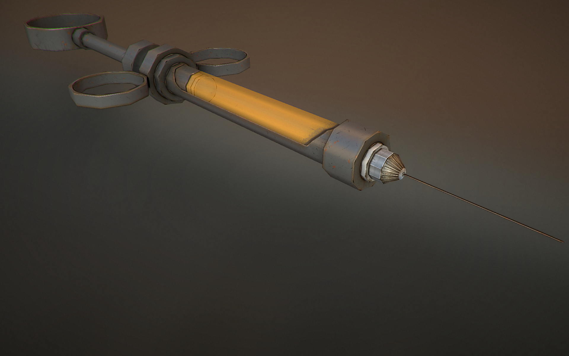
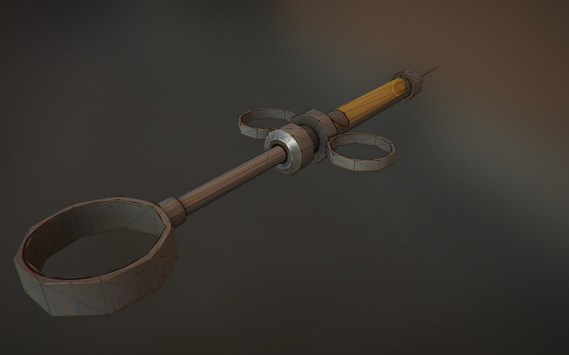
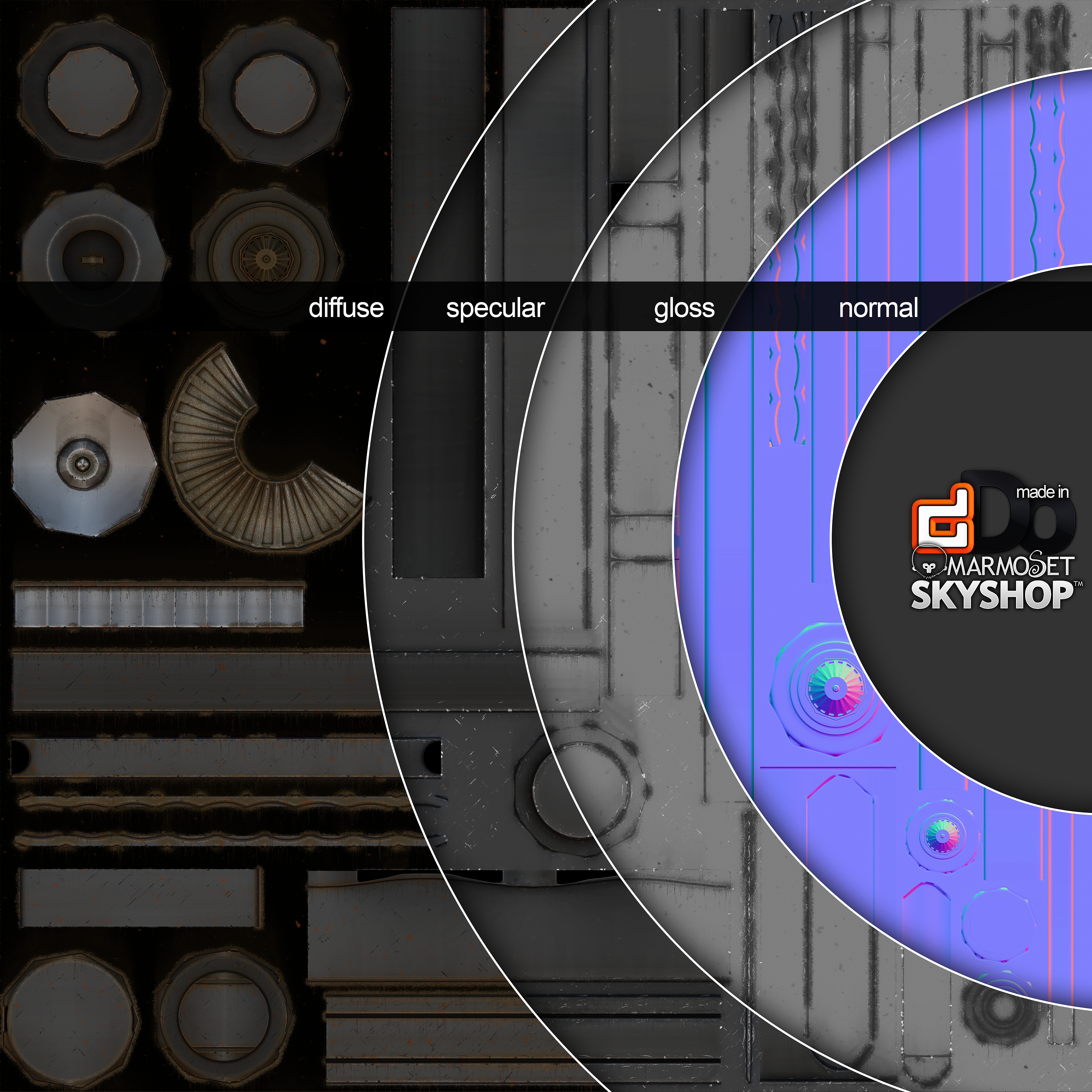
Looking at your syringe I think you've probably not got a thorough understanding of how normal baking works, as the normal map is littered with seams. Your first place to start with that is the Handplane website, there are loads of useful resources there to go over what normals are, and how they work. It's not the only place you can find normal baking info, but they've done a great job of collating the collective knowledge of the community in one place. There is a lot of misinformation about how to properly bake seamless normal maps which I found floating around when I first got into 3D art.
As it stands, your assets are, for want of a better word, boring, and this thread is barely usable on the machine I'm on right now. First off, shrink the entire content of this page to 3 jpegs of 1920x1080 or something similar/smaller. Next up, since you want to be an environment artist; make an environment! Anyone can burn through a props list one-by-one, that's the boring bit of your job, you should check out WoLD and the theory behind environments, and build something yourself, something you can walk around. You'll learn a lot more about environment art by making a hallway with tileable textures and low poly geometry than you will modelling a wheelchair.
Hardsurface skills are just one part of the package, and definitely worthy of practice, but if you really want to make environments, you've got to make environments.
Bardler and kartoonhead thank you for your advice, I appreciate all the help i can get.
KartoonHead I though I may be using too big of a resolution so i will take some time to reconstruct my thread.
Bardler,It did not take me long to model every item however let me explain my process.
First I highpoly modeled each item. it took me 6 hours to model highpoly and andother 2 to lowpoly my wheelchair, and about and hour total to model the high and low poly of the other models.
I then proceeded to unwrap my models based on where the items would have been welded or , cut in real life or where the seems would have caused a problems with normal map baking of hard edges.
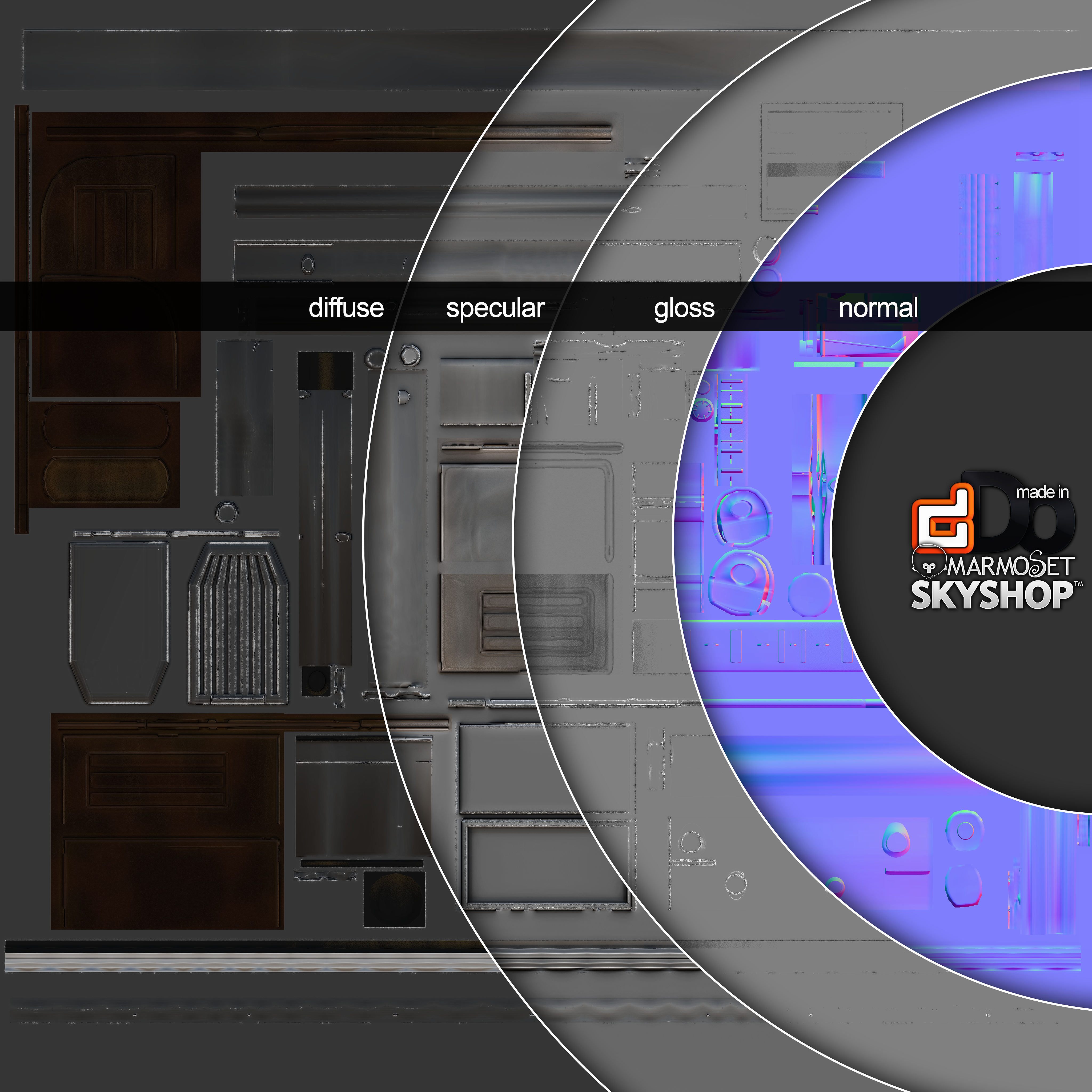
I then take my models and get my Normal, Object Space and Ambient occlusion maps from xNormal with basic settings and 4096 maps so that I can lower the resolution based on the need.
I finally work all the maps into Ddo creating my own color map with the Ddo swatches because of problems i have with 3ds max's projection modifier. my fire alarm was the only one I changed nothing with in Ddo , but that was because i wanted it to be a clean color. However the syringe texture took me and hour and a half to complete with small scratches dents rust,etc and the wheelchair texture took me 5 hours to complete in Ddo with mud splatter,mud rain, coffee stains, dirt, sun-bleaching, miscoloration and more effects subtly layered onto each other with constant tweaking to each map and detail to achieve the effects presented.
I hope im not coming off as rude or mean i just wanted to give you both insight on my workflow of how i go from start to finish with each and every model.
These specific props are for an independent game a friend of mine is working one and I really want to be the best i can be for myself and to help his game stand out from the rest.
I will continue to strive for improvement, i felt like Ive been lacking guidance for a long time due to improper schooling in game design(barely teaching anything about the pipeline) and self tutelage(days upon days of relentless studying on my own time even taking off work to focus on this and school).
thanks for shedding some light on the reality of my current position.
If you shove those things so insanely big in our face, get the polycount atleast reasonable high so we don't have to see hexagons disguised as circles as big as half my monitor.
You have to choose if you do a portfolio mesh or a simple prop for a scene id say.
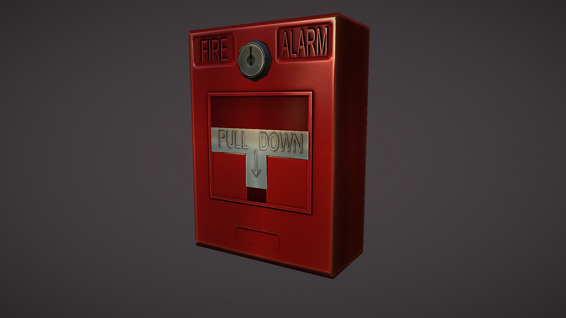
I wouldnt show simple props off like this. The presentation is good, but the assets are not worthy of that presentation. Not because they are bad, but they are so minor things with few detail and low polycount. I mean the firialarm, its just a rectangle. You have so much of your budget left for that thing, and then your key injection is so edgy that it hurts looking at.
Flaming aside, the wheelchair has a nice 19XX flair, the proportions of the syringe look a bit strange, but im no syringe expert haha, that thing on the front it so bulky. And the material definition is odd. Steel syringes ? IF you go for a crazy german doctor stereotype, alright, but else it feels strange.
You seem to do proper bakes and modeling, just use a couple more polys at places where it counts (the wheelchair is actually really fine in that regard)
I would work on your texturing the most, get some edge highlighting done / wear
so after resizing i should just delete the syringe and the fire alarm and leave the wheelchair seeing as how its the only model built intricately enough to be considered a proper portfolio piece?
Syringe: texture reference, the grey just doesn't really look like a material to me, just something generic.
I guess you weren't going for the more chrome'ish metal/new look but more something along these lines: http://img1.etsystatic.com/000/0/5736523/il_fullxfull.262233929.jpg
It would be good to just study that closer, and really try to pick it apart and replicate it (or another ref of your choosing).
This would also be good to say, maybe just leave dDo aside for a while, or if you want to keep using it, just stay away from the presets/generation things, and just stick to using photo's/brushes (wich can be easily done using the custom detail function).
It will give you a much better grasp on materials.
(a good tutorial for texturing this way using photo's would be alec moody's briefcase and tank texturing tutorial on 3dMotive)
edit: or racer445's tutorial: http://oesterkilde.dk/racer445.html
Fire alarm: Could have used a bit more poly's, I would just suggest to think of this as something that the player would interact with if it is for portfolio work.
Now the trigger/handle is just a single plane, and doesn't have the deep inset in the box like it has in real life: http://www.vote29.com/newmyblog/wp-content/uploads/2012/12/fire_alarm.jpg
This wouldn't even have driven up the triangle count all that much, and it would make the asset more interesting.
on texturing the same thing, not everything has to be super worn and grungy, clean stuff is nice to, but now it just seems like you gave it a red diffuse, some spec/gloss value and called it done after 5mins.
Keyhole: more reflective/chrome'ish, could have some small subtle scratches from a key, some dirt in the crevice where it touches the red, some glossy fingerprints from being touched
Red box: See the highlight and how the materal is slightly bumpy (would be in the normals), check the slight dings and bumps, some dust, some small scratches, etc.
thanks i will check out that texturing tutorial and give modeling for the noob challenge a go, that way i can try a different way of texturing and really focus on modeling better.
Replies
I think if you want to do some props for your portfolio you should aim for something more interesting both for modeling and texturing. For example, I love Paul's portfolio and use it for inspiration all the time http://www.peperaart.com/. Doing something like a mechanical engine, or a scifi contraption, or a crazy looking door I think is something you should consider. It doesn't need to be as crazy complicated as the ones that he does, but pushing towards that would be a lot more interesting. On the organic side some rocks, foliage, and rubble stuff are always good to have. Weapons of all kinds are good as well, ie guns, melee, realistic, scifi, fantasy, and all that fun stuff.
Hope that helps, and makes sense. If you need some more portfolio inspiration there is a great thread filled with awesome ones here. http://www.polycount.com/forum/showthread.php?t=92838
Looking at your syringe I think you've probably not got a thorough understanding of how normal baking works, as the normal map is littered with seams. Your first place to start with that is the Handplane website, there are loads of useful resources there to go over what normals are, and how they work. It's not the only place you can find normal baking info, but they've done a great job of collating the collective knowledge of the community in one place. There is a lot of misinformation about how to properly bake seamless normal maps which I found floating around when I first got into 3D art.
As it stands, your assets are, for want of a better word, boring, and this thread is barely usable on the machine I'm on right now. First off, shrink the entire content of this page to 3 jpegs of 1920x1080 or something similar/smaller. Next up, since you want to be an environment artist; make an environment! Anyone can burn through a props list one-by-one, that's the boring bit of your job, you should check out WoLD and the theory behind environments, and build something yourself, something you can walk around. You'll learn a lot more about environment art by making a hallway with tileable textures and low poly geometry than you will modelling a wheelchair.
Hardsurface skills are just one part of the package, and definitely worthy of practice, but if you really want to make environments, you've got to make environments.
KartoonHead I though I may be using too big of a resolution so i will take some time to reconstruct my thread.
Bardler,It did not take me long to model every item however let me explain my process.
First I highpoly modeled each item. it took me 6 hours to model highpoly and andother 2 to lowpoly my wheelchair, and about and hour total to model the high and low poly of the other models.
I then proceeded to unwrap my models based on where the items would have been welded or , cut in real life or where the seems would have caused a problems with normal map baking of hard edges.
I then take my models and get my Normal, Object Space and Ambient occlusion maps from xNormal with basic settings and 4096 maps so that I can lower the resolution based on the need.
I finally work all the maps into Ddo creating my own color map with the Ddo swatches because of problems i have with 3ds max's projection modifier. my fire alarm was the only one I changed nothing with in Ddo , but that was because i wanted it to be a clean color. However the syringe texture took me and hour and a half to complete with small scratches dents rust,etc and the wheelchair texture took me 5 hours to complete in Ddo with mud splatter,mud rain, coffee stains, dirt, sun-bleaching, miscoloration and more effects subtly layered onto each other with constant tweaking to each map and detail to achieve the effects presented.
I hope im not coming off as rude or mean i just wanted to give you both insight on my workflow of how i go from start to finish with each and every model.
These specific props are for an independent game a friend of mine is working one and I really want to be the best i can be for myself and to help his game stand out from the rest.
I will continue to strive for improvement, i felt like Ive been lacking guidance for a long time due to improper schooling in game design(barely teaching anything about the pipeline) and self tutelage(days upon days of relentless studying on my own time even taking off work to focus on this and school).
thanks for shedding some light on the reality of my current position.
You have to choose if you do a portfolio mesh or a simple prop for a scene id say.
I wouldnt show simple props off like this. The presentation is good, but the assets are not worthy of that presentation. Not because they are bad, but they are so minor things with few detail and low polycount. I mean the firialarm, its just a rectangle. You have so much of your budget left for that thing, and then your key injection is so edgy that it hurts looking at.
Flaming aside, the wheelchair has a nice 19XX flair, the proportions of the syringe look a bit strange, but im no syringe expert haha, that thing on the front it so bulky. And the material definition is odd. Steel syringes ? IF you go for a crazy german doctor stereotype, alright, but else it feels strange.
You seem to do proper bakes and modeling, just use a couple more polys at places where it counts (the wheelchair is actually really fine in that regard)
I would work on your texturing the most, get some edge highlighting done / wear
The best thing to do with these smaller pieces is just make a small scene out of it, it doesn't have to be a large complex environment, you could just do something along the lines of these:
http://www.polycount.com/forum/showthread.php?p=1871590#post1871590
http://www.polycount.com/forum/showthread.php?t=124023
Assets seperate:
Syringe: texture reference, the grey just doesn't really look like a material to me, just something generic.
I guess you weren't going for the more chrome'ish metal/new look but more something along these lines:
http://img1.etsystatic.com/000/0/5736523/il_fullxfull.262233929.jpg
It would be good to just study that closer, and really try to pick it apart and replicate it (or another ref of your choosing).
This would also be good to say, maybe just leave dDo aside for a while, or if you want to keep using it, just stay away from the presets/generation things, and just stick to using photo's/brushes (wich can be easily done using the custom detail function).
It will give you a much better grasp on materials.
(a good tutorial for texturing this way using photo's would be alec moody's briefcase and tank texturing tutorial on 3dMotive)
edit: or racer445's tutorial: http://oesterkilde.dk/racer445.html
Fire alarm: Could have used a bit more poly's, I would just suggest to think of this as something that the player would interact with if it is for portfolio work.
Now the trigger/handle is just a single plane, and doesn't have the deep inset in the box like it has in real life:
http://www.vote29.com/newmyblog/wp-content/uploads/2012/12/fire_alarm.jpg
This wouldn't even have driven up the triangle count all that much, and it would make the asset more interesting.
on texturing the same thing, not everything has to be super worn and grungy, clean stuff is nice to, but now it just seems like you gave it a red diffuse, some spec/gloss value and called it done after 5mins.
http://respectedhusband.files.wordpress.com/2012/10/fire-alarm.jpg
taking this as reference:
Keyhole: more reflective/chrome'ish, could have some small subtle scratches from a key, some dirt in the crevice where it touches the red, some glossy fingerprints from being touched
Red box: See the highlight and how the materal is slightly bumpy (would be in the normals), check the slight dings and bumps, some dust, some small scratches, etc.