The BRAWL² Tournament Challenge has been announced!
It starts May 12, and ends Oct 17. Let's see what you got!
https://polycount.com/discussion/237047/the-brawl²-tournament
It starts May 12, and ends Oct 17. Let's see what you got!
https://polycount.com/discussion/237047/the-brawl²-tournament
Female Sculpt (Base mesh)
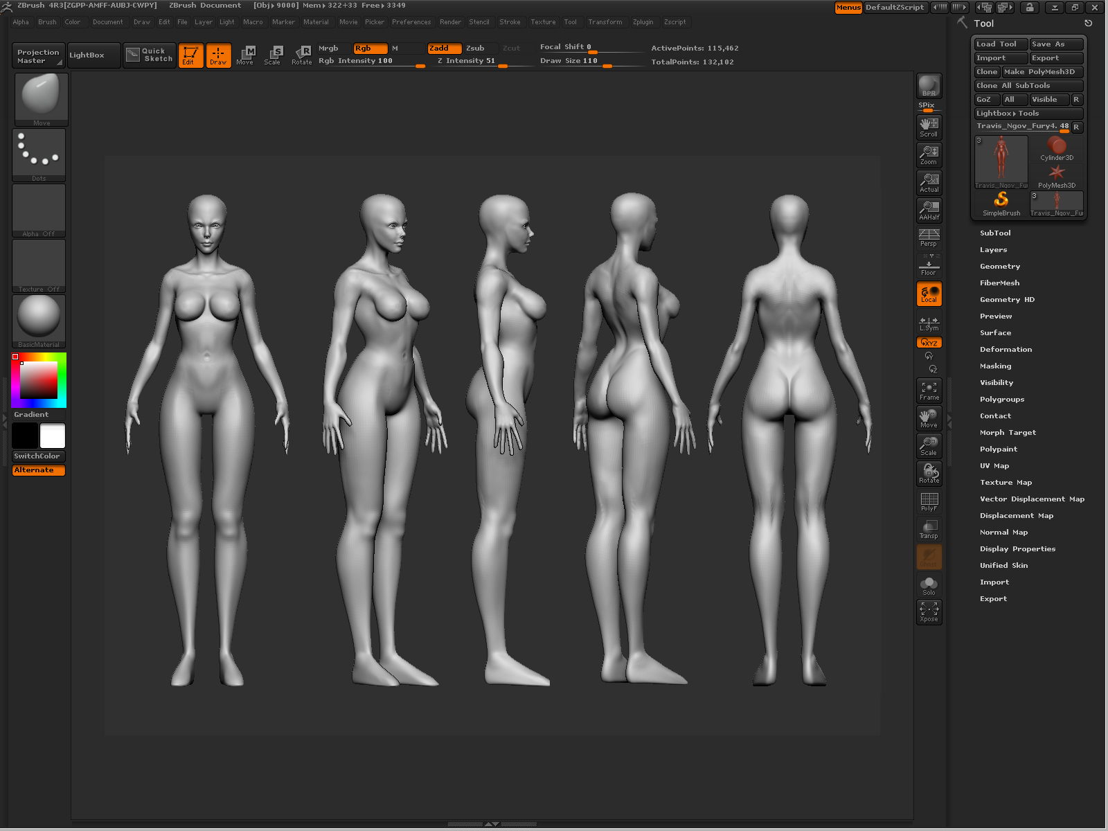
So my next upcoming projects include me having to sculpt 2 Female Characters so i decided to make a female base mesh and i plan to re use this base mesh for any future female characters.
Here's what i have so far:

im going for a comic stylized proportioned female for one of the characters.
critiques/feedback is greatly appreciated.
Thanks!
Here's what i have so far:

im going for a comic stylized proportioned female for one of the characters.
critiques/feedback is greatly appreciated.
Thanks!

Replies
Alright! i'll check the proportions on those and make the necessary changes
but as stated earlier, im going for a comic character type of style so i changed her features to this:
her head is too small overall, compared to the body.
Hope this helps.
Her collar bones are also a tad low. The clavicle is more or less a straight bone that twists to flows towards the shoulder.
Since you're aiming for stylized comic style, I'd say your proportion is quite cool to look at. You can move her knee caps a bit if you want more realistic.
However, I'd suggest you move her head back a bit so it's not like she's hunching over. And maybe she can straighten up her body and her chest, by tightening her hips and move em more forward and not pumping her chest so forward.
We do the same thing in ballroom dancing, btw. We don't pump out our chest or hips, we straighten our back and chest and send them more upward, instead of outward. That keeps us tight-cored and make our dancing frame strong, solid and impressive to look at. And yes, we push our head way back, or we would be dancing with foreheads touching xD
To drive the point home further I'd like to stress the following : Be very, very careful with shift-snapping to front view and side view in Zbrush. Here is why : every time you do that (regardless of perspective mode being enabled or not), you run the risk of mentally switching to a "CAD" approach to anatomy.
Let's take the breasts as an example. You know what shape they are supposed to be (a round, gravity-influenced pear shape sitting on the ribcage), so when snapping to front view it seems to make sense that this view should show exactly that, that is to say, a soft round shape affected by gravity, seen from the front. But now look at the nude reference, and mentally outline the breasts - in front view, their outline are projected into two diagonal ellipses, with their major axis sitting at a 45 degrees angle. That's a VERY different thing from "a round shape seen in front view". This is partly because the torso/ribcage itself is actually at an angle in depth (leaning back), which is part of the reason why breasts are falling diagonally sideways.
This is just an example of something that ends up "looking right from one angle, but off from the other" in 3D. I would strongly recommend you to avoid shift-snapping to orthos almost at all costs, and instead, just keep rotating your model in perspective view to assess it from all angles at all times. Anatomy elements are supposed to overlap in space - not sit "next to each other".
This might sound like a minor thing but I have been noticing this on Zbrush models over and over again in the past years or so. Shift-snapping to front view in Zbrush is a very nicely implemented feature that users just *want* to use, yet it is a very dangerous practice. I would also recommend you to regularly export your mesh to another program in order to check it in real 3D as often as possible, and also, keep looking at references like that nude picture, and mentally outline features to really see how they project into the 2D plane of the screen/camera/picture.
Hope this helps !!
Pior: ohh man i like that "not shift snapping orthos" part. Makes ALOT of sense. thanks ALOT, this helped a ton! ^^
thanks guys the feedback is perfect and just what i needed!
i'll post an update on this quite soon, maybe even tonight.
Except that her boobs look kinda off from front view. The top part of them.
And she's super tall. Well, more like her legs are very long. She's about 9 head tall right now. Average woman is 7 or 7.5, heroic is 8 head tall. That's your call though.