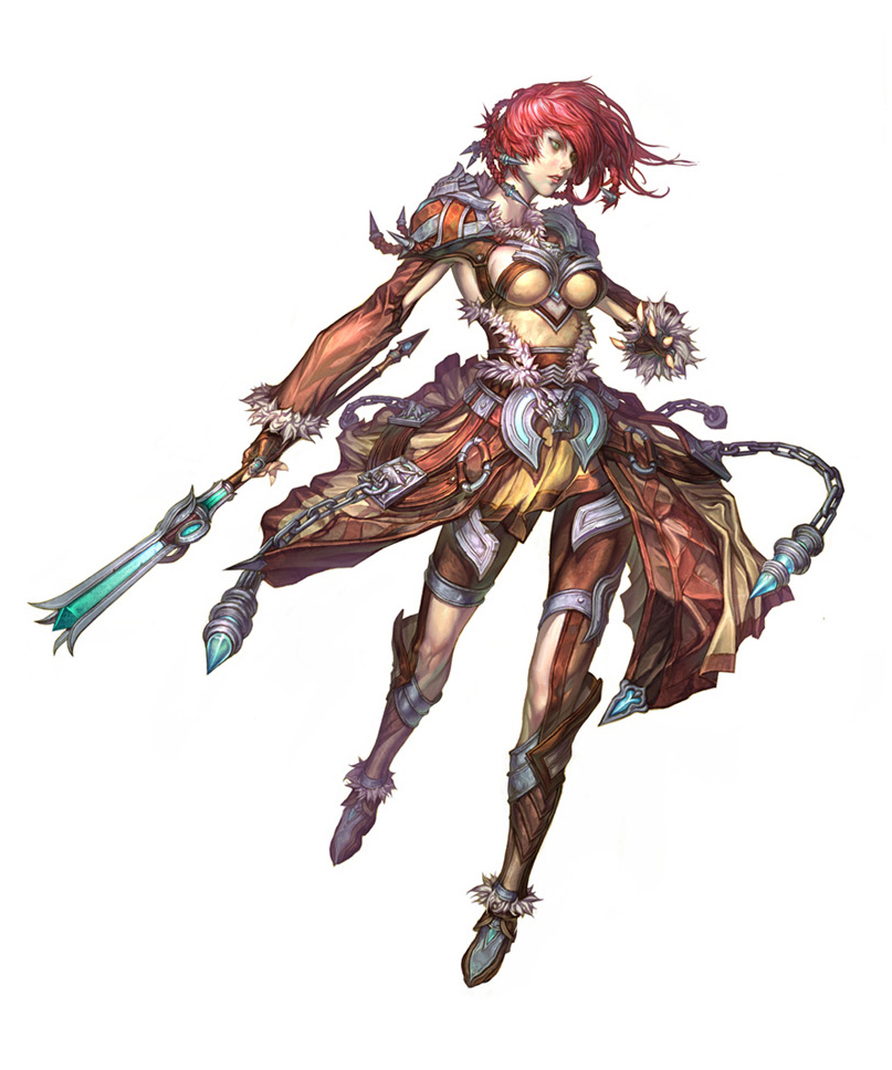
Guild Wars 2 Norn Elementalist
Hey all, I thought I'd try out that internship and I know it's past the due date, but I'd thought I'd do it for myself anyways. This will be my second time sculpting a female in zBrush so I'm sure there are some glaring problems I'm not seeing as of yet.
Here's the concept


Definitely gotta fix that nose...
Here's some of the reference I've been following

Looking forward to your feedback.
Here's the concept


Definitely gotta fix that nose...
Here's some of the reference I've been following

Looking forward to your feedback.

Replies
The reason your model looks so blobby is because of that. You need to focus on the main shapes before going.
A quick fix, but I didn't use any reference, so I could be wrong a little here.
The main problems you have on your model is muscle insertion. You have knowledge of certain muscles where they go, but not exact. The brachioradialis is attached on the humerus bone. Yours appears to show it's not connected. The deltoid is attached to the attached to midway of the humerus, your's is kinda small.
I would definitely fix the shape of the leg. Seem too stiff.
The pectoralis isn't stretching and seems kinda relax.
You do not have the Latissimus Dorsi. Even on women, you are still able to see it a little. Especially when the arms are midway like that.
I would make the pelvis slightly bigger, but that's more of an artistic taste to make it appear more feminine/attractive if you are going for that.
Edit: I forgot it's for the arenanet internship. The legs are pretty long compared to yours. You should make it a little longer and very slightly skinnier. Rest appears fine in proportions.
I believe the reason why it looks weird is probably because proportion wise, the top of the leg (from the pubic area to the bottom of the knee) is supposed to be the same length as as the bottom of the leg.
Looking at both, it seems like the thighs looks pretty big in comparison to the pelvis.
Try not to relay on the red lines much, just a visual image so you can understand what seems weird in certain areas.
Whats considered a good basics builder?...