Low Poly Sci Fi Environment
Hey guys so I have spamming the Low Poly thread for a while but it's time I made a thread!
I wanted to try some hand painted skills so I thought I would make an environment. It started off as just the hatch in the corridor and slowly expanded from there.Then I was thinking I would try to make my scene a bit more of a game and a bit more interactive just to try and stand out really.
So here it is! I still need to speed up the animations for they don't end up delaying the player!
This is the video which shows what I am going for.
[ame="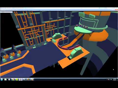 http://www.youtube.com/watch?v=FPQMl9pK3lw"]Update - YouTube[/ame]
and some shots! Any crit would be awesome!
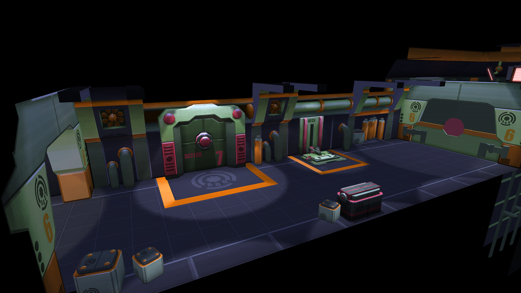
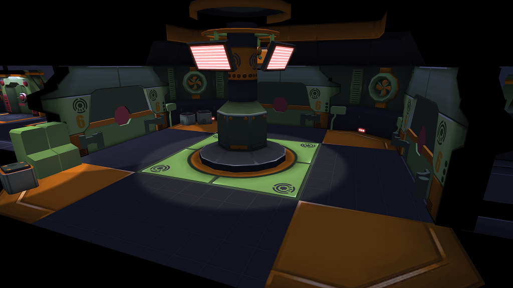
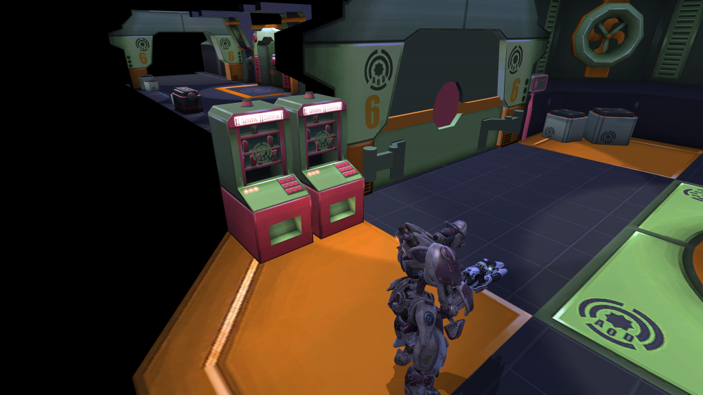
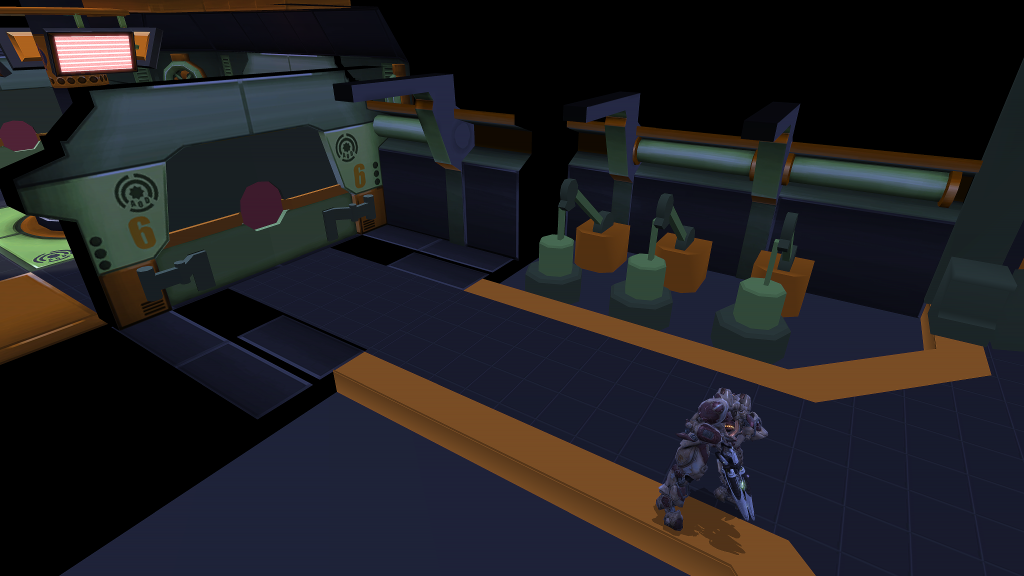
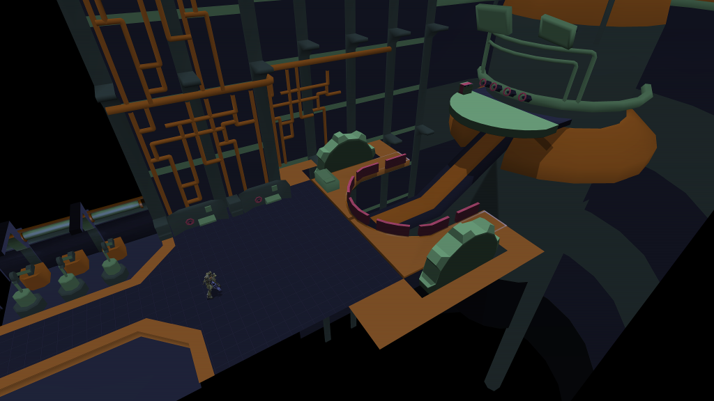
I wanted to try some hand painted skills so I thought I would make an environment. It started off as just the hatch in the corridor and slowly expanded from there.Then I was thinking I would try to make my scene a bit more of a game and a bit more interactive just to try and stand out really.
So here it is! I still need to speed up the animations for they don't end up delaying the player!
This is the video which shows what I am going for.
[ame="
 http://www.youtube.com/watch?v=FPQMl9pK3lw"]Update - YouTube[/ame]
and some shots! Any crit would be awesome!


Replies
I have changed the pumps because I didn't really like the design of the others, they looked a bit flimsy. I have also animated the lights in the engine room now as well which can be seen in the video as well as animated pumps. I need to fix up some of the parts of the pumps, its a bit rough in places!
Finbished Hallway
and animations
http://www.youtube.com/watch?v=xqyaLTrWxcs&feature=youtu.be
Long time no update!
Finally started on the last room and went through a couple of iterations of the pumps but finally got something I liked.
and the pumps in motion
http://www.youtube.com/watch?v=Zn0JfvXXZqE&feature=youtu.be
also a little OT but I spent a few days making this as well!
A few things jumped into my mind though:
How about giving that last room its own color scheme? Right now it somehow feels "just like another of those floors" because of the color distribution being too uniform. Although you have very distinct shapes going on and therefore a point of interest in this room, you are not guiding the viewers eye to that point with your color choices. You maybe could add another color to the mix and make the centerpiece of that room pop a little more, but that may proof to be too much. You also could try and separate the different elements (walls, centerpiece) a bit more using the existing colors.
Apart from that, I am not too fond of the specular shine you painted into the textures for the wall panelling in this last room. Especially not on those orangey ones, I feel the highlights might be a bit too desaturated/too white and to harsh.
All that being said, don't let me discourage you. I really think this whole project is ace and has - as I've stated before - great potential. I wish I had the patience to work on a personal project like that.
Regards,
some
Thank you so much for the advice I really appreciate it!
A different colour scheme is a great idea, I actually planned to do that at the start but never followed through. Did you mean change all the colours or just the orange? I was thinking about just changing the orange to a blue or something? I shall go over my colour distribution again and try and make things pop a bit more!
Yeah I agree with the spec, It does look a bit out of place. I will tone it down!
Thanks so much again for your comments!
Ok so I quickly went and changed the colour, I think it might be a bit too intense but maybe along the right lines?
Right now I'd say the room is a bit too dark overall, especially when comparing it to the other rooms and floors. My eye is heavily drawn towards the piping on the walls and those panels on the floor. You may want to consider what is important in this room - most certainly not the piping but the bigger stuctures!
Keeping your original colors, I thought about something along those lines:
Excuse the downright awful paintover, I just wanted to get my point across but was too lazy to grab my wacom.
Hope that all makes sense to you.
I love the style and colors.
Did you plan on some particle effects and more lightning stuff or will you
keep it very saturated ?
The Drones are great ! Got inspired ?
Hey Alpha, Yeah I want to do some custom lighting and some particle effects as well, just to try and get a better atmosphere!
Also completely my bad, every time I have linked the drones before I have linked that exact image! I just started warhammer and made that to test out colour schemes!
So I switched around the colours and much prefer what I have!
That last room could use a bit more detail love on the floor and the tank but I take it that it is not finished yet. Other than that this has improved greatly! You certainly leveled up doing this - pun intended.
some
So yeah I have nearly finished all then texturing, then I need to focus on particle effects and lighting!
and a video of the top of the tank, I dont know if looks right though!
http://youtu.be/iIyyL310t6w
A massive thanks to everyone who comments and special thanks to some3dguy whos crit really turned this around!
Flythrough/Render
[ame="
Screens
Glad I could be helpful in some way and thanks for the flattering words, but actually YOU made it happen and had the patience to go through all of this. :poly121: