University Assignment: Metal Gear Raptor (Feedback Welcome!)
For a current university assignment I was tasked with creating an organic or robotic dinosaur that has to be fully textured, normal mapped, rigged an skinned and then presented in UDK engine.
I chose to create a robotic dinosaur and decided to theme it to the Metal Gear Solid franchise. This helped me to keep within a coherent style while still allowing me to be creative.
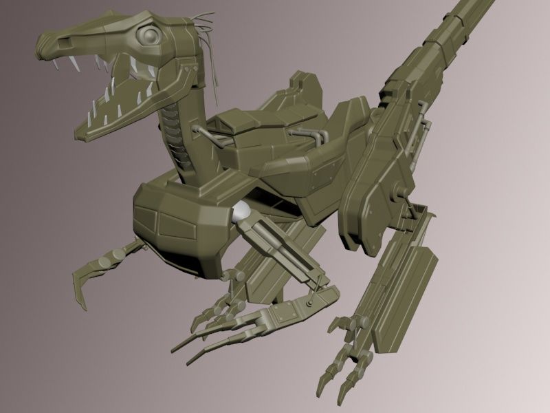
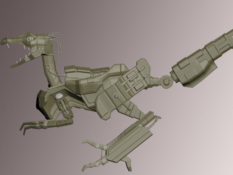
The idea behind Metal Gear Raptor is that it is the latest type of Metal Gear, it is a machine that hunts in packs at the forefront of an assault, disabling the enemies electronics and using its tail-mounted railgun to blast them to pieces.
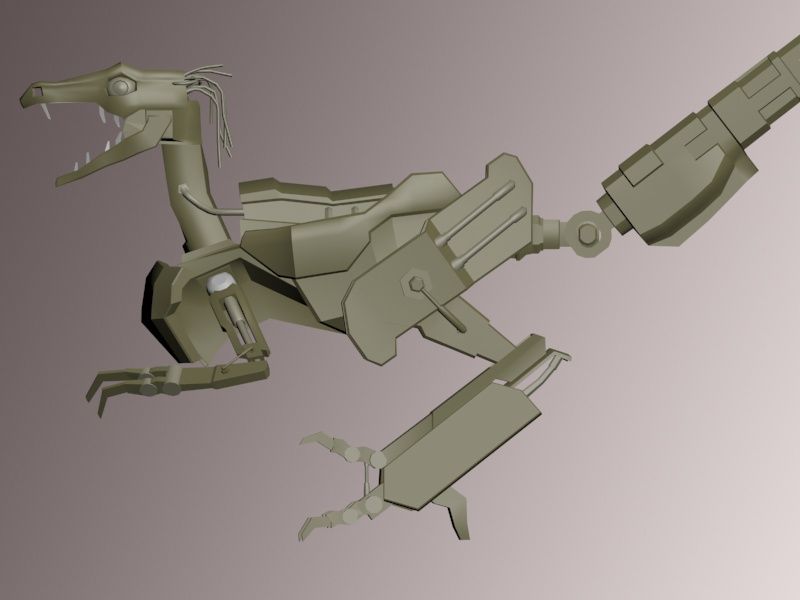
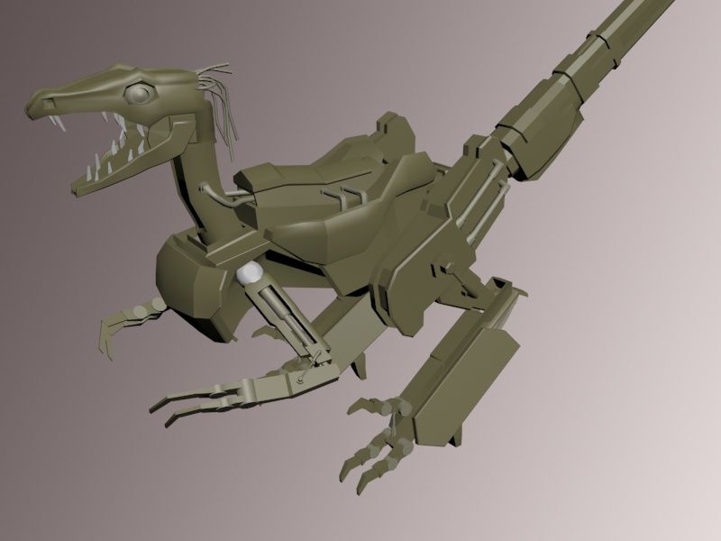
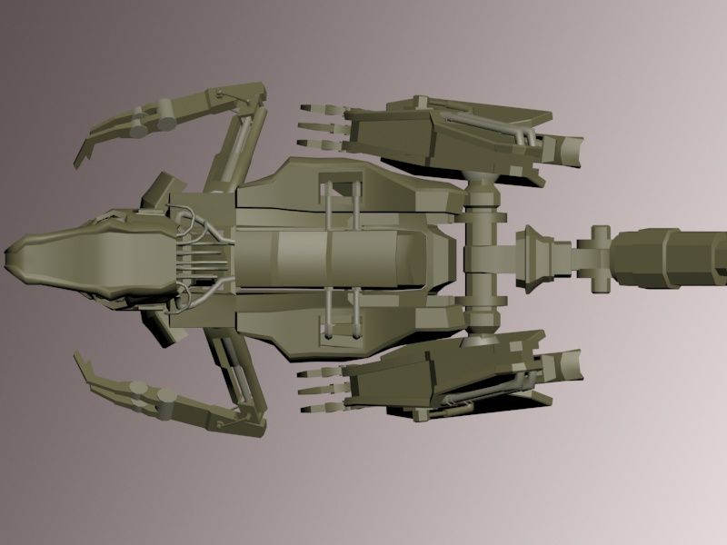
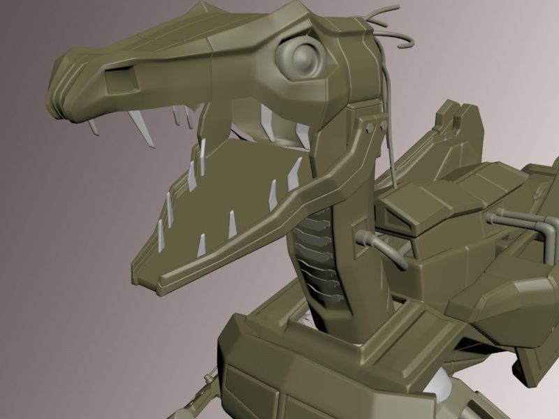
The design of Metal Gear Raptor was primarily to look consistent within the Metal Gear Solid universe, the wires at the back of the Raptor's head are cameras that aim and fire the railgun. They also are to look reminiscent of what prehistoric raptors are thought to have looked like - with feathers more so than scales. The railgun is a classic Metal Gear weapon.
All low poly and high poly are done at this stage and I am proceeding with texturing and rigging now, however i would greatly appreciate any feedback or criticism as I will be improving this model after the university deadline.
The following is the Low and High poly work done so far, FEEDBACK WELCOME!:
--LOW POLY--
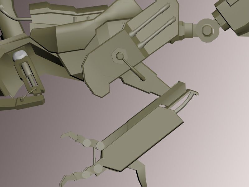
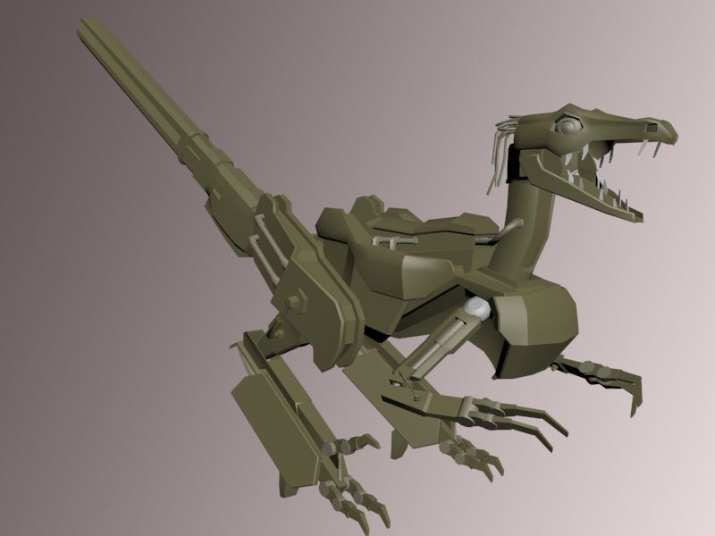
--HIGH POLY work done so far--
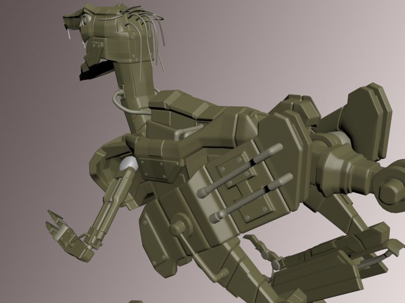
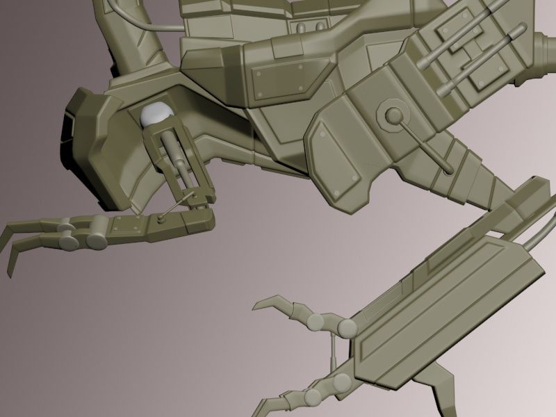
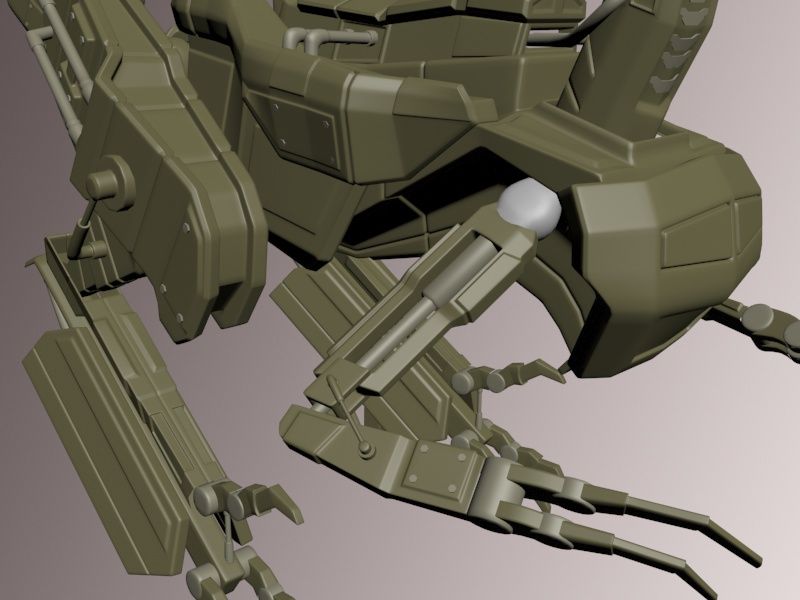
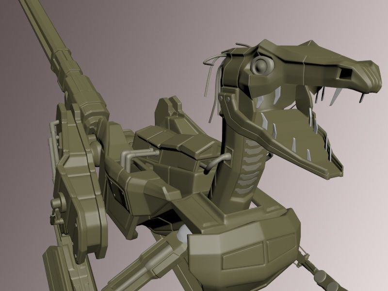
I chose to create a robotic dinosaur and decided to theme it to the Metal Gear Solid franchise. This helped me to keep within a coherent style while still allowing me to be creative.

The idea behind Metal Gear Raptor is that it is the latest type of Metal Gear, it is a machine that hunts in packs at the forefront of an assault, disabling the enemies electronics and using its tail-mounted railgun to blast them to pieces.
The design of Metal Gear Raptor was primarily to look consistent within the Metal Gear Solid universe, the wires at the back of the Raptor's head are cameras that aim and fire the railgun. They also are to look reminiscent of what prehistoric raptors are thought to have looked like - with feathers more so than scales. The railgun is a classic Metal Gear weapon.
All low poly and high poly are done at this stage and I am proceeding with texturing and rigging now, however i would greatly appreciate any feedback or criticism as I will be improving this model after the university deadline.
The following is the Low and High poly work done so far, FEEDBACK WELCOME!:
--LOW POLY--


--HIGH POLY work done so far--


Replies
At every joint, consider how the attached pieces are going to move, and what you need to cause that movement. Hydraulics can expand or contract, cables can contract, and servos can turn about one axis. I'm not sure how to represent a ball joint; that can be left as an exercise for the student.
You've limited the movement of some parts. Many raptors did have solid rods along the tail, limiting its movement to provide better balance, so that's fine. The two pins on the jaw, however, would lock it into the open position, and the neck is a single, immovable piece.
When you get to detailing, try adding subtle touches to emphasize the mechanical nature. The eyes should clearly be cameras, with almost flat lenses that spin to focus. Add a speaker in the throat. Place rubber pads under the toes for better traction.
http://www.shockya.com/news/wp-content/uploads/metal-gear-rising-revengeance-dog.jpg
i found these for you if not. hope it helps.
http://justacargal.blogspot.com/2011/05/andrew-chase-tme-sculptor.html
http://fc09.deviantart.net/fs8/i/2005/308/4/a/Wood_robot_2_by_nancynismo.jpg
http://digital-art-gallery.com/oid/30/1200x750_6712_Dino_Ver_2_0_2d_sci_fi_mech_robot_dinosaur_picture_image_digital_art.jpg
Also, have a first rough blocking out of the weaponry... Something like a smg or a small railgun.
You could also do this (head and guns) by a kick dirty paintover to explore ideas.
Good luck !
I fully agree that compared to MG Universe the head is far more organic in its form, which is mostly the case of working from organic reference and hardening it to be robotic, I definitely feel as was pointed out that animal mechs MG universe look far less realistic in their design and I can see where my interpretation has drifted from keeping with that style. i hadnt seen that MGS Rising pic, it should make for a nice reference, thanks!
The neck really does bother me the more I look at it now, It needs to be segmented rather than one whole piece, couldnt agree more with the opinion that it is jarring to the over all shape.
I'l definitely give dynamesh a look into to see if it helps create a more organic design, its a new tool to learn and not something I have yet tried. cheers!
I really see what your saying about a sorta blockey/lego look, I think that was my attempt at the chunky sections that Metal Gear Rex's design evokes, but thank you for the feedback as looking at it again I can see how many shapes are too just simplistic, like lego pieces.
I had alot of reference gathered up both organic and robotic imagery but I dont know if I best utilised the visual inspiration I had gathered, thanks for sending me some more, every bit of material is a help. The only point I would make about the being plain is that I was restricted to 12,000 tri-count and found it tough to keep within that count at times and so compromised some ideas early on.
My moodboard visual research was:
Reference images that I directly modelled from were: