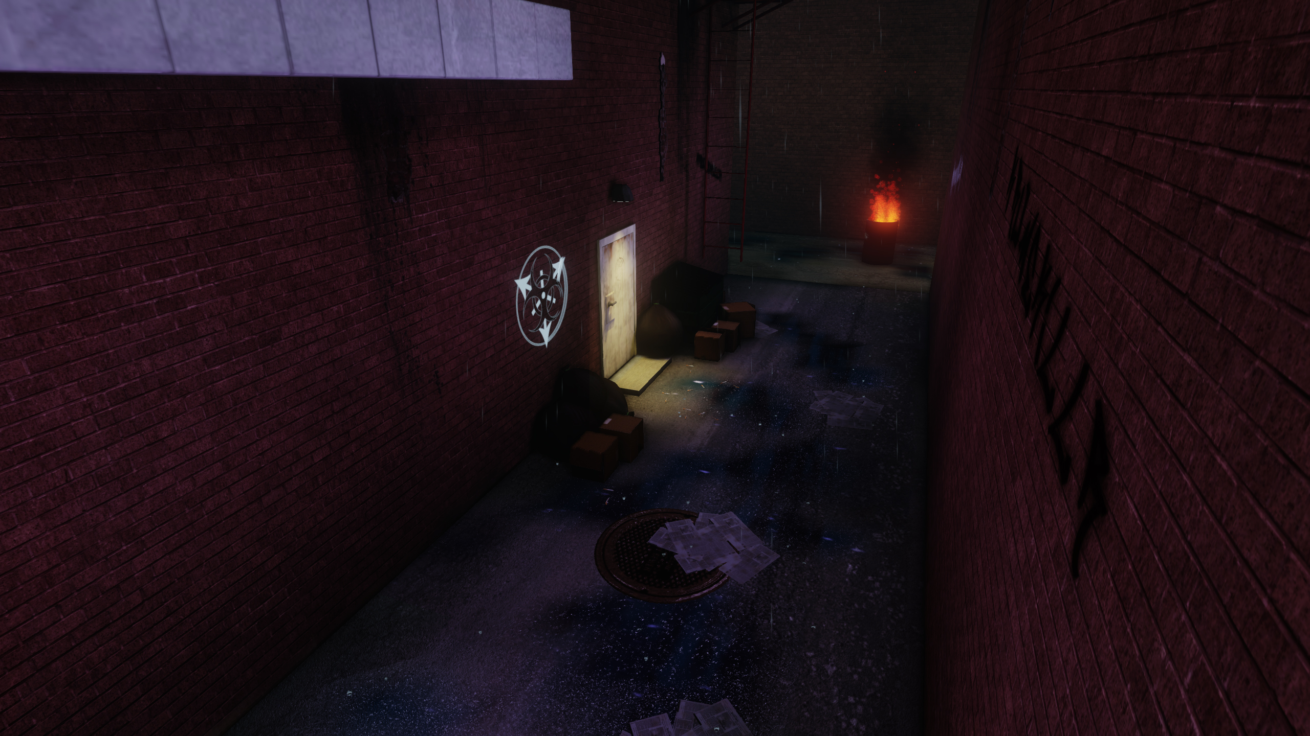
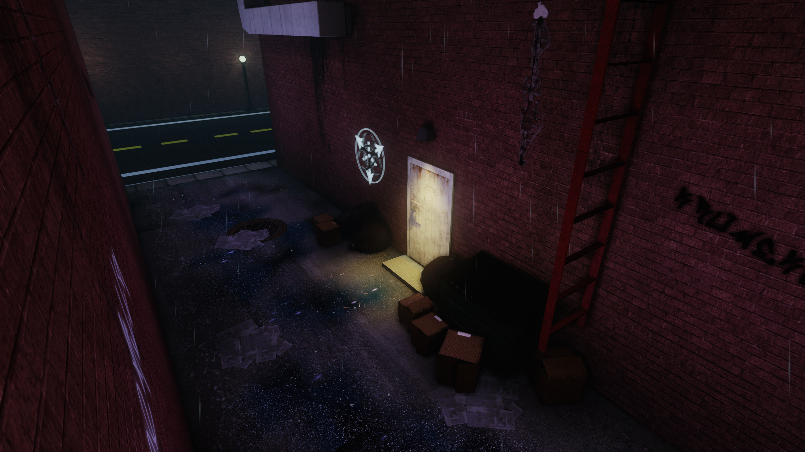
By the look of the scene nothing is going on. Try to tell a story with your work. Anyone can model and import stuff into UDK. Not everyone can tell a story. Pull the viewer (player, AD, hiring manager, etc) along a story. It's important to have that level of artistry with things.
Your buildings need a trim on the ground.
Vertex blend the walls as well.
You have no wires, small props, etc. Some medium things but no small props.
The street looks really weird to me.
Don't make both buildings identical. Change up the bricks.
Thanks for the info, right now, honestly, the "buildings" are just a wall mesh, I need to redo that so I can add in windows and such, I do have an idea about what I want to do for that.
As for vertex blending, I've also got an idea.
For small props, there is one small prop, i have cigarettes lying on the ground which are only visible when you look at it larger. But by the looks of it, if you don't know its there, you really need to look for it, i'll find a way to make them more prevelent, as well as add some more in.
And someone told me earlier about the street, I agree, I just don't know whats weird about it. If you can think of it, let me know.
I'm also going to take more consideration into my shots.
Also, I'll do something with the ladder/barrel and such.
Again, thank you for all the information.
Edit: I think I know what the problem with the street is.
Hi, about the street: the sidewalk is really narrow. on the other side of the street, there is a lamp what fills almost the full width of the sidewalk. also the pieces of the sidewalk are too small. i mean the texture tiling. and yeah. things like windows or ledges would be good. as like wall variations.
What I would like to see is a point of interest, and some cohesive visual story telling. Whether it be a hero prop, or a series of smaller props, or even some decals; what I think this scene needs is a little focus. I understand that this scene is supposed to be on the simpler side, however there are ways that you can add complexity to your piece without getting too complicated. The best way to simply add complexity to a scene of this nature is to think of it in layers. You have a great Base to start with, and grime and destruction are a great second layer to add. Moving forward consider the possibility of the adding props that will visually tell viewer which area off the world this is located, for what purpose does this locations serve, what time or season it is, etc. Ways in which you can implement this complexity, you can consider, layers. Consider some sort of sign above the door, Tattered posters on the wall, graffiti on the wall, pizza boxes, leftover butchered Goods, or old used equipment no longer needed ( like beat up amps). Layered lighting, liquid settlement, pollution, and blatant decoration are some more layering ides. Keep going and good luck.
Little update, made a mesh for the apartment, added windows, redid some lighting, redid the road, have to fix it up a little more, edit the diffuse, redid my decal placements, probably going to redo them again. still have a few textures left to do, like the windows, and I'm still working on incorporating the story to tell into this, to really give it a focal point, the focal i'm going with is on the door, but right now thats not evident. i did give it a little bit of a background to it story wise. Theres also a few other textures I have to work on, mainly my diffuses to have them stand out more against the background. Also going to make a vertex blending texture for the brick. Theres also a few things I need to do with some UVs. Heres the update:
Keep the critiques coming, I really want this to come out right.
Edit: I just looked at this on my other computer/OS, and it looks crazy different O_o... my settings are a lot more different than i thought.
Your floor heights seem very short and inconsistent. Buildings are, generally, 10-12' per level; yours appears to be maybe 6' per level. If you are going for a tenement block, the windows should be both larger and closer together, and they need frames rather than attaching directly to the brick.
I'd strongly recommend you pause, take a step back, and determine what you are going for. Find some references with similar buildings, look at the architecture and how the buildings themselves are laid out.
Thanks for the critique and making note of that. I will gather more reference on architectural anatomy for this. Then post my updates after fixing things.
It is definitely an alley way, my only suggestion would be to get some more light at the barrel on fire. In real life, flames that high would have a much higher reflection against that wall.
My biggest issue is the spray-paint, it looks too clean (the white one) and too detailed for something so hidden in an alley way.
It's almost feels like someone who works at Apple decided to come in an spray paint a sterile pictured in an alley for no reason.
The other one at the top also is out of place, it's not near a window or anything easy to access in a long stream, and climbing there is also hard, someone is not going to use a ladder to paint that which isn't going to admired.
I would do something different, like maybe make it a crime scene? Blood splatter? Instead with a half written graffiti on it? Or a simple scene for a back-door of a kitchen? Maybe card-board boxes for hobos?
Even something as simple as "Each window has a different grate" is enough to give it it's own story.
I'm actually going to go with a crime scene for it, i don't want to blood splatter since its raining. theres going to be tape going across the door that I just haven't made yet I'm also going to be adding "hobo" beds, this was pre-planned, I just haven't done it yet. I'll work some more on the graffiti and make it look more realistic. thanks for the critique.
Edit: @ mr grimm: I didn't notice your comment before, and you're right, needs more light over there, i do have a light there, i guess its just not bright enough. thanks again for the input
Did a small update, not too much, photoshop is giving me some issues right now so i didn't work on the barrel texture, or the road/sidewalk texture. I mainly did model edits to the apartment bldg, trying to work in what you talked about DWalker. I remove the graffiti for now until i can get a better way of making it look better. And I did some editing to my lighting, specifically the barrel fire.
C&C is always appreciated. (Comments and Critiques.) I know there is still a lot I need to fix, and theres a lot I know needs fixing. Thanks in advance. And looking at it again, that barrel's fire isn't bright enough yet
Could use some advice, having a problem fixing that line of shadow/light. it is an intersection of two meshes. I tried to use a light in order to fix it, but that did nothing, and i'm not quite sure what the problem is. could definitely use some help on this one.
Hey there. Think the road looks odd because of the decal size and brightness - it's too clean in comparison to the rest of the scene and the lines look to be a foot or so in width (altho I know photoshop isn't playing nice for you atm).
Re: the line of shadow/light - it looks like a lightmap issue - this vid might help:
[ame="http://www.youtube.com/watch?v=ntx10JMl9f4"]Fixing Lighting Seams in UDK - YouTube[/ame]
alright thanks, and yeah, the road was on my to do list, but photoshop just didn't want to work, i done some alterations that made the texture oversized, but that texture still needed to be fixed anyways so. and i'll look at this video here in a few. thanks again.
@Zero: that worked like a charm man, thanks so much.
Edit: Did some fixes earlier, added some more lighting, also upped the lighting for the fire some more. did a little bit of placement, and did some texturing/retexturing.
As always, keep the critiques coming. Theres still a few more things i got to do with what i have. Some more texturing and retexturing.
Everything is looking very blocky and looks like it's built of BSP rather than models. You can afford to use a lot more polys to give everything a bit more character and silhouette. The windows, walls, the concrete step, they all look so square and hard edge.
You should think of making your own brick texture. It looks very flat at the moment. If you sculpted some bricks and baked them down onto a plane, you could get a really cool brick texture. It looks like your current bricks are using a filtered normal map, which isn't really giving them the proper shape.
I'd advise you gather and use a lot more references for this stuff. For example, your ladder looks very flimsy and doesn't look very much like a ladder you'd find in the real world.
Also, your door appears to just be a block stuck on the side of the building. Check out some references; doors are a lot different to that. In most cases, they don't actually stick at out at all, they go into the building and have the frame flush with the wall.
Your windows could do with some work too. They are cut in at random intervals and look like they don't line up with the actual brick texture. Also, most windows have some sort of trim along the bricks, and don't just cut off.
i haven't posted in awhile, but i tried my hand at sculpting out some brick and making it a texture, the sculpt was nice, but the texture was too tileable, so for now i'm going to leave the texture the way it is, but paint a height map instead for the brick. I'll be redoing the fire escape completely, since the one i'm using wasn't even originally made for this piece, it was made separately for just shits and giggles and since i needed one for this i used it. I'll model in some trim to the walls, add some piping and what not to make it look better, maybe an air conditioner.
I guess what I mean to say is i'm really going to go into more detail and make it look lived. I'll also fix the door, and add some more polys where need be. as well as fix the windows, basically redo the bldg if you will. i'll have an update at some point. i'm also going to be starting a secondary project alongside this one. which i will post as well. probably in here.
Edit: Also, thank you for the great critique, you hit on a lot of things i didn't think about and no one really pointed out.
You rushed into texturing and lighting without working out an interesting composition. You should just take some time off from trying to attempt an entire scene. Make a bunch or props, remake them till they look like your peers......and then do a few of these studies. Just basic shapes, and work out a good composition.
These I made ages ago, yet they illustrate my point. Composition and staging are going to move your work forward, not updating brick textures or adding a height map. I know you want to frost the cake, but you need to spend more time getting the basics right. Think small, do a lot of stuff that you know your going to throw away, it's part of the learning process.
i understand completely, and its something i need to work on. i have an issue where when i go to work on something, even something as small as say a rock (exaggerating) I end up focusing on the bigger picture instead of focusing on it bit by bit making sure certain aspects look good before moving on to the larger tasks like the texturing and the lighting. this scene does need a lot more work. On my scene I am working on along side this, I have made small props and what not to to test the composition/scale and placement, and I'll be working on modeling pieces and placing them and making it look good instead of what I normally do and just make pieces as fast as i can and texture them all in one go before making sure it all works together and makes sense and compositionally looks good.
Thanks again, that really you know helped me a lot and is making me realize something that I should know to work on first. Also, what I feel it boils down to is my being impatience to get into the "meat" of the scene.
Replies
Your buildings need a trim on the ground.
Vertex blend the walls as well.
You have no wires, small props, etc. Some medium things but no small props.
The street looks really weird to me.
Don't make both buildings identical. Change up the bricks.
The angles aren't helping. Read http://www.cgsociety.org/index.php/CGSFeatures/CGSFeatureSpecial/phil_straub_composition_tutorial that might help.
The barrel, ladder, and wall are all the same value making them all blend together. Change that up so one is darker/lighter than another.
As for vertex blending, I've also got an idea.
For small props, there is one small prop, i have cigarettes lying on the ground which are only visible when you look at it larger. But by the looks of it, if you don't know its there, you really need to look for it, i'll find a way to make them more prevelent, as well as add some more in.
And someone told me earlier about the street, I agree, I just don't know whats weird about it. If you can think of it, let me know.
I'm also going to take more consideration into my shots.
Also, I'll do something with the ladder/barrel and such.
Again, thank you for all the information.
Edit: I think I know what the problem with the street is.
Keep the critiques coming, I really want this to come out right.
Edit: I just looked at this on my other computer/OS, and it looks crazy different O_o... my settings are a lot more different than i thought.
I'd strongly recommend you pause, take a step back, and determine what you are going for. Find some references with similar buildings, look at the architecture and how the buildings themselves are laid out.
It's almost feels like someone who works at Apple decided to come in an spray paint a sterile pictured in an alley for no reason.
The other one at the top also is out of place, it's not near a window or anything easy to access in a long stream, and climbing there is also hard, someone is not going to use a ladder to paint that which isn't going to admired.
I would do something different, like maybe make it a crime scene? Blood splatter? Instead with a half written graffiti on it? Or a simple scene for a back-door of a kitchen? Maybe card-board boxes for hobos?
Even something as simple as "Each window has a different grate" is enough to give it it's own story.
Edit: @ mr grimm: I didn't notice your comment before, and you're right, needs more light over there, i do have a light there, i guess its just not bright enough. thanks again for the input
C&C is always appreciated. (Comments and Critiques.) I know there is still a lot I need to fix, and theres a lot I know needs fixing. Thanks in advance. And looking at it again, that barrel's fire isn't bright enough yet
Re: the line of shadow/light - it looks like a lightmap issue - this vid might help:
[ame="
Edit: Did some fixes earlier, added some more lighting, also upped the lighting for the fire some more. did a little bit of placement, and did some texturing/retexturing.
As always, keep the critiques coming. Theres still a few more things i got to do with what i have. Some more texturing and retexturing.
You should think of making your own brick texture. It looks very flat at the moment. If you sculpted some bricks and baked them down onto a plane, you could get a really cool brick texture. It looks like your current bricks are using a filtered normal map, which isn't really giving them the proper shape.
I'd advise you gather and use a lot more references for this stuff. For example, your ladder looks very flimsy and doesn't look very much like a ladder you'd find in the real world.
Also, your door appears to just be a block stuck on the side of the building. Check out some references; doors are a lot different to that. In most cases, they don't actually stick at out at all, they go into the building and have the frame flush with the wall.
Your windows could do with some work too. They are cut in at random intervals and look like they don't line up with the actual brick texture. Also, most windows have some sort of trim along the bricks, and don't just cut off.
Check out these references:
I guess what I mean to say is i'm really going to go into more detail and make it look lived. I'll also fix the door, and add some more polys where need be. as well as fix the windows, basically redo the bldg if you will. i'll have an update at some point. i'm also going to be starting a secondary project alongside this one. which i will post as well. probably in here.
Edit: Also, thank you for the great critique, you hit on a lot of things i didn't think about and no one really pointed out.
These I made ages ago, yet they illustrate my point. Composition and staging are going to move your work forward, not updating brick textures or adding a height map. I know you want to frost the cake, but you need to spend more time getting the basics right. Think small, do a lot of stuff that you know your going to throw away, it's part of the learning process.
Thanks again, that really you know helped me a lot and is making me realize something that I should know to work on first. Also, what I feel it boils down to is my being impatience to get into the "meat" of the scene.